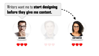
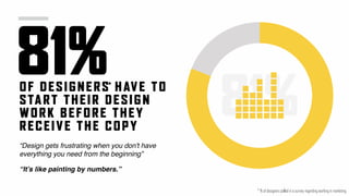
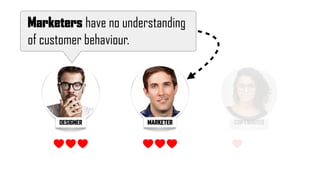
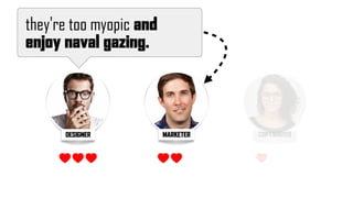
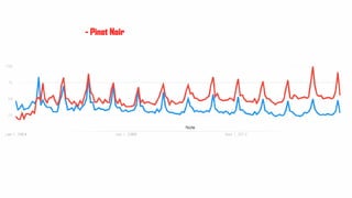
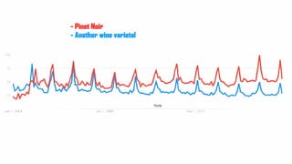
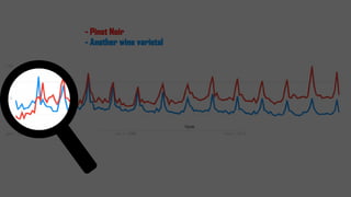
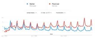
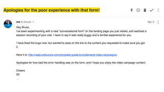
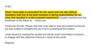
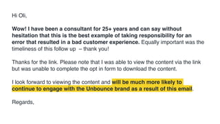
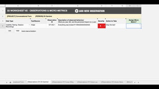
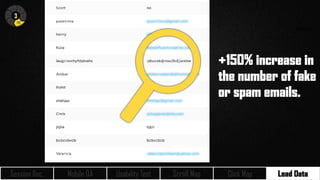
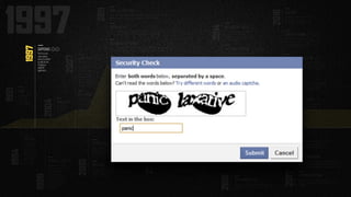
3DDATA-DRIVEN DESIGN
1
67%OF M AR KETERS
SAID THEY D ON’T
HAVE ENO UGH DATA
TO DO TH EIR J OB
EF F EC TIVELY.
67%
* who responded to my research surveys
*
@oligardner #mktfest
why create an explainer video?
We did it because it was trendy
DESIGN DECISIONS NEED TO BE INFORMED BY DATA
NOT TRENDS
@oligardner #mktfest
BEING
TRENDY
DOESN’T
MAKE IT
RIGHT
Scrappy
@oligardner bit.ly/oli-prg
What does it mean to be data-driven?
WE SHOULD BE DATA-INFORMED AND
CUSTOMER-DRIVEN
Talia Wolf - @TaliaGW #mktfest
“
“
I interviewed and surveyed over
800 people who work on
marketing teams
DESIGNER COPYWRITERMARKETER
DESIGNER COPYWRITER
Writers want me to start designing
before they give me content.
MARKETER
81%OF DESIGNERS HAVE TO
START THEIR D ESIGN
WORK BEFORE THEY
RECEIVE THE COPY
81%
“Design gets frustrating when you don't have
everything you need from the beginning”
*
* % of designers polled in a survey regarding working in marketing
“It’s like painting by numbers.”
DESIGNER COPYWRITER
Writers don't get that search engines see
things differently to humans.
MARKETER
DESIGNER COPYWRITER
Marketers have no understanding
of customer behaviour.
MARKETER
DESIGNER
they're too myopic and
enjoy naval gazing.
MARKETER COPYWRITER
na·vel-gaz·ing
/‘ nāvel gāziNG/
noun
self-indulgent or excessive contemplation of oneself…
DESIGNER
…they don't respect design

and think they know how it should be done.
MARKETERMARKETER COPYWRITER
98%OF MARKETERS SAID
THEY ARE RESPONSIBLE
FOR GIVING DES IGN
FEEDBACK TO
DESIGNE RS
98%*
* % of marketers polled in a survey regarding working with designers and copywriters in marketing
87%OF MARKETERS WHO
GIVE D ESIGN
FEEDBACK B ELI EVE
THEY ARE QUALIFIED
TO DO S O.
87%*
* % of marketers polled in a survey regarding working with designers and copywriters in marketing
87%OF MARKETERS WHO
GIVE D ESIGN
FEEDBACK B ELI EVE
THEY ARE QUALIFIED
TO DO S O.
87%*
* % of marketers polled in a survey regarding working with designers and copywriters in marketing
DESIGNER MARKETER
Designers are too sensitive.
COPYWRITER
Are you a designer?
MacGyver.
MacGyvered
design == empathy
design != copying others
2011
2010
PARALLAX SCROLLING
A beautiful motion design and photographic technique, parallax scrolling can
create an excellent experience. Sadly it was quickly abused.
CINEMAGRAPHS
Another beautiful concept, that didn’t gain much traction, instead its
subtlety was passed over in favour of the surging animated GIF.
STICKY NAVIGATION
A similar device to the HelloBar, but designed for anchor (in-page)
navigation. Something that can really help long landing pages.
INLINE FORM FIELD LABELS
This one blew up UX and CRO communities. Primarily because the label
disappeared when the field was clicked, removing context and hints.
BUTTON COLOUR
As affordable A/B testing tools hit the
market, so cometh a slew of bad case
studies that encourage bad experimentation
practices.
HELLO BAR
The first sticky bar emerges from Digital
Telepathy, allowing you to place persistent offers
at the top of the page.
2012
EXPLAINER VIDEOS
Everyone needs an explainer video, right? Explain that to me.
FULLSCREEN HERO IMAGES
Wide adoption of fullscreen background images was the
beginning of many trends that would harm readability of the
all-important above-the-fold value prop area of web pages
everywhere.
1991
WWW
The World Wide
Web is made
available to the
general public.
1994
THE FOLD
Jakob Nielsen
proclaims that
people don’t
scroll, and most
debated topic in
digital marketing
begins, and
never stops.
1997
CAPTCHAS
The first evil
interruptive
device is added
to web forms.
Creating a
usability
nightmare.
1998
POPUPS
Things get even uglier
as web designers and
developers begin
hacking browser
behaviour. The hard to
escape Javascript
popup empowers the
black hats to start
misbehaving.
2004
PINOT NOIR
Not a design
trend, but an
example of the
power trends
can wield when
left unchecked.
2007
CAROUSELS
Oft looked upon as
a way to pacify
stakeholder
politics, carousel
sliders hit every
homepage adding
massive amounts
of content destined
never to be seen.
RE-CAPTCHA
The evil captcha is
turned into a device
that does good – by
crowdsourcing
digitizing of hard-
to-read books. Gets
acquired by Google
in 2009.
RESPONSIVE WEB DESIGN
One of the biggest web bandwagons ever. RWD seemed like a great idea at the
time, but the lack of control over the mobile experience can cause issues.
MOBILE-FIRST DESIGN
Closely tied to RWD, mobile-first sought to future-proof web
experiences by placing emphasis on mobile – because all of your traffic
is mobile, right?
EYE TRACKING
An expensive and fancy way to detect what people are looking at on a web
page. It quickly gained notoriety when the “baby gaze” experiment did the
rounds on marketing blogs.
2013
INLINE FORM FIELD LABELS II
A community-led success story.
Designers created a way to keep the
label inline without disappearing.
HAMBURGER MENU
Massive debates raged about
this one, but influence from OS
designers has forced this into
mass adoption.
FLAT DESIGN
Affordance is thrown out the
window en masse with a trend
that can destroy app usability.
2014
BACKGROUND VIDEOS
The fullscreen hero image extends
to video, further impacting
readability and increasing instances
of “false bottoms”.
CONGRATULATIONS!
A Facebook hack more than a design
trend. But quite hilarious.
Congratulations!!!
GHOST BUTTONS
Rectangles with opaque fills create quite
awesome secondary state buttons, but poor
affordance and readability can render them
unclickable-looking.
GOOD COP / BAD COP
The psychological term for the two-
button popup, whereby you have to click
something you don’t agree with to exit
the experience.
SCROLLJACKING
20 years of interaction design thrown down the
toilet. Designers once more try to re-invent the
quite perfect browser scrolling mechanism.
2015
SCROLL-TRIGGERED ANIMATIONS
As you scroll down the page, images and
text start to fly in, drawing your attention to
them. Great the first time you see them.
Thereafter annoying as hell.
CSS ANIMATED CTAs
These have the ability to get really out of hand.
Although there are some really nice subtle
effects.
WELCOME MAT
An entrance-overlay method from
SumoMe whereby the entire screen is
covered. An interruptive experience
that has seen some positive updates.
2016
OVERLAYS
Unbounce signals the end to the
popup, ushering in a new era of
responsible marketing practices.
SKELETON SCREENS
A technique where a wireframe-like layout appears
before the content to accelerate load times and
provide a signal that loading is happening.
CONVERSATIONAL FORMS
One of the most interesting new interaction
models to emerge, conversational forms
turn a regular web form into a chat-like
experience.
CONFIRM SHAMING
A new name for good cop / bad cop
emerges. Manipulinks is another. Regardless
of the name, I hope one sticks as it makes it
easier to track the trend.
STICKY TOP AND BOTTOM
Top-anchored sticky bars are awesome, bottom
ones feel slightly more interruptive, but when both
are used at the same time it destroys the viewport.
2017
SMART NAVIGATION
This will be an interesting one, where navigational
devices will be presented to visitors where and when
they hold the most contextual importance and utility.
ASYMMETRIC DESIGN
Could this simple yet elegant and dynamic
trend be the saviour of the false bottom? Quite
possibly.
2017?
2017 will be an interesting year for trends,
hopefully we’ll see an increase in
experimentation and validation.
DESIGN TRENDLINE
@OliGardner @Unbounce #mktfest
- Pinot Noir
- Pinot Noir
- Another wine varietal
- Pinot Noir
- Another wine varietal
2004
Image Source: GQ
Source: http://www.decanter.com/wine-news/sideways-effect-confirmed-76585/
“It only takes one tree to
make a thousand matches.


“It only takes one tree to
make a thousand matches.


Only takes one match to
burn a thousand trees.”
— Stereophonics
I DRINK A LOT OF WINE
But I haven’t bought a bottle of
Merlot in 13 years
#TRENDpower
2011
2010
2012
1991
1994
1997
1998
2004
2007
2013
2014
2015
2016
2017
PARALLAX SCROLLING
A beautiful motion design and photographic technique, parallax scrolling can
create an excellent experience. Sadly it was quickly abused.
CINEMAGRAPHS
Another beautiful concept, that didn’t gain much traction, instead its
subtlety was passed over in favour of the surging animated GIF.
STICKY NAVIGATION
A similar device to the HelloBar, but designed for anchor (in-page)
navigation. Something that can really help long landing pages.
INLINE FORM FIELD LABELS
This one blew up UX and CRO communities. Primarily because the label
disappeared when the field was clicked, removing context and hints.
BUTTON COLOUR
As affordable A/B testing tools hit the
market, so cometh a slew of bad case
studies that encourage bad experimentation
practices.
HELLO BAR
The first sticky bar emerges from Digital
Telepathy, allowing you to place persistent offers
at the top of the page.
EXPLAINER VIDEOS
Everyone needs an explainer video, right? Explain that to me.
FULLSCREEN HERO IMAGES
Wide adoption of fullscreen background images was the
beginning of many trends that would harm readability of the
all-important above-the-fold value prop area of web pages
everywhere.
WWW
The World Wide
Web is made
available to the
general public.
THE FOLD
Jakob Nielsen
proclaims that
people don’t
scroll, and most
debated topic in
digital marketing
begins, and
never stops.
CAPTCHAS
The first evil
interruptive
device is added
to web forms.
Creating a
usability
nightmare.
POPUPS
Things get even uglier
as web designers and
developers begin
hacking browser
behaviour. The hard to
escape Javascript
popup empowers the
black hats to start
misbehaving.
PINOT NOIR
Not a design
trend, but an
example of the
power trends
can wield when
left unchecked.
CAROUSELS
Oft looked upon as
a way to pacify
stakeholder
politics, carousel
sliders hit every
homepage adding
massive amounts
of content destined
never to be seen.
RE-CAPTCHA
The evil captcha is
turned into a device
that does good – by
crowdsourcing
digitizing of hard-
to-read books. Gets
acquired by Google
in 2009.
RESPONSIVE WEB DESIGN
One of the biggest web bandwagons ever. RWD seemed like a great idea at the
time, but the lack of control over the mobile experience can cause issues.
MOBILE-FIRST DESIGN
Closely tied to RWD, mobile-first sought to future-proof web
experiences by placing emphasis on mobile – because all of your traffic
is mobile, right?
EYE TRACKING
An expensive and fancy way to detect what people are looking at on a web
page. It quickly gained notoriety when the “baby gaze” experiment did the
rounds on marketing blogs.
INLINE FORM FIELD LABELS II
A community-led success story.
Designers created a way to keep the
label inline without disappearing.
HAMBURGER MENU
Massive debates raged about
this one, but influence from OS
designers has forced this into
mass adoption.
FLAT DESIGN
Microsoft’s 2010 efforts were
amplified by Apple and
affordance is thrown out the
“window” en masse.
BACKGROUND VIDEOS
The fullscreen hero image extends
to video, further impacting
readability and increasing instances
of “false bottoms”.
CONGRATULATIONS!
A Facebook hack more than a design
trend. But quite hilarious.
Congratulations!!!
GHOST BUTTONS
Rectangles with opaque fills create quite
awesome secondary state buttons, but poor
affordance and readability can render them
unclickable-looking.
GOOD COP / BAD COP
The psychological term for the two-
button popup, whereby you have to click
something you don’t agree with to exit
the experience.
SCROLLJACKING
20 years of interaction design thrown down the
toilet. Designers once more try to re-invent the
quite perfect browser scrolling mechanism.
SCROLL-TRIGGERED ANIMATIONS
As you scroll down the page, images and
text start to fly in, drawing your attention to
them. Great the first time you see them.
Thereafter annoying as hell.
CSS ANIMATED CTAs
These have the ability to get really out of hand.
Although there are some really nice subtle
effects.
WELCOME MAT
An entrance-overlay method from
SumoMe whereby the entire screen is
covered. An interruptive experience
that has seen some positive updates.
OVERLAYS
Unbounce signals the end to the
popup, ushering in a new era of
responsible marketing practices.
SKELETON SCREENS
A technique where a wireframe-like layout appears
before the content to accelerate load times and
provide a signal that loading is happening.
CONVERSATIONAL FORMS
One of the most interesting new interaction
models to emerge, conversational forms
turn a regular web form into a chat-like
experience.
CONFIRM SHAMING
A new name for good cop / bad cop
emerges. Manipulinks is another. Regardless
of the name, I hope one sticks as it makes it
easier to track the trend.
STICKY TOP AND BOTTOM
Top-anchored sticky bars are awesome, bottom
ones feel slightly more interruptive, but when both
are used at the same time it destroys the viewport.
SMART NAVIGATION
This will be an interesting one, where navigational
devices will be presented to visitors where and when
they hold the most contextual importance and utility.
ASYMMETRIC DESIGN
Could this simple yet elegant and dynamic
trend be the saviour of the false bottom? Quite
possibly.
2017?
2017 will be an interesting year for trends,
hopefully we’ll see an increase in
experimentation and validation.
Data visualization has become big business, one whose needs
will only grow as data expands like a new universe. After an
initial peak, the quality declined as the market got swamped.
INFOGRAPHICS
2016
CONVERSATIONAL FORMS
One of the most interesting new interaction
models to emerge, conversational forms
turn a regular web form into a chat-like
experience.
2016
NEW

TREND
THE CONVERSATIONAL FORM
FROM
DANISH AGENCY
SPACE10
DATA-DRIVEN DESIGN (3D) PROCESS
@oligardner #mktfest bit.ly/oli-prg
3D
N
H
I
1
THE 3D PROJECT PLAYBOOK
A data-driven design project starts with

The 3D Playbook. An interactive
optimization lookup tool for taking the
overwhelming amount of data that exists,
and narrowing it down to the types, sources,
and formats that are most relevant to what
you’re working on.
N
3D
N
H
I
Isolate the
data sources
you NEED
BOUNCE
RATE
SESSION
REC.
SESSION
REC.
POLL
MOBILE
QA
QA ON
MOBILE
USABILITY
TEST
USABILITY
TEST
CONV
FORM
CONV
FORM
PAGE
LENGTH
NPS
SURVEY
SCROLL
MAP
CLICK
MAP
FORM
ABANDON
LEAD
DATA
NEW VS
RETURN
SCROLL
MAP
CLICK
MAP
LEAD
DATA
Choose object of interest
SESSION
REC.
QA ON
MOBILE
USABILITY
TEST
SCROLL
MAP
CLICK
MAP
LEAD
DATA
THE 3D PLAYBOOK
ANINTERACTIVEOPTIMIZATIONLOOKUPCHARTFORMARKETINGTEAMS
3D
bit.ly/oli-prg
2 OBSERVATIONS &

MICRO METRICS
Every observed pain point needs
a corresponding solution. If you
can measure it, you can optimize
and improve it. Assigning micro
metrics ensures you can
measure the impact of every
design decision you make.
N
THE 3D PROJECT PLAYBOOK
A data-driven design project starts with

The 3D Playbook. An interactive
optimization lookup tool for taking the
overwhelming amount of data that exists,
and narrowing it down to the types, sources,
and formats that are most relevant to what
you’re working on.
Mobile QA Usability Test Scroll Map Click Map Lead Data
3
N
H
E
I
Session Rec.
3
N
H
E
I
Session Rec. Mobile QA Usability Test Scroll Map Click Map Lead Data
Apologies for the poor experience with that form!
Hi Oli,
Wow! I have been a consultant for 25+ years and can say without
hesitation that this is the best example of taking responsibility for an
error that resulted in a bad customer experience. Equally important was the
timeliness of this follow up – thank you!
Thanks for the link. Please note that I was able to view the content via the link
but was unable to complete the opt in form to download the content.
I look forward to viewing the content and will be much more likely to continue
to engage with the unbounce brand as a result of this email.
Regards,
Hi Oli,
Wow! I have been a consultant for 25+ years and can say without
hesitation that this is the best example of taking responsibility for an
error that resulted in a bad customer experience. Equally important was the
timeliness of this follow up – thank you!
Thanks for the link. Please note that I was able to view the content via the link
but was unable to complete the opt in form to download the content.
I look forward to viewing the content and will be much more likely to
continue to engage with the Unbounce brand as a result of this email.
Regards,
3
N
H
E
I
Mobile QA Usability Test Scroll Map Click Map Lead DataSession Rec.
QA is essential in marketing
Mobile QA Usability Test Scroll Map Click Map Lead Data
3
N
H
E
I
Session Rec.
ANIMATED DOTS
Mobile QA Usability Test Scroll Map Click Map Lead Data
3
N
H
E
I
Session Rec.
CLICKING FIRST QUESTION
Mobile QA Usability Test Scroll Map Click Map Lead Data
3
N
H
E
I
Session Rec.
12% of people were
clicking the first
question.
Mobile QA Usability Test Scroll Map Click Map Lead Data
3
N
H
E
I
Session Rec.
Mobile QA Usability Test Scroll Map Click Map Lead Data
3
N
H
E
I
Session Rec.
+150% increase in
the number of fake
or spam emails.
2011
2010
2012
1991
1994
1997
1998
2004
2007
2013
2014
2015
2016
2017
PARALLAX SCROLLING
A beautiful motion design and photographic technique, parallax scrolling can
create an excellent experience. Sadly it was quickly abused.
CINEMAGRAPHS
Another beautiful concept, that didn’t gain much traction, instead its
subtlety was passed over in favour of the surging animated GIF.
STICKY NAVIGATION
A similar device to the HelloBar, but designed for anchor (in-page)
navigation. Something that can really help long landing pages.
INLINE FORM FIELD LABELS
This one blew up UX and CRO communities. Primarily because the label
disappeared when the field was clicked, removing context and hints.
BUTTON COLOUR
As affordable A/B testing tools hit the
market, so cometh a slew of bad case
studies that encourage bad experimentation
practices.
HELLO BAR
The first sticky bar emerges from Digital
Telepathy, allowing you to place persistent offers
at the top of the page.
EXPLAINER VIDEOS
Everyone needs an explainer video, right? Explain that to me.
FULLSCREEN HERO IMAGES
Wide adoption of fullscreen background images was the
beginning of many trends that would harm readability of the
all-important above-the-fold value prop area of web pages
everywhere.
WWW
The World Wide
Web is made
available to the
general public.
THE FOLD
Jakob Nielsen
proclaims that
people don’t
scroll, and most
debated topic in
digital marketing
begins, and
never stops.
CAPTCHAS
The first evil
interruptive
device is added
to web forms.
Creating a
usability
nightmare.
POPUPS
Things get even uglier
as web designers and
developers begin
hacking browser
behaviour. The hard to
escape Javascript
popup empowers the
black hats to start
misbehaving.
PINOT NOIR
Not a design
trend, but an
example of the
power trends
can wield when
left unchecked.
CAROUSELS
Oft looked upon as
a way to pacify
stakeholder
politics, carousel
sliders hit every
homepage adding
massive amounts
of content destined
never to be seen.
RE-CAPTCHA
The evil captcha is
turned into a device
that does good – by
crowdsourcing
digitizing of hard-
to-read books. Gets
acquired by Google
in 2009.
RESPONSIVE WEB DESIGN
One of the biggest web bandwagons ever. RWD seemed like a great idea at the
time, but the lack of control over the mobile experience can cause issues.
MOBILE-FIRST DESIGN
Closely tied to RWD, mobile-first sought to future-proof web
experiences by placing emphasis on mobile – because all of your traffic
is mobile, right?
EYE TRACKING
An expensive and fancy way to detect what people are looking at on a web
page. It quickly gained notoriety when the “baby gaze” experiment did the
rounds on marketing blogs.
INLINE FORM FIELD LABELS II
A community-led success story.
Designers created a way to keep the
label inline without disappearing.
HAMBURGER MENU
Massive debates raged about
this one, but influence from OS
designers has forced this into
mass adoption.
FLAT DESIGN
Microsoft’s 2010 efforts were
amplified by Apple and
affordance is thrown out the
“window” en masse.
BACKGROUND VIDEOS
The fullscreen hero image extends
to video, further impacting
readability and increasing instances
of “false bottoms”.
CONGRATULATIONS!
A Facebook hack more than a design
trend. But quite hilarious.
Congratulations!!!
GHOST BUTTONS
Rectangles with opaque fills create quite
awesome secondary state buttons, but poor
affordance and readability can render them
unclickable-looking.
GOOD COP / BAD COP
The psychological term for the two-
button popup, whereby you have to click
something you don’t agree with to exit
the experience.
SCROLLJACKING
20 years of interaction design thrown down the
toilet. Designers once more try to re-invent the
quite perfect browser scrolling mechanism.
SCROLL-TRIGGERED ANIMATIONS
As you scroll down the page, images and
text start to fly in, drawing your attention to
them. Great the first time you see them.
Thereafter annoying as hell.
CSS ANIMATED CTAs
These have the ability to get really out of hand.
Although there are some really nice subtle
effects.
WELCOME MAT
An entrance-overlay method from
SumoMe whereby the entire screen is
covered. An interruptive experience
that has seen some positive updates.
OVERLAYS
Unbounce signals the end to the
popup, ushering in a new era of
responsible marketing practices.
SKELETON SCREENS
A technique where a wireframe-like layout appears
before the content to accelerate load times and
provide a signal that loading is happening.
CONVERSATIONAL FORMS
One of the most interesting new interaction
models to emerge, conversational forms
turn a regular web form into a chat-like
experience.
CONFIRM SHAMING
A new name for good cop / bad cop
emerges. Manipulinks is another. Regardless
of the name, I hope one sticks as it makes it
easier to track the trend.
STICKY TOP AND BOTTOM
Top-anchored sticky bars are awesome, bottom
ones feel slightly more interruptive, but when both
are used at the same time it destroys the viewport.
SMART NAVIGATION
This will be an interesting one, where navigational
devices will be presented to visitors where and when
they hold the most contextual importance and utility.
ASYMMETRIC DESIGN
Could this simple yet elegant and dynamic
trend be the saviour of the false bottom? Quite
possibly.
2017?
2017 will be an interesting year for trends,
hopefully we’ll see an increase in
experimentation and validation.
1997
CAPTCHAS
The first evil
interruptive
device is added
to web forms.
Creating a
usability
nightmare.
1997
2011
2010
2012
1991
1994
1997
1998
2004
2007
2013
2014
2015
2016
2017
PARALLAX SCROLLING
A beautiful motion design and photographic technique, parallax scrolling can
create an excellent experience. Sadly it was quickly abused.
CINEMAGRAPHS
Another beautiful concept, that didn’t gain much traction, instead its
subtlety was passed over in favour of the surging animated GIF.
STICKY NAVIGATION
A similar device to the HelloBar, but designed for anchor (in-page)
navigation. Something that can really help long landing pages.
INLINE FORM FIELD LABELS
This one blew up UX and CRO communities. Primarily because the label
disappeared when the field was clicked, removing context and hints.
BUTTON COLOUR
As affordable A/B testing tools hit the
market, so cometh a slew of bad case
studies that encourage bad experimentation
practices.
HELLO BAR
The first sticky bar emerges from Digital
Telepathy, allowing you to place persistent offers
at the top of the page.
EXPLAINER VIDEOS
Everyone needs an explainer video, right? Explain that to me.
FULLSCREEN HERO IMAGES
Wide adoption of fullscreen background images was the
beginning of many trends that would harm readability of the
all-important above-the-fold value prop area of web pages
everywhere.
WWW
The World Wide
Web is made
available to the
general public.
THE FOLD
Jakob Nielsen
proclaims that
people don’t
scroll, and most
debated topic in
digital marketing
begins, and
never stops.
CAPTCHAS
The first evil
interruptive
device is added
to web forms.
Creating a
usability
nightmare.
POPUPS
Things get even uglier
as web designers and
developers begin
hacking browser
behaviour. The hard to
escape Javascript
popup empowers the
black hats to start
misbehaving.
PINOT NOIR
Not a design
trend, but an
example of the
power trends
can wield when
left unchecked.
CAROUSELS
Oft looked upon as
a way to pacify
stakeholder
politics, carousel
sliders hit every
homepage adding
massive amounts
of content destined
never to be seen.
RE-CAPTCHA
The evil captcha is
turned into a device
that does good – by
crowdsourcing
digitizing of hard-
to-read books. Gets
acquired by Google
in 2009.
RESPONSIVE WEB DESIGN
One of the biggest web bandwagons ever. RWD seemed like a great idea at the
time, but the lack of control over the mobile experience can cause issues.
MOBILE-FIRST DESIGN
Closely tied to RWD, mobile-first sought to future-proof web
experiences by placing emphasis on mobile – because all of your traffic
is mobile, right?
EYE TRACKING
An expensive and fancy way to detect what people are looking at on a web
page. It quickly gained notoriety when the “baby gaze” experiment did the
rounds on marketing blogs.
INLINE FORM FIELD LABELS II
A community-led success story.
Designers created a way to keep the
label inline without disappearing.
HAMBURGER MENU
Massive debates raged about
this one, but influence from OS
designers has forced this into
mass adoption.
FLAT DESIGN
Microsoft’s 2010 efforts were
amplified by Apple and
affordance is thrown out the
“window” en masse.
BACKGROUND VIDEOS
The fullscreen hero image extends
to video, further impacting
readability and increasing instances
of “false bottoms”.
CONGRATULATIONS!
A Facebook hack more than a design
trend. But quite hilarious.
Congratulations!!!
GHOST BUTTONS
Rectangles with opaque fills create quite
awesome secondary state buttons, but poor
affordance and readability can render them
unclickable-looking.
GOOD COP / BAD COP
The psychological term for the two-
button popup, whereby you have to click
something you don’t agree with to exit
the experience.
SCROLLJACKING
20 years of interaction design thrown down the
toilet. Designers once more try to re-invent the
quite perfect browser scrolling mechanism.
SCROLL-TRIGGERED ANIMATIONS
As you scroll down the page, images and
text start to fly in, drawing your attention to
them. Great the first time you see them.
Thereafter annoying as hell.
CSS ANIMATED CTAs
These have the ability to get really out of hand.
Although there are some really nice subtle
effects.
WELCOME MAT
An entrance-overlay method from
SumoMe whereby the entire screen is
covered. An interruptive experience
that has seen some positive updates.
OVERLAYS
Unbounce signals the end to the
popup, ushering in a new era of
responsible marketing practices.
SKELETON SCREENS
A technique where a wireframe-like layout appears
before the content to accelerate load times and
provide a signal that loading is happening.
CONVERSATIONAL FORMS
One of the most interesting new interaction
models to emerge, conversational forms
turn a regular web form into a chat-like
experience.
CONFIRM SHAMING
A new name for good cop / bad cop
emerges. Manipulinks is another. Regardless
of the name, I hope one sticks as it makes it
easier to track the trend.
STICKY TOP AND BOTTOM
Top-anchored sticky bars are awesome, bottom
ones feel slightly more interruptive, but when both
are used at the same time it destroys the viewport.
SMART NAVIGATION
This will be an interesting one, where navigational
devices will be presented to visitors where and when
they hold the most contextual importance and utility.
ASYMMETRIC DESIGN
Could this simple yet elegant and dynamic
trend be the saviour of the false bottom? Quite
possibly.
2017?
2017 will be an interesting year for trends,
hopefully we’ll see an increase in
experimentation and validation.
Data visualization has become big business, one whose needs
will only grow as data expands like a new universe. After an
initial peak, the quality declined as the market got swamped.
INFOGRAPHICS
2007
RE-CAPTCHA
The evil captcha is
turned into a device
that does good – by
crowdsourcing
digitizing of hard-
to-read books. Gets
acquired by Google
in 2009.
2007
Not all books should be preserved.
Scrappy
4
N
H
E
I
What are Micro Metrics?
Micro-metrics measure

how your design decisions

impact on-page behaviour
4
N
H
E
I
CTA
CTA
HEALTHY
BODY
CTA
HEALTHY
BODY
HEALTHY
PAGE
CTA
MICRO METRIC:
# OF CLICKS ON
“FEATURES” NAV ITEM
CTA
MICRO METRIC:
# OF SLIDES VIEWED
CTA
MICRO METRIC:
% WHO CAN RECALL

IMPORTANT DETAILS
CTA
MICRO METRIC:
% OF ANGRY RESPONSES
TYPED IN LIVE CHAT
CTA
MICRO METRICS:
% OF FAKE EMAILS
% OF PRO EMAILS
% OF FORM ABANDONS
The teams mission is to

create design solutions

that change on-page behaviour

improving these 3 micro metrics.
3CRAZY 4’S TEAM

DESIGN SKETCHES
This is the MacGyver phase. Take your
observations, hypotheses, and your
new understanding of the user
experience, and sketch before/after
ways to solve each problem, as a
team. Remember, we’re all designers.
N
H
OBSERVATIONS &

MICRO METRICS
Every observed pain point needs
a corresponding solution. If you
can measure it, you can optimize
and improve it. Assigning micro
metrics ensures you can
measure the impact of every
design decision you make.
THE 3D PROJECT PLAYBOOK
A data-driven design project starts with

The 3D Playbook. An interactive
optimization lookup tool for taking the
overwhelming amount of data that exists,
and narrowing it down to the types, sources,
and formats that are most relevant to what
you’re working on.
PROJECT NAME TEAM MEMBERDATA-DRIVEN DESIGN (3D) WORKSHEET #3 - DESIGN CARDS
OBSERVATION ID SKETCH 1-4 DESIGN SOLUTIONS
3D
1 2 3 4 5
SEVERITY
MICRO METRIC
DESCRIPTION
PROJECT NAME TEAM MEMBERDATA-DRIVEN DESIGN (3D) WORKSHEET #3 - DESIGN CARDS
OBSERVATION ID SKETCH 1-4 DESIGN SOLUTIONS
3D
1 2 3 4 5
SEVERITY
MICRO METRIC
DESCRIPTION Try bigger underpants
PROJECT NAME TEAM MEMBERDATA-DRIVEN DESIGN (3D) WORKSHEET #3 - DESIGN CARDS
OBSERVATION ID SKETCH 1-4 DESIGN SOLUTIONS
3D
1 2 3 4 5
SEVERITY
MICRO METRIC
DESCRIPTION Try bigger underpants
Add some
toilet
humour
PROJECT NAME TEAM MEMBERDATA-DRIVEN DESIGN (3D) WORKSHEET #3 - DESIGN CARDS
OBSERVATION ID SKETCH 1-4 DESIGN SOLUTIONS
3D
1 2 3 4 5
SEVERITY
MICRO METRIC
DESCRIPTION Try bigger underpants
Add some
toilet
humour
Panda nappies?
PROJECT NAME TEAM MEMBERDATA-DRIVEN DESIGN (3D) WORKSHEET #3 - DESIGN CARDS
OBSERVATION ID SKETCH 1-4 DESIGN SOLUTIONS
3D
1 2 3 4 5
SEVERITY
MICRO METRIC
DESCRIPTION Try bigger underpants
Add some
toilet
humour
Panda nappies?
Unique as a
snowflake
PROJECT NAME TEAM MEMBERDATA-DRIVEN DESIGN (3D) WORKSHEET #3 - DESIGN CARDS
OBSERVATION ID SKETCH 1-4 DESIGN SOLUTIONS
3D
1 2 3 4 5
SEVERITY
MICRO METRIC
DESCRIPTION
#HipsterPandaPoopyPants
these exercises breed empathy
FINAL 3D DESIGN TREATMENT5
N
H
E
I
FINAL 3D DESIGN TREATMENT5
N
H
E
I
FINAL 3D DESIGN TREATMENT5
N
H
E
I
CF-OG-5
FINAL 3D DESIGN TREATMENT5
N
H
E
I
CF-OG-7
CF-OG-6
CF-OG-3
4
TEST AND MEASURE

MICRO METRICS
Once all design solutions have been
incorporated into your new page, an 

A/B test should be performed with
reporting focusing on the impacts the
micro metric designs have on on-page
behaviour.
N
H
I
OBSERVATIONS &

MICRO METRICS
Every observed pain point needs
a corresponding solution. If you
can measure it, you can optimize
and improve it. Assigning micro
metrics ensures you can
measure the impact of every
design decision you make.
THE 3D PROJECT PLAYBOOK
CRAZY 4’S TEAM

DESIGN SKETCHES
This is the MacGyver phase. Take your
observations, hypotheses, and your
new understanding of the user
experience, and sketch before/after
ways to solve each problem, as a
team. Remember, we’re all designers.
A data-driven design project starts with

The 3D Playbook. An interactive
optimization lookup tool for taking the
overwhelming amount of data that exists,
and narrowing it down to the types, sources,
and formats that are most relevant to what
you’re working on.
TEST & MEASURE MICRO METRICS6
N
H
E
I
RESULTS
OBSER. ID
CF-OG-5
MICRO METRIC
% of ppl clicking on first question
DATA TYPE
Heat Map: Click
TOOL/SOURCE
Hotjar
SEV.
3
BEFORE
11.94%
AFTER CHANGE
TEST & MEASURE MICRO METRICS
RESULTS
OBSER. ID
CF-OG-5
MICRO METRIC
% of ppl clicking on first question
DATA TYPE
Heat Map: Click
TOOL/SOURCE
Hotjar
SEV.
3
BEFORE
11.94%
AFTER
6.28%
CHANGE
-47%
6
N
H
E
I
TEST & MEASURE MICRO METRICS
RESULTS
OBSER. ID
CF-OG-5
CF-OG-6
MICRO METRIC
% of ppl clicking on first question
% of fake emails entered
DATA TYPE
Heat Map: Click
Lead Data
TOOL/SOURCE
Hotjar
Unbounce
SEV.
3
5
BEFORE
11.94%
7.9%
AFTER
6.28%
CHANGE
-47%
6
N
H
E
I
TEST & MEASURE MICRO METRICS
RESULTS
OBSER. ID
CF-OG-5
CF-OG-6
MICRO METRIC
% of ppl clicking on first question
% of fake emails entered
DATA TYPE
Heat Map: Click
Lead Data
TOOL/SOURCE
Hotjar
Unbounce
SEV.
3
5
BEFORE
11.94%
7.9%
AFTER
6.28%
5%
CHANGE
-37%
-47%
6
N
H
E
I
TEST & MEASURE MICRO METRICS
RESULTS
OBSER. ID
CF-OG-5
CF-OG-6
CF-OG-7
MICRO METRIC
% of ppl clicking on first question
% of fake emails entered
% personal email addresses (gmail etc)
DATA TYPE
Heat Map: Click
Lead Data
Lead Data
TOOL/SOURCE
Hotjar
Unbounce
Unbounce
SEV.
3
5
5
BEFORE
11.94%
7.9%
66.4%
AFTER
6.28%
5%
CHANGE
-37%
-47%
6
N
H
E
I
Email Address
START THE COURSE NOW
41%
65% +59%
+15%Your Best Email Address
START THE COURSE NOW
Work Email Address
START THE COURSE NOW
Business Email Address
START THE COURSE NOW
47%
50% +22%
TEST & MEASURE MICRO METRICS
RESULTS
OBSER. ID
CF-OG-5
CF-OG-6
CF-OG-7
MICRO METRIC
% of ppl clicking on first question
% of fake emails entered
% pro email addresses
DATA TYPE
Heat Map: Click
Lead Data
Lead Data
TOOL/SOURCE
Hotjar
Unbounce
Unbounce
SEV.
3
5
5
BEFORE
11.94%
7.9%
66.4%
AFTER
6.28%
5%
80.8%
CHANGE
-37%
+21.7%
-47%
6
N
H
E
I
TEST & MEASURE MICRO METRICS
RESULTS
OBSER. ID
CF-OG-5
CF-OG-6
CF-OG-7
MICRO METRIC
% of ppl clicking on first question
% of fake emails entered
% pro email addresses
Conversion Rate
DATA TYPE
Heat Map: Click
Lead Data
Lead Data
A/B Test
TOOL/SOURCE
Hotjar
Unbounce
Unbounce
Unbounce
SEV.
3
5
5
-
BEFORE
11.94%
7.9%
66.4%
7.55%
AFTER
6.28%
5%
80.8%
CHANGE
-37%
+21.7%
-47%
6
N
H
E
I
TEST & MEASURE MICRO METRICS
RESULTS
OBSER. ID
CF-OG-5
CF-OG-6
CF-OG-7
-
MICRO METRIC
% of ppl clicking on first question
% of fake emails entered
% pro email addresses
Conversion Rate
DATA TYPE
Heat Map: Click
Lead Data
Lead Data
A/B Test
TOOL/SOURCE
Hotjar
Unbounce
Unbounce
Unbounce
SEV.
3
5
5
-
BEFORE
11.94%
7.9%
66.4%
7.55%
AFTER
6.28%
5%
80.8%
7.53%
CHANGE
-37%
+21.7%
-
-47%
6
N
H
E
I
?
but I still care about conversion rates!!!
IPAD MAKES IT
LOOK LIKE AN
EBOOK, NOT A
COURSE
HOW MANY
QUESTIONS
WILL I BE
ASKED?
TOO MUCH TEXT
HE LOOKS TRUSTWORTHY
+8% INCREASE IN
CONVERSION RATE
Who wants more optimization data
based on your landing pages?
Free landing page optimization tool/grader - launching Nov 15th.

Get early access bit.ly/new-LPA
SAD COREY
Sad Corey,

why did we make an explainer video?
Well... we made a bunch of shit up, without asking the
audience it was meant for, what they thought about it.
SAD COREY
Well... we made a bunch of shit up, without asking the
audience it was meant for, what they thought about it.
SAD COREY
We also started the project because we thought
we needed a video, not because we got some feedback
from our prospects that said we needed it.
Cheesy & entirely unnecessary
elevator sequence
Fake
businesswoman
walking by at
the right time.
Patronizing jerk
*Not real developers
Really? Is this the Motor Tax Office?
“Minority Report” segment.
Cos we’re a tech company
Fake
businesswoman
developer
Marketing Team Frustration
MARKETER DESIGNER
COPYWRITER
Marketing Team Frustration
MARKETER DESIGNER
COPYWRITER
Marketing Team Frustration
MARKETER DESIGNER
COPYWRITER
Marketing Team Frustration
MARKETER DESIGNER
COPYWRITER
45% OF DESIGNERS
FIND MARKETERS
FRUSTRATING
32% OF MARKETERS
FIND DESIGNERS
FRUSTRATING
“They take a
concept and do
magic…”
marketers talking about designers
“They come
from a planet
with super
powers.”
“They're enthusiastic
and motivated. Full
of ideas, even if most
of the ideas are
bad.”
“They're enthusiastic
and motivated. Full
of ideas, even if most
of the ideas are
bad.”
“They're enthusiastic
and motivated. Full
of ideas, even if most
of the ideas are
bad.”
designers talking about marketersdesigners talking about copywriters
“They're intelligent,
and can turn the
bullshit of a marketer
into something a
customer can
understand.”
“They’re our symbiotic
organism. 


We die without them.”
“They’re our symbiotic
organism. 


We die without them.”
“They're intelligent,
and can turn the
bullshit of a marketer
into something a
customer can
understand.”
Music: “The Diary” by Relejar
data-

driven
design
design == empathy
data-

driven
data-

driven
design == empathy == results
Thank you!
bit.ly/oli-prg

Oli Gardner – Data Driven Design

  • 1.
  • 2.
  • 3.
    67%OF M ARKETERS SAID THEY D ON’T HAVE ENO UGH DATA TO DO TH EIR J OB EF F EC TIVELY. 67% * who responded to my research surveys * @oligardner #mktfest
  • 4.
    why create anexplainer video?
  • 5.
    We did itbecause it was trendy
  • 6.
    DESIGN DECISIONS NEEDTO BE INFORMED BY DATA NOT TRENDS @oligardner #mktfest
  • 9.
  • 10.
  • 11.
  • 12.
    What does itmean to be data-driven?
  • 13.
    WE SHOULD BEDATA-INFORMED AND CUSTOMER-DRIVEN Talia Wolf - @TaliaGW #mktfest “ “
  • 14.
    I interviewed andsurveyed over 800 people who work on marketing teams
  • 15.
  • 16.
  • 17.
    DESIGNER COPYWRITER Writers wantme to start designing before they give me content. MARKETER
  • 18.
    81%OF DESIGNERS HAVETO START THEIR D ESIGN WORK BEFORE THEY RECEIVE THE COPY 81% “Design gets frustrating when you don't have everything you need from the beginning” * * % of designers polled in a survey regarding working in marketing “It’s like painting by numbers.”
  • 19.
    DESIGNER COPYWRITER Writers don'tget that search engines see things differently to humans. MARKETER
  • 20.
    DESIGNER COPYWRITER Marketers haveno understanding of customer behaviour. MARKETER
  • 21.
    DESIGNER they're too myopicand enjoy naval gazing. MARKETER COPYWRITER
  • 22.
    na·vel-gaz·ing /‘ nāvel gāziNG/ noun self-indulgentor excessive contemplation of oneself…
  • 23.
    DESIGNER …they don't respectdesign
 and think they know how it should be done. MARKETERMARKETER COPYWRITER
  • 24.
    98%OF MARKETERS SAID THEYARE RESPONSIBLE FOR GIVING DES IGN FEEDBACK TO DESIGNE RS 98%* * % of marketers polled in a survey regarding working with designers and copywriters in marketing
  • 25.
    87%OF MARKETERS WHO GIVED ESIGN FEEDBACK B ELI EVE THEY ARE QUALIFIED TO DO S O. 87%* * % of marketers polled in a survey regarding working with designers and copywriters in marketing
  • 26.
    87%OF MARKETERS WHO GIVED ESIGN FEEDBACK B ELI EVE THEY ARE QUALIFIED TO DO S O. 87%* * % of marketers polled in a survey regarding working with designers and copywriters in marketing
  • 27.
    DESIGNER MARKETER Designers aretoo sensitive. COPYWRITER
  • 28.
    Are you adesigner?
  • 29.
  • 33.
  • 34.
  • 35.
  • 36.
    2011 2010 PARALLAX SCROLLING A beautifulmotion design and photographic technique, parallax scrolling can create an excellent experience. Sadly it was quickly abused. CINEMAGRAPHS Another beautiful concept, that didn’t gain much traction, instead its subtlety was passed over in favour of the surging animated GIF. STICKY NAVIGATION A similar device to the HelloBar, but designed for anchor (in-page) navigation. Something that can really help long landing pages. INLINE FORM FIELD LABELS This one blew up UX and CRO communities. Primarily because the label disappeared when the field was clicked, removing context and hints. BUTTON COLOUR As affordable A/B testing tools hit the market, so cometh a slew of bad case studies that encourage bad experimentation practices. HELLO BAR The first sticky bar emerges from Digital Telepathy, allowing you to place persistent offers at the top of the page. 2012 EXPLAINER VIDEOS Everyone needs an explainer video, right? Explain that to me. FULLSCREEN HERO IMAGES Wide adoption of fullscreen background images was the beginning of many trends that would harm readability of the all-important above-the-fold value prop area of web pages everywhere. 1991 WWW The World Wide Web is made available to the general public. 1994 THE FOLD Jakob Nielsen proclaims that people don’t scroll, and most debated topic in digital marketing begins, and never stops. 1997 CAPTCHAS The first evil interruptive device is added to web forms. Creating a usability nightmare. 1998 POPUPS Things get even uglier as web designers and developers begin hacking browser behaviour. The hard to escape Javascript popup empowers the black hats to start misbehaving. 2004 PINOT NOIR Not a design trend, but an example of the power trends can wield when left unchecked. 2007 CAROUSELS Oft looked upon as a way to pacify stakeholder politics, carousel sliders hit every homepage adding massive amounts of content destined never to be seen. RE-CAPTCHA The evil captcha is turned into a device that does good – by crowdsourcing digitizing of hard- to-read books. Gets acquired by Google in 2009. RESPONSIVE WEB DESIGN One of the biggest web bandwagons ever. RWD seemed like a great idea at the time, but the lack of control over the mobile experience can cause issues. MOBILE-FIRST DESIGN Closely tied to RWD, mobile-first sought to future-proof web experiences by placing emphasis on mobile – because all of your traffic is mobile, right? EYE TRACKING An expensive and fancy way to detect what people are looking at on a web page. It quickly gained notoriety when the “baby gaze” experiment did the rounds on marketing blogs. 2013 INLINE FORM FIELD LABELS II A community-led success story. Designers created a way to keep the label inline without disappearing. HAMBURGER MENU Massive debates raged about this one, but influence from OS designers has forced this into mass adoption. FLAT DESIGN Affordance is thrown out the window en masse with a trend that can destroy app usability. 2014 BACKGROUND VIDEOS The fullscreen hero image extends to video, further impacting readability and increasing instances of “false bottoms”. CONGRATULATIONS! A Facebook hack more than a design trend. But quite hilarious. Congratulations!!! GHOST BUTTONS Rectangles with opaque fills create quite awesome secondary state buttons, but poor affordance and readability can render them unclickable-looking. GOOD COP / BAD COP The psychological term for the two- button popup, whereby you have to click something you don’t agree with to exit the experience. SCROLLJACKING 20 years of interaction design thrown down the toilet. Designers once more try to re-invent the quite perfect browser scrolling mechanism. 2015 SCROLL-TRIGGERED ANIMATIONS As you scroll down the page, images and text start to fly in, drawing your attention to them. Great the first time you see them. Thereafter annoying as hell. CSS ANIMATED CTAs These have the ability to get really out of hand. Although there are some really nice subtle effects. WELCOME MAT An entrance-overlay method from SumoMe whereby the entire screen is covered. An interruptive experience that has seen some positive updates. 2016 OVERLAYS Unbounce signals the end to the popup, ushering in a new era of responsible marketing practices. SKELETON SCREENS A technique where a wireframe-like layout appears before the content to accelerate load times and provide a signal that loading is happening. CONVERSATIONAL FORMS One of the most interesting new interaction models to emerge, conversational forms turn a regular web form into a chat-like experience. CONFIRM SHAMING A new name for good cop / bad cop emerges. Manipulinks is another. Regardless of the name, I hope one sticks as it makes it easier to track the trend. STICKY TOP AND BOTTOM Top-anchored sticky bars are awesome, bottom ones feel slightly more interruptive, but when both are used at the same time it destroys the viewport. 2017 SMART NAVIGATION This will be an interesting one, where navigational devices will be presented to visitors where and when they hold the most contextual importance and utility. ASYMMETRIC DESIGN Could this simple yet elegant and dynamic trend be the saviour of the false bottom? Quite possibly. 2017? 2017 will be an interesting year for trends, hopefully we’ll see an increase in experimentation and validation. DESIGN TRENDLINE @OliGardner @Unbounce #mktfest
  • 38.
  • 39.
    - Pinot Noir -Another wine varietal
  • 40.
    - Pinot Noir -Another wine varietal
  • 41.
  • 45.
  • 46.
    “It only takesone tree to make a thousand matches.
 

  • 47.
    “It only takesone tree to make a thousand matches.
 
 Only takes one match to burn a thousand trees.” — Stereophonics
  • 49.
    I DRINK ALOT OF WINE
  • 50.
    But I haven’tbought a bottle of Merlot in 13 years #TRENDpower
  • 51.
    2011 2010 2012 1991 1994 1997 1998 2004 2007 2013 2014 2015 2016 2017 PARALLAX SCROLLING A beautifulmotion design and photographic technique, parallax scrolling can create an excellent experience. Sadly it was quickly abused. CINEMAGRAPHS Another beautiful concept, that didn’t gain much traction, instead its subtlety was passed over in favour of the surging animated GIF. STICKY NAVIGATION A similar device to the HelloBar, but designed for anchor (in-page) navigation. Something that can really help long landing pages. INLINE FORM FIELD LABELS This one blew up UX and CRO communities. Primarily because the label disappeared when the field was clicked, removing context and hints. BUTTON COLOUR As affordable A/B testing tools hit the market, so cometh a slew of bad case studies that encourage bad experimentation practices. HELLO BAR The first sticky bar emerges from Digital Telepathy, allowing you to place persistent offers at the top of the page. EXPLAINER VIDEOS Everyone needs an explainer video, right? Explain that to me. FULLSCREEN HERO IMAGES Wide adoption of fullscreen background images was the beginning of many trends that would harm readability of the all-important above-the-fold value prop area of web pages everywhere. WWW The World Wide Web is made available to the general public. THE FOLD Jakob Nielsen proclaims that people don’t scroll, and most debated topic in digital marketing begins, and never stops. CAPTCHAS The first evil interruptive device is added to web forms. Creating a usability nightmare. POPUPS Things get even uglier as web designers and developers begin hacking browser behaviour. The hard to escape Javascript popup empowers the black hats to start misbehaving. PINOT NOIR Not a design trend, but an example of the power trends can wield when left unchecked. CAROUSELS Oft looked upon as a way to pacify stakeholder politics, carousel sliders hit every homepage adding massive amounts of content destined never to be seen. RE-CAPTCHA The evil captcha is turned into a device that does good – by crowdsourcing digitizing of hard- to-read books. Gets acquired by Google in 2009. RESPONSIVE WEB DESIGN One of the biggest web bandwagons ever. RWD seemed like a great idea at the time, but the lack of control over the mobile experience can cause issues. MOBILE-FIRST DESIGN Closely tied to RWD, mobile-first sought to future-proof web experiences by placing emphasis on mobile – because all of your traffic is mobile, right? EYE TRACKING An expensive and fancy way to detect what people are looking at on a web page. It quickly gained notoriety when the “baby gaze” experiment did the rounds on marketing blogs. INLINE FORM FIELD LABELS II A community-led success story. Designers created a way to keep the label inline without disappearing. HAMBURGER MENU Massive debates raged about this one, but influence from OS designers has forced this into mass adoption. FLAT DESIGN Microsoft’s 2010 efforts were amplified by Apple and affordance is thrown out the “window” en masse. BACKGROUND VIDEOS The fullscreen hero image extends to video, further impacting readability and increasing instances of “false bottoms”. CONGRATULATIONS! A Facebook hack more than a design trend. But quite hilarious. Congratulations!!! GHOST BUTTONS Rectangles with opaque fills create quite awesome secondary state buttons, but poor affordance and readability can render them unclickable-looking. GOOD COP / BAD COP The psychological term for the two- button popup, whereby you have to click something you don’t agree with to exit the experience. SCROLLJACKING 20 years of interaction design thrown down the toilet. Designers once more try to re-invent the quite perfect browser scrolling mechanism. SCROLL-TRIGGERED ANIMATIONS As you scroll down the page, images and text start to fly in, drawing your attention to them. Great the first time you see them. Thereafter annoying as hell. CSS ANIMATED CTAs These have the ability to get really out of hand. Although there are some really nice subtle effects. WELCOME MAT An entrance-overlay method from SumoMe whereby the entire screen is covered. An interruptive experience that has seen some positive updates. OVERLAYS Unbounce signals the end to the popup, ushering in a new era of responsible marketing practices. SKELETON SCREENS A technique where a wireframe-like layout appears before the content to accelerate load times and provide a signal that loading is happening. CONVERSATIONAL FORMS One of the most interesting new interaction models to emerge, conversational forms turn a regular web form into a chat-like experience. CONFIRM SHAMING A new name for good cop / bad cop emerges. Manipulinks is another. Regardless of the name, I hope one sticks as it makes it easier to track the trend. STICKY TOP AND BOTTOM Top-anchored sticky bars are awesome, bottom ones feel slightly more interruptive, but when both are used at the same time it destroys the viewport. SMART NAVIGATION This will be an interesting one, where navigational devices will be presented to visitors where and when they hold the most contextual importance and utility. ASYMMETRIC DESIGN Could this simple yet elegant and dynamic trend be the saviour of the false bottom? Quite possibly. 2017? 2017 will be an interesting year for trends, hopefully we’ll see an increase in experimentation and validation. Data visualization has become big business, one whose needs will only grow as data expands like a new universe. After an initial peak, the quality declined as the market got swamped. INFOGRAPHICS 2016 CONVERSATIONAL FORMS One of the most interesting new interaction models to emerge, conversational forms turn a regular web form into a chat-like experience. 2016
  • 52.
  • 53.
    DATA-DRIVEN DESIGN (3D)PROCESS @oligardner #mktfest bit.ly/oli-prg 3D N H I
  • 54.
    1 THE 3D PROJECTPLAYBOOK A data-driven design project starts with
 The 3D Playbook. An interactive optimization lookup tool for taking the overwhelming amount of data that exists, and narrowing it down to the types, sources, and formats that are most relevant to what you’re working on. N
  • 55.
    3D N H I Isolate the data sources youNEED BOUNCE RATE SESSION REC. SESSION REC. POLL MOBILE QA QA ON MOBILE USABILITY TEST USABILITY TEST CONV FORM CONV FORM PAGE LENGTH NPS SURVEY SCROLL MAP CLICK MAP FORM ABANDON LEAD DATA NEW VS RETURN SCROLL MAP CLICK MAP LEAD DATA Choose object of interest SESSION REC. QA ON MOBILE USABILITY TEST SCROLL MAP CLICK MAP LEAD DATA
  • 56.
  • 58.
    2 OBSERVATIONS &
 MICROMETRICS Every observed pain point needs a corresponding solution. If you can measure it, you can optimize and improve it. Assigning micro metrics ensures you can measure the impact of every design decision you make. N THE 3D PROJECT PLAYBOOK A data-driven design project starts with
 The 3D Playbook. An interactive optimization lookup tool for taking the overwhelming amount of data that exists, and narrowing it down to the types, sources, and formats that are most relevant to what you’re working on.
  • 59.
    Mobile QA UsabilityTest Scroll Map Click Map Lead Data 3 N H E I Session Rec.
  • 60.
    3 N H E I Session Rec. MobileQA Usability Test Scroll Map Click Map Lead Data
  • 61.
    Apologies for thepoor experience with that form!
  • 62.
    Hi Oli, Wow! Ihave been a consultant for 25+ years and can say without hesitation that this is the best example of taking responsibility for an error that resulted in a bad customer experience. Equally important was the timeliness of this follow up – thank you! Thanks for the link. Please note that I was able to view the content via the link but was unable to complete the opt in form to download the content. I look forward to viewing the content and will be much more likely to continue to engage with the unbounce brand as a result of this email. Regards,
  • 63.
    Hi Oli, Wow! Ihave been a consultant for 25+ years and can say without hesitation that this is the best example of taking responsibility for an error that resulted in a bad customer experience. Equally important was the timeliness of this follow up – thank you! Thanks for the link. Please note that I was able to view the content via the link but was unable to complete the opt in form to download the content. I look forward to viewing the content and will be much more likely to continue to engage with the Unbounce brand as a result of this email. Regards,
  • 65.
    3 N H E I Mobile QA UsabilityTest Scroll Map Click Map Lead DataSession Rec.
  • 66.
    QA is essentialin marketing
  • 67.
    Mobile QA UsabilityTest Scroll Map Click Map Lead Data 3 N H E I Session Rec. ANIMATED DOTS
  • 68.
    Mobile QA UsabilityTest Scroll Map Click Map Lead Data 3 N H E I Session Rec. CLICKING FIRST QUESTION
  • 69.
    Mobile QA UsabilityTest Scroll Map Click Map Lead Data 3 N H E I Session Rec. 12% of people were clicking the first question.
  • 71.
    Mobile QA UsabilityTest Scroll Map Click Map Lead Data 3 N H E I Session Rec.
  • 72.
    Mobile QA UsabilityTest Scroll Map Click Map Lead Data 3 N H E I Session Rec. +150% increase in the number of fake or spam emails.
  • 73.
    2011 2010 2012 1991 1994 1997 1998 2004 2007 2013 2014 2015 2016 2017 PARALLAX SCROLLING A beautifulmotion design and photographic technique, parallax scrolling can create an excellent experience. Sadly it was quickly abused. CINEMAGRAPHS Another beautiful concept, that didn’t gain much traction, instead its subtlety was passed over in favour of the surging animated GIF. STICKY NAVIGATION A similar device to the HelloBar, but designed for anchor (in-page) navigation. Something that can really help long landing pages. INLINE FORM FIELD LABELS This one blew up UX and CRO communities. Primarily because the label disappeared when the field was clicked, removing context and hints. BUTTON COLOUR As affordable A/B testing tools hit the market, so cometh a slew of bad case studies that encourage bad experimentation practices. HELLO BAR The first sticky bar emerges from Digital Telepathy, allowing you to place persistent offers at the top of the page. EXPLAINER VIDEOS Everyone needs an explainer video, right? Explain that to me. FULLSCREEN HERO IMAGES Wide adoption of fullscreen background images was the beginning of many trends that would harm readability of the all-important above-the-fold value prop area of web pages everywhere. WWW The World Wide Web is made available to the general public. THE FOLD Jakob Nielsen proclaims that people don’t scroll, and most debated topic in digital marketing begins, and never stops. CAPTCHAS The first evil interruptive device is added to web forms. Creating a usability nightmare. POPUPS Things get even uglier as web designers and developers begin hacking browser behaviour. The hard to escape Javascript popup empowers the black hats to start misbehaving. PINOT NOIR Not a design trend, but an example of the power trends can wield when left unchecked. CAROUSELS Oft looked upon as a way to pacify stakeholder politics, carousel sliders hit every homepage adding massive amounts of content destined never to be seen. RE-CAPTCHA The evil captcha is turned into a device that does good – by crowdsourcing digitizing of hard- to-read books. Gets acquired by Google in 2009. RESPONSIVE WEB DESIGN One of the biggest web bandwagons ever. RWD seemed like a great idea at the time, but the lack of control over the mobile experience can cause issues. MOBILE-FIRST DESIGN Closely tied to RWD, mobile-first sought to future-proof web experiences by placing emphasis on mobile – because all of your traffic is mobile, right? EYE TRACKING An expensive and fancy way to detect what people are looking at on a web page. It quickly gained notoriety when the “baby gaze” experiment did the rounds on marketing blogs. INLINE FORM FIELD LABELS II A community-led success story. Designers created a way to keep the label inline without disappearing. HAMBURGER MENU Massive debates raged about this one, but influence from OS designers has forced this into mass adoption. FLAT DESIGN Microsoft’s 2010 efforts were amplified by Apple and affordance is thrown out the “window” en masse. BACKGROUND VIDEOS The fullscreen hero image extends to video, further impacting readability and increasing instances of “false bottoms”. CONGRATULATIONS! A Facebook hack more than a design trend. But quite hilarious. Congratulations!!! GHOST BUTTONS Rectangles with opaque fills create quite awesome secondary state buttons, but poor affordance and readability can render them unclickable-looking. GOOD COP / BAD COP The psychological term for the two- button popup, whereby you have to click something you don’t agree with to exit the experience. SCROLLJACKING 20 years of interaction design thrown down the toilet. Designers once more try to re-invent the quite perfect browser scrolling mechanism. SCROLL-TRIGGERED ANIMATIONS As you scroll down the page, images and text start to fly in, drawing your attention to them. Great the first time you see them. Thereafter annoying as hell. CSS ANIMATED CTAs These have the ability to get really out of hand. Although there are some really nice subtle effects. WELCOME MAT An entrance-overlay method from SumoMe whereby the entire screen is covered. An interruptive experience that has seen some positive updates. OVERLAYS Unbounce signals the end to the popup, ushering in a new era of responsible marketing practices. SKELETON SCREENS A technique where a wireframe-like layout appears before the content to accelerate load times and provide a signal that loading is happening. CONVERSATIONAL FORMS One of the most interesting new interaction models to emerge, conversational forms turn a regular web form into a chat-like experience. CONFIRM SHAMING A new name for good cop / bad cop emerges. Manipulinks is another. Regardless of the name, I hope one sticks as it makes it easier to track the trend. STICKY TOP AND BOTTOM Top-anchored sticky bars are awesome, bottom ones feel slightly more interruptive, but when both are used at the same time it destroys the viewport. SMART NAVIGATION This will be an interesting one, where navigational devices will be presented to visitors where and when they hold the most contextual importance and utility. ASYMMETRIC DESIGN Could this simple yet elegant and dynamic trend be the saviour of the false bottom? Quite possibly. 2017? 2017 will be an interesting year for trends, hopefully we’ll see an increase in experimentation and validation. 1997 CAPTCHAS The first evil interruptive device is added to web forms. Creating a usability nightmare. 1997
  • 74.
    2011 2010 2012 1991 1994 1997 1998 2004 2007 2013 2014 2015 2016 2017 PARALLAX SCROLLING A beautifulmotion design and photographic technique, parallax scrolling can create an excellent experience. Sadly it was quickly abused. CINEMAGRAPHS Another beautiful concept, that didn’t gain much traction, instead its subtlety was passed over in favour of the surging animated GIF. STICKY NAVIGATION A similar device to the HelloBar, but designed for anchor (in-page) navigation. Something that can really help long landing pages. INLINE FORM FIELD LABELS This one blew up UX and CRO communities. Primarily because the label disappeared when the field was clicked, removing context and hints. BUTTON COLOUR As affordable A/B testing tools hit the market, so cometh a slew of bad case studies that encourage bad experimentation practices. HELLO BAR The first sticky bar emerges from Digital Telepathy, allowing you to place persistent offers at the top of the page. EXPLAINER VIDEOS Everyone needs an explainer video, right? Explain that to me. FULLSCREEN HERO IMAGES Wide adoption of fullscreen background images was the beginning of many trends that would harm readability of the all-important above-the-fold value prop area of web pages everywhere. WWW The World Wide Web is made available to the general public. THE FOLD Jakob Nielsen proclaims that people don’t scroll, and most debated topic in digital marketing begins, and never stops. CAPTCHAS The first evil interruptive device is added to web forms. Creating a usability nightmare. POPUPS Things get even uglier as web designers and developers begin hacking browser behaviour. The hard to escape Javascript popup empowers the black hats to start misbehaving. PINOT NOIR Not a design trend, but an example of the power trends can wield when left unchecked. CAROUSELS Oft looked upon as a way to pacify stakeholder politics, carousel sliders hit every homepage adding massive amounts of content destined never to be seen. RE-CAPTCHA The evil captcha is turned into a device that does good – by crowdsourcing digitizing of hard- to-read books. Gets acquired by Google in 2009. RESPONSIVE WEB DESIGN One of the biggest web bandwagons ever. RWD seemed like a great idea at the time, but the lack of control over the mobile experience can cause issues. MOBILE-FIRST DESIGN Closely tied to RWD, mobile-first sought to future-proof web experiences by placing emphasis on mobile – because all of your traffic is mobile, right? EYE TRACKING An expensive and fancy way to detect what people are looking at on a web page. It quickly gained notoriety when the “baby gaze” experiment did the rounds on marketing blogs. INLINE FORM FIELD LABELS II A community-led success story. Designers created a way to keep the label inline without disappearing. HAMBURGER MENU Massive debates raged about this one, but influence from OS designers has forced this into mass adoption. FLAT DESIGN Microsoft’s 2010 efforts were amplified by Apple and affordance is thrown out the “window” en masse. BACKGROUND VIDEOS The fullscreen hero image extends to video, further impacting readability and increasing instances of “false bottoms”. CONGRATULATIONS! A Facebook hack more than a design trend. But quite hilarious. Congratulations!!! GHOST BUTTONS Rectangles with opaque fills create quite awesome secondary state buttons, but poor affordance and readability can render them unclickable-looking. GOOD COP / BAD COP The psychological term for the two- button popup, whereby you have to click something you don’t agree with to exit the experience. SCROLLJACKING 20 years of interaction design thrown down the toilet. Designers once more try to re-invent the quite perfect browser scrolling mechanism. SCROLL-TRIGGERED ANIMATIONS As you scroll down the page, images and text start to fly in, drawing your attention to them. Great the first time you see them. Thereafter annoying as hell. CSS ANIMATED CTAs These have the ability to get really out of hand. Although there are some really nice subtle effects. WELCOME MAT An entrance-overlay method from SumoMe whereby the entire screen is covered. An interruptive experience that has seen some positive updates. OVERLAYS Unbounce signals the end to the popup, ushering in a new era of responsible marketing practices. SKELETON SCREENS A technique where a wireframe-like layout appears before the content to accelerate load times and provide a signal that loading is happening. CONVERSATIONAL FORMS One of the most interesting new interaction models to emerge, conversational forms turn a regular web form into a chat-like experience. CONFIRM SHAMING A new name for good cop / bad cop emerges. Manipulinks is another. Regardless of the name, I hope one sticks as it makes it easier to track the trend. STICKY TOP AND BOTTOM Top-anchored sticky bars are awesome, bottom ones feel slightly more interruptive, but when both are used at the same time it destroys the viewport. SMART NAVIGATION This will be an interesting one, where navigational devices will be presented to visitors where and when they hold the most contextual importance and utility. ASYMMETRIC DESIGN Could this simple yet elegant and dynamic trend be the saviour of the false bottom? Quite possibly. 2017? 2017 will be an interesting year for trends, hopefully we’ll see an increase in experimentation and validation. Data visualization has become big business, one whose needs will only grow as data expands like a new universe. After an initial peak, the quality declined as the market got swamped. INFOGRAPHICS 2007 RE-CAPTCHA The evil captcha is turned into a device that does good – by crowdsourcing digitizing of hard- to-read books. Gets acquired by Google in 2009. 2007
  • 75.
    Not all booksshould be preserved.
  • 77.
  • 82.
  • 83.
    What are MicroMetrics? Micro-metrics measure
 how your design decisions
 impact on-page behaviour 4 N H E I
  • 85.
  • 86.
  • 87.
  • 88.
    CTA MICRO METRIC: # OFCLICKS ON “FEATURES” NAV ITEM
  • 89.
  • 90.
    CTA MICRO METRIC: % WHOCAN RECALL
 IMPORTANT DETAILS
  • 91.
    CTA MICRO METRIC: % OFANGRY RESPONSES TYPED IN LIVE CHAT
  • 92.
    CTA MICRO METRICS: % OFFAKE EMAILS % OF PRO EMAILS % OF FORM ABANDONS
  • 94.
    The teams missionis to
 create design solutions
 that change on-page behaviour
 improving these 3 micro metrics.
  • 95.
    3CRAZY 4’S TEAM
 DESIGNSKETCHES This is the MacGyver phase. Take your observations, hypotheses, and your new understanding of the user experience, and sketch before/after ways to solve each problem, as a team. Remember, we’re all designers. N H OBSERVATIONS &
 MICRO METRICS Every observed pain point needs a corresponding solution. If you can measure it, you can optimize and improve it. Assigning micro metrics ensures you can measure the impact of every design decision you make. THE 3D PROJECT PLAYBOOK A data-driven design project starts with
 The 3D Playbook. An interactive optimization lookup tool for taking the overwhelming amount of data that exists, and narrowing it down to the types, sources, and formats that are most relevant to what you’re working on.
  • 96.
    PROJECT NAME TEAMMEMBERDATA-DRIVEN DESIGN (3D) WORKSHEET #3 - DESIGN CARDS OBSERVATION ID SKETCH 1-4 DESIGN SOLUTIONS 3D 1 2 3 4 5 SEVERITY MICRO METRIC DESCRIPTION
  • 97.
    PROJECT NAME TEAMMEMBERDATA-DRIVEN DESIGN (3D) WORKSHEET #3 - DESIGN CARDS OBSERVATION ID SKETCH 1-4 DESIGN SOLUTIONS 3D 1 2 3 4 5 SEVERITY MICRO METRIC DESCRIPTION Try bigger underpants
  • 98.
    PROJECT NAME TEAMMEMBERDATA-DRIVEN DESIGN (3D) WORKSHEET #3 - DESIGN CARDS OBSERVATION ID SKETCH 1-4 DESIGN SOLUTIONS 3D 1 2 3 4 5 SEVERITY MICRO METRIC DESCRIPTION Try bigger underpants Add some toilet humour
  • 99.
    PROJECT NAME TEAMMEMBERDATA-DRIVEN DESIGN (3D) WORKSHEET #3 - DESIGN CARDS OBSERVATION ID SKETCH 1-4 DESIGN SOLUTIONS 3D 1 2 3 4 5 SEVERITY MICRO METRIC DESCRIPTION Try bigger underpants Add some toilet humour Panda nappies?
  • 100.
    PROJECT NAME TEAMMEMBERDATA-DRIVEN DESIGN (3D) WORKSHEET #3 - DESIGN CARDS OBSERVATION ID SKETCH 1-4 DESIGN SOLUTIONS 3D 1 2 3 4 5 SEVERITY MICRO METRIC DESCRIPTION Try bigger underpants Add some toilet humour Panda nappies? Unique as a snowflake
  • 101.
    PROJECT NAME TEAMMEMBERDATA-DRIVEN DESIGN (3D) WORKSHEET #3 - DESIGN CARDS OBSERVATION ID SKETCH 1-4 DESIGN SOLUTIONS 3D 1 2 3 4 5 SEVERITY MICRO METRIC DESCRIPTION #HipsterPandaPoopyPants
  • 103.
  • 105.
    FINAL 3D DESIGNTREATMENT5 N H E I
  • 106.
    FINAL 3D DESIGNTREATMENT5 N H E I
  • 107.
    FINAL 3D DESIGNTREATMENT5 N H E I
  • 108.
    CF-OG-5 FINAL 3D DESIGNTREATMENT5 N H E I CF-OG-7 CF-OG-6 CF-OG-3
  • 109.
    4 TEST AND MEASURE
 MICROMETRICS Once all design solutions have been incorporated into your new page, an 
 A/B test should be performed with reporting focusing on the impacts the micro metric designs have on on-page behaviour. N H I OBSERVATIONS &
 MICRO METRICS Every observed pain point needs a corresponding solution. If you can measure it, you can optimize and improve it. Assigning micro metrics ensures you can measure the impact of every design decision you make. THE 3D PROJECT PLAYBOOK CRAZY 4’S TEAM
 DESIGN SKETCHES This is the MacGyver phase. Take your observations, hypotheses, and your new understanding of the user experience, and sketch before/after ways to solve each problem, as a team. Remember, we’re all designers. A data-driven design project starts with
 The 3D Playbook. An interactive optimization lookup tool for taking the overwhelming amount of data that exists, and narrowing it down to the types, sources, and formats that are most relevant to what you’re working on.
  • 111.
    TEST & MEASUREMICRO METRICS6 N H E I RESULTS OBSER. ID CF-OG-5 MICRO METRIC % of ppl clicking on first question DATA TYPE Heat Map: Click TOOL/SOURCE Hotjar SEV. 3 BEFORE 11.94% AFTER CHANGE
  • 112.
    TEST & MEASUREMICRO METRICS RESULTS OBSER. ID CF-OG-5 MICRO METRIC % of ppl clicking on first question DATA TYPE Heat Map: Click TOOL/SOURCE Hotjar SEV. 3 BEFORE 11.94% AFTER 6.28% CHANGE -47% 6 N H E I
  • 113.
    TEST & MEASUREMICRO METRICS RESULTS OBSER. ID CF-OG-5 CF-OG-6 MICRO METRIC % of ppl clicking on first question % of fake emails entered DATA TYPE Heat Map: Click Lead Data TOOL/SOURCE Hotjar Unbounce SEV. 3 5 BEFORE 11.94% 7.9% AFTER 6.28% CHANGE -47% 6 N H E I
  • 114.
    TEST & MEASUREMICRO METRICS RESULTS OBSER. ID CF-OG-5 CF-OG-6 MICRO METRIC % of ppl clicking on first question % of fake emails entered DATA TYPE Heat Map: Click Lead Data TOOL/SOURCE Hotjar Unbounce SEV. 3 5 BEFORE 11.94% 7.9% AFTER 6.28% 5% CHANGE -37% -47% 6 N H E I
  • 115.
    TEST & MEASUREMICRO METRICS RESULTS OBSER. ID CF-OG-5 CF-OG-6 CF-OG-7 MICRO METRIC % of ppl clicking on first question % of fake emails entered % personal email addresses (gmail etc) DATA TYPE Heat Map: Click Lead Data Lead Data TOOL/SOURCE Hotjar Unbounce Unbounce SEV. 3 5 5 BEFORE 11.94% 7.9% 66.4% AFTER 6.28% 5% CHANGE -37% -47% 6 N H E I
  • 116.
    Email Address START THECOURSE NOW 41% 65% +59% +15%Your Best Email Address START THE COURSE NOW Work Email Address START THE COURSE NOW Business Email Address START THE COURSE NOW 47% 50% +22%
  • 117.
    TEST & MEASUREMICRO METRICS RESULTS OBSER. ID CF-OG-5 CF-OG-6 CF-OG-7 MICRO METRIC % of ppl clicking on first question % of fake emails entered % pro email addresses DATA TYPE Heat Map: Click Lead Data Lead Data TOOL/SOURCE Hotjar Unbounce Unbounce SEV. 3 5 5 BEFORE 11.94% 7.9% 66.4% AFTER 6.28% 5% 80.8% CHANGE -37% +21.7% -47% 6 N H E I
  • 118.
    TEST & MEASUREMICRO METRICS RESULTS OBSER. ID CF-OG-5 CF-OG-6 CF-OG-7 MICRO METRIC % of ppl clicking on first question % of fake emails entered % pro email addresses Conversion Rate DATA TYPE Heat Map: Click Lead Data Lead Data A/B Test TOOL/SOURCE Hotjar Unbounce Unbounce Unbounce SEV. 3 5 5 - BEFORE 11.94% 7.9% 66.4% 7.55% AFTER 6.28% 5% 80.8% CHANGE -37% +21.7% -47% 6 N H E I
  • 119.
    TEST & MEASUREMICRO METRICS RESULTS OBSER. ID CF-OG-5 CF-OG-6 CF-OG-7 - MICRO METRIC % of ppl clicking on first question % of fake emails entered % pro email addresses Conversion Rate DATA TYPE Heat Map: Click Lead Data Lead Data A/B Test TOOL/SOURCE Hotjar Unbounce Unbounce Unbounce SEV. 3 5 5 - BEFORE 11.94% 7.9% 66.4% 7.55% AFTER 6.28% 5% 80.8% 7.53% CHANGE -37% +21.7% - -47% 6 N H E I ?
  • 120.
    but I stillcare about conversion rates!!!
  • 122.
    IPAD MAKES IT LOOKLIKE AN EBOOK, NOT A COURSE
  • 123.
  • 124.
  • 125.
  • 127.
  • 128.
    Who wants moreoptimization data based on your landing pages?
  • 129.
    Free landing pageoptimization tool/grader - launching Nov 15th.
 Get early access bit.ly/new-LPA
  • 130.
  • 131.
    Sad Corey,
 why didwe make an explainer video?
  • 132.
    Well... we madea bunch of shit up, without asking the audience it was meant for, what they thought about it. SAD COREY
  • 133.
    Well... we madea bunch of shit up, without asking the audience it was meant for, what they thought about it. SAD COREY We also started the project because we thought we needed a video, not because we got some feedback from our prospects that said we needed it.
  • 134.
    Cheesy & entirelyunnecessary elevator sequence Fake businesswoman walking by at the right time. Patronizing jerk *Not real developers Really? Is this the Motor Tax Office? “Minority Report” segment. Cos we’re a tech company Fake businesswoman developer
  • 135.
  • 136.
  • 137.
  • 138.
  • 139.
    Marketing Team Frustration MARKETERDESIGNER COPYWRITER 45% OF DESIGNERS FIND MARKETERS FRUSTRATING 32% OF MARKETERS FIND DESIGNERS FRUSTRATING
  • 141.
    “They take a conceptand do magic…” marketers talking about designers “They come from a planet with super powers.” “They're enthusiastic and motivated. Full of ideas, even if most of the ideas are bad.” “They're enthusiastic and motivated. Full of ideas, even if most of the ideas are bad.” “They're enthusiastic and motivated. Full of ideas, even if most of the ideas are bad.” designers talking about marketersdesigners talking about copywriters “They're intelligent, and can turn the bullshit of a marketer into something a customer can understand.” “They’re our symbiotic organism. 
 
 We die without them.” “They’re our symbiotic organism. 
 
 We die without them.” “They're intelligent, and can turn the bullshit of a marketer into something a customer can understand.” Music: “The Diary” by Relejar
  • 142.
  • 143.
  • 144.
  • 145.