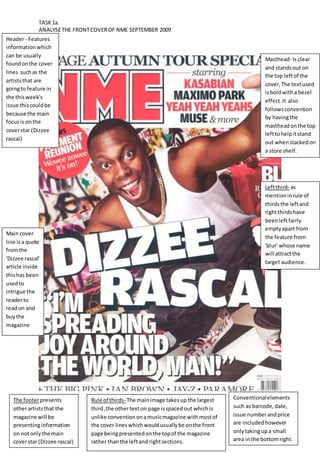
TASK 1a. 
ANALYSE THE FRONT COVER OF NME SEPTEMBER 2009 
Masthead- Is clear 
and stands out on 
the top left of the 
cover, The text used 
is bold with a bezel 
effect .It also 
follows convention 
by having the 
masthead on the top 
left to help it stand 
out when stacked on 
a store shelf. 
Conventional elements 
such as barcode, date, 
issue number and price 
are included however 
only taking up a small 
area in the bottom right. 
Header - Features 
information which 
can be usually 
found on the cover 
lines such as the 
artists that are 
going to feature in 
the this week's 
issue this could be 
because the main 
focus is on the 
cover star (Dizzee 
rascal) 
The footer presents 
other artists that the 
magazine will be 
presenting information 
on not only the main 
cover star (Dizzee rascal) 
Rule of thirds- The main image takes up the largest 
third ,the other text on page is spaced out which is 
unlike convention on a music magazine with most of 
the cover lines which would usually be on the front 
page being presented on the top of the magazine 
rather than the left and right sections. 
Left third- as 
mention in rule of 
thirds the left and 
right thirds have 
been left fairly 
empty apart from 
the feature from 
'blur' whose name 
will attract the 
target audience. 
Main cover 
line is a quote 
from the 
'Dizzee rascal' 
article inside 
this has been 
used to 
intrigue the 
reader to 
read on and 
buy the 
magazine

Nme dizzee rascal cover analysis

  • 1.
    TASK 1a. ANALYSETHE FRONT COVER OF NME SEPTEMBER 2009 Masthead- Is clear and stands out on the top left of the cover, The text used is bold with a bezel effect .It also follows convention by having the masthead on the top left to help it stand out when stacked on a store shelf. Conventional elements such as barcode, date, issue number and price are included however only taking up a small area in the bottom right. Header - Features information which can be usually found on the cover lines such as the artists that are going to feature in the this week's issue this could be because the main focus is on the cover star (Dizzee rascal) The footer presents other artists that the magazine will be presenting information on not only the main cover star (Dizzee rascal) Rule of thirds- The main image takes up the largest third ,the other text on page is spaced out which is unlike convention on a music magazine with most of the cover lines which would usually be on the front page being presented on the top of the magazine rather than the left and right sections. Left third- as mention in rule of thirds the left and right thirds have been left fairly empty apart from the feature from 'blur' whose name will attract the target audience. Main cover line is a quote from the 'Dizzee rascal' article inside this has been used to intrigue the reader to read on and buy the magazine