
Download to read offline
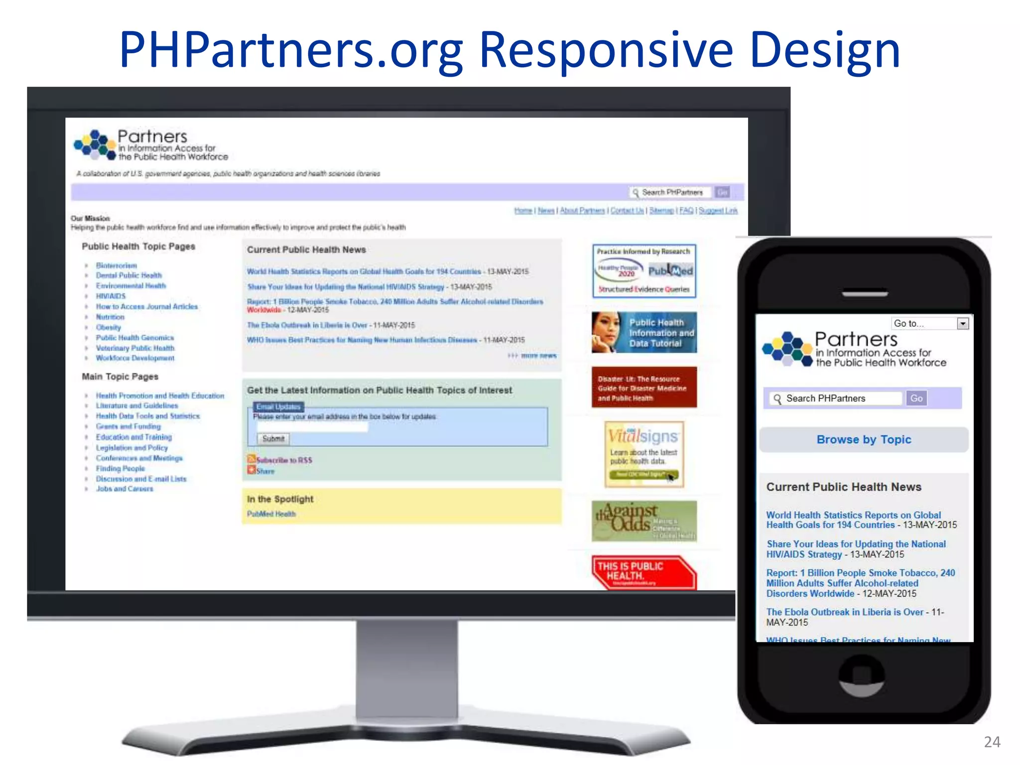
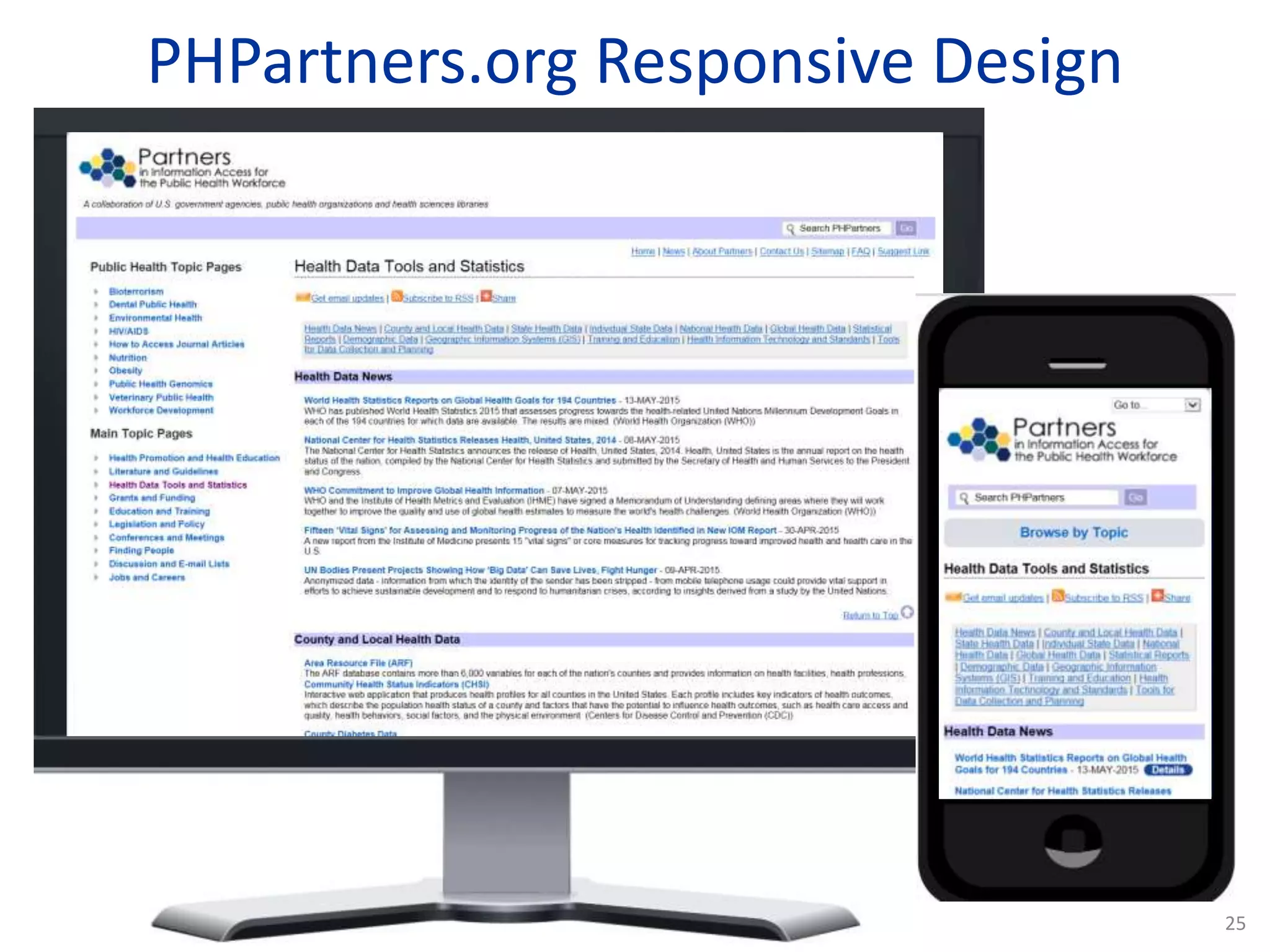
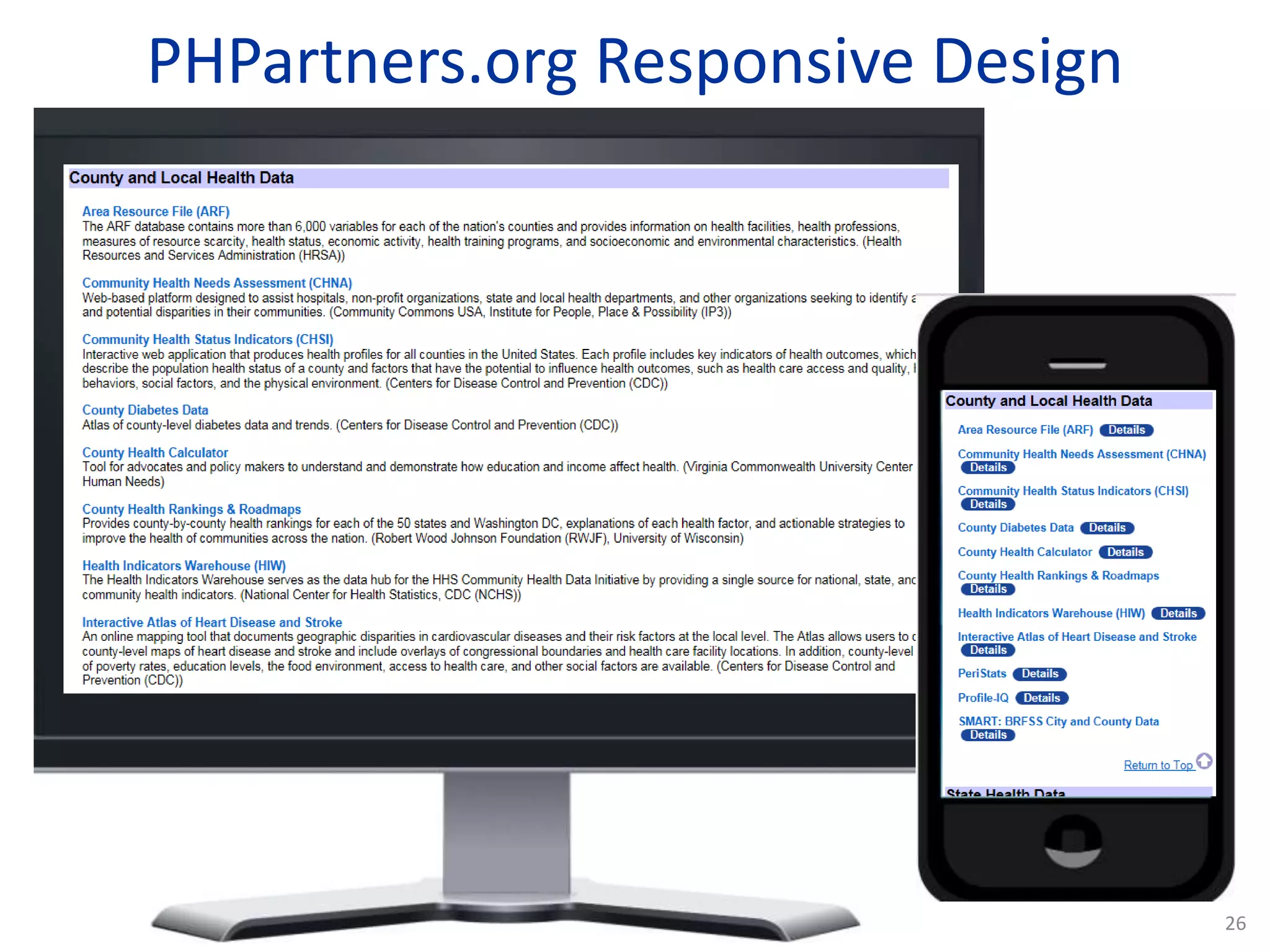
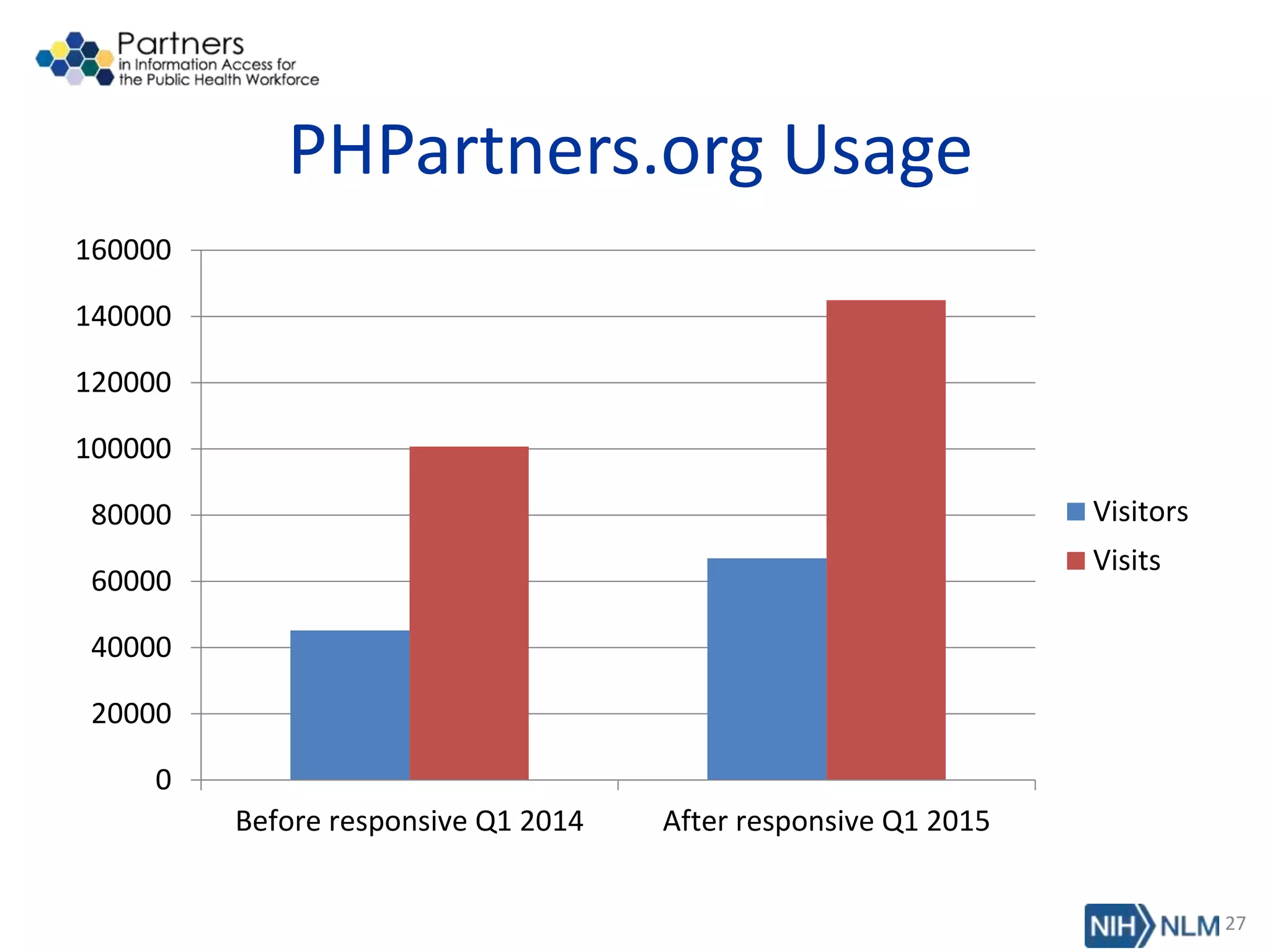
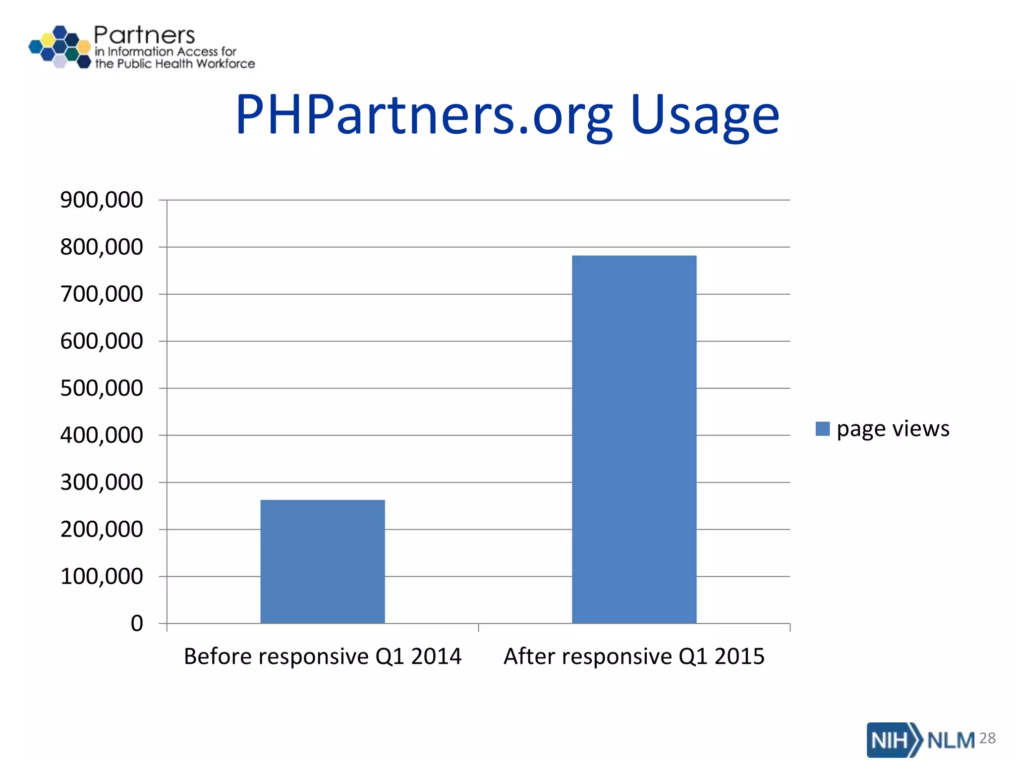
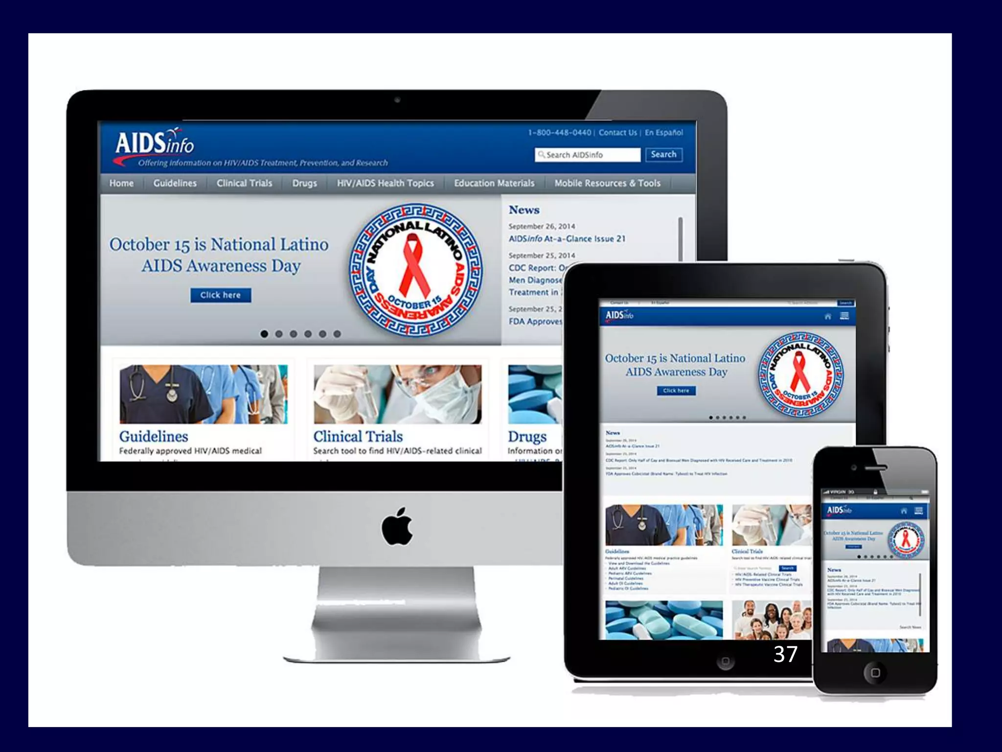
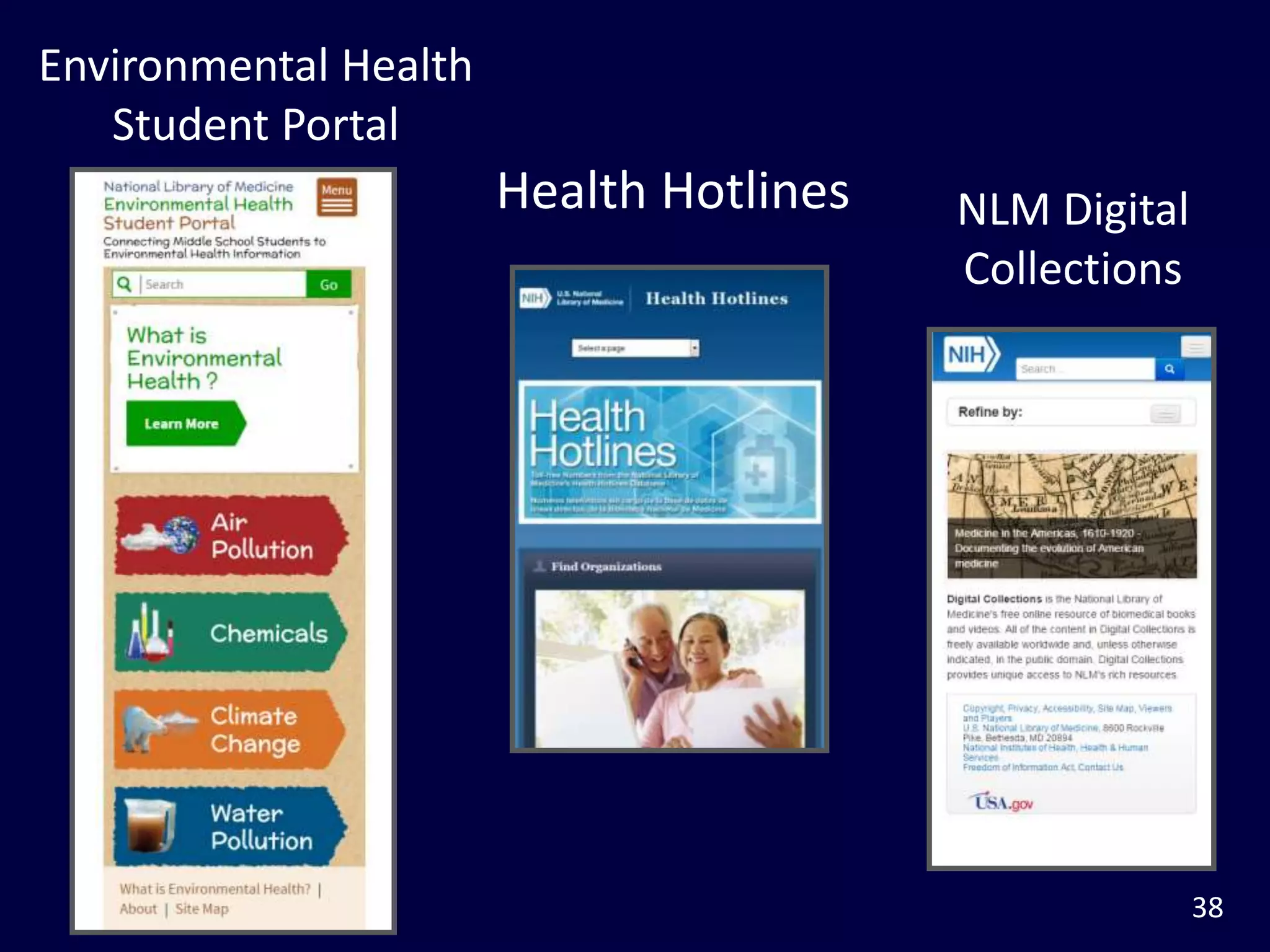

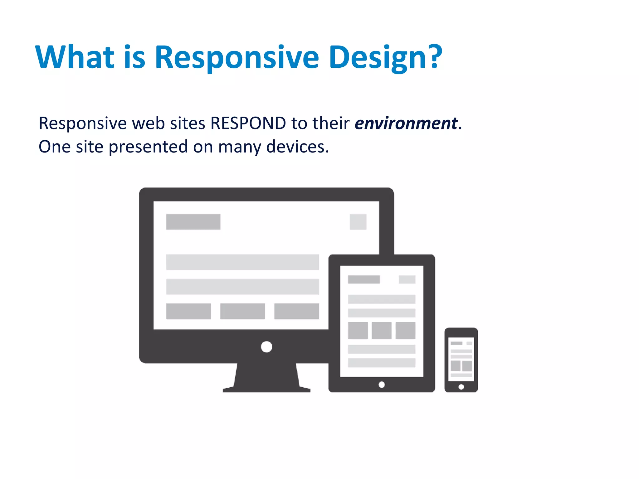
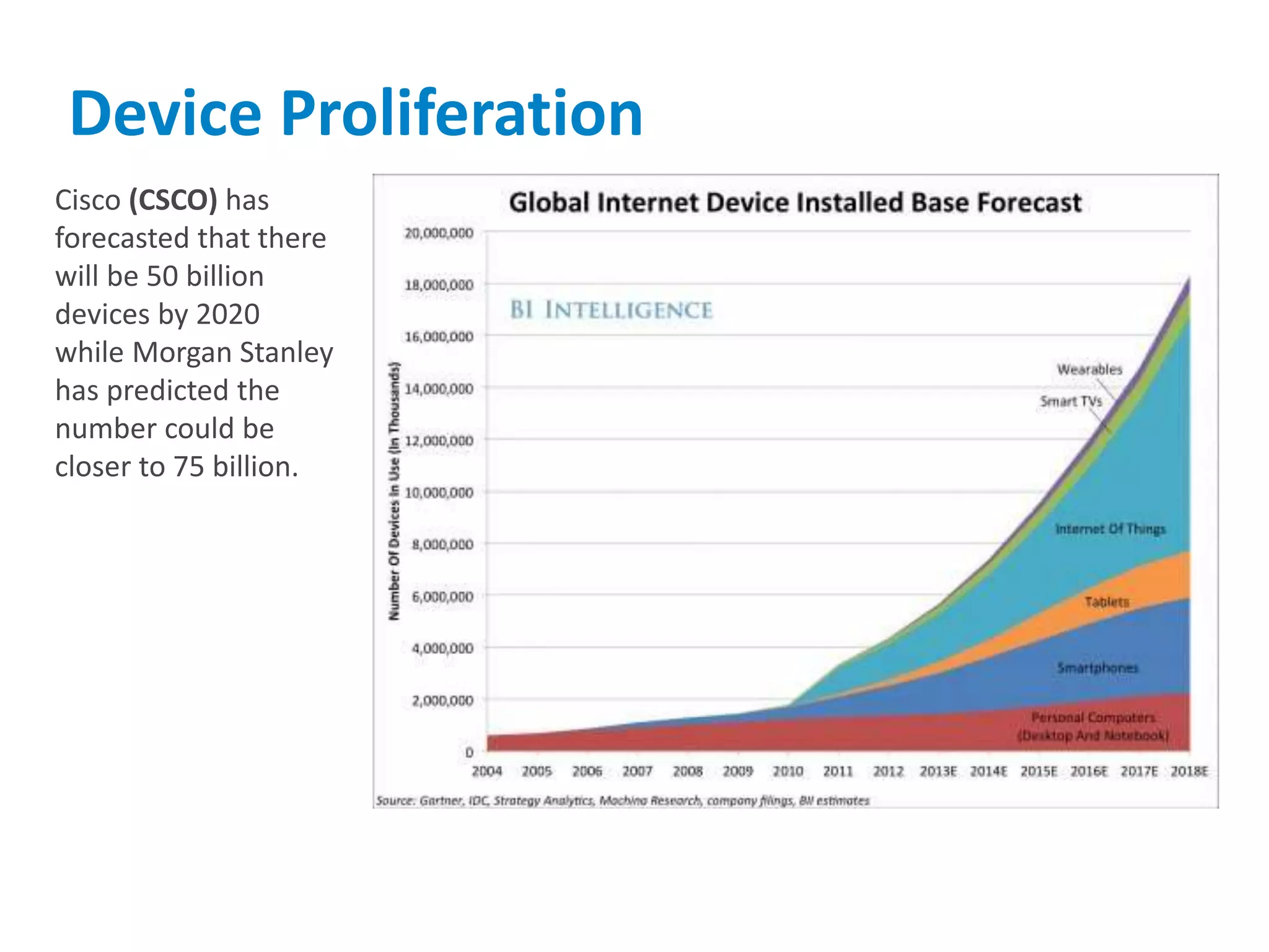
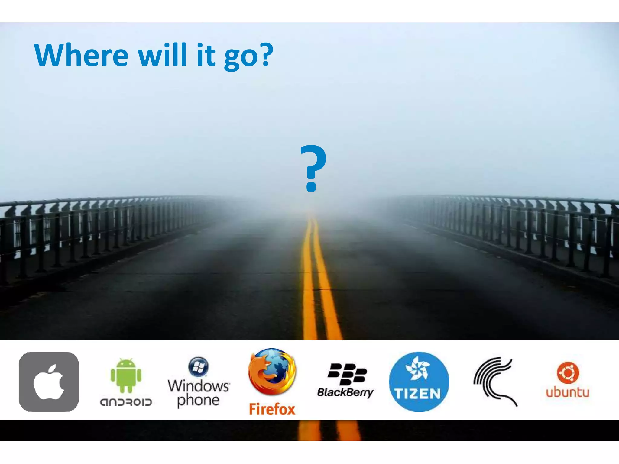

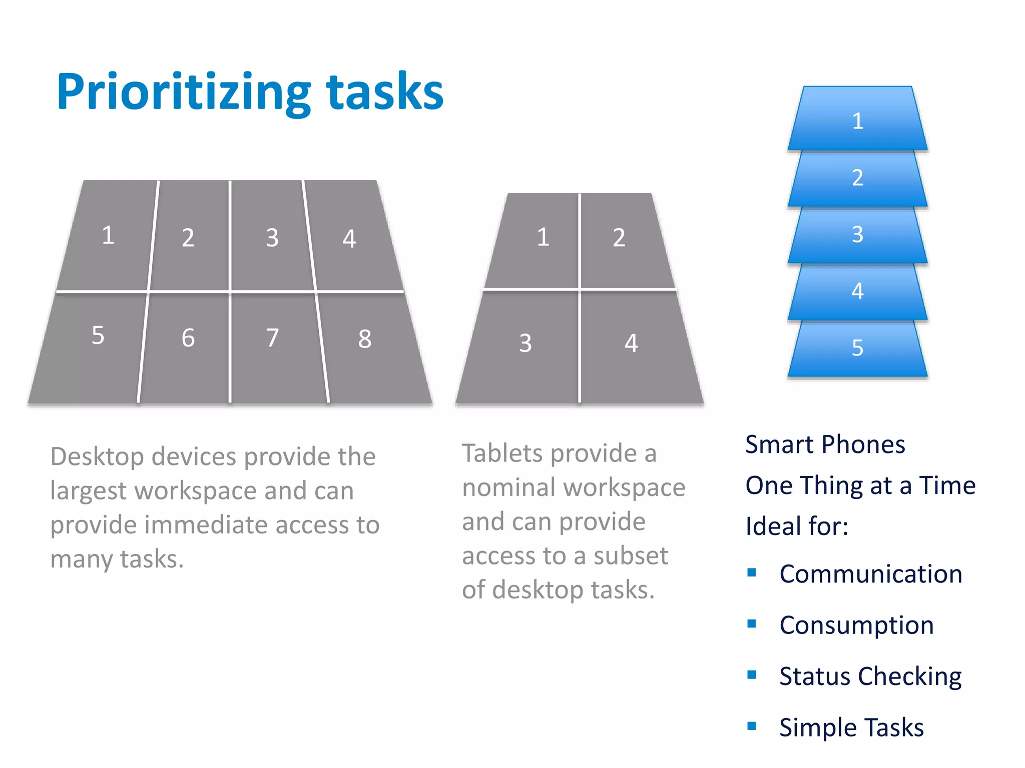
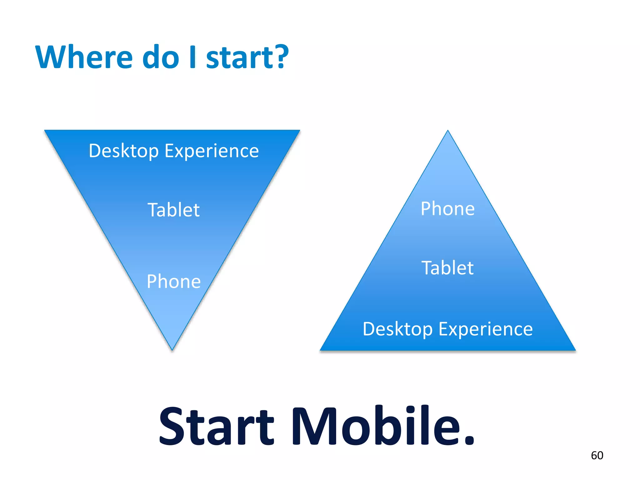
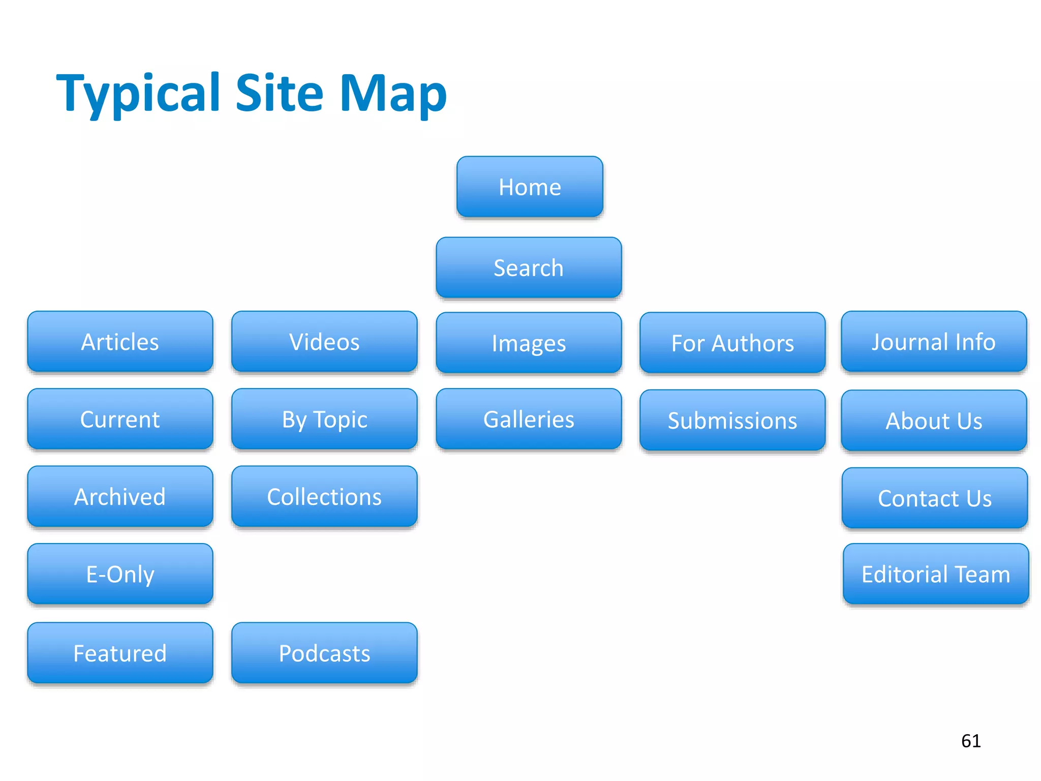

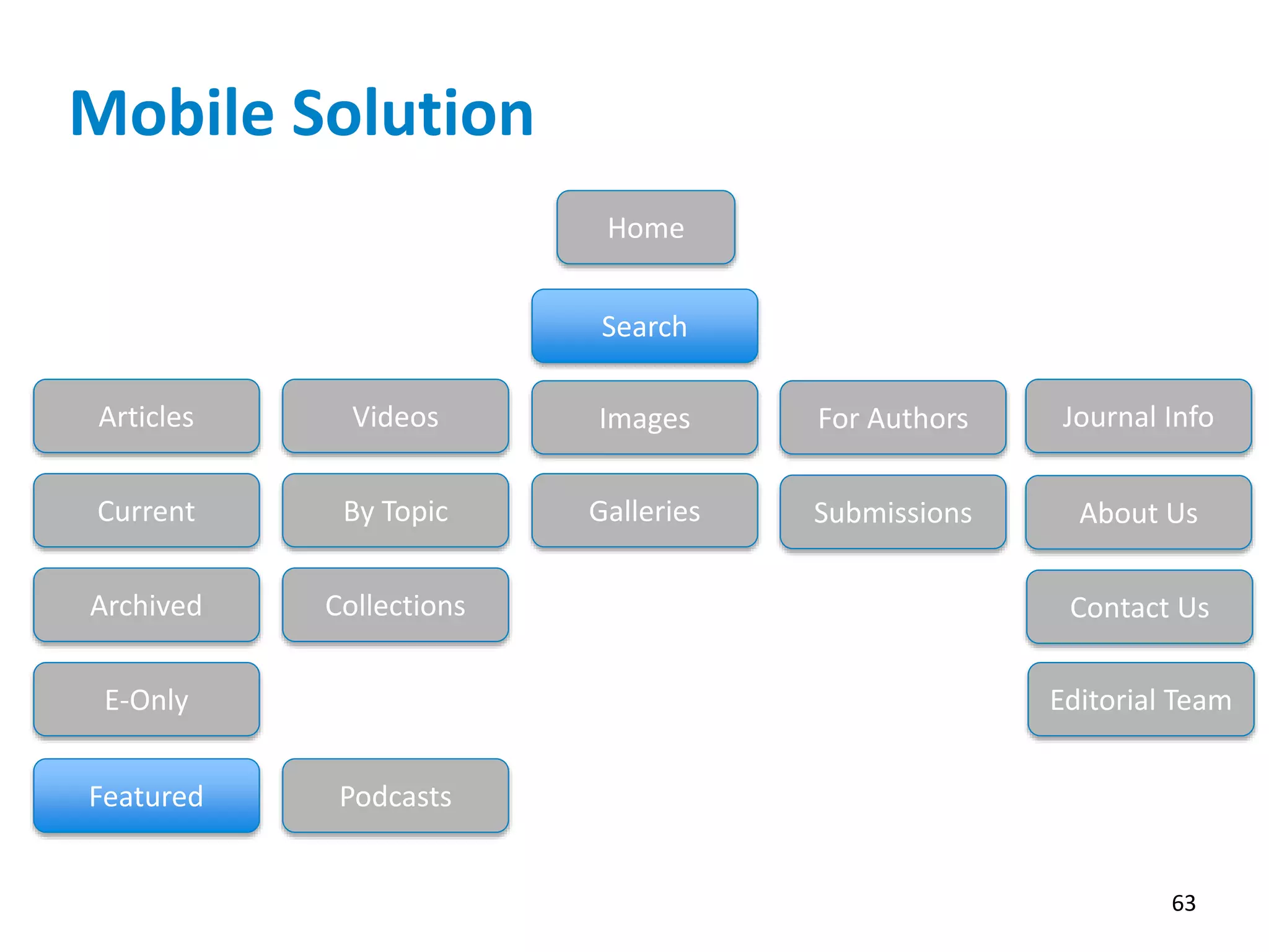
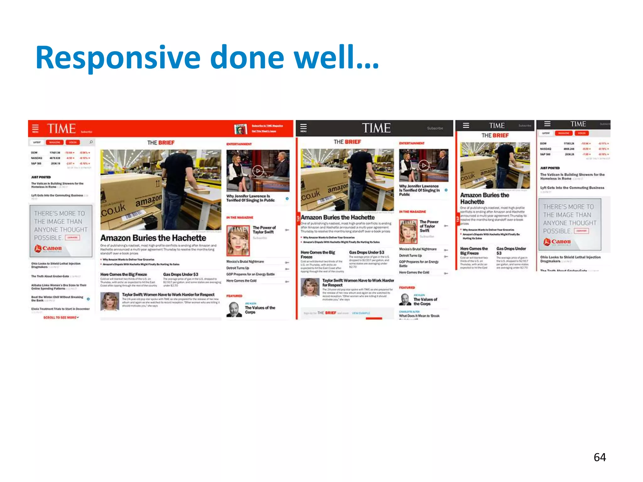
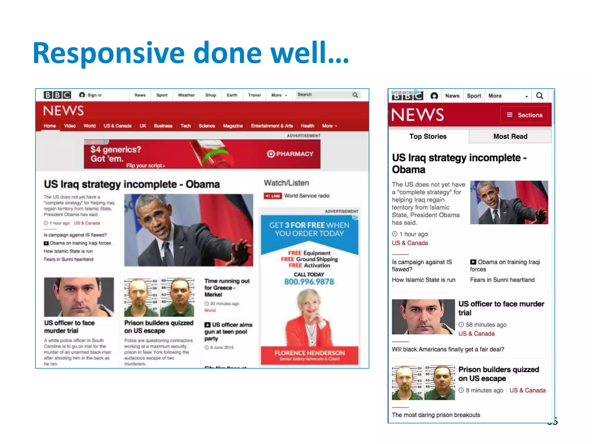
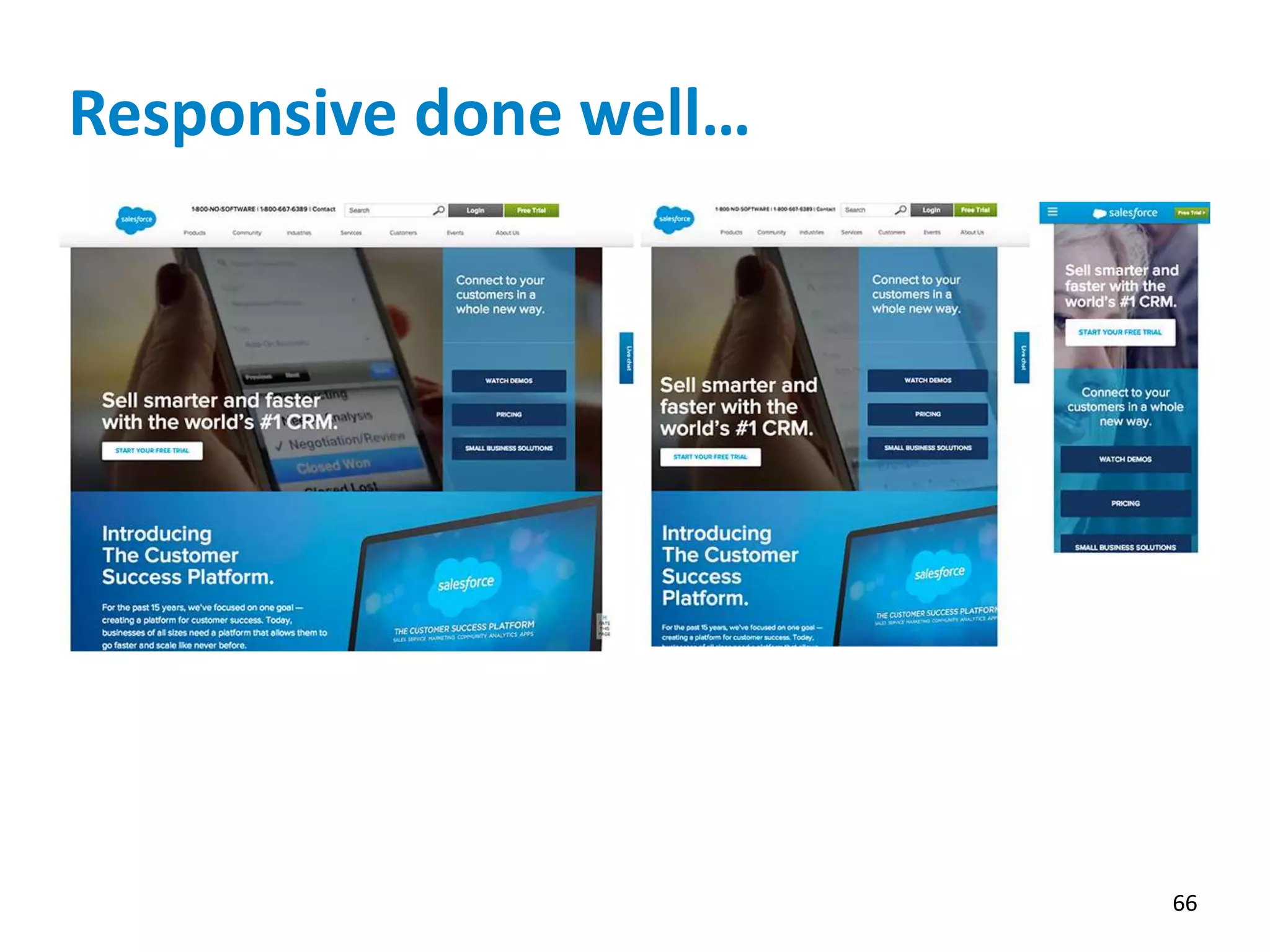
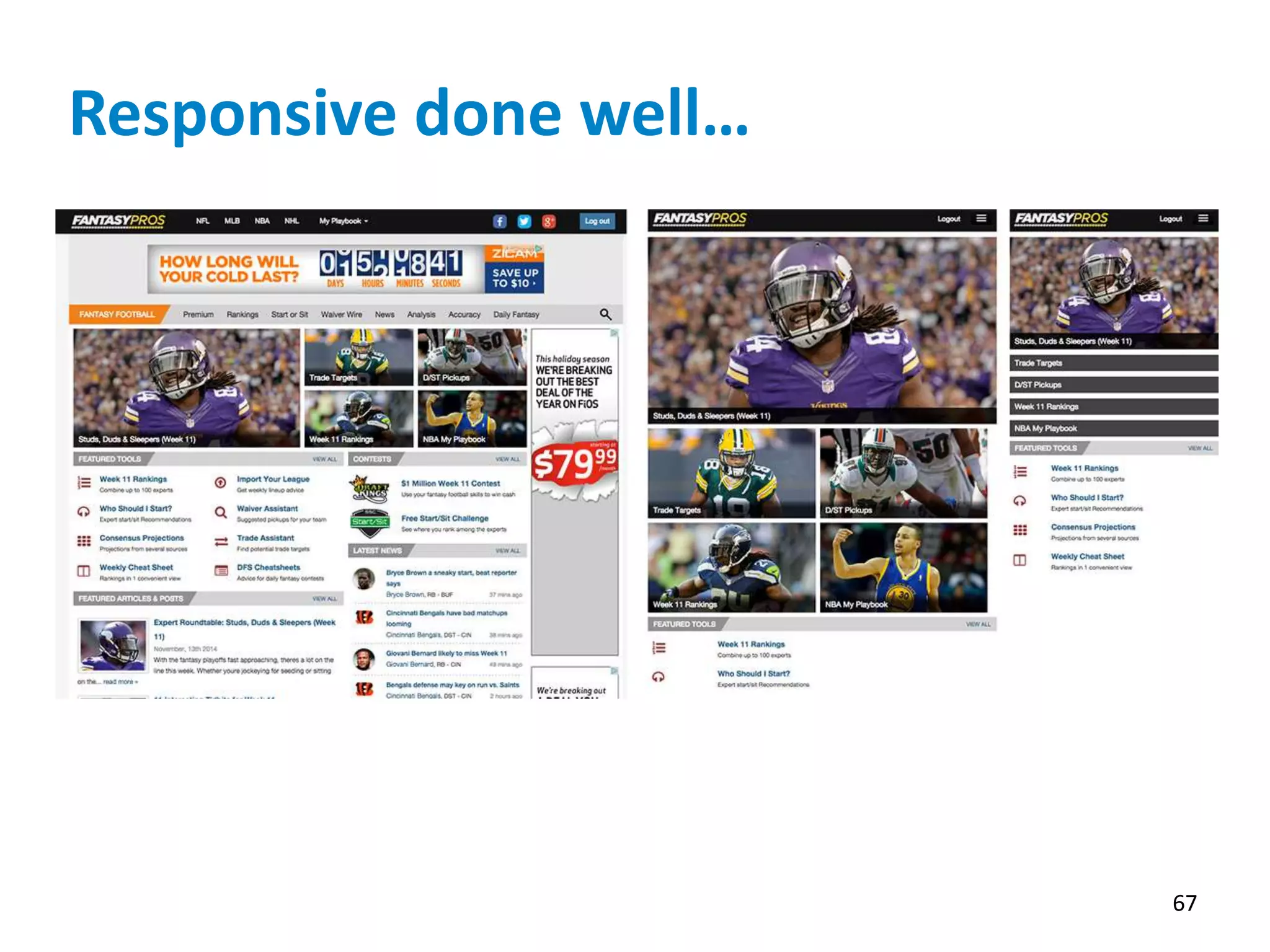
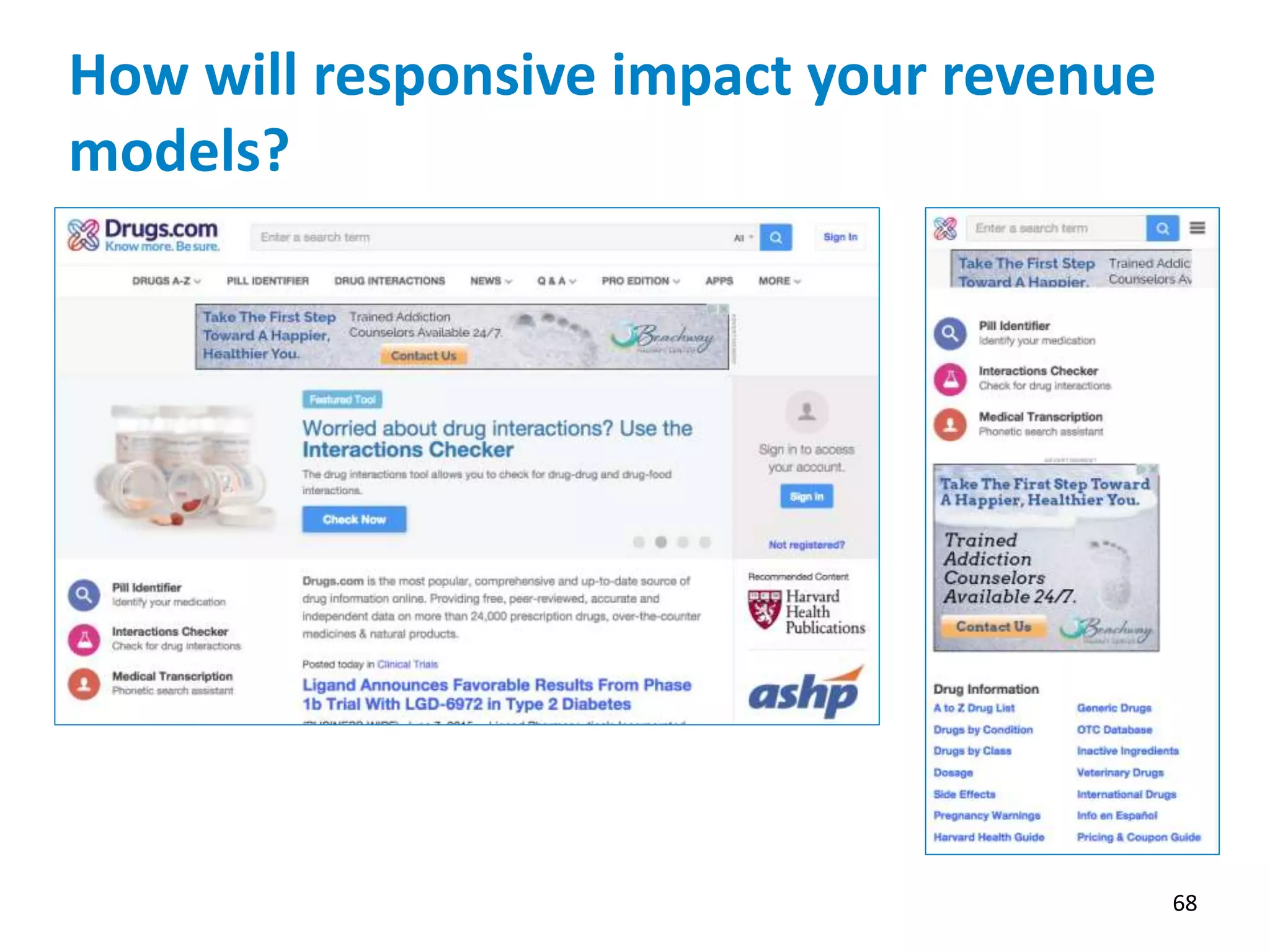
The NISO webinar on June 10, 2015, focused on enhancing user experience through responsive web design across various devices for public health information access. Experts discussed the importance of adapting websites to mobile technologies, emphasizing increased usage and the need for better content delivery methods. The event highlighted the growing reliance on mobile devices in the public health workforce and the effectiveness of responsive design in improving access and user engagement.


