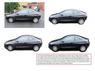
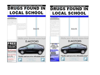
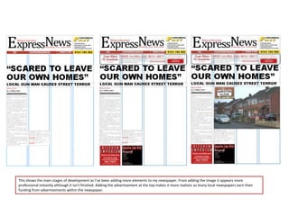
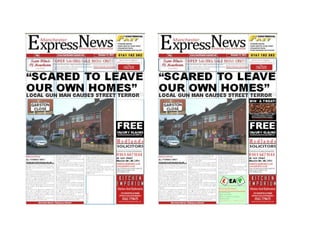
NEWSPAPER
DEVELOPMENT
This shows the development for my car advertisement used on the 2nd page. Once I had taken
the images I then wanted to edit them on Photoshop and from adding a slight glow around the
car makes it look more professional. This was then added with the simple background as it would
look unprofessional as it’s outside a house. Having no background also makes the reader imagine
that the car is brand new or could be in a showroom. I chose to include a car advertisement as it’s
something that will appeal to the majority of the target audience.
This shows the main stages of development as I’ve been adding more elements to my newspaper. From adding the image it appears more
professional instantly although it isn’t finished. Adding the advertisement at the top makes it more realistic as many local newspapers earn their
funding from advertisements within the newspaper.
I designed a name that would fit      This bar contains all the
     together nicely and have a good       information that the reader
     impact on the page and also be        needs and it’s clean and
     memorable.                            understandable.


      The advertisement banner
      running along ensures that
      there’s enough colour on the          A good headline will ensure
      page and also closes up gaps. It’s    that the reader will buy and
      a good place to put it as the         read the rest of the
      reader will look at the name and      newspaper.
      immediately see the advert.
                                             The subheading is also just
                                             as important as it expands
    The front page image is                  on the main headline so the
    important as it’s what the               reader knows the general
    reader looks at, including the           idea and they can then read
    street name will make them               the story for more detail.
    more familiar with the place
    instantly.

                                             ‘FREE’ is what will entice
I’ve included this as I found that the       the reader to purchase the
Wigan observer also does it, it makes        paper as people like to have
the reader feel like they can relate and     things for free.
be closer to the writer and contact them
if needed.


    I decided to place the story on
    the page like this so that it would      As many local papers are
    look the best. To the reader, it         very cheap, advertising is
    doesn’t look like there’s too            key to ensure they have
    much to read as it’s in small            enough funding. I have
    chunks.                                  included adverts that
                                             would be for local
                                             business’ and to help the
                                             reader see what’s on
                                             offer.

Newspaper Development

  • 1.
  • 2.
    This shows thedevelopment for my car advertisement used on the 2nd page. Once I had taken the images I then wanted to edit them on Photoshop and from adding a slight glow around the car makes it look more professional. This was then added with the simple background as it would look unprofessional as it’s outside a house. Having no background also makes the reader imagine that the car is brand new or could be in a showroom. I chose to include a car advertisement as it’s something that will appeal to the majority of the target audience.
  • 4.
    This shows themain stages of development as I’ve been adding more elements to my newspaper. From adding the image it appears more professional instantly although it isn’t finished. Adding the advertisement at the top makes it more realistic as many local newspapers earn their funding from advertisements within the newspaper.
  • 6.
    I designed aname that would fit This bar contains all the together nicely and have a good information that the reader impact on the page and also be needs and it’s clean and memorable. understandable. The advertisement banner running along ensures that there’s enough colour on the A good headline will ensure page and also closes up gaps. It’s that the reader will buy and a good place to put it as the read the rest of the reader will look at the name and newspaper. immediately see the advert. The subheading is also just as important as it expands The front page image is on the main headline so the important as it’s what the reader knows the general reader looks at, including the idea and they can then read street name will make them the story for more detail. more familiar with the place instantly. ‘FREE’ is what will entice I’ve included this as I found that the the reader to purchase the Wigan observer also does it, it makes paper as people like to have the reader feel like they can relate and things for free. be closer to the writer and contact them if needed. I decided to place the story on the page like this so that it would As many local papers are look the best. To the reader, it very cheap, advertising is doesn’t look like there’s too key to ensure they have much to read as it’s in small enough funding. I have chunks. included adverts that would be for local business’ and to help the reader see what’s on offer.