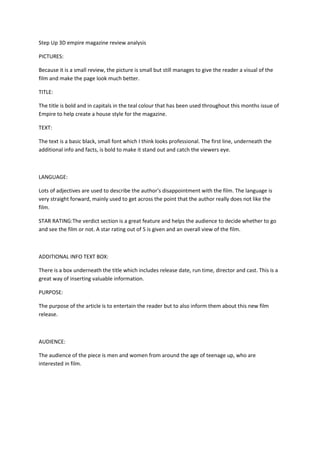
1. Step Up 3D empire magazine review analysis <br />PICTURES:<br />Because it is a small review, the picture is small but still manages to give the reader a visual of the film and make the page look much better.<br />TITLE:<br />The title is bold and in capitals in the teal colour that has been used throughout this months issue of Empire to help create a house style for the magazine.<br />TEXT:<br />The text is a basic black, small font which I think looks professional. The first line, underneath the additional info and facts, is bold to make it stand out and catch the viewers eye.<br />LANGUAGE:<br />Lots of adjectives are used to describe the author's disappointment with the film. The language is very straight forward, mainly used to get across the point that the author really does not like the film.<br />STAR RATING:The verdict section is a great feature and helps the audience to decide whether to go and see the film or not. A star rating out of 5 is given and an overall view of the film.<br />ADDITIONAL INFO TEXT BOX:<br />There is a box underneath the title which includes release date, run time, director and cast. This is a great way of inserting valuable information.<br />PURPOSE:<br />The purpose of the article is to entertain the reader but to also inform them about this new film release.<br />AUDIENCE:<br />The audience of the piece is men and women from around the age of teenage up, who are interested in film.<br />