
More Related Content
What's hot
What's hot (20)
Viewers also liked
Viewers also liked (16)
Similar to New open document presentation
Similar to New open document presentation (20)
New open document presentation
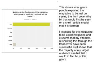
- 1. . This shows what genre people expected the magazine to be just on seeing the front cover (the bit that would first be seen on a shelf so it is crucial that it is correct) I intended for the magazine to be a rockmagazine and it seems that my attempts at showing this through the front cover have been successful as it shows that the majority of my target audience can tell that it would in fact be of this genre
- 2. . This question evaluates how successful my title was for the magazine. It is important that the title follows the genre and flow of the magazine for it to be successful and as it is one of the most noticable things on the front page and will be seen on every cover then it needs to be good. This shows that themajorty felt it was edgy and rocky. Ad this is the feel I wanted for the magazine it shows that my attempts at the genre have been good and my audience understand.
- 3. . As the font and typography is important to the over all fell and readability of the magazine, it is seen in many places and so it must give the correct impression about the magazine. Most believe that the font created a rocky and edgy feel again, it must therefor appeal to my audience and it makes it clear what the genre of the magazine is intended to be.
- 4. . This evaluates how well a convention has been followed. The idea that the main story will be the biggest and most obvious, stand out the most on the front cover. When asked which one the audience thought the main story was, to see if I had followed this convention successfully, they all correctly said 'Danger Danger, High Voltage.' So I have followed this convention well.
- 5. . Colour sheme is an important convention, to have a certain set of colours that run through the magazine to create a certain atmosphere or feel. I wanted to know how well I had done with this convention, if it created the appropriate feel for a magazine intended for female, rock lovers. The responses I got were all afermative. It seemed femine which appeals to my audience but also edgey, sophisticated and dark. All great for the genre.
- 6. . I wanted to know if all of the conventions I used to appeal to my target audience were successful. If my magazine was on a shelf, would it be obvious to who would want to buy it. It seemed as though I was successful in appealing to my audience as it seemed that the survey showed they know who it is. Young, adolescent femles. One saying it could appeal to everyone and so have a secondary audience of older people or males too perhaps.
- 7. . As the contents page contains a lot of writing and is important to navigate around the magazine, I wanted to know how well you would be able to using it. It looks as though it would be a good page that would certainly be simple to use, making the magazine easier to read.
- 8. . As my contents page already pushes conventions, having many photos on one half and all the text on the lower, I wanted to know if it had been a worthwhile risk that would still mean it was attractive and easy to read. This shows that most people think that it was a good decision and that it was excecuted well, that there was a good balance between text and images.
- 9. . Representation is important in any magazine and it was crucial to me that I represented the people in mine well, that they weren't too sexualsied or stereotypical. It seems no one found that the models were too sexualised or objectified to this makes the representation much better. Instead they were shown as fun loving, relatable (crucial for appealing to an audience) and cool and edgy which links in with the genre and so it shows that the fashion, shot types and model choices were successful.
- 10. . The price is an important component as it determines who can afford it and will pay for it. I wanted to be sure that the price I had advertised was good when the amount of content and quality of stories and articles I had to offer were taken into account and it seems that 100% of my audience found my pricing to be appropraite.