This document provides an overview of MS Excel and its features:
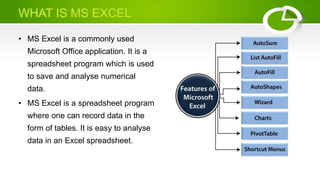
- MS Excel is a commonly used spreadsheet program for storing and analyzing numerical data in an organized manner. Data can be easily filtered, recovered, and manipulated using mathematical formulas.
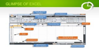
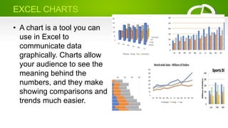
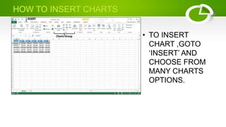
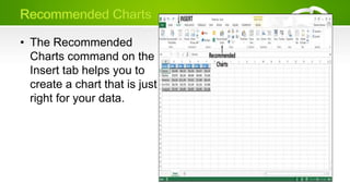
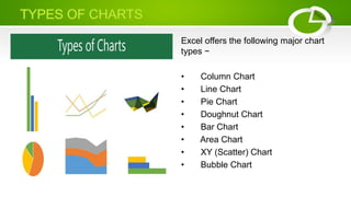
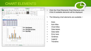
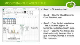
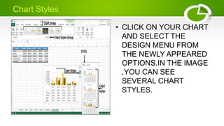
- Excel allows for easy visualization of data through tables and various chart types like column, line, pie, and bar charts. Chart elements, styles, and colors can be customized.
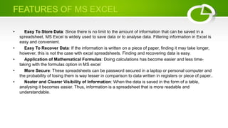
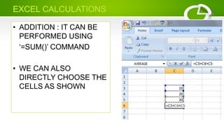
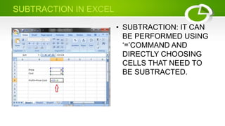
- Key features include unlimited data storage, password protection, and the ability to perform calculations using functions like SUM.