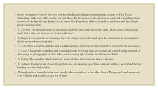
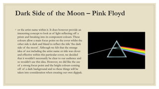
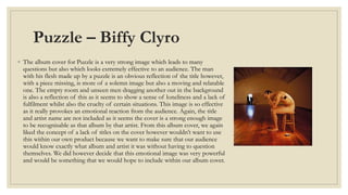
STORM 
THORGERSON
◦ Storm thorgerson is one of the most well known digi-pack designers having made designs for Pink Floyd, 
Audioslave, Biffy Clyro, The Cranberries and Muse. He has produced the most memorable and compelling album 
artwork of the last 40 years. In the East-London Idea Generation Gallery, he held an exhibition and his thought 
process became clear: 
◦ 1) The Brief. The designer listens to the music, reads the lyrics, and talks to the band. These create a ‘brain soup’, 
from which ideas can be extracted to form the brief. 
◦ 2) Roughs. Over a number of meetings/days, the designer meets the band again for discussions, in an attempt to 
decide upon a theme or big idea. 
◦ 3) Tests. Once a rough is accepted and a budget agreed, a prototype is often created to ensure that the idea works. 
◦ 4) Shoot. A location is researched and booked, possibly for a long-time and models are selected and positioned. A 
wide range of photographs are then taken, under varying light/weather conditions and filters. 
◦ 5) Editing. This could be called ‘selection’, where the best shot from the shoot is chosen. 
◦ 6) Artwork. Finally, having chosen the perfect shot, any cleaning-up or final computer editing is performed, before 
handing over the final product. 
◦ Although written down the ideas seem simple, when considered, it is evident Storm Thorgerson’s work process is 
very complex and would take up a lot of time.
Storm Thorgerson created many iconic 
digipaks within his career that are classed as 
some of the best rock album covers of all time. 
Here are some of our favourites that we 
decided to analyse in order to help us 
understand what would make an incredible 
album cover and, in result, an awesome digipak.
Dark Side of the Moon – Pink Floyd 
◦ or the artist name within it. It does however provide an 
interesting concept to look at of light reflecting off a 
prism and breaking into its component colours. These 
colours allow a main focus point on the cover whilst the 
other side is dark and bland to reflect the title ‘the dark 
side of the moon’. Although we felt that the strange 
idea of not including the artist name or title was clever 
and effective within this particular cover, we decided 
that it wouldn’t necessarily be clear to our audience and 
so wouldn’t use this idea. However, we did like the use 
of a strong focus point and the bright colours coming 
off of a dark background and so these things will be 
taken into consideration when creating our own digipak.
Puzzle – Biffy Clyro 
◦ The album cover for Puzzle is a very strong image which leads to many 
questions but also which looks extremely effective to an audience. The man 
with his flesh made up by a puzzle is an obvious reflection of the title however, 
with a piece missing, is more of a solemn image but also a moving and relatable 
one. The empty room and unseen men dragging another out in the background 
is also a reflection of this as it seems to show a sense of loneliness and a lack of 
fulfilment whilst also the cruelty of certain situations. This image is so effective 
as it really provokes an emotional reaction from the audience. Again, the title 
and artist name are not included as it seems the cover is a strong enough image 
to be recognisable as that album by that artist. From this album cover, we again 
liked the concept of a lack of titles on the cover however wouldn’t want to use 
this within our own product because we want to make sure that our audience 
would know exactly what album and artist it was without having to question 
themselves. We did however decide that this emotional image was very powerful 
and would be something that we would hope to include within our album cover.
Absolution - Muse 
◦ This is a much more typical album cover as it has the 
artist name and album title featured on the cover. We 
felt that the use of it being relatively small in the top 
left corner looked very effective as it was out of the 
way of the rest of the image but also draw your eyes 
towards it. The image itself is a very creative one which 
raises lots of questions whilst also looking well 
produced and interesting. The birds eye view shot 
makes the cover look like it has much more depth and 
makes it stand out from other images. From this design 
we feel that we will consider the placement of the title 
and artist name in the top left hand corner with a 
strong font and will think about making the image 
seem more abstract with an interesting camera shot.

Storm thorgerson 2

  • 1.
  • 2.
    ◦ Storm thorgersonis one of the most well known digi-pack designers having made designs for Pink Floyd, Audioslave, Biffy Clyro, The Cranberries and Muse. He has produced the most memorable and compelling album artwork of the last 40 years. In the East-London Idea Generation Gallery, he held an exhibition and his thought process became clear: ◦ 1) The Brief. The designer listens to the music, reads the lyrics, and talks to the band. These create a ‘brain soup’, from which ideas can be extracted to form the brief. ◦ 2) Roughs. Over a number of meetings/days, the designer meets the band again for discussions, in an attempt to decide upon a theme or big idea. ◦ 3) Tests. Once a rough is accepted and a budget agreed, a prototype is often created to ensure that the idea works. ◦ 4) Shoot. A location is researched and booked, possibly for a long-time and models are selected and positioned. A wide range of photographs are then taken, under varying light/weather conditions and filters. ◦ 5) Editing. This could be called ‘selection’, where the best shot from the shoot is chosen. ◦ 6) Artwork. Finally, having chosen the perfect shot, any cleaning-up or final computer editing is performed, before handing over the final product. ◦ Although written down the ideas seem simple, when considered, it is evident Storm Thorgerson’s work process is very complex and would take up a lot of time.
  • 3.
    Storm Thorgerson createdmany iconic digipaks within his career that are classed as some of the best rock album covers of all time. Here are some of our favourites that we decided to analyse in order to help us understand what would make an incredible album cover and, in result, an awesome digipak.
  • 4.
    Dark Side ofthe Moon – Pink Floyd ◦ or the artist name within it. It does however provide an interesting concept to look at of light reflecting off a prism and breaking into its component colours. These colours allow a main focus point on the cover whilst the other side is dark and bland to reflect the title ‘the dark side of the moon’. Although we felt that the strange idea of not including the artist name or title was clever and effective within this particular cover, we decided that it wouldn’t necessarily be clear to our audience and so wouldn’t use this idea. However, we did like the use of a strong focus point and the bright colours coming off of a dark background and so these things will be taken into consideration when creating our own digipak.
  • 5.
    Puzzle – BiffyClyro ◦ The album cover for Puzzle is a very strong image which leads to many questions but also which looks extremely effective to an audience. The man with his flesh made up by a puzzle is an obvious reflection of the title however, with a piece missing, is more of a solemn image but also a moving and relatable one. The empty room and unseen men dragging another out in the background is also a reflection of this as it seems to show a sense of loneliness and a lack of fulfilment whilst also the cruelty of certain situations. This image is so effective as it really provokes an emotional reaction from the audience. Again, the title and artist name are not included as it seems the cover is a strong enough image to be recognisable as that album by that artist. From this album cover, we again liked the concept of a lack of titles on the cover however wouldn’t want to use this within our own product because we want to make sure that our audience would know exactly what album and artist it was without having to question themselves. We did however decide that this emotional image was very powerful and would be something that we would hope to include within our album cover.
  • 6.
    Absolution - Muse ◦ This is a much more typical album cover as it has the artist name and album title featured on the cover. We felt that the use of it being relatively small in the top left corner looked very effective as it was out of the way of the rest of the image but also draw your eyes towards it. The image itself is a very creative one which raises lots of questions whilst also looking well produced and interesting. The birds eye view shot makes the cover look like it has much more depth and makes it stand out from other images. From this design we feel that we will consider the placement of the title and artist name in the top left hand corner with a strong font and will think about making the image seem more abstract with an interesting camera shot.