Download as PDF, PPTX


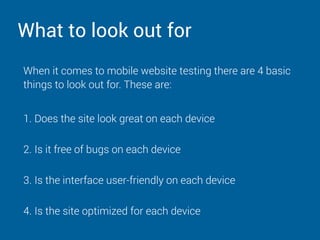

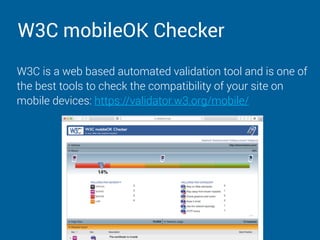


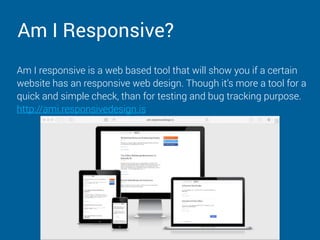


The document outlines best practices for mobile website testing, emphasizing the necessity of responsive design and user-friendly interfaces across devices. Key steps include validating HTML/CSS code, testing on various browsers and mobile devices, and utilizing tools like Chrome Developer Tools and BrowserStack. The document also highlights the importance of post-deployment monitoring to address any bugs, recommending tools like Pingdom and Usersnap.


