
Download to read offline


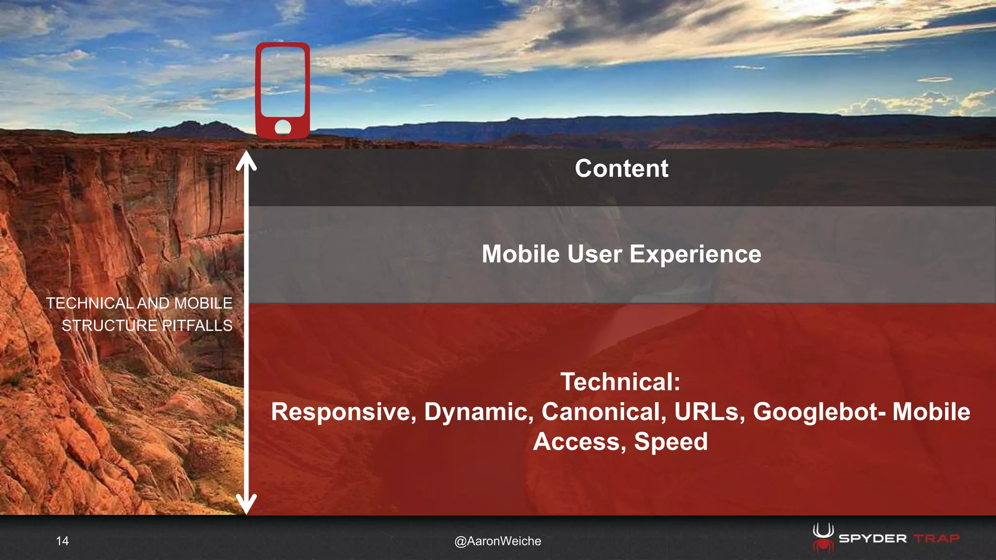


The document discusses the importance of mobile optimization in web design and user experience, emphasizing the need for responsive web design and careful navigation strategies. It highlights the potential pitfalls related to technical structure and user engagement, advocating for a mobile-first approach that prioritizes user needs. Additionally, it offers practical tips on mobile content creation and SEO strategies to improve search rankings for mobile users.


