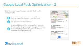
Download to read offline


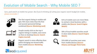
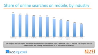
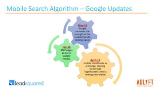
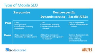

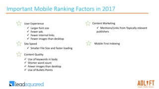


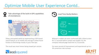

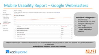
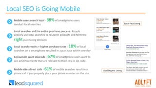
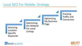
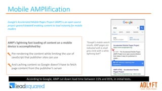


The document discusses the evolution and significance of mobile search marketing in 2017, emphasizing the importance of mobile SEO and user experience to improve traffic and conversions. It highlights key strategies like optimizing for local SEO, utilizing Accelerated Mobile Pages (AMP), and enhancing mobile site performance to capture the growing mobile user base. Data presented indicates that effective mobile search practices can significantly increase engagement, conversion rates, and local business visibility.


