3
Binary Classifier
Abinary classifier produces output with two class values or labels,
such as Yes/No, 1/0, Positive/Negative for given input data
For performance evaluation: Observed labels are used to compare with the
predicted labels after classification
The predicted labels will be exactly the same, if the performance of a
classifier is perfect.
But it is uncommon to be able to develop a perfect classifier.
4.
4
Confusion Matrix
Aconfusion matrix is formed from the four outcomes
produced as a result of binary classification
True positive (TP): correct positive prediction
False positive (FP): incorrect positive prediction
True negative (TN): correct negative prediction
False negative (FN): incorrect negative prediction
5.
5
Confusion Matrix
BinaryClassification: Green Vs. Grey
• Rows represent what is predicted, and columns represent what is
the actual label.
6.
6
Confusion Matrix
Confusion Matrix
TruePositives
Green examples
correctly identified as
green
True Negatives
Gray examples
correctly identified as
grey
False Positives
Gray examples falsely
identified as green
False Negatives
Green examples
falsely identified as
grey
7.
7
Accuracy
Accuracy iscalculated as the number of all correct predictions
divided by the total number of the dataset
The best ACC is 1.0, whereas the worst is 0.0
Accuracy = (9+8) / (9+2+1+8) = 0.85
= (TP + TN) / (TP+ FP + TN + FN)
8.
8
Precision
Precision iscalculated as the number of correct positive predictions
divided by the total number of positive predictions
The best precision is 1.0, whereas the worst is 0.0
Precision = 9 / (9+2) = 0.81
9.
9
Recall
Sensitivity =Recall = True Positive Rate
Recall is calculated as the number of correct positive predictions
divided by the total number of positives
The best recall is 1.0, whereas the worst is 0.0
Recall = 9 / (9+1) = 0.9
= TP / (TP+FN)
10.
10
Example 1
Example:The example to classify whether images contain either a dog or a cat
The training data contains 25000 images of dogs and cats;
The training data 75% of 25000 images; (25000*0.75 = 18750)
Validation data 25% of training data; (25000*0.25 = 6250)
Test Data, 5 cats, 5 dogs
Precision = 2/(2 + 0) * 100% = 100%
Recall = 2/(2 + 3) * 100% = 40%
Accuracy = (2 + 5)/(2 + 0 + 3 + 5) * 100% = 70%
12
Precision vs Recall
There is always a tradeoff between precision and recall.
Higher precision means lower recall and vice versa.
Due to this tradeoff, precision/recall alone will not be very useful.
We need to compute both the measures to get a true picture.
There is another measure, which takes into account both precision and
recall, i.e. the F-measure.
13.
13
The F-measure
F-measure:A combined measure that assesses the precision/recall
tradeoff
It is computed as a weighted harmonic mean of both precision and
recall.
R
P
PR
R
P
F
2
2
)
1
(
1
)
1
(
1
1
People usually use balanced F1 measure, where F1 measure is an F measure with β=1
i.e., with β = 1 or α = ½
Thus, the F1-measure can be computed using the following equation:
For example 1, precision was 1.0 and recall was 0.4, therefore, F1-measure can be
computed as:
𝐹 1=
2 𝑃𝑅
𝑃 + 𝑅
14.
14
The F1-measure (Example)
In example 1:
Precision was 1.0
Recall was 0.4
Therefore, F1-measure can be computed as:
𝐹 1=
2 𝑃𝑅
𝑃 + 𝑅
𝐹 1=
2∗1.0∗0.4
1.0+0.4
𝐹 1=
0.8
1.4
=0.57
Therefore, F1-measure = 0.57
Try yourself:
Precision=0.8, recall=0.3
Precision=0.4, recall=0.9
17
ROC Curve basics
The ROC curve is an evaluation measure that is based on two basic
evaluation measures:
- specificity and sensitivity
Specificity = True Negative Rate,
Sensitivity – It is the same as Recall = True Positive Rate,
Specificity
Specificity is calculated as the number of correct negative
predictions divided by the total number of negatives.
18.
18
ROC Curve basics(contd.)
In order to understand, let us consider a disease detection (binary classification)
problem.
Here, positive class represents diseased people and negative class represents
healthy people.
Broadly speaking, these two quantities tell us how good we are at detecting
diseased people (sensitivity) and healthy people (specificity).
The sensitivity is the proportion of the diseased people (T P +F N) that
we correctly classify as being diseased (T P).
Specificity is the proportion of all of the healthy people (T N + F P) that
we correctly classify as being healthy (T N).
19.
19
ROC Curve basics(contd.)
If we diagnosed everyone as healthy, we would have a specificity
of 1 (very good – we diagnose all healthy people correctly), but a
sensitivity of 0 (we diagnose all unhealthy people incorrectly)
which is very bad.
Ideally, we would like Se = Sp = 1, i.e. perfect sensitivity and
specificity.
It is often convenient to be able to combine sensitivity and
specificity into a single value.
This can be achieved through evaluating the area under the
receiver operating characteristic (ROC) curve.
20.
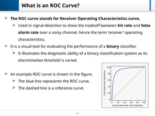
20
What is anROC Curve?
The ROC curve stands for Receiver Operating Characteristics curve.
Used in signal detection to show the tradeoff between hit rate and false
alarm rate over a noisy channel, hence the term ‘receiver’ operating
characteristics.
It is a visual tool for evaluating the performance of a binary classifier.
It illustrates the diagnostic ability of a binary classification system as its
discrimination threshold is varied.
An example ROC curve is shown in the figure.
The blue line represents the ROC curve.
The dashed line is a reference curve.
21.
21
ROC Curve presumption
Before, we can plot the ROC curve, it is assumed that the classifier produces a positivity score,
which can then be used to determine a discrete label.
E.g. in case of NB classifier, the positivity score is the probability of positive class given the
test example. Usually, a cut-off threshold v = 0.5 is applied on this positivity score for
producing the output label.
In case of ML algorithms, that produce a discrete label for the test examples, slight modifications
can be made to produce a positivity score, e.g.
1. In KNN algorithm with K=3, majority voting is used to produce a discrete output label.
However, a positive score can be produced by computing the probability/ratio of
positive neighbors of the test example.
i.e. if K=3, and the labels for closest neighbors are: [1, 0, 1], then the positivity score
may be (1+0+1)/3 = 2/3 = 0.66. A cut-off threshold v can be applied on this positivity
score to produce an output label, usually, v = 0.5.
For decision tree algorithm, refer to the following link:
https://stats.stackexchange.com/questions/105760/how-we-can-draw-an-roc-curve-for-decision-trees
22.
22
ROC Curve presumption
An ROC curve is plotted by varying the cut-off threshold v.
The y-axis represents the sensitivity (true positive rate).
The x-axis represents 1-specificity, also called the false positive rate.
The threshold v is varied (e.g. from 0 to 1), and a pair of sensitivity/specificity value is
achieved, which forms a single point on the ROC curve.
E.g. for v = 0.5, say sensitivity=0.8, specificity=0.6 (hence FPR=1-specificity=0.4),
hence (x,y)=(0.8, 0.4). However, if v = 0.6, say sensitivity=0.7, specificity=0.7 (hence
FPR=1-specificity=0.3), hence (x,y) = (0.7, 0.3)
The final ROC curve is drawn by connecting all these points, e.g. given below:
23.
23
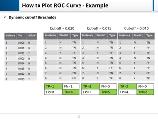
How to PlotROC Curve - Example
Cut-off = 0.020 Cut-off = 0.015 Cut-off = 0.010
Dynamic cut-off thresholds
24.
24
True positiverate (TPR) = /( + )
𝑇𝑃 𝑇𝑃 𝐹𝑁
and False positive rate (FPR) = /( + )
𝐹𝑃 𝐹𝑃 𝑇𝑁
Use different cut-off thresholds (0.00, 0.01, 0.02,…, 1.00),
calculate the TPR and FPR, and plot them into graph.
That is receiver operating characteristic (ROC) curve.
Example
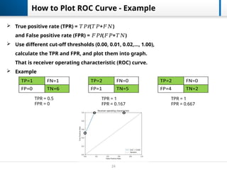
How to Plot ROC Curve - Example
TPR = 0.5
FPR = 0
TPR = 1
FPR = 0.167
TPR = 1
FPR = 0.667
25.
25
How to PlotROC Curve
A ROC curve is created by connecting ROC points of a classifier
A ROC point is a point with a pair of x and y values
where x is 1-specificity and y is sensitivity
The curve starts at (0.0, 0.0) and ends at (1.0, 1.0)
26.
26
ROC Curve
Aclassifier with the random performance level always shows a straight line
Two areas separated by this ROC curve
ROC curves in the area with the top left corner indicate good performance levels
ROC curves in the other area with the bottom right corner indicate poor
performance levels
27.
27
ROC Curve
Aclassifier with the perfect performance level shows
a combination of two straight lines
It is important to notice that classifiers with meaningful performance levels
usually lie in the area between the random ROC curve and the perfect ROC curve
28.
28
The AUC measure
AUC(Area under the ROC curve) score
An advantage of using ROC curve is a single measure called AUC score
As the name indicates, it is an area under the curve calculated in the ROC space
Although the theoretical range of AUC score is between 0 and 1, the actual scores of
meaningful classifiers are greater than 0.5, which is the AUC score of a random classifier
ROC curves clearly shows classifiers A
outperforms classifier B


![21
ROC Curve presumption
Before, we can plot the ROC curve, it is assumed that the classifier produces a positivity score,
which can then be used to determine a discrete label.
E.g. in case of NB classifier, the positivity score is the probability of positive class given the
test example. Usually, a cut-off threshold v = 0.5 is applied on this positivity score for
producing the output label.
In case of ML algorithms, that produce a discrete label for the test examples, slight modifications
can be made to produce a positivity score, e.g.
1. In KNN algorithm with K=3, majority voting is used to produce a discrete output label.
However, a positive score can be produced by computing the probability/ratio of
positive neighbors of the test example.
i.e. if K=3, and the labels for closest neighbors are: [1, 0, 1], then the positivity score
may be (1+0+1)/3 = 2/3 = 0.66. A cut-off threshold v can be applied on this positivity
score to produce an output label, usually, v = 0.5.
For decision tree algorithm, refer to the following link:
https://stats.stackexchange.com/questions/105760/how-we-can-draw-an-roc-curve-for-decision-trees](https://image.slidesharecdn.com/metrics-250917081133-82479a07/85/metrics-in-data-science-calculating-pptx-21-320.jpg)