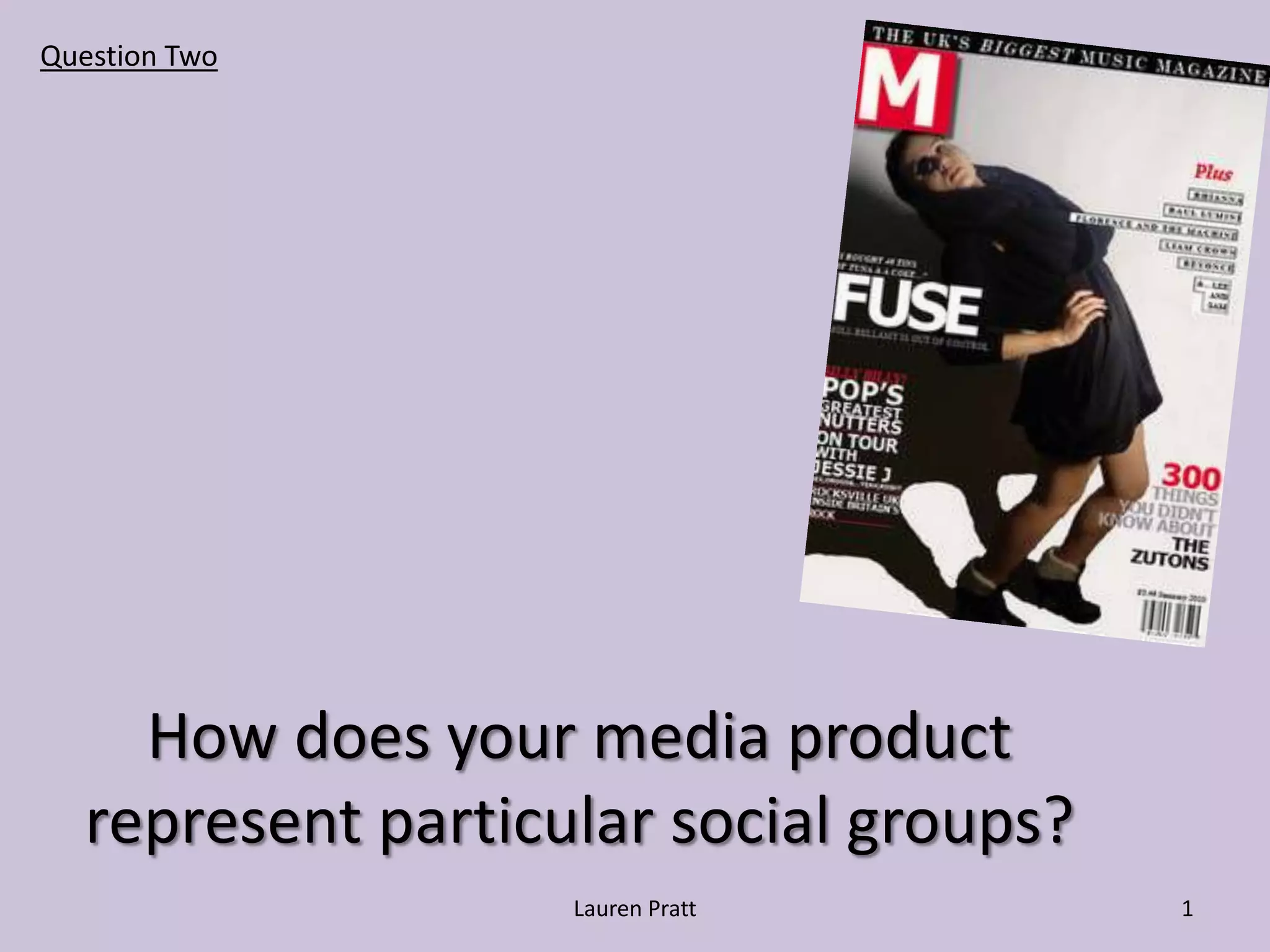
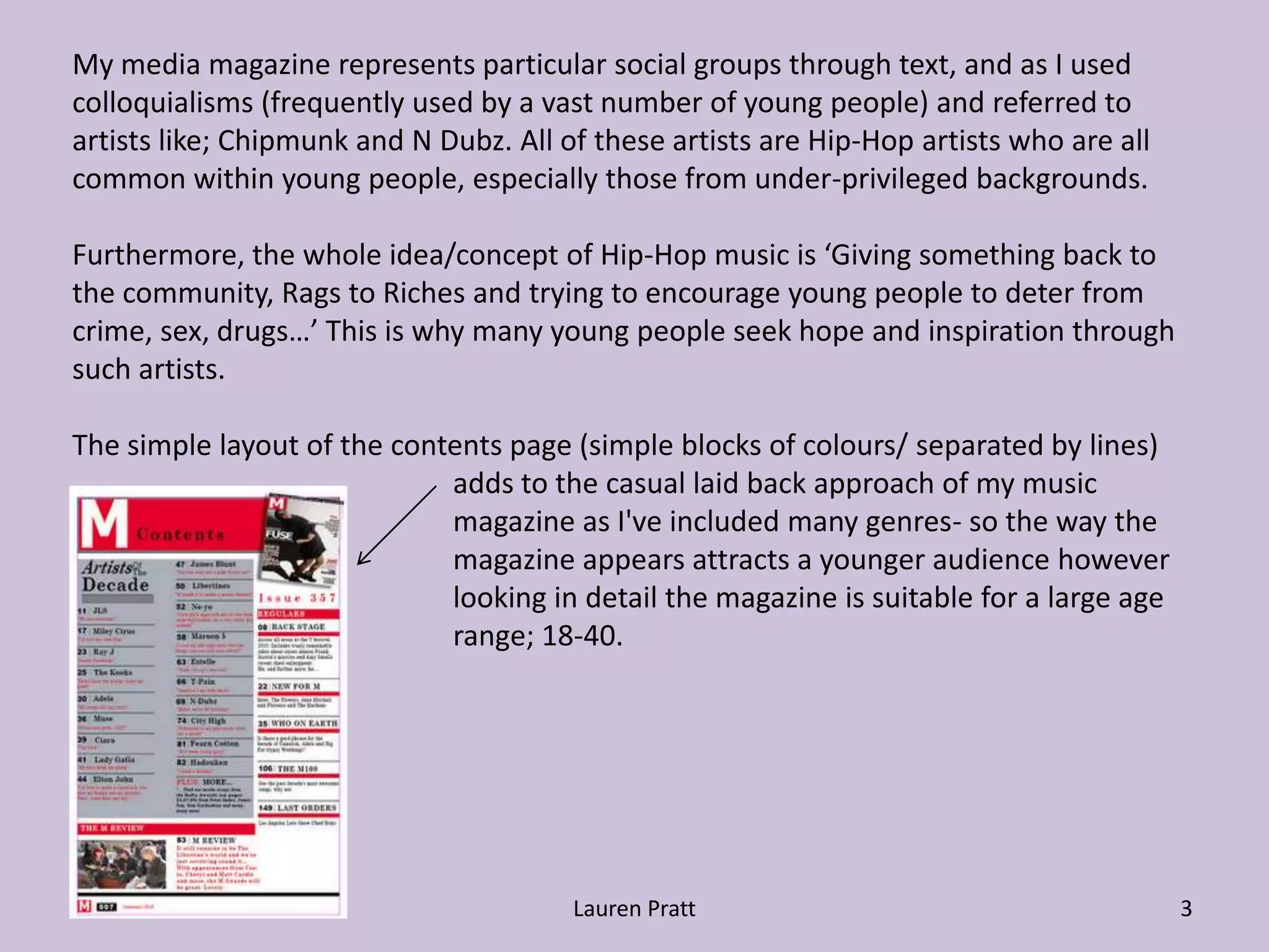
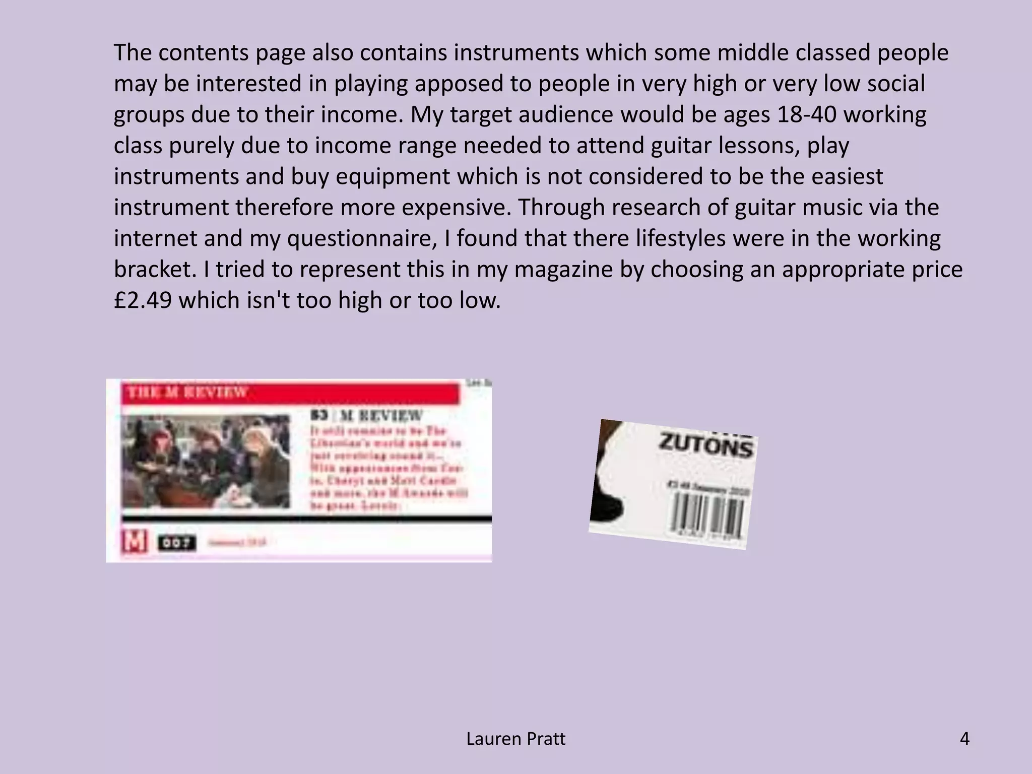
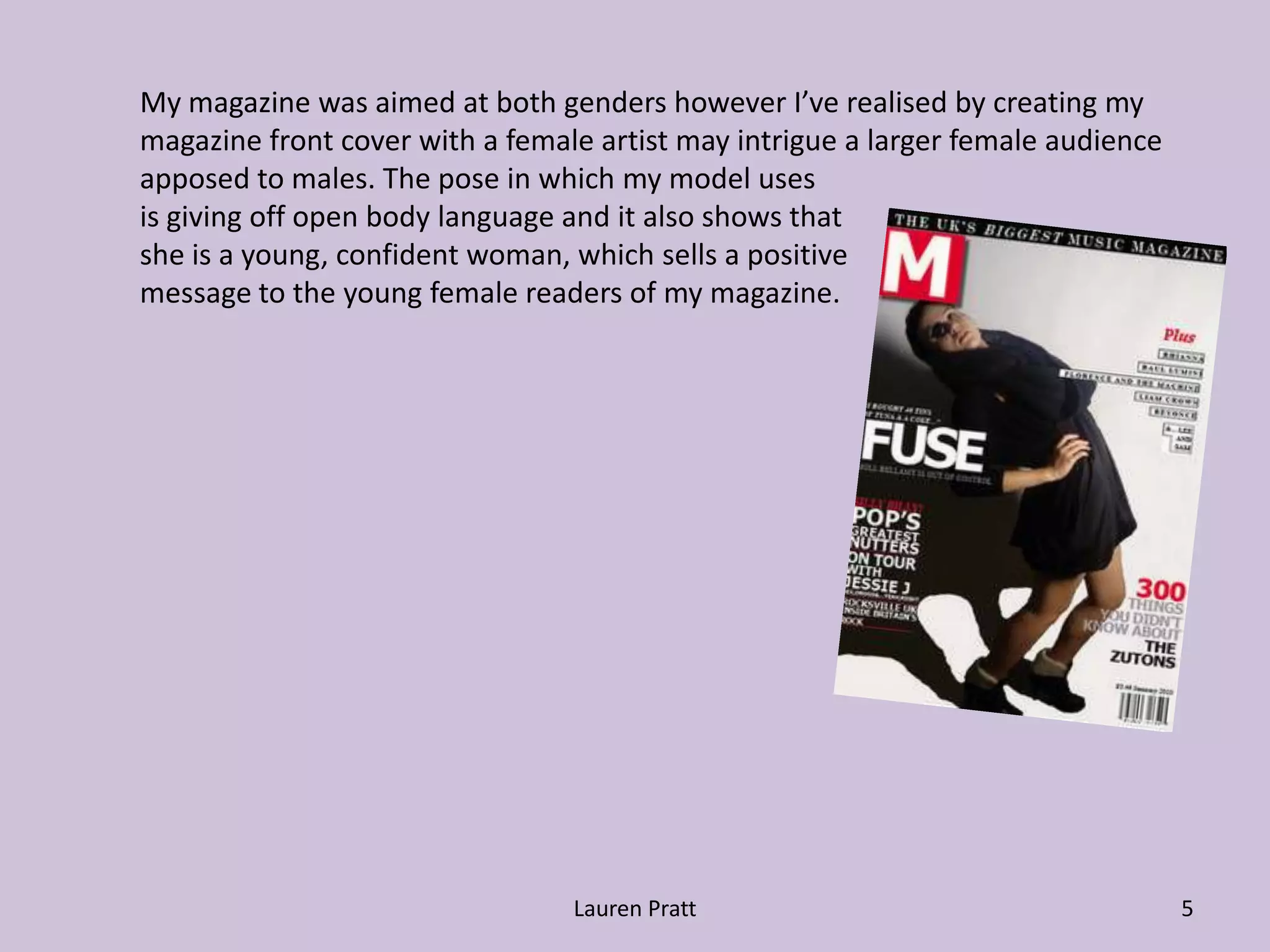
Question TwoHow does your media product represent particular social groups?1Lauren Pratt
Lauren Pratt2The product on it’s own represnts itself to groups of people such as ‘indie’ males and 	females as the product uses three different colours -black, white, red on all pages 	which don’t attract a minority but actually appeal to a majority. The black could be 	considered a deterrent for some groups of people such as those who are into blues 	and jazz music apposed to those who like current pop-rock bands/singers like AvrilLavigne it is a very enticing thing. 	The magazine represents itself as focusing on bands such as Paramour and other 	bands in a similar genre, these can appeal to a variety of groups, however in this 	magazine it is used to appeal to the younger generation because those are the people 	who were targeted in my questionnaire and I found out their likes.	Firstly the style of the model on the front cover page instantly would make the reader 	relate to the magazine as they could recognise their own style and be interested in the 	magazine, using this  would make the magazine sell more to the specific target 	audience. The colours contrast each other well and stand out enough to appeal to 	everyone, much like the target audience for my magazine as they are the type of 	people who like to stand out and be ‘different’ by the choice of the music they listen 	to. Also, from my research I found many magazines used bold contrasting colours 	together like black and white and this spurred me to do the same to give my magazine 	identity.
Lauren Pratt3My media magazine represents particular social groups through text, and as I used colloquialisms (frequently used by a vast number of young people) and referred to artists like; Chipmunk and N Dubz. All of these artists are Hip-Hop artists who are all common within young people, especially those from under-privileged backgrounds. Furthermore, the whole idea/concept of Hip-Hop music is ‘Giving something back to the community, Rags to Riches and trying to encourage young people to deter from crime, sex, drugs…’ This is why many young people seek hope and inspiration through such artists.The simple layout of the contents page (simple blocks of colours/ separated by lines) 			adds to the casual laid back approach of my music 			magazine as I've included many genres- so the way the 			magazine appears attracts a younger audience however 			looking in detail the magazine is suitable for a large age  			range; 18-40.
Lauren Pratt4The contents page also contains instruments which some middle classed people 	may be interested in playing apposed to people in very high or very low social 	groups due to their income. My target audience would be ages 18-40 working 	class purely due to income range needed to attend guitar lessons, play 	instruments and buy equipment which is not considered to be the easiest 	instrument therefore more expensive. Through research of guitar music via the 	internet and my questionnaire, I found that there lifestyles were in the working 	bracket. I tried to represent this in my magazine by choosing an appropriate price 	£2.49 which isn't too high or too low.
Lauren Pratt5My magazine was aimed at both genders however I’ve realised by creating my 	magazine front cover with a female artist may intrigue a larger female audience 	apposed to males. The pose in which my model usesis giving off open body language and it also shows that 				she is a young, confident woman, which sells a positive 	message to the young female readers of my magazine.

MEDIA QUESTION 2

  • 1.
    Question TwoHow doesyour media product represent particular social groups?1Lauren Pratt
  • 2.
    Lauren Pratt2The producton it’s own represnts itself to groups of people such as ‘indie’ males and females as the product uses three different colours -black, white, red on all pages which don’t attract a minority but actually appeal to a majority. The black could be considered a deterrent for some groups of people such as those who are into blues and jazz music apposed to those who like current pop-rock bands/singers like AvrilLavigne it is a very enticing thing. The magazine represents itself as focusing on bands such as Paramour and other bands in a similar genre, these can appeal to a variety of groups, however in this magazine it is used to appeal to the younger generation because those are the people who were targeted in my questionnaire and I found out their likes. Firstly the style of the model on the front cover page instantly would make the reader relate to the magazine as they could recognise their own style and be interested in the magazine, using this would make the magazine sell more to the specific target audience. The colours contrast each other well and stand out enough to appeal to everyone, much like the target audience for my magazine as they are the type of people who like to stand out and be ‘different’ by the choice of the music they listen to. Also, from my research I found many magazines used bold contrasting colours together like black and white and this spurred me to do the same to give my magazine identity.
  • 3.
    Lauren Pratt3My mediamagazine represents particular social groups through text, and as I used colloquialisms (frequently used by a vast number of young people) and referred to artists like; Chipmunk and N Dubz. All of these artists are Hip-Hop artists who are all common within young people, especially those from under-privileged backgrounds. Furthermore, the whole idea/concept of Hip-Hop music is ‘Giving something back to the community, Rags to Riches and trying to encourage young people to deter from crime, sex, drugs…’ This is why many young people seek hope and inspiration through such artists.The simple layout of the contents page (simple blocks of colours/ separated by lines) adds to the casual laid back approach of my music magazine as I've included many genres- so the way the magazine appears attracts a younger audience however looking in detail the magazine is suitable for a large age range; 18-40.
  • 4.
    Lauren Pratt4The contentspage also contains instruments which some middle classed people may be interested in playing apposed to people in very high or very low social groups due to their income. My target audience would be ages 18-40 working class purely due to income range needed to attend guitar lessons, play instruments and buy equipment which is not considered to be the easiest instrument therefore more expensive. Through research of guitar music via the internet and my questionnaire, I found that there lifestyles were in the working bracket. I tried to represent this in my magazine by choosing an appropriate price £2.49 which isn't too high or too low.
  • 5.
    Lauren Pratt5My magazinewas aimed at both genders however I’ve realised by creating my magazine front cover with a female artist may intrigue a larger female audience apposed to males. The pose in which my model usesis giving off open body language and it also shows that she is a young, confident woman, which sells a positive message to the young female readers of my magazine.