The document discusses how the trailer, magazine, and poster for the film "Crow's Field" use and challenge conventions of real media products.
The trailer uses typical conventions like fade to black transitions between shots and capitalized text for titles, but challenges conventions by having an unusually long establishing shot of the witch and an abrupt change to a black and white filter.
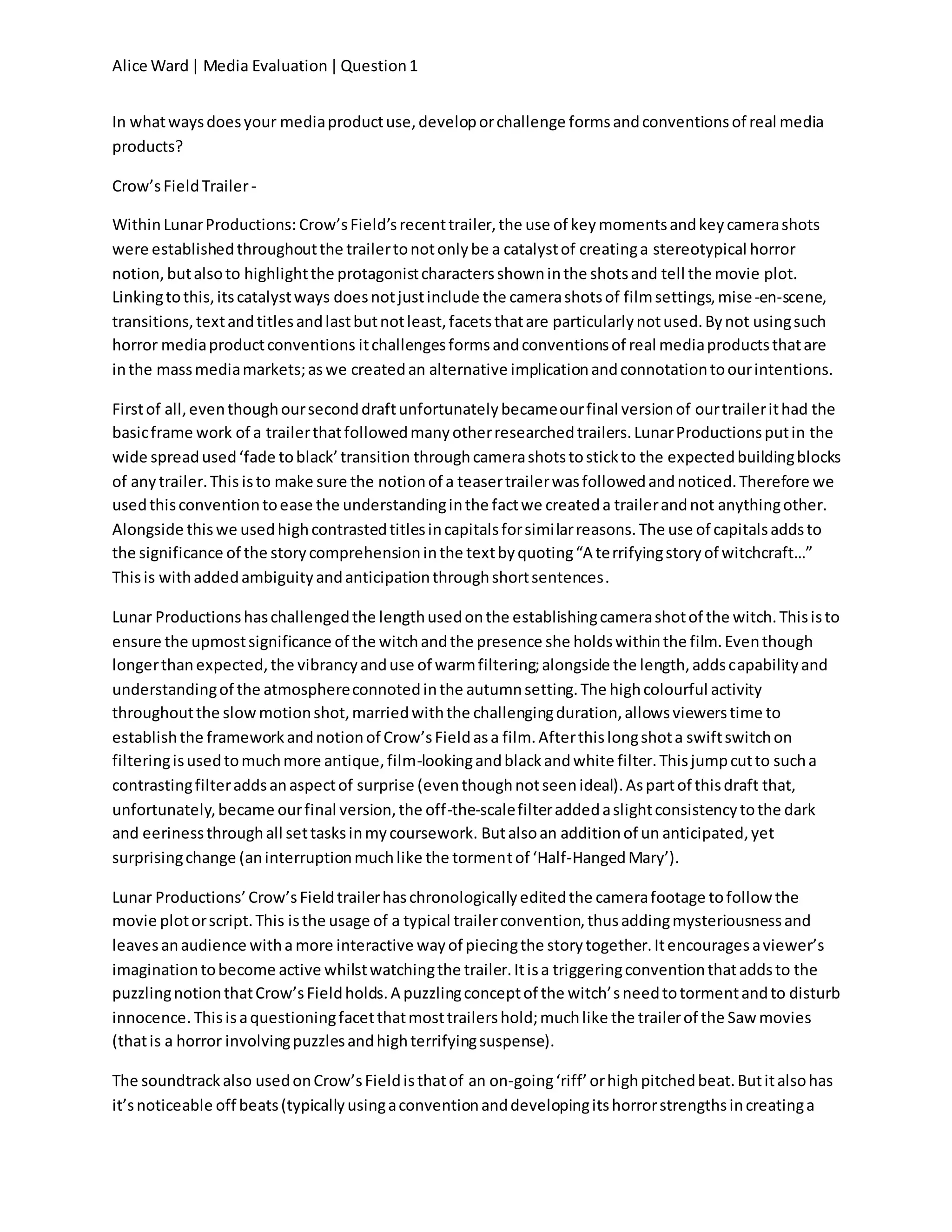
The magazine follows the general format of Empire magazine but challenges conventions by placing the price between the peaks of the "M" rather than the side. It also lacks a central still image to maintain ambiguity.
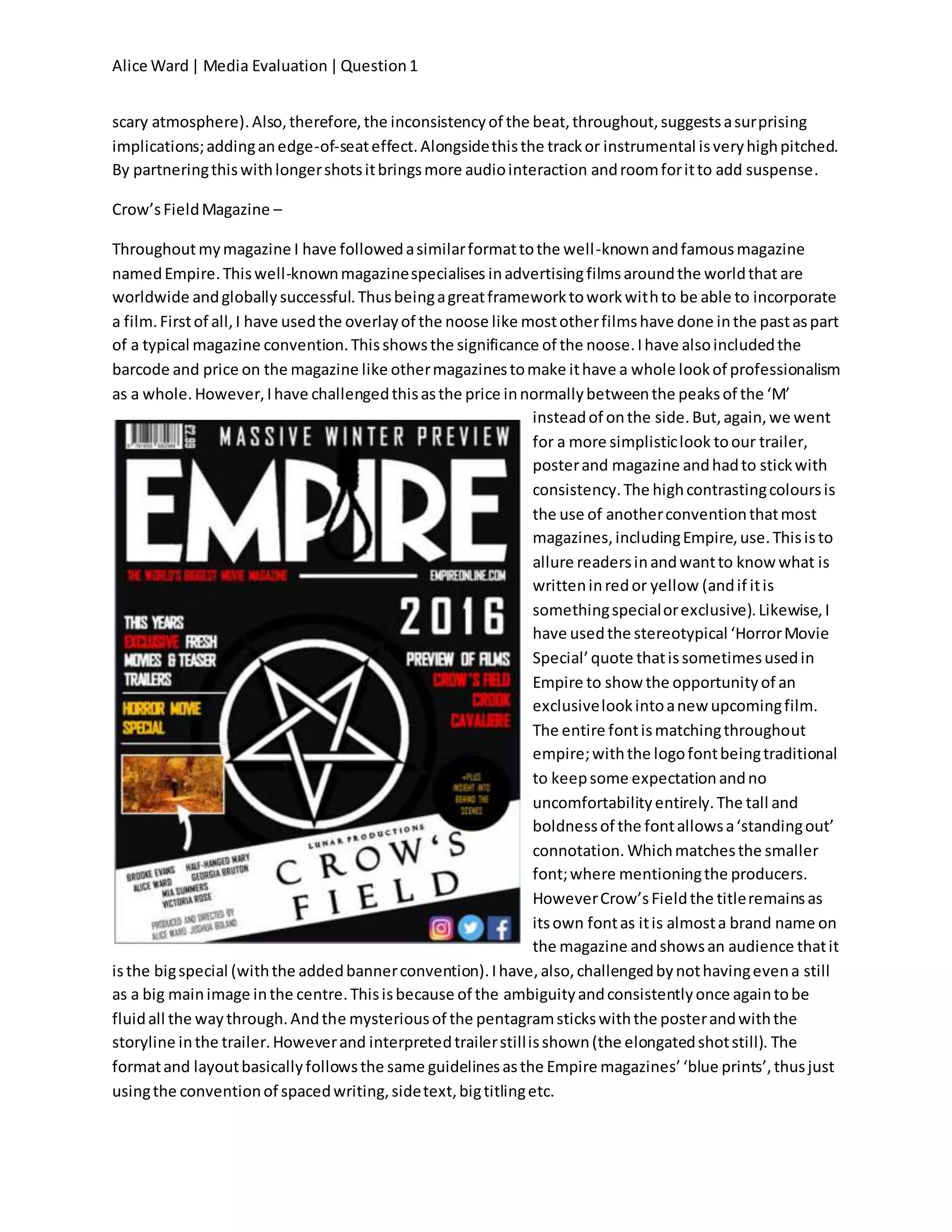
The poster uses a simple white pentagram as the main image rather than character portraits, and includes a short slogan and release date centered below,