EVALUATION –
QUESTION 2
In what ways will your media product use, develop
or challenge forms and conventions of real media
products?
   My research into Horror movie trailers provided me with an insight into the codes and
    conventions they use for all three of my products.
   For my trailer I believed that the best way to connect with the audience was to use or
    develop the conventions I found. From my research, 28 Days Later informed me of
    the use of a single survivor, a male main character, wide shots to show isolation
    and the use of props. From Dead Set I was able to analyse quick cuts, chase
    scenes, abandoned locations, dark lighting and the use of make-up. Other generic
    features such as fast paced editing also influenced my final construction.
   I also intended to use theory of binary oppositions to evoke feelings of empathy
    from the audience for the survivor as they will see his (the hero)’s struggle against
    the (villains) zombies and will wish for him to survive as he is interpreted ‘good’ and
    they are interpreted as ‘evil’.
   This is the main concept I wanted to promote through the use of a single survivor
    compared to a group; As with other zombie movies, I followed the convention of a
    horde, a strong number of zombies against a protagonist as I believed the audience
    would feel more empathy in the knowledge that he has immense odds against him.
   A further convention I used was dark lighting. Dark lighting and
    dark locations are a frequent and common feature found in horror
    movies as they create suspense and make for a thrilling, gripping
    and creepy experience for the viewer. Using dark locations induces
    a ‘fear of the unknown’ into the audience as they are uncertain as to
    what will emerge from the shadows. Using this convention
    alongside the use of a single survivor allowed me to ensure the
    audience will feel empathy for him and wish him to succeed and it
    will also increase the challenge the character faces. In tandem with
    the use of an abandoned location, I believe I was able to create a
    sense that the survivor had a hard task to survive which also
    heightened the drama.
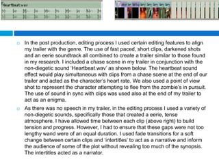
   In the post production, editing process I used certain editing features to align
    my trailer with the genre. The use of fast paced, short clips, darkened shots
    and an eerie soundtrack all combined to create a trailer similar to those found
    in my research. I included a chase scene in my trailer in conjunction with the
    non-diegetic sound ‘Heartbeat.wav’ as shown below. The heartbeat sound
    effect would play simultaneous with clips from a chase scene at the end of our
    trailer and acted as the character’s heart rate. We also used a point of view
    shot to represent the character attempting to flee from the zombie’s in pursuit.
    The use of sound in sync with clips was used also at the end of my trailer to
    act as an enigma.
   As there was no speech in my trailer, in the editing process I used a variety of
    non-diegetic sounds, specifically those that created a eerie, tense
    atmosphere. I have allowed time between each clip (above right) to build
    tension and progress. However, I had to ensure that these gaps were not too
    lengthy wand were of an equal duration. I used fade transitions for a soft
    change between certain clips and ‘intertitles’ to act as a narrative and inform
    the audience of some of the plot without revealing too much of the synopsis.
    The intertitles acted as a narrator.
   A main convention that is a certainty for a film of the
    horror genre specifically a zombie film is the use of make
    up on actors.
   This convention has been used effectively in a variety of
    different films, yet the example that I found was in my
    research of Dead Set. This make up, as seen above, is
    obviously more sophisticated than the make up our
    make-up artist was able to apply to the actors cast as the
    zombies. However I believe that when I was able to edit
    the raw photo (above left) and transform it into my
    completed movie poster (above right), I was able to edit
    the faces and contrast ensuring that the actors looked
    more convincing.
   In my film poster production, I used a variety of conventions to
    ensure that my product looked like a real media product.
   As seen above, I have used positive pull quotes, a convention I
    found in The Expendables film poster as I analysed it. Pull quotes
    are taken from film review magazines such as Total Film and
    Empire and therefore are added to a poster to increase its appeal to
    an audience as an audience is more likely to watch a film that has
    positive reviews. Similarly to The Expendables poster I have used a
    bold statement ‘Horror movie of the year’ to sell the film to the
    audience.
   Alongside the pull quotes I have used a star rating, typically given
    out of five, as another rating system for the audience to judge the
    movie upon.
   Similarly to The Expendables, I have used a bold font to display the
    title of the movie. The font is very noticeable to viewers and also the
    centralisation of the text increases the likelihood the viewer will be
    able to see the title when they look at the poster.
   The use of a outer glow effect added in Photoshop relates to the
    theme of death conveyed by the title and will create an eerie effect.
    This effect will be furthered by the colour selection as red
    symbolizes danger and death hence why I used it so often both on
    my poster and magazine cover.
   I have also added a reference to another movie. The term ‘from the
    creators of’ has been used so members of the target audience will
    be attracted to this film if they liked or watched the one referred to.
   I have used a single image on my poster. In comparison to the
    Expendables poster, I have not used a special effect such as an explosion
    seen in the analysed poster as it is not a poster of my genre, it is an action
    film and explosions are typically a feature of action films.
   As my film is of the horror genre, I edited the contrast of the image,
    darkening it to make it more suitably for my genre as darkness can
    represent fear.
   I have used a billing block at the foot of the poster listing the production
    staff, added the date and website and also a certificate rating, stating to the
    audience that the movie is only suitable for a certain age group.
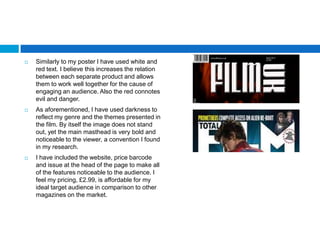
   Similarly to my poster I have used white and
    red text. I believe this increases the relation
    between each separate product and allows
    them to work well together for the cause of
    engaging an audience. Also the red connotes
    evil and danger.
   As aforementioned, I have used darkness to
    reflect my genre and the themes presented in
    the film. By itself the image does not stand
    out, yet the main masthead is very bold and
    noticeable to the viewer, a convention I found
    in my research.
   I have included the website, price barcode
    and issue at the head of the page to make all
    of the features noticeable to the audience. I
    feel my pricing, £2.99, is affordable for my
    ideal target audience in comparison to other
    magazines on the market.
   Unlike Total Film, I have decided
    against a regular convention, a free
    giveaway. Instead I have included
    screenshots of the main article and
    have adapted the ‘world exclusive’
    exclamatory to entice the reader and
    suggest they are the first to receive the
    information. A further exclamation was
    used on the banner ‘Plus!’ and
    influences the reader into believing
    there is a great deal of context.
   The layout of my magazine is also
    conventional as I have added the main
    article near the centre of the magazine,
    a banner at the foot of the magazine
    and small sub-headings on either side
    of the lanes on the page.

Evaluation – Question 2

  • 1.
  • 2.
    In what wayswill your media product use, develop or challenge forms and conventions of real media products?  My research into Horror movie trailers provided me with an insight into the codes and conventions they use for all three of my products.  For my trailer I believed that the best way to connect with the audience was to use or develop the conventions I found. From my research, 28 Days Later informed me of the use of a single survivor, a male main character, wide shots to show isolation and the use of props. From Dead Set I was able to analyse quick cuts, chase scenes, abandoned locations, dark lighting and the use of make-up. Other generic features such as fast paced editing also influenced my final construction.  I also intended to use theory of binary oppositions to evoke feelings of empathy from the audience for the survivor as they will see his (the hero)’s struggle against the (villains) zombies and will wish for him to survive as he is interpreted ‘good’ and they are interpreted as ‘evil’.  This is the main concept I wanted to promote through the use of a single survivor compared to a group; As with other zombie movies, I followed the convention of a horde, a strong number of zombies against a protagonist as I believed the audience would feel more empathy in the knowledge that he has immense odds against him.
  • 3.
    A further convention I used was dark lighting. Dark lighting and dark locations are a frequent and common feature found in horror movies as they create suspense and make for a thrilling, gripping and creepy experience for the viewer. Using dark locations induces a ‘fear of the unknown’ into the audience as they are uncertain as to what will emerge from the shadows. Using this convention alongside the use of a single survivor allowed me to ensure the audience will feel empathy for him and wish him to succeed and it will also increase the challenge the character faces. In tandem with the use of an abandoned location, I believe I was able to create a sense that the survivor had a hard task to survive which also heightened the drama.
  • 4.
    In the post production, editing process I used certain editing features to align my trailer with the genre. The use of fast paced, short clips, darkened shots and an eerie soundtrack all combined to create a trailer similar to those found in my research. I included a chase scene in my trailer in conjunction with the non-diegetic sound ‘Heartbeat.wav’ as shown below. The heartbeat sound effect would play simultaneous with clips from a chase scene at the end of our trailer and acted as the character’s heart rate. We also used a point of view shot to represent the character attempting to flee from the zombie’s in pursuit. The use of sound in sync with clips was used also at the end of my trailer to act as an enigma.  As there was no speech in my trailer, in the editing process I used a variety of non-diegetic sounds, specifically those that created a eerie, tense atmosphere. I have allowed time between each clip (above right) to build tension and progress. However, I had to ensure that these gaps were not too lengthy wand were of an equal duration. I used fade transitions for a soft change between certain clips and ‘intertitles’ to act as a narrative and inform the audience of some of the plot without revealing too much of the synopsis. The intertitles acted as a narrator.
  • 5.
    A main convention that is a certainty for a film of the horror genre specifically a zombie film is the use of make up on actors.  This convention has been used effectively in a variety of different films, yet the example that I found was in my research of Dead Set. This make up, as seen above, is obviously more sophisticated than the make up our make-up artist was able to apply to the actors cast as the zombies. However I believe that when I was able to edit the raw photo (above left) and transform it into my completed movie poster (above right), I was able to edit the faces and contrast ensuring that the actors looked more convincing.
  • 6.
    In my film poster production, I used a variety of conventions to ensure that my product looked like a real media product.  As seen above, I have used positive pull quotes, a convention I found in The Expendables film poster as I analysed it. Pull quotes are taken from film review magazines such as Total Film and Empire and therefore are added to a poster to increase its appeal to an audience as an audience is more likely to watch a film that has positive reviews. Similarly to The Expendables poster I have used a bold statement ‘Horror movie of the year’ to sell the film to the audience.  Alongside the pull quotes I have used a star rating, typically given out of five, as another rating system for the audience to judge the movie upon.
  • 7.
    Similarly to The Expendables, I have used a bold font to display the title of the movie. The font is very noticeable to viewers and also the centralisation of the text increases the likelihood the viewer will be able to see the title when they look at the poster.  The use of a outer glow effect added in Photoshop relates to the theme of death conveyed by the title and will create an eerie effect. This effect will be furthered by the colour selection as red symbolizes danger and death hence why I used it so often both on my poster and magazine cover.  I have also added a reference to another movie. The term ‘from the creators of’ has been used so members of the target audience will be attracted to this film if they liked or watched the one referred to.
  • 8.
    I have used a single image on my poster. In comparison to the Expendables poster, I have not used a special effect such as an explosion seen in the analysed poster as it is not a poster of my genre, it is an action film and explosions are typically a feature of action films.  As my film is of the horror genre, I edited the contrast of the image, darkening it to make it more suitably for my genre as darkness can represent fear.  I have used a billing block at the foot of the poster listing the production staff, added the date and website and also a certificate rating, stating to the audience that the movie is only suitable for a certain age group.
  • 9.
    Similarly to my poster I have used white and red text. I believe this increases the relation between each separate product and allows them to work well together for the cause of engaging an audience. Also the red connotes evil and danger.  As aforementioned, I have used darkness to reflect my genre and the themes presented in the film. By itself the image does not stand out, yet the main masthead is very bold and noticeable to the viewer, a convention I found in my research.  I have included the website, price barcode and issue at the head of the page to make all of the features noticeable to the audience. I feel my pricing, £2.99, is affordable for my ideal target audience in comparison to other magazines on the market.
  • 10.
    Unlike Total Film, I have decided against a regular convention, a free giveaway. Instead I have included screenshots of the main article and have adapted the ‘world exclusive’ exclamatory to entice the reader and suggest they are the first to receive the information. A further exclamation was used on the banner ‘Plus!’ and influences the reader into believing there is a great deal of context.  The layout of my magazine is also conventional as I have added the main article near the centre of the magazine, a banner at the foot of the magazine and small sub-headings on either side of the lanes on the page.