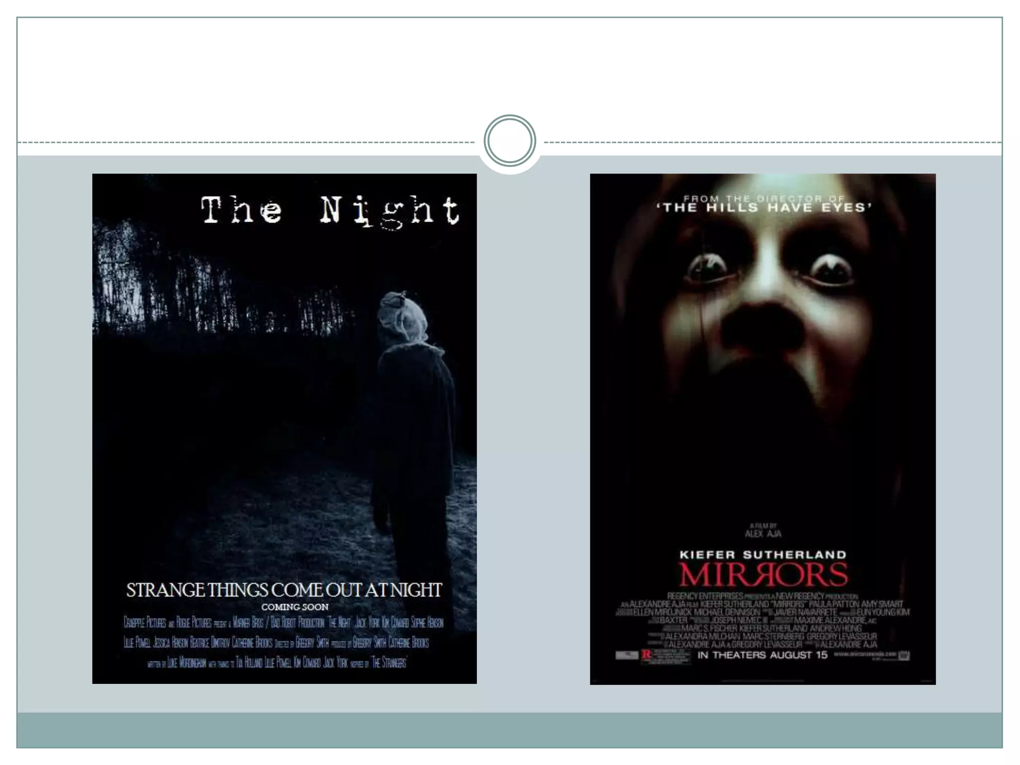
Download to read offline
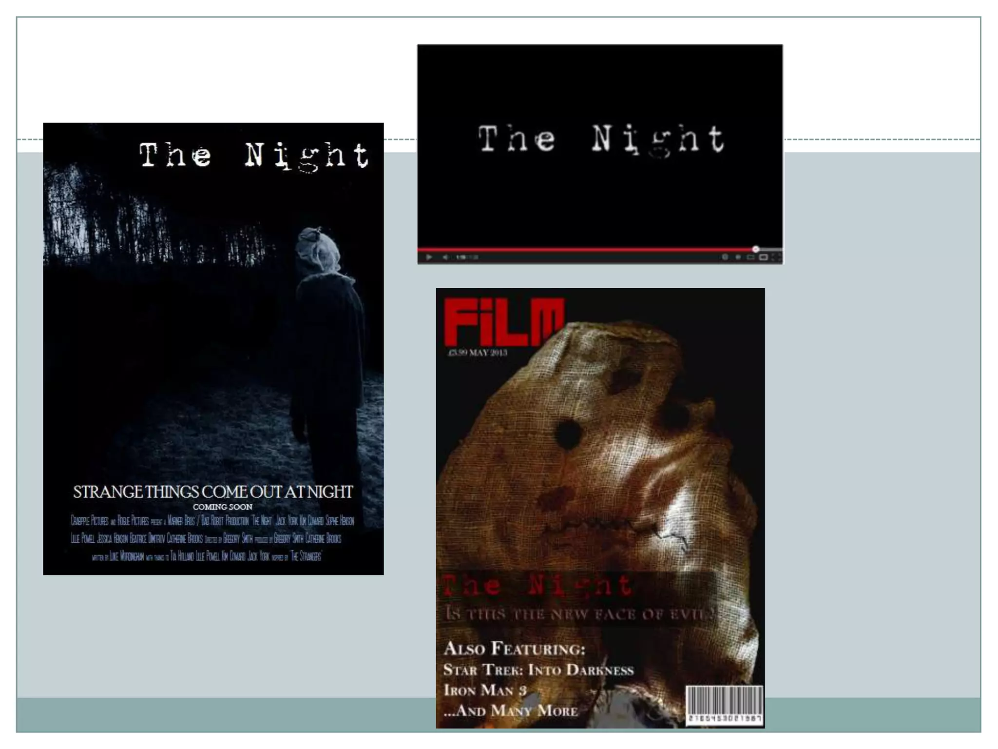
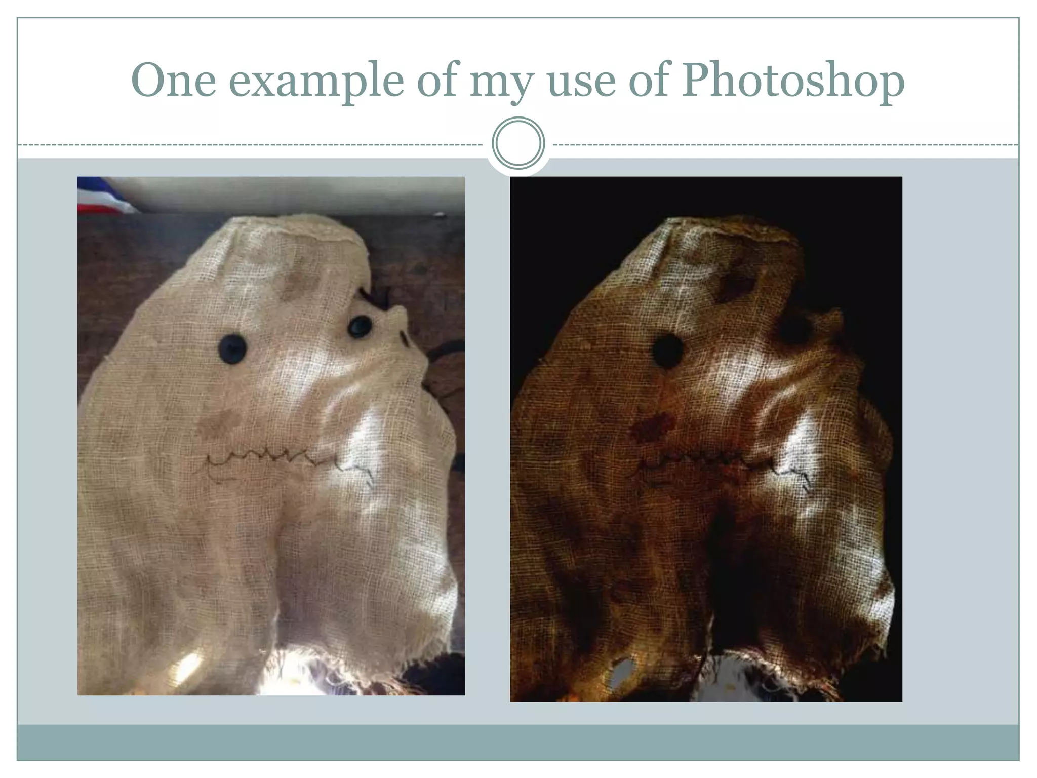
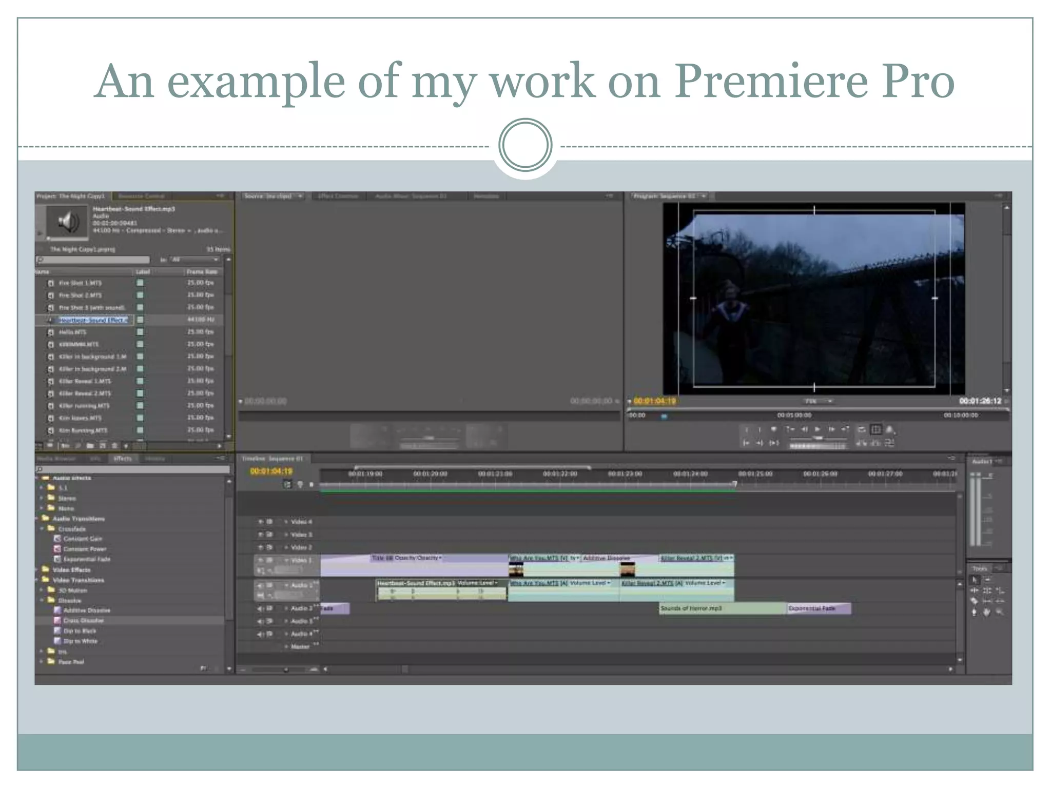
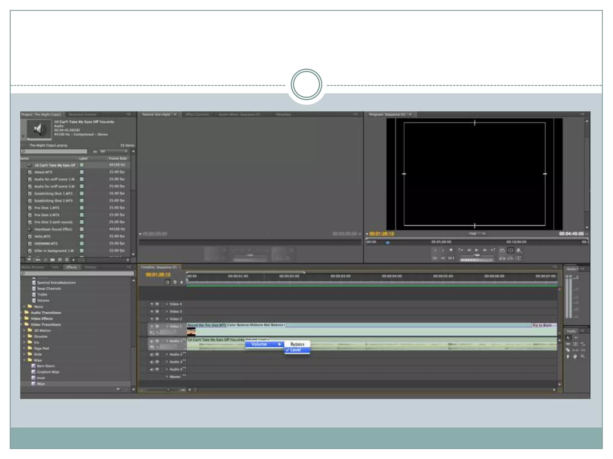

This document summarizes a student's media coursework project creating a promotional package for a fictional horror film. The package includes a magazine cover, film poster, and trailer. The student aimed to use conventions from real media products while also innovating in some ways. Feedback was positive and praised the creepy tone, continuity across items, and clear genre. However, some felt it revealed too much about the killer. The student learned new technologies like Photoshop, Premiere Pro, and professional cameras during the project.


