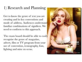
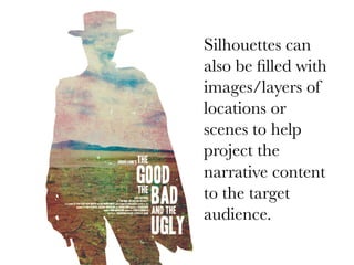
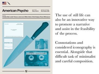
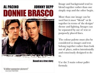
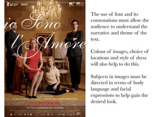
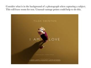
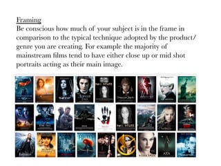
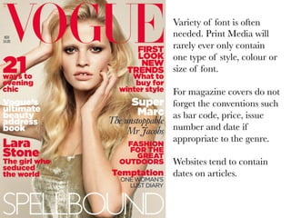
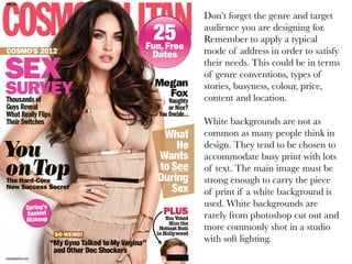
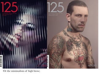
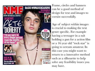
Tips to consider
when designing
print media
We need to consider the following aspects when designing and
creating our practical piece of coursework.

1) Research, analysis and planning

2) Linking to our research investigation – Via Genre/
Representation/Narrative

3) Design, quality of images, composition, integration
Research and
Planning
1)  Research and Planning
Get to know the genre of text you are
creating and its key conventions and
mode of address. Audiences understand
familiar combinations of signifiers. We
need to conform to this approach. 

The exam board should be able to easily
recognise the genre of magazine,
advert, film or TV program from your
use of convention, iconography, font,
lighting and mise en scene.
1)  Research and Planning

Options
You can adopt different approaches to your practical coursework.
They still have to follow typical conventions, but you could, for
example, create 2 mainstream posters and 1 niche for the same
genre. You would not reinvent the wheel, you would research the
two different approaches.
Mainstream Rom/Com


Typical conventions
•  The back to back lean
•  Use of the colour red 

or pink
•  Big smiles
•  High key lighting
•  Studio shot
•  Key/familar iconography	
  
Mainstream Rom/Com


Pastel colour schemes
Quirky facial expressions
A more niche Romance film poster. 

It still connotes romance but there
is much more attention placed on
artistic quality and highbrow
aesthetics. 

The image used also gives a sense
of the narrative themes and that all
might not end well unlike the
equilibrium mainstream rom/coms
tend to end on. 

A film poster should give the
audience a clue of the gratifications
that they will gain from the text it
advertises.
Linking to
investigation
2) Linking to your investigation

It is vital your practical coursework links to your investigation. Be
it via your main focus being representation, genre or narrative. 

Again you can adopt different approaches. For example a
negative hyper real or objectified representation of females for a
magazine cover or a more dominant, contemporary and complex
representation of females on a DVD cover.
Representation of females in
the action genre.

The Action genre has various
common representations of
females. For example the
genre often represents
females as needing a males
protection and guidance.
Another negative example is
how the genre hugely under
representing females.

You should read your
conclusion and ensure your
practical piece reflects your
main findings.
Another type of
representation within the
genre is female
objectification.

Iron Man, The Avengers and
the student created poster
“Dirty Sexy Lies” all contain
negative representations of
females But you oppose your
findings and create more
positive representation.
Still male dominated?
A wholly positive representation?
Magazines often represent females
superficially, as objects of desire
and visual pleasure. You could air
brush skin to help adopt a hyper
real representation.
Design tips
Researching genre and convention alongside ensuring your work
clearly links to your investigation is vital. It is also important to make
your piece look professional and sophisiticated.

You should have clear visual influences whilst desinging. Here are
some design tips.
The use of
Silhouettes are
often used to
make up for the
lack of high
quality images
that are
sometimes
unattainable to
students with
time restraints.
Silhouettes can
also be filled with
images/layers of
locations or
scenes to help
project the
narrative content
to the target
audience.
The use of still life can
also be an innovative way
to promote a narrative
and assist in the feasibility
of the process. 

Connotations and
considered iconography is
essential. Alongside that
difficult task of minimalist
and careful composition.
Shallow depth of field is useful when capturing images. Cameras such as a
Canon 5D with Apertures of F1.4 will help blur the background helping text to
be more legible
If photographs are to be
used they must be striking
and catch the audiences eye,
alongside giving clear
indication of narrative
themes. Print Media prime
purpose is to promote and
attract.

How do you make an image
not look amateur?

Using, directing and
manipulating light. High
contrast and hard light is a
common strategy to add a
cinematic style.
Image and background tend to
blend together rather than one
simply stop and the other begin.

More than one image can be
used but it must “blend” or fit
together in terms of the design/
theme and lighting. Images can
be separated by use of text or
purposely placed lines.

The colour palette must also be
considered so images and text
belong together rather than look
out of place, unless intentionally
and consciously designed to do
so.

Use the 3 main colour pallet
formula
The use of font and its
connotations must allow the
audience to understand the
narrative and theme of the
text.

Colour of images, choice of
locations and style of dress
will also help to do this.

Subjects in images must be
directed in terms of body
language and facial
expressions to help gain the
desired look.
Consider what is in the background of a photograph when capturing a subject.
This will leave room for text. Unusual vantage points could help to do this.
Framing
Be conscious how much of your subject is in the frame in
comparison to the typical technique adopted by the product/
genre you are creating. For example the majority of
mainstream films tend to have either close up or mid shot
portraits acting as their main image.
The rule of thirds

In terms of composition we as an
audience enjoy to look at design
split into 3 sections. Here is an
obvious example, but you could
consider your placement of text to
meet this rule.
Print Media such as
Film posters and CD
covers should contain a
credit block, details of
production companies
which relate to the genre
and a caption containing
an enigma code.
Promotional reviews or
award logos could also
help promote. Again this
must be appropriate to
your text.
Variety of font is often
needed. Print Media will
rarely ever only contain
one type of style, colour or
size of font.

For magazine covers do not
forget the conventions such
as bar code, price, issue
number and date if
appropriate to the genre.

Websites tend to contain
dates on articles.
Don’t forget the genre and target
audience you are designing for.
Remember to apply a typical
mode of address in order to satisfy
their needs. This could be in terms
of genre conventions, types of
stories, busyness, colour, price,
content and location.

White backgrounds are not as
common as many people think in
design. They tend to be chosen to
accommodate busy print with lots
of text. The main image must be
strong enough to carry the piece
of print if a white background is
used. White backgrounds are
rarely from photoshop cut out and
more commonly shot in a studio
with soft lighting.
Or the minimalism of high brow;
Frame, circles and banners
can be a good method of
design for text and images to
coexist successfully.

Age of subject within images
is crucial to making the text
genre specific. For example
having a teenager in a suit
holding a gun for a action film
or a 16 year old “rock star” is
going to scream amateur. In
this case you might want to
return to a innovative method
such as a silhouette to help
solve any feasibility issues you
may have.

Media practical coursework v3

  • 1.
    Tips to consider whendesigning print media
  • 2.
    We need toconsider the following aspects when designing and creating our practical piece of coursework. 1) Research, analysis and planning 2) Linking to our research investigation – Via Genre/ Representation/Narrative 3) Design, quality of images, composition, integration
  • 3.
  • 4.
    1)  Research andPlanning Get to know the genre of text you are creating and its key conventions and mode of address. Audiences understand familiar combinations of signifiers. We need to conform to this approach. The exam board should be able to easily recognise the genre of magazine, advert, film or TV program from your use of convention, iconography, font, lighting and mise en scene.
  • 5.
    1)  Research andPlanning Options You can adopt different approaches to your practical coursework. They still have to follow typical conventions, but you could, for example, create 2 mainstream posters and 1 niche for the same genre. You would not reinvent the wheel, you would research the two different approaches.
  • 6.
    Mainstream Rom/Com Typical conventions • The back to back lean •  Use of the colour red or pink •  Big smiles •  High key lighting •  Studio shot •  Key/familar iconography  
  • 7.
    Mainstream Rom/Com Pastel colourschemes Quirky facial expressions
  • 8.
    A more nicheRomance film poster. It still connotes romance but there is much more attention placed on artistic quality and highbrow aesthetics. The image used also gives a sense of the narrative themes and that all might not end well unlike the equilibrium mainstream rom/coms tend to end on. A film poster should give the audience a clue of the gratifications that they will gain from the text it advertises.
  • 9.
  • 10.
    2) Linking toyour investigation It is vital your practical coursework links to your investigation. Be it via your main focus being representation, genre or narrative. Again you can adopt different approaches. For example a negative hyper real or objectified representation of females for a magazine cover or a more dominant, contemporary and complex representation of females on a DVD cover.
  • 11.
    Representation of femalesin the action genre. The Action genre has various common representations of females. For example the genre often represents females as needing a males protection and guidance. Another negative example is how the genre hugely under representing females. You should read your conclusion and ensure your practical piece reflects your main findings.
  • 13.
    Another type of representationwithin the genre is female objectification. Iron Man, The Avengers and the student created poster “Dirty Sexy Lies” all contain negative representations of females But you oppose your findings and create more positive representation.
  • 14.
  • 15.
    A wholly positiverepresentation?
  • 16.
    Magazines often representfemales superficially, as objects of desire and visual pleasure. You could air brush skin to help adopt a hyper real representation.
  • 17.
    Design tips Researching genreand convention alongside ensuring your work clearly links to your investigation is vital. It is also important to make your piece look professional and sophisiticated. You should have clear visual influences whilst desinging. Here are some design tips.
  • 18.
    The use of Silhouettesare often used to make up for the lack of high quality images that are sometimes unattainable to students with time restraints.
  • 20.
    Silhouettes can also befilled with images/layers of locations or scenes to help project the narrative content to the target audience.
  • 21.
    The use ofstill life can also be an innovative way to promote a narrative and assist in the feasibility of the process. Connotations and considered iconography is essential. Alongside that difficult task of minimalist and careful composition.
  • 23.
    Shallow depth offield is useful when capturing images. Cameras such as a Canon 5D with Apertures of F1.4 will help blur the background helping text to be more legible
  • 24.
    If photographs areto be used they must be striking and catch the audiences eye, alongside giving clear indication of narrative themes. Print Media prime purpose is to promote and attract. How do you make an image not look amateur? Using, directing and manipulating light. High contrast and hard light is a common strategy to add a cinematic style.
  • 27.
    Image and backgroundtend to blend together rather than one simply stop and the other begin. More than one image can be used but it must “blend” or fit together in terms of the design/ theme and lighting. Images can be separated by use of text or purposely placed lines. The colour palette must also be considered so images and text belong together rather than look out of place, unless intentionally and consciously designed to do so. Use the 3 main colour pallet formula
  • 31.
    The use offont and its connotations must allow the audience to understand the narrative and theme of the text. Colour of images, choice of locations and style of dress will also help to do this. Subjects in images must be directed in terms of body language and facial expressions to help gain the desired look.
  • 32.
    Consider what isin the background of a photograph when capturing a subject. This will leave room for text. Unusual vantage points could help to do this.
  • 33.
    Framing Be conscious howmuch of your subject is in the frame in comparison to the typical technique adopted by the product/ genre you are creating. For example the majority of mainstream films tend to have either close up or mid shot portraits acting as their main image.
  • 34.
    The rule ofthirds In terms of composition we as an audience enjoy to look at design split into 3 sections. Here is an obvious example, but you could consider your placement of text to meet this rule.
  • 35.
    Print Media suchas Film posters and CD covers should contain a credit block, details of production companies which relate to the genre and a caption containing an enigma code. Promotional reviews or award logos could also help promote. Again this must be appropriate to your text.
  • 36.
    Variety of fontis often needed. Print Media will rarely ever only contain one type of style, colour or size of font. For magazine covers do not forget the conventions such as bar code, price, issue number and date if appropriate to the genre. Websites tend to contain dates on articles.
  • 37.
    Don’t forget thegenre and target audience you are designing for. Remember to apply a typical mode of address in order to satisfy their needs. This could be in terms of genre conventions, types of stories, busyness, colour, price, content and location. White backgrounds are not as common as many people think in design. They tend to be chosen to accommodate busy print with lots of text. The main image must be strong enough to carry the piece of print if a white background is used. White backgrounds are rarely from photoshop cut out and more commonly shot in a studio with soft lighting.
  • 38.
    Or the minimalismof high brow;
  • 39.
    Frame, circles andbanners can be a good method of design for text and images to coexist successfully. Age of subject within images is crucial to making the text genre specific. For example having a teenager in a suit holding a gun for a action film or a 16 year old “rock star” is going to scream amateur. In this case you might want to return to a innovative method such as a silhouette to help solve any feasibility issues you may have.