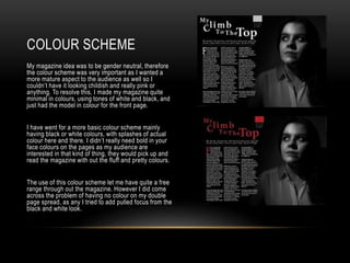
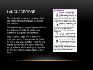
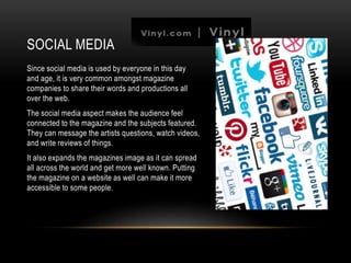
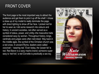
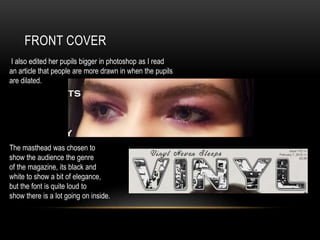
The document discusses the target audience and design choices for a magazine. It describes choosing a minimal color scheme of white and black tones to appear mature without being childish. Humor and sarcasm are used for the language/tone as the audience appreciates personality. Social media is utilized to connect the audience to the magazine's content and expand its reach. The front cover features a close-up of a model in red to symbolize power and status based on historical meanings of the color, with enlarged pupils to draw readers in, and a loud masthead font to showcase the magazine's content.