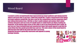
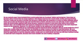
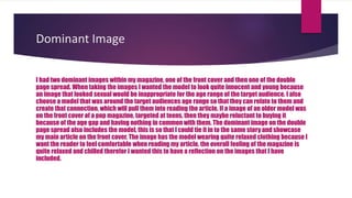
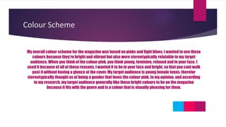
The document discusses the creation of mood boards to evaluate color schemes and genres that would appeal to the target audience of young teenage females. Pink was selected as the main tone for the magazine because it generally represents and appeals to this demographic. Social media links were included on the contents page to match the interests of the target audience and allow them to access articles online. Images featured a model around the target age to create relatability, and a relaxed tone and informal language were used throughout the text and articles.
Johnny Depp Long Hair: A Signature Look Through the Yearsgreendigital
Johnny Depp, synonymous with eclectic roles and unparalleled acting prowess. has also been a significant figure in fashion and style. Johnny Depp long hair is a distinctive trademark among the various elements that define his unique persona. This article delves into the evolution, impact. and cultural significance of Johnny Depp long hair. exploring how it has contributed to his iconic status.
Follow us on: Pinterest
Introduction
Johnny Depp is an actor known for his chameleon-like ability to transform into a wide range of characters. from the eccentric Captain Jack Sparrow in "Pirates of the Caribbean" to the introspective Edward Scissorhands. His long hair is one constant throughout his evolving roles and public appearances. Johnny Depp long hair is not a style choice but a significant aspect of his identity. contributing to his allure and mystique. This article explores the journey and significance of Johnny Depp long hair. highlighting how it has become integral to his brand.
The Early Years: A Budding Star with Signature Locks
1980s: The Rise of a Young Heartthrob
Johnny Depp's journey in Hollywood began in the 1980s. with his breakout role in the television series "21 Jump Street." During this time, his hair was short, but it was already clear that Depp had a penchant for unique and edgy styles. By the decade's end, Depp started experimenting with longer hair. setting the stage for a lifelong signature.
1990s: From Heartthrob to Icon
The 1990s were transformative for Johnny Depp his career and personal style. Films like "Edward Scissorhands" (1990) and "Benny & Joon" (1993) saw Depp sporting various hair lengths and styles. But, his long, unkempt hair in "What's Eating Gilbert Grape" (1993) began to draw significant attention. This period marked the beginning of Johnny Depp long hair. which became a defining feature of his image.
The Iconic Roles: Hair as a Character Element
Edward Scissorhands (1990)
In "Edward Scissorhands," Johnny Depp's character had a wild and mane that complemented his ethereal and misunderstood persona. This role showcased how long hair Johnny Depp could enhance a character's depth and mystery.
Captain Jack Sparrow: The Pirate with Flowing Locks
One of Johnny Depp's iconic roles is Captain Jack Sparrow from the "Pirates of the Caribbean" series. Sparrow's long, dreadlocked hair symbolised his rebellious and unpredictable nature. The character's look, complete with beads and trinkets woven into his hair. was a collaboration between Depp and the film's costume designers. This style became iconic and influenced fashion trends and Halloween costumes worldwide.
Other Memorable Characters
Depp's long hair has also been featured in other roles, such as Ichabod Crane in "Sleepy Hollow" (1999). and Roux in "Chocolat" (2000). In these films, his hair added a layer of authenticity and depth to his characters. proving that Johnny Depp with long hair is more than a style—it's a storytelling tool.
Off-Screen Influenc
From Stress to Success How Oakland's Corporate Wellness Programs are Cultivat...Kitchen on Fire
Discover how Oakland's innovative corporate wellness initiatives are transforming workplace culture, nurturing the well-being of employees, and fostering a thriving environment. From comprehensive mental health support to flexible work arrangements and holistic wellness workshops, these programs are empowering individuals to navigate stress effectively, leading to increased productivity, satisfaction, and overall success.
What Makes Candle Making The Ultimate Bachelorette CelebrationWick & Pour
The above-discussed factors are the reason behind an increasing number of millennials opting for candle making events to celebrate their bachelorette. If you are in search of any theme for your bachelorette then do opt for a candle making session to make your celebration memorable for everyone involved.
La transidentité, un sujet qui fractionne les FrançaisIpsos France
Ipsos, l’une des principales sociétés mondiales d’études de marché dévoile les résultats de son étude Ipsos Global Advisor “Pride 2024”. De ses débuts aux Etats-Unis et désormais dans de très nombreux pays, le mois de juin est traditionnellement consacré aux « Marches des Fiertés » et à des événements festifs autour du concept de Pride. A cette occasion, Ipsos a réalisé une enquête dans vingt-six pays dressant plusieurs constats. Les clivages des opinions entre générations s’accentuent tandis que le soutien à des mesures sociétales et d’inclusion en faveur des LGBT+ notamment transgenres continue de s’effriter.
Is your favorite ring slipping and sliding on your finger? You're not alone. Must Read this Guide on What To Do If Your Ring Is Too Big as shared by the experts of Andrews Jewelers.
2. Mood Board
I created a series of mood boards that represented my target audience and showcased the
objects and areas that, in my eyes, I think they would like. I made a mood board of the things
my target audience would like, but also a one for the competitions and the magazines that I
was taking information from. I did this so that I could evaluate and analyse their colour
scheme and genre and see it any of it would clash or could inspire me when creating my
magazine. In the bottom right corner of this slide is one of my mood boards that I made. As
you can see I have included band and manufacture logos that would appeal to and also be
some thing that they would generally have and use. The main colour of the mood board is
pink because that will be the main tone that I use on my
magazine because it generally represents and appeals to young
teenage females.
3. How did I attract my target audience?
I used many methods to attract my target audience in to reading my magazine. The
main ways in which I did so was by picking a very feminine colour scheme that
includes pink and blue tones. When looking at various pop magazines, most of
them have quite a feminine colour scheme therefor I decided to go long with the
trend and have the same type of colour scheme. I also made all of the article more
relatable and interesting o a female audience rather than having an article about
motorbikes because it wont match the genre or target audience.
4. Social Media
On my contents page I have included three social media links for Facebook, Twitter and Instagram. I have done so
because when I researched my target audience, their biggest interest was social media, texting and Snapchatting.
Therefor I made one my aims to include this because it would allow the magazine to create an online following where
teens can go onto our Instagram page and read the latest articles and also access our web page. At first I planned to
make the social media segment quite large because I wanted to promote it even more than some of the articles,
however after a lot of deliberation and research I minimized it in order to draw more attention to the more important
aspects of the magazine. However, it is still clearly visible for the audience to read and look for.
Due to growing up in a technology targeted and based world, teenagers will use social media for a lot of
things like reading about gossip. Therefor, by including an online resource for them to read information. We, as a
magazine company, will be creating that connection between the magazine and the reader because we are offering
them the opportunity to read the magazine online, maybe not is as much detail, but they can still view it without having
to stand and read a magazine, because most teens wouldn't be seen reading a magazine
5. Dominant Image
I had two dominant images within my magazine, one of the front cover and then one of the double
page spread. When taking the images I wanted the model to look quite innocent and young because
an image that looked sexual would be inappropriate for the age range of the target audience. I also
choose a model that was around the target audiences age range so that they can relate to them and
create that connection, which will pull them into reading the article. If a image of an older model was
on the front cover of a pop magazine, targeted at teens, then they maybe reluctant to buying it
because of the age gap and having nothing in common with them. The dominant image on the double
page spread also includes the model, this is so that I could tie it in to the same story and showcase
my main article on the front cover. The image has the model wearing quite relaxed clothing because I
want the reader to feel comfortable when reading my article, the overall feeling of the magazine is
quite relaxed and chilled therefor I wanted this to have a reflection on the images that I have
included.
6. Language And Register
I have used quite a relaxed tone throughout my articles and text because I wanted to make it
sound as though someone young has wrote it, making a stronger connection with the target
audience and the writer. Throughout all of the text I tried to use as many rhetorical questions
as possible in order to interact the audience more and keep them involved. This will also
make it more personal and make them think about it more, intaking the information more
effectively. I used quite a few slang terms like ‘lass’ in the text because I felt that type of
language is more relatable for teens rather than formal language that doesn't really make
much of a personal connection with the audience.
7. Colour Scheme
My overall colour scheme for the magazine was based on pinks and light blues. I wanted to use these
colours because they’re bright and vibrant but also were stereotypically relatable to my target
audience. When you think of the colour pink, you think young, feminine, relaxed and in your face. I
used it because of all of these reasons, I wanted it to be in your face and bright, so that you cant walk
past it without having a glance at the cover. My target audience is young female teens, therefor
stereotypically thought as of being a gender that loves the colour pink. In my opinion, and according
to my research, my target audience generally like these bright colours to be on the magazine
because it fits with the genre and is a colour that is visually pleasing for them.