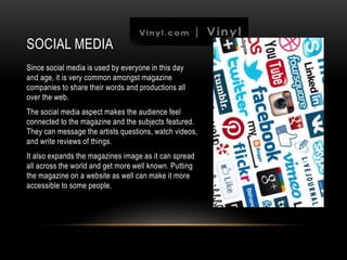
TARGET AUDIENCE REVIEW
COLOUR SCHEME
My magazine idea was to be gender neutral, therefore
the colour scheme was very important as I wanted a
more mature aspect to the audience as well so I
couldn’t have it looking childish and really pink or
anything. To resolve this, I made my magazine quite
minimal in colours, using tones of white and black, and
just had the model in colour for the front page.
I have went for a more basic colour scheme mainly
having black or white colours, with splashes of actual
colour here and there. I didn’t really need bold in your
face colours on the pages as my audience are
interested in that kind of thing, they would pick up and
read the magazine with out the fluff and pretty colours.
The use of this colour scheme let me have quite a free
range through out the magazine. However I did come
across the problem of having no colour on my double
page spread, as any I tried to add pulled focus from the
black and white look.
LANGUAGE/TONE
Since my audience are a more mature, I can
use effective types of language like humour
and sarcasm.
This means they can appreciate personality in
text, although a lot of it will still be more
informative than purely entertainment.
I feel like I don’t need a lot of alterations,
puns, and catchy phrases to draw the reader
in. This is also why I don’t feel I need the text
to jump out so much, with colour and sizing,
as my audience will be reading the magazine
on their own without it needing to be in their
face.
SOCIAL MEDIA
Since social media is used by everyone in this day
and age, it is very common amongst magazine
companies to share their words and productions all
over the web.
The social media aspect makes the audience feel
connected to the magazine and the subjects featured.
They can message the artists questions, watch videos,
and write reviews of things.
It also expands the magazines image as it can spread
all across the world and get more well known. Putting
the magazine on a website as well can make it more
accessible to some people.
FRONT COVER
The front page is the most important way to attract the
audience and get them to pick it up off the shelf. I chose
a close up of my model to really dominate the page,
with direct lighting to show off her face. I picked red for
her to wear so it was eye catching and stood out from
the rest of the page, I also edited her pupils bigger in
photoshop as I read an article that people are more
drawn in when the pupils are dilated.
The masthead was chosen to show the audience the
genre of the magazine, its black and white to show a bit
of elegance, but the font is quite loud to show there is a
lot going on inside.

Media evaluationq5.

  • 1.
  • 2.
    COLOUR SCHEME My magazineidea was to be gender neutral, therefore the colour scheme was very important as I wanted a more mature aspect to the audience as well so I couldn’t have it looking childish and really pink or anything. To resolve this, I made my magazine quite minimal in colours, using tones of white and black, and just had the model in colour for the front page. I have went for a more basic colour scheme mainly having black or white colours, with splashes of actual colour here and there. I didn’t really need bold in your face colours on the pages as my audience are interested in that kind of thing, they would pick up and read the magazine with out the fluff and pretty colours. The use of this colour scheme let me have quite a free range through out the magazine. However I did come across the problem of having no colour on my double page spread, as any I tried to add pulled focus from the black and white look.
  • 3.
    LANGUAGE/TONE Since my audienceare a more mature, I can use effective types of language like humour and sarcasm. This means they can appreciate personality in text, although a lot of it will still be more informative than purely entertainment. I feel like I don’t need a lot of alterations, puns, and catchy phrases to draw the reader in. This is also why I don’t feel I need the text to jump out so much, with colour and sizing, as my audience will be reading the magazine on their own without it needing to be in their face.
  • 4.
    SOCIAL MEDIA Since socialmedia is used by everyone in this day and age, it is very common amongst magazine companies to share their words and productions all over the web. The social media aspect makes the audience feel connected to the magazine and the subjects featured. They can message the artists questions, watch videos, and write reviews of things. It also expands the magazines image as it can spread all across the world and get more well known. Putting the magazine on a website as well can make it more accessible to some people.
  • 5.
    FRONT COVER The frontpage is the most important way to attract the audience and get them to pick it up off the shelf. I chose a close up of my model to really dominate the page, with direct lighting to show off her face. I picked red for her to wear so it was eye catching and stood out from the rest of the page, I also edited her pupils bigger in photoshop as I read an article that people are more drawn in when the pupils are dilated. The masthead was chosen to show the audience the genre of the magazine, its black and white to show a bit of elegance, but the font is quite loud to show there is a lot going on inside.