This document provides an overview of Material Design for Android, including:
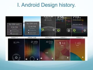
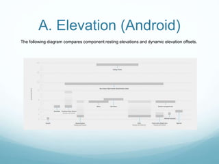
1. A brief history of Android design and an introduction to Material Design principles like material properties, elevation and shadows.
2. Details on key Material Design layout concepts such as density-independent pixels, baseline grids, spacing guidelines and touch target sizing.
3. How to implement Material Design in Android apps using the Material Theme, animation APIs and support libraries to ensure compatibility on pre-Lollipop devices.
4. Recommendations for third-party libraries that can help bring Material Design elements to older Android versions.