Downloaded 216 times


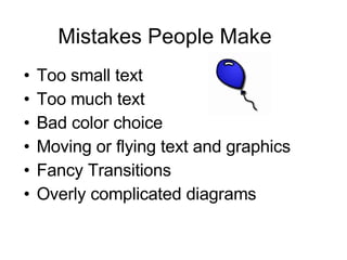
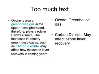
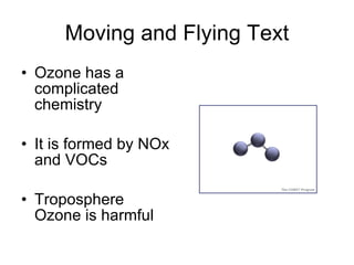


This document provides tips for improving PowerPoint presentations by avoiding common mistakes. It discusses formatting mistakes like using small text, including too much text on slides, and using bad color choices. Content mistakes discussed are poor preparation and lack of balance between text, graphics, and other elements. The document offers tips to address these issues, such as keeping backgrounds consistent, using dark text on light backgrounds, limiting fancy transitions and animations, and maintaining a good balance of text and graphics. Presenters are advised to keep information concise and meaningful, and to start with an outline slide and end with a summary.


