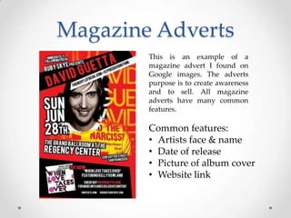
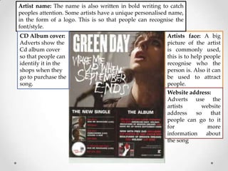
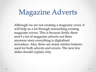
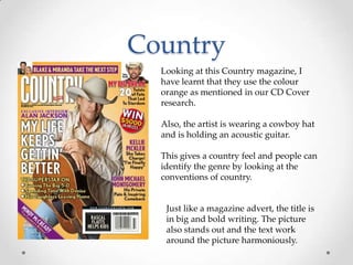
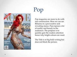
Magazine Adverts
& Covers
By Kamrul
Magazine Adverts
This is an example of a
magazine advert I found on
Google images. The adverts
purpose is to create awareness
and to sell. All magazine
adverts have many common
features.

Common features:
• Artists face & name
• Date of release
• Picture of album cover
• Website link
Artist name: The name is also written in bold writing to catch
peoples attention. Some artists have a unique personalised name,
in the form of a logo. This is so that people can recognise the
font/style.
CD Album cover:
Adverts show the
Cd album cover
so that people can
identify it in the
shops when they
go to purchase the
song.

Artists face: A big
picture of the artist
is commonly used,
this is to help people
recognise who the
person is. Also it can
be used to attract
people.
Website address:
Adverts use the
artists
website
address
so
that
people can go to it
for
more
information
about
the song
Magazine Adverts
Although we are not creating a magazine cover, it
will help us a lot through researching existing
magazine covers. This is because firstly there
aren’t a lot of magazine adverts out there
anymore since everything is digitalised
nowadays. Also, there are many similar features
used for both adverts and covers. The next few
slides should explain why.
Country
Looking at this Country magazine, I
have learnt that they use the colour
orange as mentioned in our CD Cover
research.
Also, the artist is wearing a cowboy hat
and is holding an acoustic guitar.
This gives a country feel and people can
identify the genre by looking at the
conventions of country.

Just like a magazine advert, the title is
in big and bold writing. The picture
also stands out and the text work
around the picture harmoniously.
Pop
Pop magazine are more to do with
star construction. Here we can see
Rihanna in a provocative and
revealing stance, Pop exposes a lot
of nudity and beauty to the
audiences. The purpose is to
quickly gain the readers attention
hence why bright colours are used.
The Title is in big bold writing but
does not block the picture.

Magz adverts&covers

  • 1.
  • 2.
    Magazine Adverts This isan example of a magazine advert I found on Google images. The adverts purpose is to create awareness and to sell. All magazine adverts have many common features. Common features: • Artists face & name • Date of release • Picture of album cover • Website link
  • 3.
    Artist name: Thename is also written in bold writing to catch peoples attention. Some artists have a unique personalised name, in the form of a logo. This is so that people can recognise the font/style. CD Album cover: Adverts show the Cd album cover so that people can identify it in the shops when they go to purchase the song. Artists face: A big picture of the artist is commonly used, this is to help people recognise who the person is. Also it can be used to attract people. Website address: Adverts use the artists website address so that people can go to it for more information about the song
  • 4.
    Magazine Adverts Although weare not creating a magazine cover, it will help us a lot through researching existing magazine covers. This is because firstly there aren’t a lot of magazine adverts out there anymore since everything is digitalised nowadays. Also, there are many similar features used for both adverts and covers. The next few slides should explain why.
  • 5.
    Country Looking at thisCountry magazine, I have learnt that they use the colour orange as mentioned in our CD Cover research. Also, the artist is wearing a cowboy hat and is holding an acoustic guitar. This gives a country feel and people can identify the genre by looking at the conventions of country. Just like a magazine advert, the title is in big and bold writing. The picture also stands out and the text work around the picture harmoniously.
  • 6.
    Pop Pop magazine aremore to do with star construction. Here we can see Rihanna in a provocative and revealing stance, Pop exposes a lot of nudity and beauty to the audiences. The purpose is to quickly gain the readers attention hence why bright colours are used. The Title is in big bold writing but does not block the picture.