1. ContentsPage
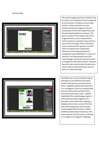
The contentspage layoutnevertooktoolong
to create,since Ihad planof howit wasgoing
to be structured.The layoutisverysimple,
and thisiswhat I wantedsince most
professionalcontentspagesare notover
complicated.All the textisBebasNeueand
thiswas downloadedfromawebsite.The
greenisusedas it’sthe staple colourof my
magazine Rizma,andso isblackwhichis
mainlyusedasmy secondarycolourwhichis
seenonthe front page.There isbarelyany
colourvariationwhichisgood;as we don’t
wantit to looktoo overcomplicated
otherwise itwon’tlookprofessional.I
enlargedthe word‘CONTENTS’asI wantit to
standout, and make people knowitthe
contentspage;likewise tofeaturesthe word
isenlargedtoshowswhatis below.The green
box at the topis usedtomake the date more
easilyvisible,aswithoutthe greenbox the
date isn’treallynoticeable
The difference isverynoticeableinlayout.
Althoughitisverydifferent,the staple
themesof the previousversionsare still
there.Iaddedtwo photosof to showwho
isin mymagazine.Since Iam representing
themas famousartists,people will be
interestedtopurchase acopy. I addeda
mastheadtothe contentspage,togive it
some identitytowhat magazine itis.I
have givensome of the textsa lightgrey
backgroundto create a contrast fromthe
plainwhite background;otherwisethe
contentspage will be tooplain.Iadded
headlines/statementstocreate buzz.The
colourscheme isstill the same,asI believe
it isa staple of my magazine’sideology.
2. I changedthe photosusedinthe
contentspage,as one wasued
alreadyandthe otherpicture
was of poor quality.However
bothphotosare still locatedin
the last editsplace.Iaddeda
Date Line tothe magazine sothe
space that as justblankhas
somethingonit;otherwise the
magazine looksdepletedand
uninteresting.