Call Girls Vastrapur 7397865700 Ridhima Hire Me Full Night
Magazine Film Poster Design Analysis
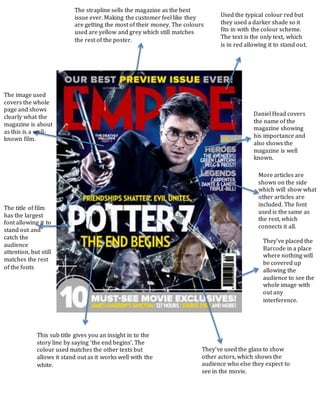
1. They’ve placed the
Barcode in a place
where nothing will
be covered up
allowing the
audience to see the
whole image with
out any
interference.
Used the typical colour red but
they used a darker shade so it
fits in with the colour scheme.
The text is the only text, which
is in red allowing it to stand out.
Daniel Head covers
the name of the
magazine showing
his importance and
also shows the
magazine is well
known.
This sub title gives you an insight in to the
story line by saying ‘the end begins’. The
colour used matches the other texts but
allows it stand out as it works well with the
white.
The title of film
has the largest
font allowing it to
stand out and
catch the
audience
attention, but still
matches the rest
of the fonts
The image used
covers the whole
page and shows
clearly what the
magazine is about
as this is a well-
known film.
They’ve used the glass to show
other actors, which shows the
audience who else they expect to
see in the movie.
The strapline sells the magazine as the best
issue ever. Making the customer feel like they
are getting the most of their money. The colours
used are yellow and grey which still matches
the rest of the poster.
More articles are
shown on the side
which will show what
other articles are
included. The font
used is the same as
the rest, which
connects it all.