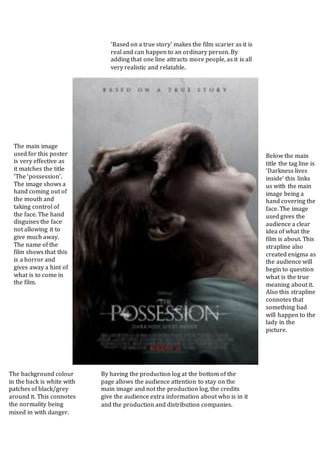
1. The main image
used for this poster
is very effective as
it matches the title
‘The ‘possession’.
The image shows a
hand coming out of
the mouth and
taking control of
the face. The hand
disguises the face
not allowing it to
give much away.
The name of the
film shows that this
is a horror and
gives away a hint of
what is to come in
the film.
By having the production log at the bottom of the
page allows the audience attention to stay on the
main image and not the production log, the credits
give the audience extra information about who is in it
and the production and distribution companies.
Below the main
title the tag line is
‘Darkness lives
inside’ this links
us with the main
image being a
hand covering the
face. The image
used gives the
audience a clear
idea of what the
film is about. This
strapline also
created enigma as
the audience will
begin to question
what is the true
meaning about it.
Also this strapline
connotes that
something bad
will happen to the
lady in the
picture.
‘Based on a true story’ makes the film scarier as it is
real and can happen to an ordinary person. By
adding that one line attracts more people, as it is all
very realistic and relatable.
The background colour
in the back is white with
patches of black/grey
around it. This connotes
the normality being
mixed in with danger.