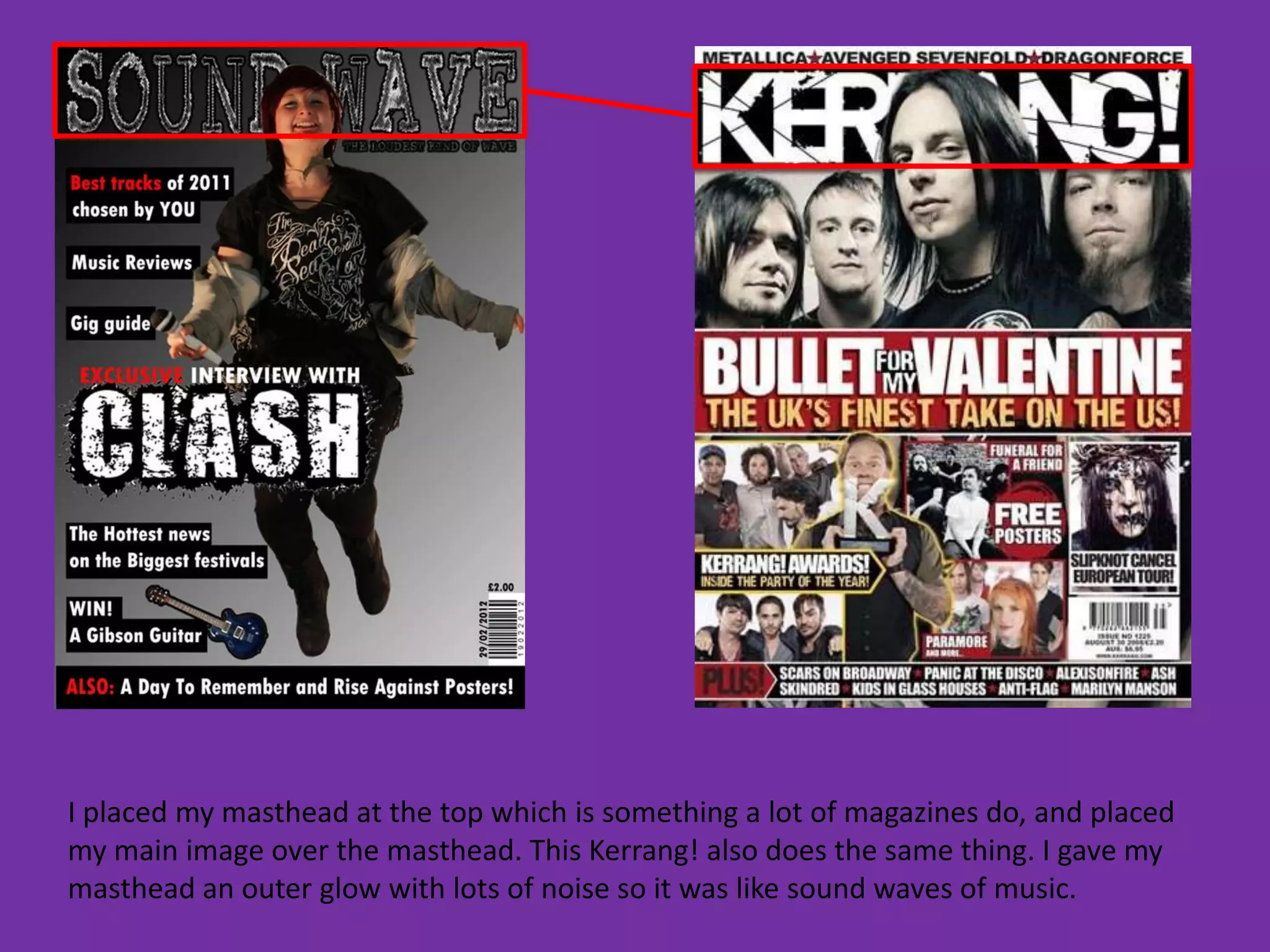
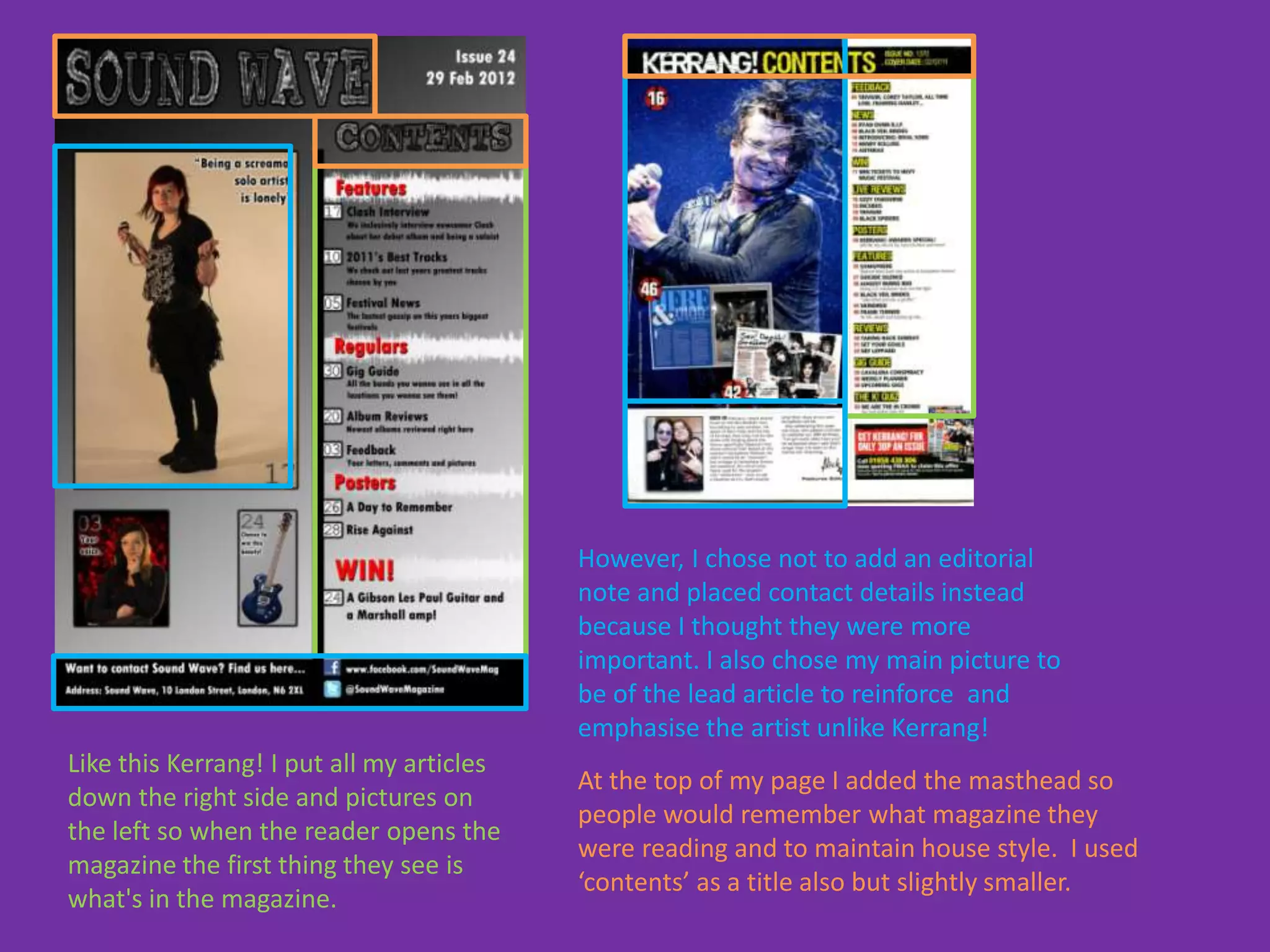
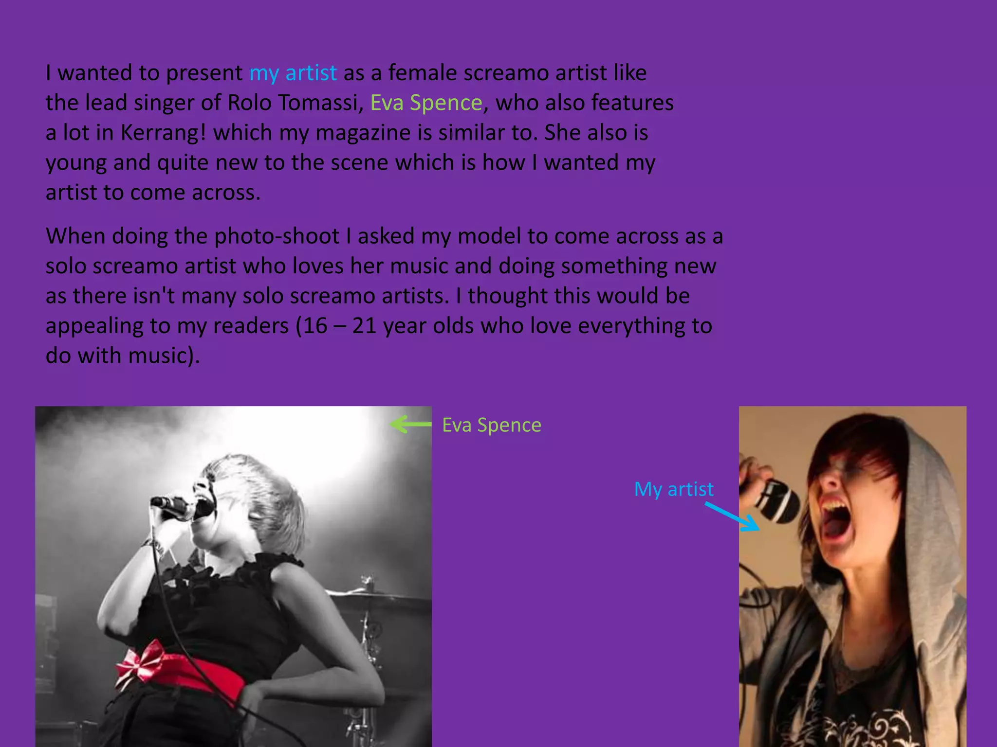
1. In what ways does your
magazine use, develop or
challenge forms and conventions
of real media products?
I placed my lead article on the left third, over the main image. This Kerrang! Cover with
Slipknot does the same. I also included a tagline to draw people to the article, similarly
to Kerrang!.
I placed my masthead at the top which is something a lot of magazines do, and placed
my main image over the masthead. This Kerrang! also does the same thing. I gave my
masthead an outer glow with lots of noise so it was like sound waves of music.
My cover lines are placed on the left-third so that the reader would be able to see them on
the shelf before picking up the magazine. Most magazines do the same, like this Kerrang!
Unlike this Kerrang! though, I placed cover lines above and underneath my lead article.
This was because if my lead article was any higher it would cover the face of the main
image.
I added a banner at the bottom and put ‘Free posters’ in there, like this Kerrang!
does, because they aren’t a big enough thing to be a cover line but are still something
that attracts readers to magazines, for example I used to base whether I bought a
magazine or not on its posters. The majority of my readers were also Kerrang! Readers
therefore I thought I should add some similar detail.
However, I chose not to add an editorial
                                           note and placed contact details instead
                                           because I thought they were more
                                           important. I also chose my main picture to
                                           be of the lead article to reinforce and
                                           emphasise the artist unlike Kerrang!
Like this Kerrang! I put all my articles
                                           At the top of my page I added the masthead so
down the right side and pictures on
                                           people would remember what magazine they
the left so when the reader opens the
                                           were reading and to maintain house style. I used
magazine the first thing they see is
                                           ‘contents’ as a title also but slightly smaller.
what's in the magazine.
Similarly to this Kerrang! I placed my main
image on the left however Kerrang!’s goes all
the way across both pages where as mine
doesn’t. I chose to design my layout like this
because it fits in better and it didn’t need to
leak across so the reader can focus on the
text. Also Kerrang!’s image doesn’t matter that
it does because the image under the text
doesn’t matter, the main picture you’re
focusing on is still on the left.
Also like this Kerrang! I placed my pull-quote in
the text so the attention is drawn towards the
interview not the image. The only difference is
Kerrang! placed there's right in the middle of the
text so the text goes around it, where as I placed
mine in a box so the reader would be more drawn
to it and want to find that quote in the interview.
Unlike this Kerrang! I placed my stand first as
part if the text. This was to direct the reader
to the interview and encourage them to read
on. I also chose not to use a drop cap in mine
like Kerrang!
2. How does your magazine
represent particular social groups?
I wanted to present my artist as a female screamo artist like
the lead singer of Rolo Tomassi, Eva Spence, who also features
a lot in Kerrang! which my magazine is similar to. She also is
young and quite new to the scene which is how I wanted my
artist to come across.
When doing the photo-shoot I asked my model to come across as a
solo screamo artist who loves her music and doing something new
as there isn't many solo screamo artists. I thought this would be
appealing to my readers (16 – 21 year olds who love everything to
do with music).

                                       Eva Spence

                                                         My artist
My photos effectively portray my artist as a
solo, screamo singer by her being alone on
the contents and her screaming into a mic on
the DPS which is how I wanted her to come
across. She is dressed in clothes that would be
associated with the rock/metal genre.
My pull-quotes reinforce the artists
representation by saying “its lonely” which
enhances the fact she’s a solo artist. Also my
pull-quote on my DPS draws the reader in as it
suggests the artist used to be completely
different.
3. What kind of media
institution might distribute
your magazine and why?
Magazine evaluation

Magazine evaluation

  • 2.
    1. In whatways does your magazine use, develop or challenge forms and conventions of real media products?
  • 4.
    I placed mylead article on the left third, over the main image. This Kerrang! Cover with Slipknot does the same. I also included a tagline to draw people to the article, similarly to Kerrang!.
  • 5.
    I placed mymasthead at the top which is something a lot of magazines do, and placed my main image over the masthead. This Kerrang! also does the same thing. I gave my masthead an outer glow with lots of noise so it was like sound waves of music.
  • 6.
    My cover linesare placed on the left-third so that the reader would be able to see them on the shelf before picking up the magazine. Most magazines do the same, like this Kerrang! Unlike this Kerrang! though, I placed cover lines above and underneath my lead article. This was because if my lead article was any higher it would cover the face of the main image.
  • 7.
    I added abanner at the bottom and put ‘Free posters’ in there, like this Kerrang! does, because they aren’t a big enough thing to be a cover line but are still something that attracts readers to magazines, for example I used to base whether I bought a magazine or not on its posters. The majority of my readers were also Kerrang! Readers therefore I thought I should add some similar detail.
  • 8.
    However, I chosenot to add an editorial note and placed contact details instead because I thought they were more important. I also chose my main picture to be of the lead article to reinforce and emphasise the artist unlike Kerrang! Like this Kerrang! I put all my articles At the top of my page I added the masthead so down the right side and pictures on people would remember what magazine they the left so when the reader opens the were reading and to maintain house style. I used magazine the first thing they see is ‘contents’ as a title also but slightly smaller. what's in the magazine.
  • 9.
    Similarly to thisKerrang! I placed my main image on the left however Kerrang!’s goes all the way across both pages where as mine doesn’t. I chose to design my layout like this because it fits in better and it didn’t need to leak across so the reader can focus on the text. Also Kerrang!’s image doesn’t matter that it does because the image under the text doesn’t matter, the main picture you’re focusing on is still on the left. Also like this Kerrang! I placed my pull-quote in the text so the attention is drawn towards the interview not the image. The only difference is Kerrang! placed there's right in the middle of the text so the text goes around it, where as I placed mine in a box so the reader would be more drawn to it and want to find that quote in the interview. Unlike this Kerrang! I placed my stand first as part if the text. This was to direct the reader to the interview and encourage them to read on. I also chose not to use a drop cap in mine like Kerrang!
  • 10.
    2. How doesyour magazine represent particular social groups?
  • 11.
    I wanted topresent my artist as a female screamo artist like the lead singer of Rolo Tomassi, Eva Spence, who also features a lot in Kerrang! which my magazine is similar to. She also is young and quite new to the scene which is how I wanted my artist to come across. When doing the photo-shoot I asked my model to come across as a solo screamo artist who loves her music and doing something new as there isn't many solo screamo artists. I thought this would be appealing to my readers (16 – 21 year olds who love everything to do with music). Eva Spence My artist
  • 12.
    My photos effectivelyportray my artist as a solo, screamo singer by her being alone on the contents and her screaming into a mic on the DPS which is how I wanted her to come across. She is dressed in clothes that would be associated with the rock/metal genre. My pull-quotes reinforce the artists representation by saying “its lonely” which enhances the fact she’s a solo artist. Also my pull-quote on my DPS draws the reader in as it suggests the artist used to be completely different.
  • 13.
    3. What kindof media institution might distribute your magazine and why?