
Recommended
More Related Content
What's hot
What's hot (18)
Similar to Evaluation question 1
Similar to Evaluation question 1 (20)
Recently uploaded
Recently uploaded (20)
Evaluation question 1
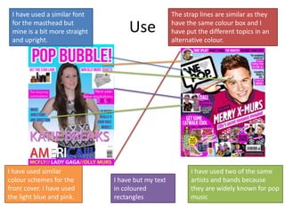
- 1. Use I have used a similar font for the masthead but mine is a bit more straight and upright. The strap lines are similar as they have the same colour box and I have put the different topics in an alternative colour. I have used similar colour schemes for the front cover. I have used the light blue and pink. I have used two of the same artists and bands because they are widely known for pop music I have but my text in coloured rectangles
- 2. Use I used the masthead on the contents page so that people can distinguish that it is from the same magazine. I have used a blue square in the background the same as the one in we heart pop. I have added an editors note to inform the readers what was is in the magazine. On my contents there is a main image which is the biggest image which will draw the attention for the story.
- 3. Use I used a larger image and then a smaller image on the other side the same the we heart pop magazine. I put my text into more than one column. I have took quotes from the text and put them in a bigger font to make them stand out. The text for the mast head is similar as it is all capital letters
- 4. Develop I used a subheading offering advice but it is offering different advice I put the strap lines in different places on the magazine I still have a main image like the front cover of we heart pop but mine is a smaller image I used subheadings but I did not put boxes around the subheadings.
- 5. Develop Both have stated how often they are published but mine is weekly and theirs is monthly Both feature an editors note but mine has a photo of the editor and mine is in a box where as theirs is blended in with the background. Both have main images but mine is cut out rather than in a box like theirs I have put my contents page in a long rectangle and opaque box where as the we heart pop magazine is just a little box at the bottom.
- 6. Develop The model has been dressed in different clothes on theirs where as my model is in the same outfit The masthead is just on the background but on we heart pop their masthead is in a banner. I referred to the subject as “she” whereas they actually put some of the subjects name in the masthead embedded into a word play. They have put a pull out quote into a speech bubble whereas I have just pulled mine out.
- 7. Challenge I have challenged where they put their masthead. I put mine to be the first thing they see. I have also challenged where to put a product placement. I have put mine as the second that they will look at. My main headline starts from the left which is where people naturally start reading from. It is also straight which may show that it is aimed at a younger audience. I have challenged putting lots of photos on the front of my magazine. The one on the right has lots all clumped together.
- 8. Challenge I challenged having all of my photos with a background in. I have put a mixture of cut outs and images with a background. I have put the contents list into two different sections. I have split it into the content which will be in every week and content which will only be in the one edition I have used a different way of introducing the contents page. I have also put the leading statement into a box unlike the one on the right. I have used an image of myself (the editor) under the editors not whereas the we heart pop hasn’t. This will help create more of a personal relationship with the reader
- 9. Challenge I have put my page numbers in as my audience is young so would help them whereas we heart pop haven’t put any page numbers to help. In the we heart pop magazine they use a leading sentence but i have just opened my story with a paragraph because if they were reading it they would probably already know what the story is about because it is aimed at the subjects fans. I challenged leaving a bit of white space so it didn’t look over crowded but on the other magazine it is filled with a photo. I also challenged making my story longer than the we heart pop magazine, so that the reader can get more information but without it being too long.