
Recommended
More Related Content
Similar to Magazine cover analysis
Similar to Magazine cover analysis (20)
More from JoshTaylorASMedia
Recently uploaded
Recently uploaded (20)
Magazine cover analysis
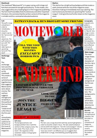
- 1. Masthead: The masthead“Movieworld”isinuppercasing,withalarge red fontthat connotedof strengthandauthority.To the reader,this may suggesttheyare a leadingfigure infilmmagazinespublishing. The font itself resemblesthatof a dictionary andotherimportant literature,thisconnotesthatthe writtencontentof the magazine isreliable andfora somewhateducatedaudience Skyline: The skyline hasa brightyellow backgroundthatcreatesa stark contrastwiththe restof the magazine cover, therefore makingitimmediatelymore eye catching.The texthumorouslymentionsanupcomingfilm“Justice League”, linkingtothe textfurtherdownonthe magazine cover Puff: The puff is large and yellow in order to immediately draw the viewer’s eye to the “exclusivity” that it advertises.The puff contains a pun with “fill the void” referring to an upcoming horror fil “The Void” Anchorage Text: The anchorage textusesthe same red font as the masthead. Thiscreate a sense of symmetryand togetherness that suggests Movie world cares about cinema.The redfont suggests strengthand reliabilityin the qualityof theirwriting the text “Undermind” isthe title of the filmand so immediately directsthe audience to the focusof thisissue of Movieworld magazine. Text: The text uses a large,black font with key words highlighted in order to drawthe viewer’s focus. The text advertisefeature articles within themagazine. “Join the JusticeLeague” links to the skylineand is reference to a big upcoming blockbuster. “Lose your mind” is an effective pun as itsuggests that Undermind is a huge, mind-bending, psychological film. Iconography: A graphic of a globe is depicted in placeof the ‘O’ in “World”, this image is iconic of the world as is easily identifiable. Consequently the masthead is quite effective in its use of iconography. Main Image: The main image shows the main character of the film.He is positioned away from the viewer, witha knife in hand.This suggeststhat the action and genre of the filmare more important than the ac tors. The backgroundis blurred, however, whichdoes draw more attentionto the actor. Barcode: Although, not as importantof a feature, the barcodeis a typical convention of magazine covers and is usually positioned in the bottom right. Sell Lines: The background had a red background that links in with the red font of the company name. The text states “Plus much, much more”, the vagueness of the statement makes itintriguingfor the viewer.