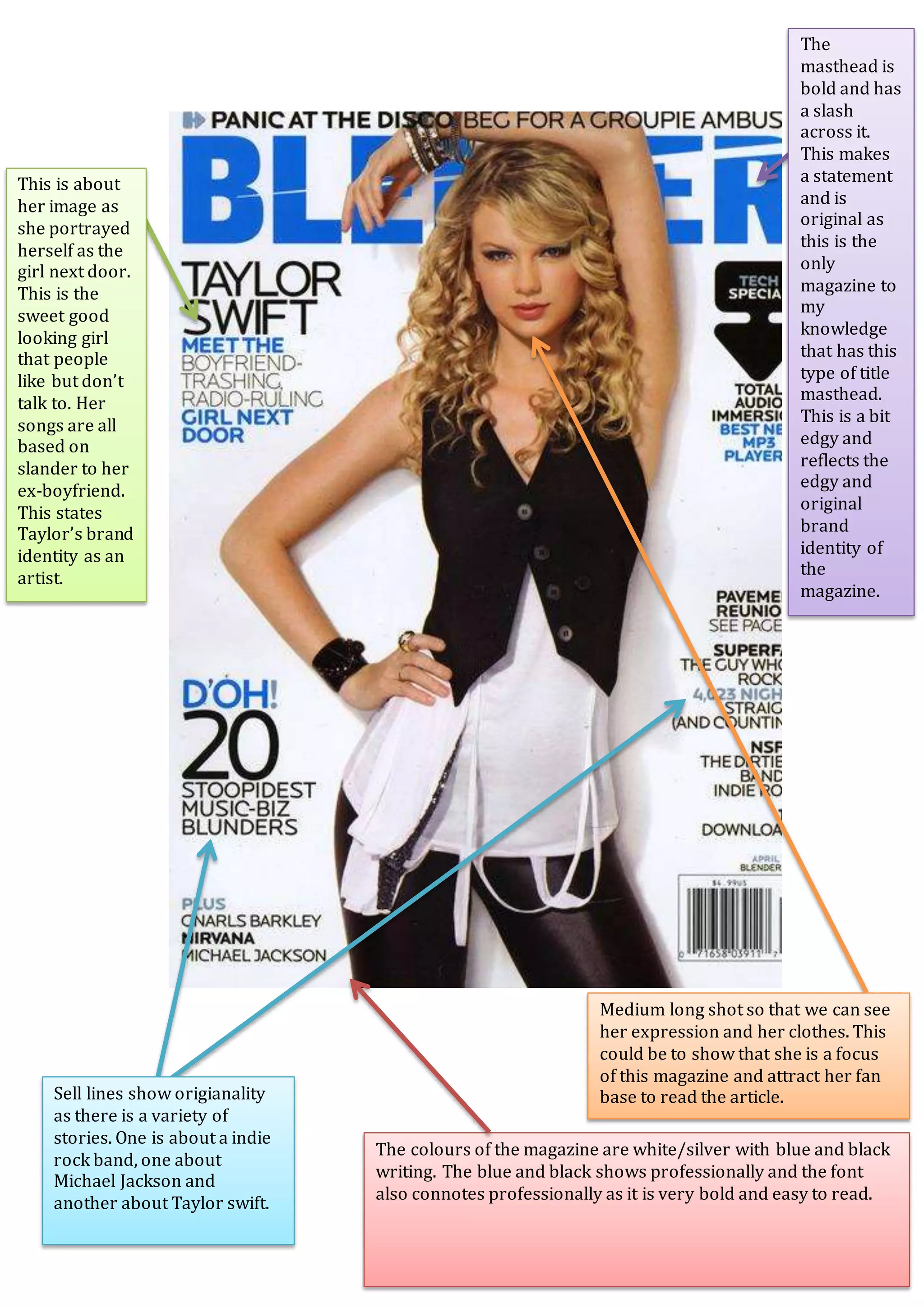
The document discusses different elements of magazine design and branding, including cover stories on a indie rock band, Michael Jackson, and Taylor Swift. It notes the bold masthead features a slash, making a unique and edgy statement reflective of the magazine's brand identity. An article on Taylor Swift discusses her image as the girl next door and how her songs are based on past relationships, representing her artistic brand. Photography of her in the magazine aims to attract fans by showing her expression and outfit from a medium distance. The color scheme and bold, easy-to-read font convey professionalism.


![Music Mag Mood Board =]](https://cdn.slidesharecdn.com/ss_thumbnails/musicmagmoodboard-091119153226-phpapp02-thumbnail.jpg?width=640&height=640&fit=bounds)

![Coveranalysis[1]](https://cdn.slidesharecdn.com/ss_thumbnails/coveranalysis1-130207060729-phpapp02-thumbnail.jpg?width=640&height=640&fit=bounds)


