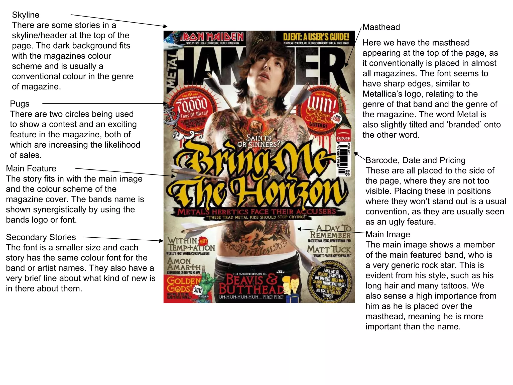
Skyline There are some stories in a skyline/header at the top of the page. The dark background fits with the magazines colour scheme and is usually a conventional colour in the genre of magazine. Pugs There are two circles being used to show a contest and an exciting feature in the magazine, both of which are increasing the likelihood of sales. Main Feature The story fits in with the main image and the colour scheme of the magazine cover. The bands name is shown synergistically by using the bands logo or font. Secondary Stories The font is a smaller size and each story has the same colour font for the band or artist names. They also have a very brief line about what kind of new is in there about them. Masthead Here we have the masthead appearing at the top of the page, as it conventionally is placed in almost all magazines. The font seems to have sharp edges, similar to Metallica ’s logo, relating to the genre of that band and the genre of the magazine. The word Metal is also slightly tilted and ‘branded’ onto the other word. Barcode, Date and Pricing These are all placed to the side of the page, where they are not too visible. Placing these in positions where they won ’t stand out is a usual convention, as they are usually seen as an ugly feature. Main Image The main image shows a member of the main featured band, who is a very generic rock star. This is evident from his style, such as his long hair and many tattoos. We also sense a high importance from him as he is placed over the masthead, meaning he is more important than the name.
Pug The top corner of the magazine features a pug, which informs the customer that this magazine includes a  ‘special report’. This promise of exclusive news will make fans of this type of genre be drawn to the magazine. Not only does this feature advertise the magazine, it fits in with the colour scheme. Main Feature The main feature here relates again to the main image, along with explaining why he looks frustrated. The text mentions the genre (R&B) and also mentions his race, both of which may relate to the target audience of this magazine. Secondary Stories These all appear around the main image, which seems to rank their importance, not as highly as the special main feature. These also fit in with the house style of the magazine by keeping the colour scheme. Barcode, website and Date These all appear again in the corner. Despite being important for the purchase, they are deemed an  ‘ugly’ feature which tends to get in the way of the overall look of the magazine. Masthead The masthead conventionally is placed at the top of the cover. This is a plain colour and a bold font, which may relate to the genre of the magazine, in that the font seems similar to fonts on R&B album covers. Main Image There is one image on the whole cover, which is a medium close up of R.Kelly, who is the main focus of this issue of Vibe. His t-shirt fits with the colour scheme of the magazine. He is also well known in this genre, so no other pictures are needed to sell the magazine. He also appears over the top of the masthead, emphasizing his importance. Buzz Words are used in this tab in the corner, mainly the word  ‘sickest’. This makes it sound like the featured motorcycles will be the best ones that can be seen. This is a unique selling line that will make motorcycle fans have an increased interest in purchasing this magazine.
Skyline There is a skyline that also uses the sell line, these both increase the likelihood of sales. A good selling point is the free CD as it would be cheaper than buying a cd on its own. Main Image The image shows the band that feature in the main feature. The style of the band relates to the genre of the magazine as the men are wearing dark clothes and have long and messy hair. Pug There is a pug here which is being used to promote the  ‘special’ poster of a band. This will target fans of the band into buying the magazine especially for this poster. It is not a conventional pug as instead of looking like a sticker that has been stuck on, it uses a 3 dimension effect to make it look as if the man is jumping out of the magazine. Masthead This is a bold and plain title, it says Rock Sound, which is the simplest way of showing which genre this magazine features. The text is simple to read and very to the point, rather than in an established magazine the title does need to be mainly visible to catch the viewers eye. Main Feature Here the main story is synergetic with the main image as it uses the logo that the band use on their album covers. The story obviously links with the main image and will have a target audience of fans of My Chemical Romance. The barcode appears in the bottom right corner, as seen in previous analysis ’, it is an ugly feature that is usually placed at the bottom or far to the side. These features are still important for the sale and to make the cover look conventional. Secondary Stories These stories are not as important as the main feature, which means that they appear at a smaller size than the main story. The colour scheme fits with the whole cover with the green and white house style. The font is also that of the magazine as opposed to being the bands logos, which again shows that the news is of minor importance.
Masthead This feature uses the usual font that appears in all issues of vogue, which is a noticeable and high profile magazine. The red colour is very visible from the plain white background and can also be used to represent either love or passion, which is a popular theme with these mainly female related magazine. The serif font also looks mature and formal, which are features of the target audience. Main Image This links to two parts of the cover, the main story and the secondary story. One of them is about her while the other is a sell line story which promises advice to obtain a  ‘classic look’. The image can relate to Laura Mulvey who created the Male Gaze theory that men always want to look at women in movies as an item of sexual attraction. Women also want to look like this and they would be likely to buy this magazine as they think it would help them look similar to this. The face seems airbrushed and stands out from the plain background and the lightly coloured clothes. Cover Story This story links in to the main image, but is a smaller font as the larger story is more likely to pull in the target audience, who are searching for  ‘fashion tips’ etc. The red writing is bold, and the text above also relates to the previous things that Kristen Stewart has appeared in. This will also draw in fans of ‘Twilight’ and Kristen Stewart. Main Feature This is the largest text that relates to a story featured inside the magazine. This story is the one that the editors seem to think is most likely to draw in a large part of the target audience, as it is what the audience wants. The red writing again fits in with the general house style and may be used to represent passion, another popular emotion among the female audience. The barcode appears very small here, as it is almost hidden from the rest of the magazine. It is very conventional to try to almost hide the barcode and website etc. Secondary Stories The importance of these stories is very minor, as some are even the same colour as the background, just in a different shade. The text also looks a lot less formal, as a sans serif font is being used. The writing is still bold so that it doesn ’t completely blend in with the background, as the stories still have some importance, and are likely to appeal to a few people in the target audience.

Analysis of Front Covers

  • 1.
    Skyline There aresome stories in a skyline/header at the top of the page. The dark background fits with the magazines colour scheme and is usually a conventional colour in the genre of magazine. Pugs There are two circles being used to show a contest and an exciting feature in the magazine, both of which are increasing the likelihood of sales. Main Feature The story fits in with the main image and the colour scheme of the magazine cover. The bands name is shown synergistically by using the bands logo or font. Secondary Stories The font is a smaller size and each story has the same colour font for the band or artist names. They also have a very brief line about what kind of new is in there about them. Masthead Here we have the masthead appearing at the top of the page, as it conventionally is placed in almost all magazines. The font seems to have sharp edges, similar to Metallica ’s logo, relating to the genre of that band and the genre of the magazine. The word Metal is also slightly tilted and ‘branded’ onto the other word. Barcode, Date and Pricing These are all placed to the side of the page, where they are not too visible. Placing these in positions where they won ’t stand out is a usual convention, as they are usually seen as an ugly feature. Main Image The main image shows a member of the main featured band, who is a very generic rock star. This is evident from his style, such as his long hair and many tattoos. We also sense a high importance from him as he is placed over the masthead, meaning he is more important than the name.
  • 2.
    Pug The topcorner of the magazine features a pug, which informs the customer that this magazine includes a ‘special report’. This promise of exclusive news will make fans of this type of genre be drawn to the magazine. Not only does this feature advertise the magazine, it fits in with the colour scheme. Main Feature The main feature here relates again to the main image, along with explaining why he looks frustrated. The text mentions the genre (R&B) and also mentions his race, both of which may relate to the target audience of this magazine. Secondary Stories These all appear around the main image, which seems to rank their importance, not as highly as the special main feature. These also fit in with the house style of the magazine by keeping the colour scheme. Barcode, website and Date These all appear again in the corner. Despite being important for the purchase, they are deemed an ‘ugly’ feature which tends to get in the way of the overall look of the magazine. Masthead The masthead conventionally is placed at the top of the cover. This is a plain colour and a bold font, which may relate to the genre of the magazine, in that the font seems similar to fonts on R&B album covers. Main Image There is one image on the whole cover, which is a medium close up of R.Kelly, who is the main focus of this issue of Vibe. His t-shirt fits with the colour scheme of the magazine. He is also well known in this genre, so no other pictures are needed to sell the magazine. He also appears over the top of the masthead, emphasizing his importance. Buzz Words are used in this tab in the corner, mainly the word ‘sickest’. This makes it sound like the featured motorcycles will be the best ones that can be seen. This is a unique selling line that will make motorcycle fans have an increased interest in purchasing this magazine.
  • 3.
    Skyline There isa skyline that also uses the sell line, these both increase the likelihood of sales. A good selling point is the free CD as it would be cheaper than buying a cd on its own. Main Image The image shows the band that feature in the main feature. The style of the band relates to the genre of the magazine as the men are wearing dark clothes and have long and messy hair. Pug There is a pug here which is being used to promote the ‘special’ poster of a band. This will target fans of the band into buying the magazine especially for this poster. It is not a conventional pug as instead of looking like a sticker that has been stuck on, it uses a 3 dimension effect to make it look as if the man is jumping out of the magazine. Masthead This is a bold and plain title, it says Rock Sound, which is the simplest way of showing which genre this magazine features. The text is simple to read and very to the point, rather than in an established magazine the title does need to be mainly visible to catch the viewers eye. Main Feature Here the main story is synergetic with the main image as it uses the logo that the band use on their album covers. The story obviously links with the main image and will have a target audience of fans of My Chemical Romance. The barcode appears in the bottom right corner, as seen in previous analysis ’, it is an ugly feature that is usually placed at the bottom or far to the side. These features are still important for the sale and to make the cover look conventional. Secondary Stories These stories are not as important as the main feature, which means that they appear at a smaller size than the main story. The colour scheme fits with the whole cover with the green and white house style. The font is also that of the magazine as opposed to being the bands logos, which again shows that the news is of minor importance.
  • 4.
    Masthead This featureuses the usual font that appears in all issues of vogue, which is a noticeable and high profile magazine. The red colour is very visible from the plain white background and can also be used to represent either love or passion, which is a popular theme with these mainly female related magazine. The serif font also looks mature and formal, which are features of the target audience. Main Image This links to two parts of the cover, the main story and the secondary story. One of them is about her while the other is a sell line story which promises advice to obtain a ‘classic look’. The image can relate to Laura Mulvey who created the Male Gaze theory that men always want to look at women in movies as an item of sexual attraction. Women also want to look like this and they would be likely to buy this magazine as they think it would help them look similar to this. The face seems airbrushed and stands out from the plain background and the lightly coloured clothes. Cover Story This story links in to the main image, but is a smaller font as the larger story is more likely to pull in the target audience, who are searching for ‘fashion tips’ etc. The red writing is bold, and the text above also relates to the previous things that Kristen Stewart has appeared in. This will also draw in fans of ‘Twilight’ and Kristen Stewart. Main Feature This is the largest text that relates to a story featured inside the magazine. This story is the one that the editors seem to think is most likely to draw in a large part of the target audience, as it is what the audience wants. The red writing again fits in with the general house style and may be used to represent passion, another popular emotion among the female audience. The barcode appears very small here, as it is almost hidden from the rest of the magazine. It is very conventional to try to almost hide the barcode and website etc. Secondary Stories The importance of these stories is very minor, as some are even the same colour as the background, just in a different shade. The text also looks a lot less formal, as a sans serif font is being used. The writing is still bold so that it doesn ’t completely blend in with the background, as the stories still have some importance, and are likely to appeal to a few people in the target audience.