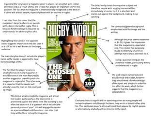
The magazine cover targets people with a keen interest in rugby through visual cues and information that require some prior knowledge of the sport. It features a well-known rugby player dressed in attire that will appeal to English audiences and readers familiar with the sport. The magazine's title, internationally recognized status, and use of a question are intended to intrigue potential readers interested in rugby.
1. The title clearly states the magazine subject and
therefore people with a rugby interest will be
immediately attracted to it. It is also bold and
stands out against the background, making it eye
catching.
In general the very top of a magazine cover is always an area that gets initial
attention and as a result of this, the creator has placed an important USP in this
position. The fact that the magazine is internationally recognized as the best of
it’s kind will attract people, especially those with an interest in rugby.
The contrasting green background
emphasises both the image and the
writing.
Although the price seems expensive
at £4.20, it gives the impression
that the magazine is a specialist
one. The creator has purposely
made it extremely small in an
attempt not to draw attention to it.
Using a question intrigues the
potential reader, particularly if they
are interested in rugby.
The well known names featured
would entice the reader, however
they would need a foreknowledge
of the sport and players in order for
this effect to work; which further
suggests that the magazine is a
specialist one.
Costume choice is significant for sport magazines as many people will
recognize players only through the team they are in or country they play
for. This particular player’s attire will most likely appeal to English people
or alternatively anybody with an interest in the sport.
This hint at what is inside the magazine will attract
the reader, particularly as the black circle is
prominent against the white shirt. The wording is also
effective because it is a question which includes the
personal pronoun ‘your’, this will engage the reader
on a personal level and therefore I can infer that
they will be likely to buy the magazine.
The fact that the player’s name is
small(whereas in many magazines it
would be one of the main features) is
another suggestion that this particular
magazine is a specialist. This is because
it is expected that the reader will
already know the man on the cover just
by image.
The main storyline doesn’t include the player’s
name as the reader is expected to have
foreknowledge of this.
Highlighting this name in the opposite
colour suggests importance and also uses it
as a USP as he is well known to the target
audience.
I can infer from this cover that the
magazine’s target audience are people
with a keen interest for rugby. This is
because foreknowledge is required to
understand a lot of the aspects of it.
2. The creator has placed three of the most well known
sporting names in the world at the top of the cover,
possibly in an attempt to use them as a selling point
because they will be one of the first features the reader
will see.
These names make evident that
the magazine is about tennis,
however the reader would need
an extent of foreknowledge in
order to understand this.
Both the red of the masthead and black of the
names stand out against the muted blue
background.
The masthead clearly indicates that the magazine
specialises in tennis, it is also extremely bold and
eye catching.
Using the image of all three players will
appeal to the magazine’s target
audience, as well as people in general .
This is because they are well recognized
both inside and outside of the tennis
industry.
Dressing the men in the attire they
most famously wear will make
them more recognizable and thus
attract more potential readers.
Their facial expressions relate to
the title ‘trivalry’ (a pun of rivalry)
because they look as if they are in
competition. This is a technique
that will intrigue the reader as they
will most likely be interested in the
rivalry between the men,
especially if they are particularly
interested in the sport.
This yellow border is eye catching
compared to the background and
also enables the headline to stand
out.
As the majority of magazines do, the price has
been made extremely small. This is in order to
stop attention being drawn to it. The price is
$4.99 (around £3.30), which is relatively cheap
but not to the extent that it appears not to be a
professional magazine.
These strap boosts will
encourage potential readers to
buy the magazine. It also
suggests that the target
audience is people who play
tennis as the stories are
directed to those who want to
improve at the sport.
The fact that the creator
allowed the image to cover the
masthead suggests that the
players are of higher
importance or alternatively that
the magazine is well known
enough and people will
therefore recognize it
immediately.
Overall the cover is very simplistic
which makes it look professional
and suggests that people will buy it
without having to know what is
inside. I can infer that the target
audience are people with an
interest or who play tennis because
of the stories and expected
foreknowledge.