Looking back at your preliminary
  task, what do you feel you have
learnt in the progression from it to
          the full product?
  Double page spread progression
One


My first version isn’t very good as the text overlaps onto my character and the
picture is dull and does not have a consistent background and my text is an
interview but there is no way to tell between interviewer and the interviewees
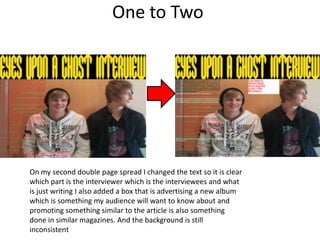
One to Two


On my second double page spread I changed the text so it is clear
which part is the interviewer which is the interviewees and what
is just writing I also added a box that is advertising a new album
which is something my audience will want to know about and
promoting something similar to the article is also something
done in similar magazines. And the background is still
inconsistent
Two to Three


In my third double page spread I have made the background more
consistent and I have put the text into columns and made the picture
thinner so my characters actually look human and so the text didn’t overlap
onto my character, I also moved my promotion to the bottom of the page
as it covered part of my characters and I have added an image to the
promotion as this is a convention ofdouble page spreads and is something
similar magazines do
Three to four


In my fourth double page spread all I did was use the stroke effect on the
title of my article to make it stand out more
Four to Five


On my fifth double page spread I added page numbers and a website as
these are conventions of a magazine I also added a pull out quote on as this
is something done by similar magazines, I also altered the levels of my
picture to make it brighter and clearer
Five to Six


On my sixth double page spread I added a picture to my promotion to make the
album look more realistic and I changed the font of my pull out quote to make it
more appropriate for my genre
Six to Seven/final product


On my final product I made the red text in my interview darker so it is easier to
read and I made my page numbers smaller because one of them overlapped onto
the text and I made the title of the article smaller so it stayed within it’s box

Looking back at your preliminary task3,

  • 1.
    Looking back atyour preliminary task, what do you feel you have learnt in the progression from it to the full product? Double page spread progression
  • 2.
    One My first versionisn’t very good as the text overlaps onto my character and the picture is dull and does not have a consistent background and my text is an interview but there is no way to tell between interviewer and the interviewees
  • 3.
    One to Two Onmy second double page spread I changed the text so it is clear which part is the interviewer which is the interviewees and what is just writing I also added a box that is advertising a new album which is something my audience will want to know about and promoting something similar to the article is also something done in similar magazines. And the background is still inconsistent
  • 4.
    Two to Three Inmy third double page spread I have made the background more consistent and I have put the text into columns and made the picture thinner so my characters actually look human and so the text didn’t overlap onto my character, I also moved my promotion to the bottom of the page as it covered part of my characters and I have added an image to the promotion as this is a convention ofdouble page spreads and is something similar magazines do
  • 5.
    Three to four Inmy fourth double page spread all I did was use the stroke effect on the title of my article to make it stand out more
  • 6.
    Four to Five Onmy fifth double page spread I added page numbers and a website as these are conventions of a magazine I also added a pull out quote on as this is something done by similar magazines, I also altered the levels of my picture to make it brighter and clearer
  • 7.
    Five to Six Onmy sixth double page spread I added a picture to my promotion to make the album look more realistic and I changed the font of my pull out quote to make it more appropriate for my genre
  • 8.
    Six to Seven/finalproduct On my final product I made the red text in my interview darker so it is easier to read and I made my page numbers smaller because one of them overlapped onto the text and I made the title of the article smaller so it stayed within it’s box