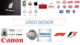
LOGO DESIGN
What is LOGO DESIGN?
• A symbol or other small design
adopted by an organization to
identify its product, uniform,
vehicles, etc.
• Logo design is an important
area of graphic design.
• Logotype is a graphic
representation or symbol of a
company name trademark,
abbreviation, etc. often uniquely
designed for ready recognition.
• In order to understand
what a logo design is,
it is important to first
understand what a
logo design is used for:
• BRANDING.
• IDENTIFICATION.
WHAT PRINCIPLES
FOR A LOGO DESIGN:-
• Keep the design
simple:
• One of the basic requirements and qualities of a
great logo design is that it has to be made on a
simple concept.
• less is more and simplicity is more impactful.
• Use colors
strategically:
• Logo design must be attractive.
• Colors have this amazing ability of evoking our feelings.
• RED – emotions of aggressiveness, love, energy, and
passion.
• BLUE – intelligence, friendliness.
• PINK - symbolizes tenderness.
• YELLOW - hope, freshness.
• GREEN - nature, freshness, and health.
• Make it scalable
and versatile:
• A logo would be used in
business on various
surfaces.
• These surfaces may be as
little as the production
of a stamp or a pen.
• A logo design does not need
to explain business practices,
but it should symbolize the
quality of that business.
• It should look good in
black and white:
• Point to be noted, advertising would be done for a
respective business on magazines, newspapers, leaflets,
etc.
• Hence for such ads colorless printing is a good way of
show casing the product.
• In general, logos are better of with colors
• But if on a newspaper ads, we must rethink the logo
design.
• Similarly, the logo should make a good impression on
faxed document as well as on its colorless version.
• Make it a memorable
design:
• One of the qualities of global
companies logo is that they are
memorable.
• A simple trick to create
memorable logos is to have a
unique concept.
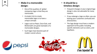
• Logos such as Pepsi, Coca-Cola, and
McDonald’s are great examples of a
memorable designs.
• Such logos have become part of
modern social culture.
• It should be a
timeless design:
• Frequent changes in your original logo
design is also not advisable for many
reasons.
• If you redesign a logo so often, you are
leaving your customers confused and
directionless.
• The logo design must have a modern
approach to the public including
specific elements such as colors, and
typefaces.
LOGO DESIGN PROCESS:-
• Designing a good logo ay require involvement from the marketing team and
the design agency (if the process is outsourced), or graphic design contest
platform (if it is a crowd-sourced).
• It requires a clear idea about the concept and values of the brand.
• The best shapes to use are symmetrical geometrical shapes they can be
placed almost anywhere and still maintain the balance, they are very easy to
handle
• U
S
E
C
O
L
O
R
S
• U
S
E
T
H
E
R
I
G
H
T
F
O
N
T
• B
E
S
I
M
P
L
E
• B
E
M
E
M
O
R
A
B
L
E
• A
V
O
I
D
D
I
S
T
R
A
C
T
O
N
 Color
association is
an important
factor to take
into
consideration
when
designing your
logo.
 As
personal
preference
plays an
important
role in
choosing
logo
design
font, we
must
remember
the motto
of our
company.
 Bold
statement
must be
made while
designing a
logo in order
for customers
to remember.
In that case
customers
are more
likely to
choose that
particular
logo.
 Logo
designs
may
contain
fancy
features,
but it
should
fairly be
kept simple
to provoke
a quick
reaction.
 Labels such as
LLC, Inc, or
&Co should be
saved for the
professional
documentation
of your
company.
ELEMENTS OF LOGO
DESIGN:-
• Logo should capture the personality
of the business.
• Use of 1 to 3 colors would make the
design simple and memorable.
• A logo should have some
originality and should be unique.
• It should be practical, usable, and adaptable
and if created in vector format you can resize
when needed without loss of image quality.
• It should maintain proportionality –
a logo should function as one
complete unit.
• Logos that are too tall are hard to
read when reduced or enlarged.
• The design should work on any sized
media- from business card to
billboard.
By :- Vansh Shetty

Logo design

  • 1.
  • 2.
    What is LOGODESIGN? • A symbol or other small design adopted by an organization to identify its product, uniform, vehicles, etc. • Logo design is an important area of graphic design. • Logotype is a graphic representation or symbol of a company name trademark, abbreviation, etc. often uniquely designed for ready recognition. • In order to understand what a logo design is, it is important to first understand what a logo design is used for: • BRANDING. • IDENTIFICATION.
  • 3.
    WHAT PRINCIPLES FOR ALOGO DESIGN:- • Keep the design simple: • One of the basic requirements and qualities of a great logo design is that it has to be made on a simple concept. • less is more and simplicity is more impactful. • Use colors strategically: • Logo design must be attractive. • Colors have this amazing ability of evoking our feelings. • RED – emotions of aggressiveness, love, energy, and passion. • BLUE – intelligence, friendliness. • PINK - symbolizes tenderness. • YELLOW - hope, freshness. • GREEN - nature, freshness, and health.
  • 4.
    • Make itscalable and versatile: • A logo would be used in business on various surfaces. • These surfaces may be as little as the production of a stamp or a pen. • A logo design does not need to explain business practices, but it should symbolize the quality of that business. • It should look good in black and white: • Point to be noted, advertising would be done for a respective business on magazines, newspapers, leaflets, etc. • Hence for such ads colorless printing is a good way of show casing the product. • In general, logos are better of with colors • But if on a newspaper ads, we must rethink the logo design. • Similarly, the logo should make a good impression on faxed document as well as on its colorless version.
  • 5.
    • Make ita memorable design: • One of the qualities of global companies logo is that they are memorable. • A simple trick to create memorable logos is to have a unique concept. • Logos such as Pepsi, Coca-Cola, and McDonald’s are great examples of a memorable designs. • Such logos have become part of modern social culture. • It should be a timeless design: • Frequent changes in your original logo design is also not advisable for many reasons. • If you redesign a logo so often, you are leaving your customers confused and directionless. • The logo design must have a modern approach to the public including specific elements such as colors, and typefaces.
  • 6.
    LOGO DESIGN PROCESS:- •Designing a good logo ay require involvement from the marketing team and the design agency (if the process is outsourced), or graphic design contest platform (if it is a crowd-sourced). • It requires a clear idea about the concept and values of the brand. • The best shapes to use are symmetrical geometrical shapes they can be placed almost anywhere and still maintain the balance, they are very easy to handle
  • 7.
    • U S E C O L O R S • U S E T H E R I G H T F O N T •B E S I M P L E • B E M E M O R A B L E • A V O I D D I S T R A C T O N  Color association is an important factor to take into consideration when designing your logo.  As personal preference plays an important role in choosing logo design font, we must remember the motto of our company.  Bold statement must be made while designing a logo in order for customers to remember. In that case customers are more likely to choose that particular logo.  Logo designs may contain fancy features, but it should fairly be kept simple to provoke a quick reaction.  Labels such as LLC, Inc, or &Co should be saved for the professional documentation of your company.
  • 8.
    ELEMENTS OF LOGO DESIGN:- •Logo should capture the personality of the business. • Use of 1 to 3 colors would make the design simple and memorable. • A logo should have some originality and should be unique. • It should be practical, usable, and adaptable and if created in vector format you can resize when needed without loss of image quality. • It should maintain proportionality – a logo should function as one complete unit. • Logos that are too tall are hard to read when reduced or enlarged. • The design should work on any sized media- from business card to billboard.
  • 9.