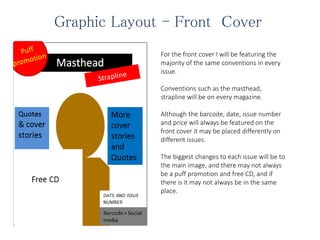
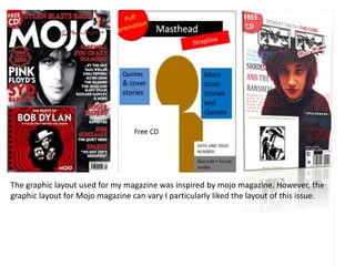
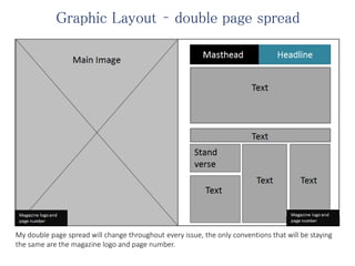
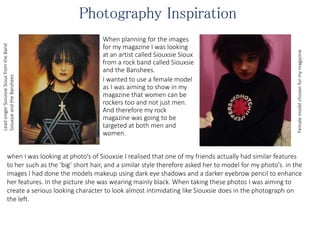
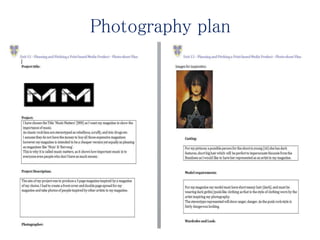
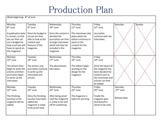
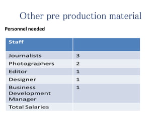
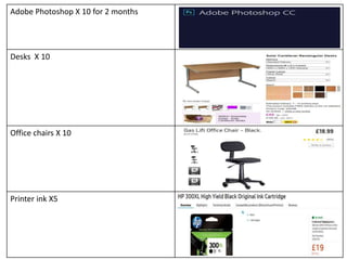
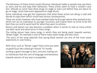
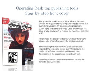
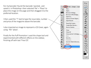
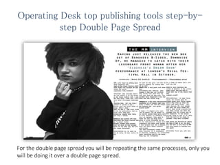
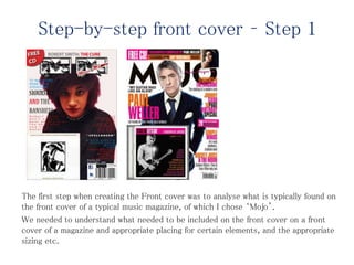
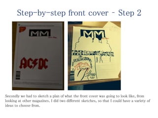
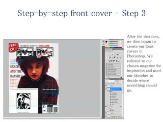
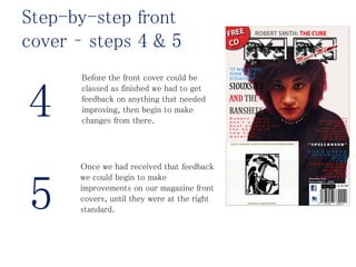
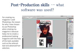
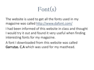
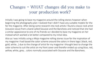
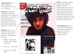
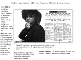
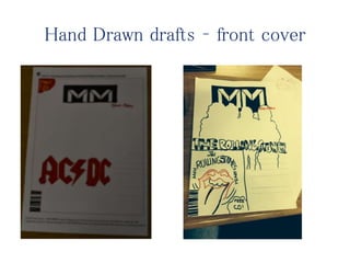
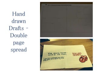
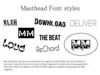
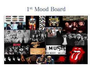
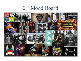
Rhia De Carlo is pitching a print-based music magazine called MM Magazine. The document includes mood boards, draft layouts, and a production plan for the first issue. Photographs were taken of a model inspired by Siouxsie Sioux to resemble her punk style. Interviews and articles will be written, and the magazine will go to print by June 26th for distribution and sale.

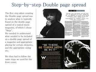
![Draft Article - Double page spread
Interview – Siouxsie's e Sioux
Having just released the new box set of Banshees B-Sides, Downside Up, we managed to catch with their legendary
front woman after her ‘Siouxsie’s Dream Show’ performance at London’s Royal Festival Hall in October.
[b]MM: Let’s begin by talking about what happened that night at the Royal Festival Hall? what made You stormed off
and called the venue organizers “silly fuckers”?[/b]
SIOUXSIE: well, basically before we had agreed to do the shows at the Royal Festival Hall, I said the only thing I want
and I don’t care about champagne backstage or anything else, the one thing I needed to specify is that I cannot have
any Arctic drafts on stage. When I sing I open up and if I get Arctic drafts it kills my performance. And on stage that’s
what was happening, despite them being told what I wanted.
[b]And you walked off?[/b]
And described the Royal Festival Hall as “a dump”. Haha!
[b]Budgie couldn’t have jumped over his drum kit fast enough when he ran after you. Did you two argue backstage?[/b]
Oh no, he stuck by me all along. He was rooting for me. He said he was glad I did that he went 'I'm freezing my fucking
balls off as well”.
b]It was a very punk rock situation.[/b]
It was, although they created it that way not me. What they should have done from the start was block off that draft.
This wouldn’t have happened if that had done that one simple thing.
[b]there is a big punk retrospective exhibition on in London right now. Does it bother you that the nostalgia industry
has now grown around punk?[/b]](https://image.slidesharecdn.com/lo1-150716152416-lva1-app6892/85/Lo1-8-320.jpg)
![[It seem s to happen every year "It's 25 years!” “It’s 26 years!” In my opinion people keep going back to
Punk because it’s something that can’t be repeated. They want to make the next big thing that’s going to
shake everything up but it’s too self-conscious. People don’t understand that when punk started it was
innocent and not a phenomenon and that’s where everyone goes wrong. You can’t consciously create
something important, it’s a combination of chemistry, conditions, the environment, everything and it’s
not something you can orchestrate. It’s a freak of nature and I love stuff like that.
[MM]You were definitely the centre of attention at the London punk scene. Are you still in touch with
any of the others from that original crowd?
Yeah, I’ve seen Steve Jones .He actually said, he wished those early Pistols shows before they blew up
when the media was being filmed. He’s right, because not many people had seen the early shows and
they’re what turned everyone who saw them around, not when the spotlight from Bill Grundy and all
that happened. To see people actually trying to stay as far away from the front of the stage as possible.
They were incredible.](https://image.slidesharecdn.com/lo1-150716152416-lva1-app6892/85/Lo1-9-320.jpg)