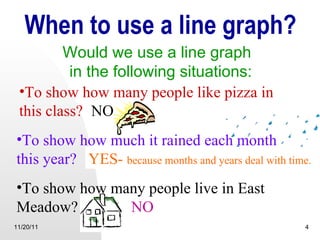
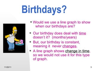
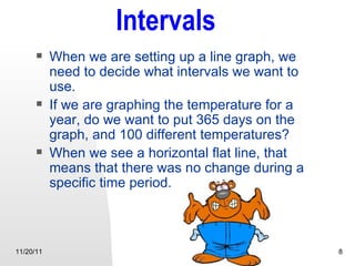
Download to read offline
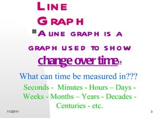
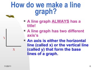
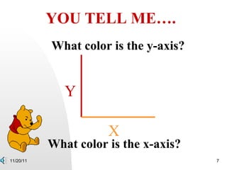
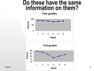
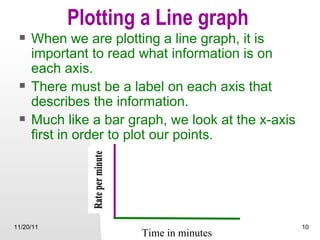
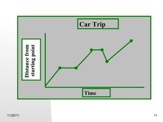
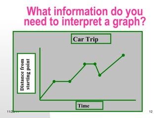
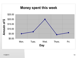

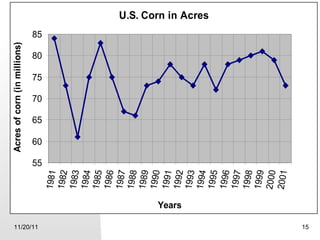

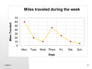


A line graph shows changes over time and is used to display data measured at different points in time, such as monthly rainfall. It always includes a title and two labeled axes, with time typically plotted along the horizontal x-axis. Intervals should be chosen appropriately so the graph is easy to read, without having too many data points. To interpret a line graph, you need the information on the axes to determine what is being measured and compare values at different points in time shown on the graph.