James Blunt Digipack Analysis
•Download as DOCX, PDF•
1 like•142 views
I have analysed the album artwork for James Blunt's 'Moon Landing: Apollo Edition' by using Lacey's Repertoire of Elements, and other media theorists, to be able to use Blunt's style to create my own music digipack and CD artwork.
Report
Share
Report
Share

Recommended
Composition overview
This document discusses photographic composition. It defines composition as the arrangement of shapes and forms in an image, including their position and relationship. Compositions can be symmetrical or asymmetrical to create different effects. Symmetrical compositions tend to be balanced and calm, while asymmetrical uses angles to add dynamism. The document examines examples from photographers like Louis Faurer, Andreas Gursky, William Eggleston, Nan Goldin, Robert Frank, and Harry Callahan to illustrate different compositional techniques and effects.
What Is Composition?
The document discusses various photographic composition techniques including symmetrical, asymmetrical, grid-like compositions and "all over" compositions. It provides examples of photographs that effectively utilize different compositional styles like symmetrical images that appear calm and balanced but can be more complex, asymmetrical compositions that create dynamism through diagonals, and "all over" compositions that resemble abstract paintings due to their complex scenes. The document examines how composition influences a photograph's meaning and emotional impact.
Location ideas
This document discusses potential filming locations for three scenes of a student film project. For the protagonist Alex's bedroom, Chris' house is proposed as it has space on the walls to display drawings. An alleyway near Chris' house is suggested for the kidnapping scene to create tension. The school art room is presented as the ideal low-budget location to briefly show the protagonist's drawings that are central to the plot and opening title sequence.
Location ideas
This document discusses potential filming locations for three scenes of a student film project. For the protagonist Alex's bedroom, Chris' house is proposed as it has space on the walls to display drawings. An alleyway near Chris' house is suggested for the kidnapping scene to create tension. The school art room is presented as the ideal low-cost location to briefly show the protagonist's drawings that are central to the plot and opening title sequence.
Existing ots deconstruction
This document provides an analysis of the opening title sequence (OTS) for the HBO television series "Six Feet Under". It describes the various film techniques, camera angles, transitions, and editing effects used throughout the sequence. Key conventions of OTS like including production companies and credits are met. The music in the sequence creates tension at certain points. Overall, the OTS intrigues viewers about the show's subject of death without revealing too much of the story.
Light design bus stop
This document discusses the role of a lighting designer and provides examples for lighting the play "Bus Stop". The lighting designer's jobs are to provide visibility of actors, reveal set designs, add to the mood and style, and suggest a central visual image. For "Bus Stop", the designer proposes using practical cafe lights, colored washes to set moods, and focused area lights on conversations to direct attention. Cue changes would vary in speed to enhance tension. Side lighting would make characters more dynamic during performances.
Julius caesar
This production of Julius Caesar will be directed by focusing more on the character of Brutus and his sacrifice. It will use the style of heightened realism and be performed on a thrust stage at Houston's Stages Repertory Theatre. The main characters will be portrayed by well-known actors and the costumes will aim to reflect ancient Roman fashion to further immerse the audience. Lighting will be an important element to set the mood and enhance key moments, such as Caesar's assassination and appearances by his ghost.
Film terms and techniques introduction
This document provides an introduction to key film techniques including mise-en-scène, framing, composition, use of space, and shot types. It discusses concepts like tight vs loose framing, the rule of thirds, deep vs shallow space, and establishing shots. Specific examples are given from films to illustrate techniques like framing characters in the background to show emotional distance or using shallow space to create a sense of being trapped. The document aims to explain the technical and symbolic aspects of how scenes are photographed and composed in film.
mise en scene hans beckert
This scene from the 1931 film M introduces the character Hans Beckert, the child murderer antagonist, through his large shadow splayed across a warning poster. The shadow's dominance and human shape indicate this is the person being sought. The orderly shapes of the poster and surface are disrupted by Beckert's organic shadow blob. The neutral eye-level angle and low-density image create a sense of primal fear and imply the helpless adults feel against this hidden threat within their community. The form of the scene suggests Beckert is both a threat and trapped by his criminal identity and the consequences of his crimes.
Reading a film
The document provides information about key film analysis concepts including narrative, characters, point of view, mise-en-scene, and symbols. It defines types of characters such as round and flat characters. It discusses analyzing narrative structure, point of view, setting through elements like lighting and costumes, and composition. It provides examples of how camera placement like angle, distance, and movement affect interpretation. Finally, it outlines common cinematic symbols and definitions like auteur, genre, and archetypes.
Illusions of space
This document discusses various design elements that can create the illusion of space in two-dimensional artwork, including overlapping objects, similar objects decreasing in size with distance, transparency, forced perspective, scale/proportion, atmospheric perspective, and linear perspective converging at a point. It provides examples like a veil that appears transparent, an Op Art painting with progressively smaller squares, and an Escher work that plays with linear perspective rules. The principles can be combined, as in a surrealist painting example that uses transparency, size reduction, and atmospheric techniques.
Film as text
The document discusses various techniques used in filmmaking to tell visual stories. It begins by explaining that films use pictures and sounds, in addition to words, to convey meaning. It then covers concepts like mise-en-scène, cinematography, editing techniques, narrative structures, and semiotics - how meaning is constructed through signs and symbols in film. Overall, the document illustrates that film is a complex visual text that uses multiple artistic and technical elements purposefully arranged to immerse viewers in fictional worlds and communicate ideas.
Evaluation Question One
The document analyzes how the media product uses and challenges conventions of real media forms. It summarizes that the protagonist is an unconventional character that blends genres. Both the protagonist and antagonist begin vulnerable but become terrified. The antagonist uses intellect over strength, which is conventional of thriller and psychological genres. The plot involves conventional elements like a goal to retrieve memory, and the antagonist removing it. The lighting, sound, and editing styles aim for realism to relate to the character, while the credits, subtitles and colors subliminally reinforce themes.
How to read a film
This document provides an overview of key elements for analyzing films: story, setting, sound, color, character, and camera. It explains that story can be linear or non-linear, setting provides the context, sound conveys emotion, color impacts mood, character is revealed through appearance and behavior, and camera acts as the storyteller through shots and angles. Examples are given for each element to illustrate their roles in film analysis.
Julius caesar
This document discusses production design elements for a performance of William Shakespeare's play "Julius Caesar". It includes sections on costume design, lighting design, set design, and direction. For costumes, it describes the historical period and proposed outfits for key characters like Caesar and Brutus. The lighting design section outlines how lighting can be used to focus on important scenes and characters, set mood, and transition between scenes. The set design discusses creating the setting and establishing period details. Finally, the direction section provides casting choices and describes the play's themes of deceit and hatred that will be emphasized.
Film posters analysis
The poster depicts the protagonist in a tense stance on a blue background, suggesting a science fiction setting. His simple clothing implies a lower-class status. Dark colors create contrast to draw the eye to the technological equipment on his back and head. The lack of facial expression leaves the character mysterious and prompts viewers' curiosity to learn more by watching the film. Overall the poster uses iconography, color schemes, and the protagonist's pose and attire to represent the film as a science fiction story about a lower-class freedom fighter set in a technological world.
Title Sequence Analysis
The genre of the film is a thriller or mystery, as established by the ominous music, typography, and underground setting shown. The narrative focuses on three objects - money, a clock, and a tower - which foreshadows a story about characters battling over money with the clock implying the importance of time. The atmosphere is set as tense and dramatic by the unsettling music that builds in volume and tempo. The typography used for the title and job roles enhances the underground theme. The camerawork in the animation shows the titles appearing and disappearing into the ground to get buried, with split images of the clock, tower, and money. The target audience is very wide as there is nothing inappropriate for children.
Project Research & Technology (Question 1 & 6)
This slide-share looks at the research I took towards making my thriller opening film, looking particularly at the technical aspects I chose to use and media features such as mise-en-scene and cinematography.
Grp 45 Julius Caesar Presentation
This document discusses the costume, lighting, and set design for a production of Shakespeare's play Julius Caesar. It explains that the costumes aim to establish the historical Roman context by using togas and sandals. The lighting design creates moods like shadows and intensity through color and focus. The set design depicts the environment of streets in Rome through realistic props that maintain the period while allowing the actors to immerse the audience. Coordination between these design elements incorporates the central image of the color red as a symbol.
Butchcassidy
The document discusses the cinematography and opening scenes of the 1969 film Butch Cassidy and the Sundance Kid. It notes that Conrad Hall was the cinematographer, known for using flat space. The opening scene uses a montage of tight shots edited together to create a sense of claustrophobia, referencing the fear of jail that outlaws like Butch Cassidy felt. The second scene then moves from tight to loose framing in an extremely long take to build tension and introduce conflict.
When Robots...Save Earth?
This document provides an analysis of the Disney Pixar film Wall-E and how it explores themes of connection, individuality, and humanity through its use of media aesthetic principles like light, color, depth, and visualization. The film is set in a future where Earth has become an uninhabitable trash pile and humanity lives aboard ships in space. While some critics view the film as an environmental warning, the analysis argues it actually uses the dystopian setting as a backdrop to examine what it means to be human through the lens of loneliness, isolation, and the search for connection between the robot Wall-E and Eve. The document examines in detail how the film uses lighting and color specifically to convey emotion and influence the viewer
Production concept of my Adventure Trailer
Chris is the main character who is introduced through narration describing his backstory and journey across the country seeking freedom and solitude in nature. The plot follows Chris' adventures as he encounters different landscapes and experiences while traveling. Most of the trailer will feature natural scenery shot at sunset to set an inspiring and adventurous tone. Chris wears typical hiking gear including an old army coat as his only props are cigarettes he smokes. The trailer uses techniques like low angle shots, dolly shots, and tracking shots of Chris walking to showcase the landscapes and his reactions throughout his journey. Sound and music will start low and increase in volume to match the progression of the trailer while incorporating natural ambient noises.
Film HandOut
The document summarizes four key formal elements of film: mise-en-scène, cinematography, editing, and sound. Mise-en-scène refers to everything visible within the frame of a shot, including props, lighting, costumes, and background elements. Cinematography encompasses camera angles, distances, movement, and lenses. Editing links shots together through techniques like matching graphics or establishing spatial relationships. Sound can be diegetic, originating from within the story, or non-diegetic, coming from outside the narrative, and shapes the audience's perception.
Connotations of ancillary drafts
This document discusses draft poster and magazine cover designs for a horror film. Three drafts of posters and magazine covers are described. The most effective poster draft features a medium close-up of the boy in bed with his teddy, implying vulnerability, with the antagonist lurking in the background wood, connoting isolation and the supernatural. The most effective magazine cover draft also features a medium shot of the boy with direct address and a shadow building intrigue, using low key lighting and a dark background to imply entrapment and the antagonist's presence.
Connotations of ancillary drafts
The document discusses draft designs for a movie poster and magazine cover. It analyzes how different compositional elements are used to convey meaning and atmosphere. The three poster drafts all feature a vulnerable young boy in direct address with a looming antagonist shadow. This connotes horror and the supernatural. The magazine covers also place the boy in direct address with an antagonist shadow and use masking, vignettes, and rule of thirds placement to imply entrapment and draw attention to create an ominous tone.
Lighting design
This document discusses the lighting design plan for the play "Bus Stop". The lighting design aims to establish the mood, style, time and place through a mixture of soft and sharp lighting. Soft lighting will be used for slower scenes, while sharp lighting will grab attention during scenes of action. A realistic lighting style using natural colors is chosen over a nonrealistic style to fit the play's real-life situations. Visibility will be maintained through lights above and in the house. Angles of light will define shapes and forms in three dimensions. Spotlights will focus on performers and dimmer lights will define character areas.
Moon poster
The poster uses a minimal black and white color scheme with the astronaut, title, and slogan standing out in white, grey, and orange to draw attention. It emphasizes the title in the largest font and places the astronaut and actor's name prominently but small to reflect the film's focus on an anonymous astronaut rather than highlighting the actor. Other names, logos, and details are kept at the bottom to avoid distraction from the main visual elements. Overall it creates a dramatic and ambiguous style that increases intrigue through its use of graphics over actual film images.
Location Scouting KARJ PRODUCTION
The document discusses location scouting and planning for 8 scenes of a short film called "The Job Interview". Scene 1 takes place in public toilets to allow characters privacy for reflection. Scene 2 is in a corridor outside the toilets to show the characters' journeys. Scene 3 splits the characters onto different paths with different lighting. Scenes 4-6 continue following the characters and lead to an outside area and entrance to the interview room. Scene 7 is a small waiting area outside the interview room. Scene 8 is the dark interview room itself, serving as the climax. The locations provide variety in shots while keeping focus on the characters.
Market Research Analysis - Music Videos
Analysing the results of my survey of 20 people responding to 10 questions relating to the topic of the music industry and video
Eminem - Mockingbird
Eminem's music video for "Mockingbird" features old home video footage of him with his daughters and their mother. The video depicts Eminem alone, watching these old videos and lamenting not being able to be with his family as his career requires him to be away. Through personal lyrics directly addressing his daughters, the video shows Eminem's love for his family and desire to protect and support his daughters, despite being physically distant from them due to his work and their mother struggling with addiction issues. Intercutting old home videos with scenes of Eminem's success and coverage of his wife's legal troubles, the video uses nostalgia and sentimentality to provide context for the song's emotional lyrics and
More Related Content
What's hot
mise en scene hans beckert
This scene from the 1931 film M introduces the character Hans Beckert, the child murderer antagonist, through his large shadow splayed across a warning poster. The shadow's dominance and human shape indicate this is the person being sought. The orderly shapes of the poster and surface are disrupted by Beckert's organic shadow blob. The neutral eye-level angle and low-density image create a sense of primal fear and imply the helpless adults feel against this hidden threat within their community. The form of the scene suggests Beckert is both a threat and trapped by his criminal identity and the consequences of his crimes.
Reading a film
The document provides information about key film analysis concepts including narrative, characters, point of view, mise-en-scene, and symbols. It defines types of characters such as round and flat characters. It discusses analyzing narrative structure, point of view, setting through elements like lighting and costumes, and composition. It provides examples of how camera placement like angle, distance, and movement affect interpretation. Finally, it outlines common cinematic symbols and definitions like auteur, genre, and archetypes.
Illusions of space
This document discusses various design elements that can create the illusion of space in two-dimensional artwork, including overlapping objects, similar objects decreasing in size with distance, transparency, forced perspective, scale/proportion, atmospheric perspective, and linear perspective converging at a point. It provides examples like a veil that appears transparent, an Op Art painting with progressively smaller squares, and an Escher work that plays with linear perspective rules. The principles can be combined, as in a surrealist painting example that uses transparency, size reduction, and atmospheric techniques.
Film as text
The document discusses various techniques used in filmmaking to tell visual stories. It begins by explaining that films use pictures and sounds, in addition to words, to convey meaning. It then covers concepts like mise-en-scène, cinematography, editing techniques, narrative structures, and semiotics - how meaning is constructed through signs and symbols in film. Overall, the document illustrates that film is a complex visual text that uses multiple artistic and technical elements purposefully arranged to immerse viewers in fictional worlds and communicate ideas.
Evaluation Question One
The document analyzes how the media product uses and challenges conventions of real media forms. It summarizes that the protagonist is an unconventional character that blends genres. Both the protagonist and antagonist begin vulnerable but become terrified. The antagonist uses intellect over strength, which is conventional of thriller and psychological genres. The plot involves conventional elements like a goal to retrieve memory, and the antagonist removing it. The lighting, sound, and editing styles aim for realism to relate to the character, while the credits, subtitles and colors subliminally reinforce themes.
How to read a film
This document provides an overview of key elements for analyzing films: story, setting, sound, color, character, and camera. It explains that story can be linear or non-linear, setting provides the context, sound conveys emotion, color impacts mood, character is revealed through appearance and behavior, and camera acts as the storyteller through shots and angles. Examples are given for each element to illustrate their roles in film analysis.
Julius caesar
This document discusses production design elements for a performance of William Shakespeare's play "Julius Caesar". It includes sections on costume design, lighting design, set design, and direction. For costumes, it describes the historical period and proposed outfits for key characters like Caesar and Brutus. The lighting design section outlines how lighting can be used to focus on important scenes and characters, set mood, and transition between scenes. The set design discusses creating the setting and establishing period details. Finally, the direction section provides casting choices and describes the play's themes of deceit and hatred that will be emphasized.
Film posters analysis
The poster depicts the protagonist in a tense stance on a blue background, suggesting a science fiction setting. His simple clothing implies a lower-class status. Dark colors create contrast to draw the eye to the technological equipment on his back and head. The lack of facial expression leaves the character mysterious and prompts viewers' curiosity to learn more by watching the film. Overall the poster uses iconography, color schemes, and the protagonist's pose and attire to represent the film as a science fiction story about a lower-class freedom fighter set in a technological world.
Title Sequence Analysis
The genre of the film is a thriller or mystery, as established by the ominous music, typography, and underground setting shown. The narrative focuses on three objects - money, a clock, and a tower - which foreshadows a story about characters battling over money with the clock implying the importance of time. The atmosphere is set as tense and dramatic by the unsettling music that builds in volume and tempo. The typography used for the title and job roles enhances the underground theme. The camerawork in the animation shows the titles appearing and disappearing into the ground to get buried, with split images of the clock, tower, and money. The target audience is very wide as there is nothing inappropriate for children.
Project Research & Technology (Question 1 & 6)
This slide-share looks at the research I took towards making my thriller opening film, looking particularly at the technical aspects I chose to use and media features such as mise-en-scene and cinematography.
Grp 45 Julius Caesar Presentation
This document discusses the costume, lighting, and set design for a production of Shakespeare's play Julius Caesar. It explains that the costumes aim to establish the historical Roman context by using togas and sandals. The lighting design creates moods like shadows and intensity through color and focus. The set design depicts the environment of streets in Rome through realistic props that maintain the period while allowing the actors to immerse the audience. Coordination between these design elements incorporates the central image of the color red as a symbol.
Butchcassidy
The document discusses the cinematography and opening scenes of the 1969 film Butch Cassidy and the Sundance Kid. It notes that Conrad Hall was the cinematographer, known for using flat space. The opening scene uses a montage of tight shots edited together to create a sense of claustrophobia, referencing the fear of jail that outlaws like Butch Cassidy felt. The second scene then moves from tight to loose framing in an extremely long take to build tension and introduce conflict.
When Robots...Save Earth?
This document provides an analysis of the Disney Pixar film Wall-E and how it explores themes of connection, individuality, and humanity through its use of media aesthetic principles like light, color, depth, and visualization. The film is set in a future where Earth has become an uninhabitable trash pile and humanity lives aboard ships in space. While some critics view the film as an environmental warning, the analysis argues it actually uses the dystopian setting as a backdrop to examine what it means to be human through the lens of loneliness, isolation, and the search for connection between the robot Wall-E and Eve. The document examines in detail how the film uses lighting and color specifically to convey emotion and influence the viewer
Production concept of my Adventure Trailer
Chris is the main character who is introduced through narration describing his backstory and journey across the country seeking freedom and solitude in nature. The plot follows Chris' adventures as he encounters different landscapes and experiences while traveling. Most of the trailer will feature natural scenery shot at sunset to set an inspiring and adventurous tone. Chris wears typical hiking gear including an old army coat as his only props are cigarettes he smokes. The trailer uses techniques like low angle shots, dolly shots, and tracking shots of Chris walking to showcase the landscapes and his reactions throughout his journey. Sound and music will start low and increase in volume to match the progression of the trailer while incorporating natural ambient noises.
Film HandOut
The document summarizes four key formal elements of film: mise-en-scène, cinematography, editing, and sound. Mise-en-scène refers to everything visible within the frame of a shot, including props, lighting, costumes, and background elements. Cinematography encompasses camera angles, distances, movement, and lenses. Editing links shots together through techniques like matching graphics or establishing spatial relationships. Sound can be diegetic, originating from within the story, or non-diegetic, coming from outside the narrative, and shapes the audience's perception.
Connotations of ancillary drafts
This document discusses draft poster and magazine cover designs for a horror film. Three drafts of posters and magazine covers are described. The most effective poster draft features a medium close-up of the boy in bed with his teddy, implying vulnerability, with the antagonist lurking in the background wood, connoting isolation and the supernatural. The most effective magazine cover draft also features a medium shot of the boy with direct address and a shadow building intrigue, using low key lighting and a dark background to imply entrapment and the antagonist's presence.
Connotations of ancillary drafts
The document discusses draft designs for a movie poster and magazine cover. It analyzes how different compositional elements are used to convey meaning and atmosphere. The three poster drafts all feature a vulnerable young boy in direct address with a looming antagonist shadow. This connotes horror and the supernatural. The magazine covers also place the boy in direct address with an antagonist shadow and use masking, vignettes, and rule of thirds placement to imply entrapment and draw attention to create an ominous tone.
Lighting design
This document discusses the lighting design plan for the play "Bus Stop". The lighting design aims to establish the mood, style, time and place through a mixture of soft and sharp lighting. Soft lighting will be used for slower scenes, while sharp lighting will grab attention during scenes of action. A realistic lighting style using natural colors is chosen over a nonrealistic style to fit the play's real-life situations. Visibility will be maintained through lights above and in the house. Angles of light will define shapes and forms in three dimensions. Spotlights will focus on performers and dimmer lights will define character areas.
Moon poster
The poster uses a minimal black and white color scheme with the astronaut, title, and slogan standing out in white, grey, and orange to draw attention. It emphasizes the title in the largest font and places the astronaut and actor's name prominently but small to reflect the film's focus on an anonymous astronaut rather than highlighting the actor. Other names, logos, and details are kept at the bottom to avoid distraction from the main visual elements. Overall it creates a dramatic and ambiguous style that increases intrigue through its use of graphics over actual film images.
Location Scouting KARJ PRODUCTION
The document discusses location scouting and planning for 8 scenes of a short film called "The Job Interview". Scene 1 takes place in public toilets to allow characters privacy for reflection. Scene 2 is in a corridor outside the toilets to show the characters' journeys. Scene 3 splits the characters onto different paths with different lighting. Scenes 4-6 continue following the characters and lead to an outside area and entrance to the interview room. Scene 7 is a small waiting area outside the interview room. Scene 8 is the dark interview room itself, serving as the climax. The locations provide variety in shots while keeping focus on the characters.
What's hot (20)
Viewers also liked
Market Research Analysis - Music Videos
Analysing the results of my survey of 20 people responding to 10 questions relating to the topic of the music industry and video
Eminem - Mockingbird
Eminem's music video for "Mockingbird" features old home video footage of him with his daughters and their mother. The video depicts Eminem alone, watching these old videos and lamenting not being able to be with his family as his career requires him to be away. Through personal lyrics directly addressing his daughters, the video shows Eminem's love for his family and desire to protect and support his daughters, despite being physically distant from them due to his work and their mother struggling with addiction issues. Intercutting old home videos with scenes of Eminem's success and coverage of his wife's legal troubles, the video uses nostalgia and sentimentality to provide context for the song's emotional lyrics and
Passion Pit Digipack Analysis
I have analysed the album artwork for Passion Pit's 'Gossamer' by using Lacey's Repertoire of Elements, and other media theorists, to be able to use Angelakos's style to create my own music digipack and CD artwork.
Music Video Analysis - Tattered Line of String
The Postal Service's Tattered Line of String conceptual music video analysed as product research my music video production portfolio
Music Video Analysis - Love Me (The 1975)
1) The music video for "Love Me" by The 1975 uses cardboard cutouts and other imagery to parody celebrity culture and fandom.
2) It depicts the lead singer interacting in comedic ways with cutouts of celebrities while also objectifying women.
3) Through these techniques, the video comments on the superficiality of the music industry and modern representations of gender, but is intended as an in-joke for their fans rather than a serious critique.
Magazine Advert Analysis - LCD Soundsystem
Analysis of the magazine advert featuring the release of LCD Soundsystem's new album 'This is Happening' as part of the product research of my media portfolio
Storyboard
The document discusses plans for shots in a music video. It proposes opening with a long shot of the protagonist reflecting in an urban setting, then walking away from the camera. Later shots would involve a performance by the protagonist singing happily to the camera to create a positive mood. The document considers using different weather conditions and bokeh lenses and effects to subtly convey deeper emotions beneath the surface happiness and to thrust the viewer from an uplifted state back to reality.
Magazine Advert Analysis - Eminem
An analysis of a music magazine advert featuring the release of Eminem's "Recovery" for my media coursework advanced portfolio.
Magazine Advert Analysis - Mika
Analysis of the artwork for Mika's album The Boy Who Knew Too Much as one third of the magazine adverts analysed for my advanced media portfolio A Level.
Contents page planning
This document contains a list of magazine contents pages for planning sections, including PLAN1, PLAN2, and PLAN3. The document provides a high-level listing of 3 planning pages or sections within a magazine without additional context or details.
Double page planning
Double page spreads in magazines require careful planning. The designer must consider how images and text will be arranged across both pages and if any elements need to wrap from one page to the other. A general plan should be made addressing these layout questions before beginning detailed design work.
Image Manipulation Record
I have edited images using Photoshop for my introductory double page spread and magazine cover. For the artist image, I used the magnetic lasso tool and eraser with a blurred edge to softly crop the image and flip it so the artist faces the opposite direction. For the magazine cover key signifier, I cropped out the background and shadow using only the eraser tool to avoid jagged edges and retain high image quality for the cover.
Bingo players & far east movement get up
The video portrays a rivalry between a gang of youths and a gang of ducks. The youths harass innocent people in the park and throw an old woman's bag into the duck pond, angering the ducks. When one of the youths kills a baby duck with a rock, the ducks seek revenge. Throughout the video, the ducks and youths represent gang stereotypes through their use of icons like chains and mobile phones. The settings of the park and parking garage are atypical for a hip hop video but provide locations for the rivalry between the groups to escalate.
Poster analysis 2
The poster depicts Katy Perry dressed in 1950s attire standing in a backyard setting from that era. Her facial expression suggests disgust at the stereotypical view of women during that time period as subordinate to men. The title "One of the Boys" implies her desire to break out of stereotypes and be seen as an equal in society. While set in the 1950s visually, the use of a contemporary artist represents the postmodern concept of confusion over time and space.
Taylor swift you belong with me
This document provides an analysis of the music video for Taylor Swift's song "You Belong with Me" across several elements:
1. The characters represent stereotypical roles of the popular and shy female protagonists and the honest male protagonist.
2. The narrative follows the typical trope of the shy protagonist winning over the boy from the popular antagonist by changing her image.
3. Iconic imagery in the video includes the use of signs expressing their love and the contrast between red and white dresses representing opposition.
4. Settings include the protagonists' bedrooms, a football game, and the prom to show their relationship development and typical pop video tropes.
5. Technical codes
Evaluation of Mind Map
The document provides an in-depth analysis of the characters, narrative, iconography, setting, and style of a music video. The main protagonists are a boy dressed in dark colors who loves a girl dressed in white. The narrative follows the common story of unrequited love. Iconography in the video represents the song's lyrics and the boy's inner turmoil. The setting changes from bright parks to dark woods to emphasize the boy's emotions. Camera shots and editing techniques aim to progress the narrative and make the video seem professional.
Poster analysis 1
The poster depicts the faces of the band Kings of Leon superimposed with an eagle. This suggests that the band feels patriotic towards America, represented by the eagle symbol. The band has a sad, neutral expression, reflecting the rock genre. The sepia tones and worn appearance of the image imply nostalgia. It creates a narrative enigma around the band's motivations and possible past mistakes.
Analysis 3 poster media
Lana Del Rey stares angrily at the camera in a poster for her album "Born to Die". Her 1950s-style outfit and hair suggest she is unsatisfied with her role as a housewife. The setting of a trailer park in the 1950s reinforces this, implying she wants to escape this life. The direct gaze and title of the album make the viewer feel like the target of her anger. The high camera angle suggests she has power over whoever she is staring at, continuing the atypical hostile and intimidating tone for a pop artist.
Pink family portrait
The document provides an analysis of the music video for P!nk's song "Family Portrait". It summarizes that the video depicts two versions of P!nk - a younger self and her current self - showing the breakdown of her family through divorce and her desire for the perfect family portrayed in television advertisements. Key symbols in the video include the cereal the two families eat called "Pretty Happy" and the younger P!nk wearing the same clothes as the older P!nk. The setting is P!nk's childhood home and the television, representing her real past versus the false ideal of family portrayed in media.
Digipak analysis 2
This document provides a summary of the imagery, narrative, characters, and technical codes used in the album artwork for the band You Me at Six's album "Sinners". The summary describes how the fingerprints, mugshots, and surveillance-style photography establish a narrative that the band has gotten into legal trouble. It also analyzes how these visual elements represent negative stereotypes about the rock genre, portraying band members and fans as rebellious criminals. The setting and style of the imagery suggests an American police investigation.
Viewers also liked (20)
Similar to James Blunt Digipack Analysis
Process of digi pak
This document discusses the process of creating a digi-pak album cover for the band GoldBloom. It includes potential images and layouts for the different sections of the digi-pak. Several album cover concepts are presented, drawing inspiration from bands like Two Door Cinema Club, Snow Patrol, and focusing on themes of warmth and friendliness to match GoldBloom's style. Packaging options are also briefly discussed, with the band preferring a simple cardboard cover to portray their message of focusing on the music rather than image.
Process of digi pak
This document discusses the design process for an album cover for the band GoldBloom. It explores different design concepts and imagery inspired by other album covers. Feedback is gathered from focus groups. The final design uses a digipak format with different images and elements on each panel, including photos of the band, their logo, and handwritten song titles. The band prefers this professional plastic packaging over a cardboard option. Audience feedback praised the vintage aesthetics, color schemes, and how the cover represents the band's laidback image while standing out on store shelves.
A Day To Remember – What Separates Me From You
The digipack album cover tells a story through a series of images seen when opening the flaps. The first flap shows a man trapped in an hourglass watching others who don't see him. The second flap depicts the man watching an elderly person in a hospital bed. The third shows him unhappy at a wedding. When fully opened, broken glass, litter and a broken watch are seen, implying the man's time is up. Inside is a dark green "drain lid" CD with the band's name, continuing the theme. The back shows the top of the man's head being buried as his story concludes.
Digipack research
This document provides summaries of 4 different album covers in 3 sentences or less:
The first album cover features a composite image of fingers, a tiger and forest arranged like a flower with people and society references representing the reggae/pop music.
The second is a dark monochrome image of Batman standing in the foreground at a low angle surrounded by fire and destruction, accurately portraying the dark tone of the film's soundtrack.
The third cover is done in a childlike style with colored pencil of an animal figure holding the alphabet, representing an amusing children's song.
The last analyzes two versions of a cover, finding the blue, black and white one to be better due to higher contrast allowing
Production planning
This document outlines a production plan and schedule for two albums over 11 weeks. For Album A called "Archipelagos," the artist will create a concept album inspired by revolution against oppression, depicted through island artwork and graffiti styles. A gatefold album cover and additional art will be digitally produced. For Album B called "Lunar Sea," the cover will feature a famous photo of an astronaut to commemorate the Apollo 11 mission, with the footprint photo on the back. Both albums aim to combine famous images with music to create striking hybrid artworks.
Portfolio
Tommaso Cremonesi is an Italian graphic artist from Cremona. He studied graphic design and multimedia at university, graduating in 2014. His personal style features psychedelic elements, textures, and repeated patterns used to create evocative landscapes and surreal scenes. Some of his projects include designing the app "Booklet" to view digital album artworks and recreating album covers as part of his thesis. He works as a freelance graphic artist and under his pseudonym "TRUTH" creates posters and personal artworks.
Similar to James Blunt Digipack Analysis (6)
More from Smith_
All of the people
The speaker is tired of the same old stories with their romantic partner and wants to return to easier times. They have saved money and hidden it away for when times get harder. The speaker feels like the world is against them and they need to escape and find another open door if they leave this place. Everyone is waiting for something that doesn't seem like it will happen. The speaker wants to get away from the crowds of unhappy people waiting instead of taking control of their own lives.
Little bird
The poem compares a girl to a bird with a broken leg that needs nursing back to health. There is romantic tension as the speaker wants to comfort and be close to the girl, but they are not currently together. Their relationship was damaged in the past but the speaker hopes it can be healed through simple caring gestures and intimacy. However, the speaker worries that pursuing romance too quickly could lead to regret, and is uncertain if the girl still loves him. The broken bird represents the damaged relationship that ultimately could not be mended.
Brand New Colony lyrics
The speaker uses similes to describe how they will always be there to support and care for their romantic partner. They want to provide comfort as a gentle listener, help their partner make good choices, and ensure they are never alone or in need. The speaker aims to dedicate themselves entirely to their partner by being a good memory, keeping them warm, and doing anything to make their life easier. They desire to escape from judgments by starting a new life alone with their partner where everything will change and their past holds no relevance.
Shot by shot Analysis
The document provides a scene-by-scene analysis of a video. Key figures show ideas of lifting the viewer into the journey, the protagonist grabbing the camera to share happiness, dancing silly to represent being human, and throwing food to share contentedness. Later scenes show the individual standing out in darkness yet among people, their movement juxtaposed with rising buildings, and reflection suggesting individualism is fluid like society or an illusion. The analysis suggests recognizing individual life amid the collective.
Evaluation Q1
The document describes an album advert, digipak, and music video created by the author for their media product. It summarizes how each component uses and develops conventions of real media products in the indie/electronic genre. The album advert uses minimalist design with an out-of-focus city skyline, while the digipak focuses on conceptual style over narrative. The music video sets its urban setting and costumes in Manchester to reflect the genre, and uses techniques like a focus shift and non-linear narrative to develop conventions. Overall, the media product challenges conventions in some technical aspects but aims to represent the conceptual focus and aesthetics valued in the indie genre.
Evaluation 1
evaluation powerpoint based on how my music video and album ancillary work follows, develops or challenges typical conventions of media products.
Adobe premiere
Adobe Premiere allows the creator to add various effects and transitions to video and audio footage to professionally edit together a music video. Effects like reversing clips and speeding up or slowing down footage were used to match elements to the music. Transitions such as cross dissolves and fades were also employed to piece the layered sequence together over time. Through experimenting with Premiere's editing capabilities, the creator was able to achieve aesthetic goals like a time lapse transitioning from day to night and adjusting brightness and contrast to graphically match the intended mood.
Production diary
This production diary details the process of creating a music video over several months. Key events include:
- Deciding to create an indie music video and choosing the song "All of the People"
- Planning shots and storyboarding ideas for the video
- Filming test footage and practice shots in various locations to capture the planned scenes
- Editing the footage together into a first cut of the music video
- Gathering feedback and making improvements by filming additional shots
- Creating a final cut of the music video and completing ancillary tasks like a digipack for evaluation
Light trails
Long-exposure photography techniques capture movement through blurred trails. This document discusses using these techniques to create star trails by tracking celestial object movement with a slow shutter speed. While most photographers do this on busy roads, the author was only able to recreate light trails in a still photo with their basic camera. They discovered Adobe AfterEffects software can similarly edit video clips to distort shapes and blend speeds to generate light trails, which is what the author has tried to do for their music video by adding echo effects.
Bokeh
Bokeh is a Japanese photographic technique that blurs out-of-focus areas to improve aesthetic lighting quality. It can change the size and shape of the blurred areas. The document discusses creating a DIY paper bokeh filter by drawing shapes and attaching them to a camera lens with an elastic band. While this changed the shape of the blurred areas, it did not have a strong enough effect. Exchanging the camera lens for a higher quality 50mm lens with a larger aperture achieved the desired bokeh effect.
Focus Group
The document asks for an interpretation of a concept or narrative explored in a video, which favorite parts stood out, and whether the video is representative of the indie/electronic genre. It also asks what didn't go as well and could be improved.
Image files
This document discusses image and footage files. Images and videos are important digital assets that can be used across many platforms and devices. Proper file formats, naming conventions, and organization are key to ensuring images and footage can be easily accessed, searched, and reused.
Media institutions
Bauer Media and Time Inc. are the two major publishing houses in the UK that could distribute the author's music magazine. Bauer Media produces magazines like Q and Kerrang! that target a similar demographic of 17-35 year olds to the author's magazine. While Q's readership is majority male, the author's research found their target is majority female. Time Inc. produces magazines like NME and Uncut that appeal to wide audiences with bright designs and cover multiple genres like indie, rock, and electro like the author's magazine. Due to the author's magazine's focus on online presence and social media, it could suit both publishers, but is most similar to Q so Bauer Media may be the best choice unless they don
Attract audience
The document discusses strategies for attracting and addressing the target audience of a music magazine. It focuses on using appealing content like bands and exclusive articles. The photography features artists similar to readers' age. The design has a bright color scheme that grabs attention while the font is sophisticated yet fun. The layout principles ensure the name and key articles are prominent. Market research found readers want free content and exclusives. Links to online content and social media extend the magazine's reach. Including these elements and pricing at £2.99 allows attracting customers while releasing monthly.
Front cover planning
Magazine front covers require careful planning. The document outlines 3 plans - PLAN1, PLAN2, and PLAN3 - for developing magazine covers.
Magazine Conventions
This document describes the conventions used in real magazines and how the author's magazine uses and challenges those conventions on the front cover, contents page, and double page spreads. Some of the conventions utilized include mastheads, cover lines, pricing, images, pull quotes, and columnar text layout. The author's magazine remains consistent with the house style while experimenting with conventions like enlarged text and different font styles to draw readers in.
Analysis of Magazine Double Page Spreads
This double-page spread from Q magazine summarizes an interview with Daft Punk about their new album. It uses informal, humorous language and wordplay to entertain readers while informing them about Daft Punk taking a more positive, optimistic approach to electronic music. Photos show the duo in iconic outfits and helmets, wielding fake ice cream to humorously contrast their robotic personas. Color schemes and layout aim to convey the album's cheerful summer vibe.
Magazine features
The document describes the conventions used on magazine covers and interior pages and how the author's magazine prototype utilizes these conventions. Key conventions included are mastheads, cover lines, price, contents listings, pull quotes, and columnar text layout. The author's magazine maintains a consistent house style across issues with bright colors, consistent fonts, and banner elements that frame the cover and interior pages. Photos and captions are used to preview interior articles and drive reader engagement.
More from Smith_ (18)
Recently uploaded
Traditional Musical Instruments of Arunachal Pradesh and Uttar Pradesh - RAYH...
Traditional Musical Instruments of Arunachal Pradesh and Uttar Pradesh
BÀI TẬP DẠY THÊM TIẾNG ANH LỚP 7 CẢ NĂM FRIENDS PLUS SÁCH CHÂN TRỜI SÁNG TẠO ...
BÀI TẬP DẠY THÊM TIẾNG ANH LỚP 7 CẢ NĂM FRIENDS PLUS SÁCH CHÂN TRỜI SÁNG TẠO ...Nguyen Thanh Tu Collection
https://app.box.com/s/qhtvq32h4ybf9t49ku85x0n3xl4jhr15How to Create a More Engaging and Human Online Learning Experience
How to Create a More Engaging and Human Online Learning Experience Wahiba Chair Training & Consulting
Wahiba Chair's Talk at the 2024 Learning Ideas Conference. How to Make a Field Mandatory in Odoo 17
In Odoo, making a field required can be done through both Python code and XML views. When you set the required attribute to True in Python code, it makes the field required across all views where it's used. Conversely, when you set the required attribute in XML views, it makes the field required only in the context of that particular view.
What is Digital Literacy? A guest blog from Andy McLaughlin, University of Ab...
What is Digital Literacy? A guest blog from Andy McLaughlin, University of Aberdeen
Your Skill Boost Masterclass: Strategies for Effective Upskilling
Your Skill Boost Masterclass: Strategies for Effective UpskillingExcellence Foundation for South Sudan
Strategies for Effective Upskilling is a presentation by Chinwendu Peace in a Your Skill Boost Masterclass organisation by the Excellence Foundation for South Sudan on 08th and 09th June 2024 from 1 PM to 3 PM on each day.Bed Making ( Introduction, Purpose, Types, Articles, Scientific principles, N...
Topic : Bed making
Subject : Nursing Foundation
বাংলাদেশ অর্থনৈতিক সমীক্ষা (Economic Review) ২০২৪ UJS App.pdf
বাংলাদেশের অর্থনৈতিক সমীক্ষা ২০২৪ [Bangladesh Economic Review 2024 Bangla.pdf] কম্পিউটার , ট্যাব ও স্মার্ট ফোন ভার্সন সহ সম্পূর্ণ বাংলা ই-বুক বা pdf বই " সুচিপত্র ...বুকমার্ক মেনু 🔖 ও হাইপার লিংক মেনু 📝👆 যুক্ত ..
আমাদের সবার জন্য খুব খুব গুরুত্বপূর্ণ একটি বই ..বিসিএস, ব্যাংক, ইউনিভার্সিটি ভর্তি ও যে কোন প্রতিযোগিতা মূলক পরীক্ষার জন্য এর খুব ইম্পরট্যান্ট একটি বিষয় ...তাছাড়া বাংলাদেশের সাম্প্রতিক যে কোন ডাটা বা তথ্য এই বইতে পাবেন ...
তাই একজন নাগরিক হিসাবে এই তথ্য গুলো আপনার জানা প্রয়োজন ...।
বিসিএস ও ব্যাংক এর লিখিত পরীক্ষা ...+এছাড়া মাধ্যমিক ও উচ্চমাধ্যমিকের স্টুডেন্টদের জন্য অনেক কাজে আসবে ...
How to deliver Powerpoint Presentations.pptx
"How to make and deliver dynamic presentations by making it more interactive to captivate your audience attention"
BÀI TẬP BỔ TRỢ TIẾNG ANH LỚP 9 CẢ NĂM - GLOBAL SUCCESS - NĂM HỌC 2024-2025 - ...
BÀI TẬP BỔ TRỢ TIẾNG ANH LỚP 9 CẢ NĂM - GLOBAL SUCCESS - NĂM HỌC 2024-2025 - ...Nguyen Thanh Tu Collection
https://app.box.com/s/tacvl9ekroe9hqupdnjruiypvm9rdaneHindi varnamala | hindi alphabet PPT.pdf
हिंदी वर्णमाला पीपीटी, hindi alphabet PPT presentation, hindi varnamala PPT, Hindi Varnamala pdf, हिंदी स्वर, हिंदी व्यंजन, sikhiye hindi varnmala, dr. mulla adam ali, hindi language and literature, hindi alphabet with drawing, hindi alphabet pdf, hindi varnamala for childrens, hindi language, hindi varnamala practice for kids, https://www.drmullaadamali.com
Beyond Degrees - Empowering the Workforce in the Context of Skills-First.pptx
Iván Bornacelly, Policy Analyst at the OECD Centre for Skills, OECD, presents at the webinar 'Tackling job market gaps with a skills-first approach' on 12 June 2024
Recently uploaded (20)
Traditional Musical Instruments of Arunachal Pradesh and Uttar Pradesh - RAYH...
Traditional Musical Instruments of Arunachal Pradesh and Uttar Pradesh - RAYH...
BÀI TẬP DẠY THÊM TIẾNG ANH LỚP 7 CẢ NĂM FRIENDS PLUS SÁCH CHÂN TRỜI SÁNG TẠO ...
BÀI TẬP DẠY THÊM TIẾNG ANH LỚP 7 CẢ NĂM FRIENDS PLUS SÁCH CHÂN TRỜI SÁNG TẠO ...
NEWSPAPERS - QUESTION 1 - REVISION POWERPOINT.pptx
NEWSPAPERS - QUESTION 1 - REVISION POWERPOINT.pptx
How to Create a More Engaging and Human Online Learning Experience
How to Create a More Engaging and Human Online Learning Experience
What is Digital Literacy? A guest blog from Andy McLaughlin, University of Ab...
What is Digital Literacy? A guest blog from Andy McLaughlin, University of Ab...
Your Skill Boost Masterclass: Strategies for Effective Upskilling
Your Skill Boost Masterclass: Strategies for Effective Upskilling
Bed Making ( Introduction, Purpose, Types, Articles, Scientific principles, N...
Bed Making ( Introduction, Purpose, Types, Articles, Scientific principles, N...
বাংলাদেশ অর্থনৈতিক সমীক্ষা (Economic Review) ২০২৪ UJS App.pdf
বাংলাদেশ অর্থনৈতিক সমীক্ষা (Economic Review) ২০২৪ UJS App.pdf
spot a liar (Haiqa 146).pptx Technical writhing and presentation skills
spot a liar (Haiqa 146).pptx Technical writhing and presentation skills
BÀI TẬP BỔ TRỢ TIẾNG ANH LỚP 9 CẢ NĂM - GLOBAL SUCCESS - NĂM HỌC 2024-2025 - ...
BÀI TẬP BỔ TRỢ TIẾNG ANH LỚP 9 CẢ NĂM - GLOBAL SUCCESS - NĂM HỌC 2024-2025 - ...
Beyond Degrees - Empowering the Workforce in the Context of Skills-First.pptx
Beyond Degrees - Empowering the Workforce in the Context of Skills-First.pptx
Film vocab for eal 3 students: Australia the movie
Film vocab for eal 3 students: Australia the movie
James Blunt Digipack Analysis
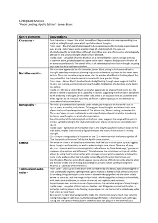
- 1. CD DigipackAnalysis 'Moon Landing:ApolloEdition'- JamesBlunt Genre elements Conventions Characters – One character is shown - the artist, JamesBlunt. Representedas anaverage workingclass male travellingthroughspace whichsymbolisesdeep thoughts. Front cover - Blunt's headphotoshopped to be unaccompaniedbyhis body, superimposed over a long shot of space and a graphic image of a lightning bolt. Hiseyes are photoshopped to be bright blue. Althoughbright blue eyes are oftenseenas stereotypically attractive, the unnaturalbright shade is more abstract. Inside cover - Longshot of James Blunt sat on a normal leather seat inaverage working class male attire, photoshoppedto appear to be a seat inspace. Bodyposture like that of an astronaut midlaunch. The overall effect is of a stereotypical man lost inthought or going to places that he's not beento before. Narrative events– The narrative appears to be of a character, James Blunt, sittinginhis home and lost in thought over deepmatters or planning to go onan adventure to places he has never been before. There is a narrative enigma as we start to wonder what Blunt is thinking about, but suggestionthat the character wants to move on to new, greater things. Front cover - James Blunt's headwithout a bodyfloating throughspace suggests that his headis lost in deep, uncharteredandnew thoughts. Implication ofadventure anda desire to explore. Inside art - We see a shot of Blunt sat in what appears to be a typical front room, but the photo is edited to appear to be a spaceship inlaunch, suggesting that hisheadis awayfrom earth anddeep inthought. On the other side, there is anequation next to a satellite with what appears to be a mapof a journey, as if Blunt is planningto go on anadventure to somewhere he has never been. Iconography – There is a paraphernalia ofsymbolic codes relatingto things out of thisworldsuchas space, stars, a satellite, andplanets. This suggests deepthoughts andadventure to new places that man hasalways dreamed of. The album title, 'Moon Landing', reiteratesthis. The use of space inmost mediatexts tends to symbolise unboundcreativity, broadening horizons, newthoughts, or a lackof concentration. Graphic symbol ofthe lightning bolt onthe front cover suggests the songs will be quickin tempo, symbol relatingto the skybut almost out of place as it carriesno connotations of space Inside cover - Symbolism of the leather chair is the onlything whichtiesBlunt downto the real world, implies that it is onlya figurative trip to the moon, the character is indeep thought. CDs - Simpleiconographyof a footprint on the CD is reminiscent of the famous symbol of "the footprint onthe moon" left bythe Apollospace mission. Setting- The mise enscene is all darkblue andmade to looklike it is inouter space. Space suggests deep thoughts andcreativity, as well as adventuring to new places. These are all very abstract concepts whichare stereotypical ofindie albums. As Steve Neale says, "genres are instances ofrepetition and difference." Thisis because the artist does not tryandsellthe album byusing their face but rather with a deeper concept whichappealsto artists with a more niche audience that like to be able to identifywith the artist (Katz's Usesand Gratifications Theory). James Blunt appeals to anaudience ofthis kind, unlike albums which are directlytiedto one of the Big 3 recordlabels, despite 'Moon Landing' being from Atlantic, a subsidiaryof Warner Bros). Technical and audio codes– Front cover - Close up ofJames Blunt witha direct mode of address, eyes photoshopped to look unnaturallybrighter, lightingdirect against his face is editedto look almost unhuman. Guttenberg DesignPrinciple - artist name is above the keysignifier and the album title is below so as not to spoil the image. Rule ofthirds - the keysignifier is directlyinthe middle, with text above andbelow, to create a balancedandsophisticated aesthetic. Superimposedover a mise enscene of space createsthe narrative enigma of deepthought. Inside cover - Longshot of Blunt sat ona leather seat. All appears normal but the shot is editedsothat it appears to be floating inspace (we cansee that not all is editedawayas his feet are ina stone floor). Back cover - Simple blue backgroundto make the informationeasyto read - two columns listing the songs on bothdiscs. Guttenberg DesignPrinciple - informationsuchas the age rating and the types of media players that the album can playon in the terminal area.
- 2. Barcode is at the topinthe middle soit is out of the wayanddoesnot spoilthe balanced appearance of the backcover.