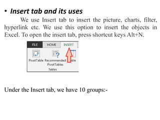
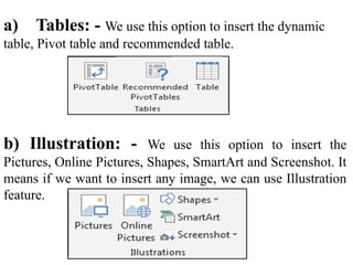
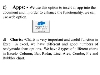
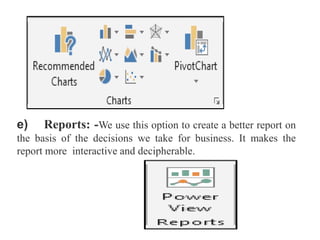
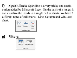
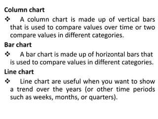
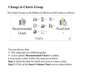
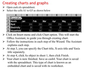
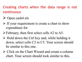
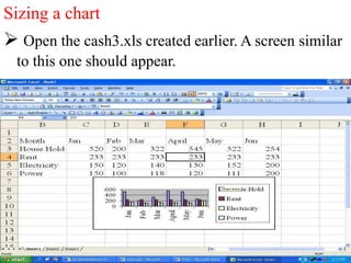
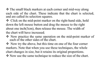
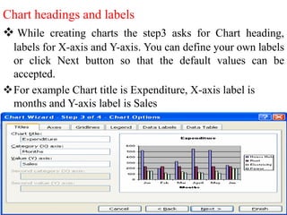
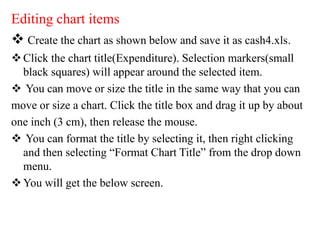
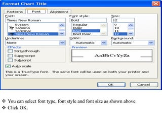
SlideShare a Scribd company logo
1 of 22
Dr.M.PREMANANTHAM
Asst. Prof. of Commerce(CA)
VivekanandaCollege
TiruvedakamWest – 625234
Madurai
• Insert tab and its uses
We use Insert tab to insert the picture, charts, filter,
hyperlink etc. We use this option to insert the objects in
Excel. To open the insert tab, press shortcut keys Alt+N.
Under the Insert tab, we have 10 groups:-
a) Tables: - We use this option to insert the dynamic
table, Pivot table and recommended table.
b) Illustration: - We use this option to insert the
Pictures, Online Pictures, Shapes, SmartArt and Screenshot. It
means if we want to insert any image, we can use Illustration
feature.
c) Apps: - We use this option to insert an app into the
document and, in order to enhance the functionality, we can
use web option.
d) Charts: -Charts is very important and useful function in
Excel. In excel, we have different and good numbers of
readymade chart options. We have 8 types of different charts
in Excel:- Column, Bar, Radar, Line, Area, Combo, Pie and
Bubbles chart.
e) Reports: -We use this option to create a better report on
the basis of the decisions we take for business. It makes the
report more interactive and decipherable.
f) Sparklines: Sparkline is a very tricky and useful
option added by Microsoft Excel. On the basis of a range, it
can visualize the trends in a single cell as charts. We have 3
different types of cell charts:- Line, Column and Win/Loss
chart.
g) Filters:
Column chart
 A column chart is made up of vertical bars
that is used to compare values over time or two
compare values in different categories.
Bar chart
 A bar chart is made up of horizontal bars that
is used to compare values in different categories.
Line chart
 Line chart are useful when you want to show
a trend over the years (or other time periods
such as weeks, months, or quarters).
Change in Charts Group
The Charts Group on the Ribbon in MS Excel 2013 looks as follows:
You can observe that:
 The subgroups are clubbed together.
 A new option ‘Recommended Charts’ is added.
Let us create a chart. Follow the steps given below.
Step 1: Select the data for which you want to create a chart.
Step 2: Click on the Insert Column Chart icon as shown below.
h) Links:
i) Text:
j) Symbols:
Ribbon in MS-Excel
 The ribbon in Excel consists of the tabs at
the top. These tabs are split into groups
which categorize related command buttons
into sub tasks.
 Each group has its respective command
button and the dialog box launcher, which
are present in the lower right corner in some
of the groups.
Ribbon of Chart Tools
When you click on your Chart, the CHART TOOLS tab, comprising of the DESIGN
and FORMAT tabs is introduced on the ribbon.
Step 1: Click on the Chart. CHART TOOLS with the DESIGN and FORMAT tabs will be
displayed on the ribbon.
Creating charts and graphs
 Open cash.xls spreadsheet.
 Select the cells A1 to G5 as shown below
 Click on Insert menu and click Chart option. This will start the
Office Assistant, to guide you through creating chart.
 Follow the instructions in each step of the Wizard. The Assistant
explains each step.
 At step 3, you can specify the Chart title, X-axis title and Yaxis
title separately.
 At step 4, click As object in sheet 1, then click Finish.
 Your chart is now finished. Save as cash4. Your chart is saved
with the spreadsheet. This type of chart is known as an
embedded chart and is saved with its worksheet.
Creating charts when the data range is not
continuous
 Open cash4.xls
 If your requirement is create a chart to show
expenditure for
February, then first select cells A2 to A5.
 Hold down the Ctrl key and, while holding it
down, select cells C2 to C5. Your screen should
be similar to this one.
 Click on the Chart Wizard and create a column
chart. Your screen should look similar to this.
Sizing a chart
 Open the cash3.xls created earlier. A screen similar
to this one should appear.
 The small black markers at each corner and mid-way along
each side of the chart. These indicate that the chart is selected,
and are called its selection squares.
 Click on the mid-point marker on the right-hand side, hold
down the left mouse button and drag the mouse to the right
about one inch(3cm), then release the mouse. The width of
the chart will have increased.
 Now practice the same operation on the mid-point marker of
each of the other sides of the chart.
 Now try the above, but this time on one of the four corner
markers. Note that when you use these techniques, the whole
chart changes in size, but it retains its original proportions.
 Now use the same technique to reduce the size of the chart.
Deleting Charts
 Make sure the chart is selected(the small black
markers are visible). If not, move the mouse pointer into
the chart area and click and release the left mouse
button once.
 Press Delete to delete the chart.
Moving charts and graphs
 Make the chart active.
 Move the mouse pointer into the chart area.
 Hold down the left mouse button and drag the chart to
the desired position.
Chart headings and labels
 While creating charts the step3 asks for Chart heading,
labels for X-axis and Y-axis. You can define your own labels
or click Next button so that the default values can be
accepted.
For example Chart title is Expenditure, X-axis label is
months and Y-axis label is Sales
Editing chart items
 Create the chart as shown below and save it as cash4.xls.
Click the chart title(Expenditure). Selection markers(small
black squares) will appear around the selected item.
 You can move or size the title in the same way that you can
move or size a chart. Click the title box and drag it up by about
one inch (3 cm), then release the mouse.
 You can format the title by selecting it, then right clicking
and then selecting “Format Chart Title” from the drop down
menu.
You will get the below screen.
 You can select font type, font style and font size as shown above
 Click OK.
References
 R.K.Taxali., “PC Software For Windows Made
Simple”.,MCG Raw – Hill Publicating Company LTD, New
Delhi.
 Sanjay Saxena, “MS –Office 2000”,Vikas Publishing House
Private Ltd,New Delhi.
 Robert De Levie, “Advanced Excel for Scientific Data
Analysis”, 3rd Edition Wiley Publishing, Cananda.
Advanced excel

More Related Content

What's hot

Different types of charts
Different types of chartsDifferent types of charts
Different types of chartsZakaria Salim
 
TID Chapter 5 Introduction To Charts And Graph
TID Chapter 5 Introduction To Charts And GraphTID Chapter 5 Introduction To Charts And Graph
TID Chapter 5 Introduction To Charts And GraphWanBK Leo
 
Interpret data for use in charts and graphs
Interpret data for use in charts and graphsInterpret data for use in charts and graphs
Interpret data for use in charts and graphsCharles Flynt
 
Graphs and chars
Graphs and charsGraphs and chars
Graphs and charssalemhusin
 
Charts and graphs in excel
Charts and graphs in excelCharts and graphs in excel
Charts and graphs in excelIqra Nehal
 
Types of graphs and charts and their uses with examples and pics
Types of graphs and charts and their uses  with examples and picsTypes of graphs and charts and their uses  with examples and pics
Types of graphs and charts and their uses with examples and picsMakati Science High School
 
Creating a graph in excel
Creating a graph in excelCreating a graph in excel
Creating a graph in excelorthms
 
Graphexamples how-to-do
Graphexamples how-to-doGraphexamples how-to-do
Graphexamples how-to-doMelody Teoxon
 
Statistics
StatisticsStatistics
Statisticsdiereck
 
$5 COUPON LINK - Excel Udemy Course: Excel with Excel Dynamic Graphs, Dashboa...
$5 COUPON LINK - Excel Udemy Course: Excel with Excel Dynamic Graphs, Dashboa...$5 COUPON LINK - Excel Udemy Course: Excel with Excel Dynamic Graphs, Dashboa...
$5 COUPON LINK - Excel Udemy Course: Excel with Excel Dynamic Graphs, Dashboa...mellontraining
 
Tables and-figures-business-research
Tables and-figures-business-researchTables and-figures-business-research
Tables and-figures-business-researchrowenahurley1
 
Top 8 Different Types Of Charts In Statistics And Their Uses
Top 8 Different Types Of Charts In Statistics And Their UsesTop 8 Different Types Of Charts In Statistics And Their Uses
Top 8 Different Types Of Charts In Statistics And Their UsesStat Analytica
 
Tabulating and graphing the data
Tabulating and graphing the dataTabulating and graphing the data
Tabulating and graphing the dataJone Zelita Orlina
 
Week 8 presenting data in charts, graphs, and tables 2
Week 8 presenting data in charts, graphs, and tables 2Week 8 presenting data in charts, graphs, and tables 2
Week 8 presenting data in charts, graphs, and tables 2Hafizul Mukhlis
 
Tables, Graphs, and Charts Social Studies
Tables, Graphs, and Charts Social StudiesTables, Graphs, and Charts Social Studies
Tables, Graphs, and Charts Social StudiesLyn Gile Facebook
 

What's hot (20)

Types of Charts
Types of ChartsTypes of Charts
Types of Charts
 
Different types of charts
Different types of chartsDifferent types of charts
Different types of charts
 
Types of Chart
Types of ChartTypes of Chart
Types of Chart
 
TID Chapter 5 Introduction To Charts And Graph
TID Chapter 5 Introduction To Charts And GraphTID Chapter 5 Introduction To Charts And Graph
TID Chapter 5 Introduction To Charts And Graph
 
Interpret data for use in charts and graphs
Interpret data for use in charts and graphsInterpret data for use in charts and graphs
Interpret data for use in charts and graphs
 
Graphs and chars
Graphs and charsGraphs and chars
Graphs and chars
 
Charts and graphs in excel
Charts and graphs in excelCharts and graphs in excel
Charts and graphs in excel
 
Types of graphs and charts and their uses with examples and pics
Types of graphs and charts and their uses  with examples and picsTypes of graphs and charts and their uses  with examples and pics
Types of graphs and charts and their uses with examples and pics
 
Charts and graphs
Charts and graphsCharts and graphs
Charts and graphs
 
Creating a graph in excel
Creating a graph in excelCreating a graph in excel
Creating a graph in excel
 
Graphexamples how-to-do
Graphexamples how-to-doGraphexamples how-to-do
Graphexamples how-to-do
 
Statistics
StatisticsStatistics
Statistics
 
$5 COUPON LINK - Excel Udemy Course: Excel with Excel Dynamic Graphs, Dashboa...
$5 COUPON LINK - Excel Udemy Course: Excel with Excel Dynamic Graphs, Dashboa...$5 COUPON LINK - Excel Udemy Course: Excel with Excel Dynamic Graphs, Dashboa...
$5 COUPON LINK - Excel Udemy Course: Excel with Excel Dynamic Graphs, Dashboa...
 
TYPES ON CHARTS
TYPES ON CHARTS TYPES ON CHARTS
TYPES ON CHARTS
 
Tables and-figures-business-research
Tables and-figures-business-researchTables and-figures-business-research
Tables and-figures-business-research
 
excel charts
excel chartsexcel charts
excel charts
 
Top 8 Different Types Of Charts In Statistics And Their Uses
Top 8 Different Types Of Charts In Statistics And Their UsesTop 8 Different Types Of Charts In Statistics And Their Uses
Top 8 Different Types Of Charts In Statistics And Their Uses
 
Tabulating and graphing the data
Tabulating and graphing the dataTabulating and graphing the data
Tabulating and graphing the data
 
Week 8 presenting data in charts, graphs, and tables 2
Week 8 presenting data in charts, graphs, and tables 2Week 8 presenting data in charts, graphs, and tables 2
Week 8 presenting data in charts, graphs, and tables 2
 
Tables, Graphs, and Charts Social Studies
Tables, Graphs, and Charts Social StudiesTables, Graphs, and Charts Social Studies
Tables, Graphs, and Charts Social Studies
 

Similar to Advanced excel

Making a Chart Using Excel
Making a Chart Using ExcelMaking a Chart Using Excel
Making a Chart Using Excelrebelbrindley
 
Excel Graphs Charts
Excel Graphs ChartsExcel Graphs Charts
Excel Graphs Chartssimply_coool
 
Excel 2007 create a chart
Excel 2007    create a chartExcel 2007    create a chart
Excel 2007 create a chartkhankamrul
 
Excel 2007 create a chart
Excel 2007    create a chartExcel 2007    create a chart
Excel 2007 create a chartrezaulslide
 
Basic Computer skill-P4 Excel.pptx
Basic Computer skill-P4 Excel.pptxBasic Computer skill-P4 Excel.pptx
Basic Computer skill-P4 Excel.pptxMastewal5
 
Creating & Editing Charts In Microsoft Excel 2003
Creating & Editing Charts In Microsoft Excel 2003Creating & Editing Charts In Microsoft Excel 2003
Creating & Editing Charts In Microsoft Excel 2003bud_00
 
Lesson11 working with charts
Lesson11 working with chartsLesson11 working with charts
Lesson11 working with chartsricsanmae
 
excel charts and graphs.ppt
excel charts and graphs.pptexcel charts and graphs.ppt
excel charts and graphs.pptChemOyasan1
 
03 microsoft office (creating charts)
03 microsoft office (creating charts)03 microsoft office (creating charts)
03 microsoft office (creating charts)benchhood
 
Lesson 11 working with charts
Lesson 11   working with chartsLesson 11   working with charts
Lesson 11 working with chartsguevarra_2000
 
Lesson 10 working with charts
Lesson 10   working with chartsLesson 10   working with charts
Lesson 10 working with chartsguevarra_2000
 
Basics of Creating Graphs / Charts using Microsoft Excel
Basics of Creating Graphs / Charts using Microsoft ExcelBasics of Creating Graphs / Charts using Microsoft Excel
Basics of Creating Graphs / Charts using Microsoft ExcelTope Osanyintuyi
 
Module 6 component of excel chart
Module 6 component of excel chartModule 6 component of excel chart
Module 6 component of excel chartDr. Shalini Pandey
 
Introduction to Excel
Introduction to ExcelIntroduction to Excel
Introduction to ExcelNajma Alam
 

Similar to Advanced excel (20)

Making a Chart Using Excel
Making a Chart Using ExcelMaking a Chart Using Excel
Making a Chart Using Excel
 
Excel Graphs Charts
Excel Graphs ChartsExcel Graphs Charts
Excel Graphs Charts
 
ms_excel.pdf
ms_excel.pdfms_excel.pdf
ms_excel.pdf
 
Excel 2007 create a chart
Excel 2007    create a chartExcel 2007    create a chart
Excel 2007 create a chart
 
Excel 2007 create a chart
Excel 2007    create a chartExcel 2007    create a chart
Excel 2007 create a chart
 
Excel training create a chart
Excel training create a chartExcel training create a chart
Excel training create a chart
 
Excel 2007 - Create a chart
Excel 2007 - Create a chartExcel 2007 - Create a chart
Excel 2007 - Create a chart
 
Basic Computer skill-P4 Excel.pptx
Basic Computer skill-P4 Excel.pptxBasic Computer skill-P4 Excel.pptx
Basic Computer skill-P4 Excel.pptx
 
Creating & Editing Charts In Microsoft Excel 2003
Creating & Editing Charts In Microsoft Excel 2003Creating & Editing Charts In Microsoft Excel 2003
Creating & Editing Charts In Microsoft Excel 2003
 
Lesson11 working with charts
Lesson11 working with chartsLesson11 working with charts
Lesson11 working with charts
 
excel charts and graphs.ppt
excel charts and graphs.pptexcel charts and graphs.ppt
excel charts and graphs.ppt
 
excel.ppt
excel.pptexcel.ppt
excel.ppt
 
03 microsoft office (creating charts)
03 microsoft office (creating charts)03 microsoft office (creating charts)
03 microsoft office (creating charts)
 
kiromax.ppt
kiromax.pptkiromax.ppt
kiromax.ppt
 
Lesson 11 working with charts
Lesson 11   working with chartsLesson 11   working with charts
Lesson 11 working with charts
 
Lesson 10 working with charts
Lesson 10   working with chartsLesson 10   working with charts
Lesson 10 working with charts
 
Print16
Print16Print16
Print16
 
Basics of Creating Graphs / Charts using Microsoft Excel
Basics of Creating Graphs / Charts using Microsoft ExcelBasics of Creating Graphs / Charts using Microsoft Excel
Basics of Creating Graphs / Charts using Microsoft Excel
 
Module 6 component of excel chart
Module 6 component of excel chartModule 6 component of excel chart
Module 6 component of excel chart
 
Introduction to Excel
Introduction to ExcelIntroduction to Excel
Introduction to Excel
 

Recently uploaded

Unit-V; Pricing (Pharma Marketing Management).pptx
Unit-V; Pricing (Pharma Marketing Management).pptxUnit-V; Pricing (Pharma Marketing Management).pptx
Unit-V; Pricing (Pharma Marketing Management).pptxVishalSingh1417
 
Beyond the EU: DORA and NIS 2 Directive's Global Impact
Beyond the EU: DORA and NIS 2 Directive's Global ImpactBeyond the EU: DORA and NIS 2 Directive's Global Impact
Beyond the EU: DORA and NIS 2 Directive's Global ImpactPECB
 
Activity 01 - Artificial Culture (1).pdf
Activity 01 - Artificial Culture (1).pdfActivity 01 - Artificial Culture (1).pdf
Activity 01 - Artificial Culture (1).pdfciinovamais
 
1029 - Danh muc Sach Giao Khoa 10 . pdf
1029 -  Danh muc Sach Giao Khoa 10 . pdf1029 -  Danh muc Sach Giao Khoa 10 . pdf
1029 - Danh muc Sach Giao Khoa 10 . pdfQucHHunhnh
 
psychiatric nursing HISTORY COLLECTION .docx
psychiatric  nursing HISTORY  COLLECTION  .docxpsychiatric  nursing HISTORY  COLLECTION  .docx
psychiatric nursing HISTORY COLLECTION .docxPoojaSen20
 
How to Give a Domain for a Field in Odoo 17
How to Give a Domain for a Field in Odoo 17How to Give a Domain for a Field in Odoo 17
How to Give a Domain for a Field in Odoo 17Celine George
 
Application orientated numerical on hev.ppt
Application orientated numerical on hev.pptApplication orientated numerical on hev.ppt
Application orientated numerical on hev.pptRamjanShidvankar
 
Explore beautiful and ugly buildings. Mathematics helps us create beautiful d...
Explore beautiful and ugly buildings. Mathematics helps us create beautiful d...Explore beautiful and ugly buildings. Mathematics helps us create beautiful d...
Explore beautiful and ugly buildings. Mathematics helps us create beautiful d...christianmathematics
 
Ecological Succession. ( ECOSYSTEM, B. Pharmacy, 1st Year, Sem-II, Environmen...
Ecological Succession. ( ECOSYSTEM, B. Pharmacy, 1st Year, Sem-II, Environmen...Ecological Succession. ( ECOSYSTEM, B. Pharmacy, 1st Year, Sem-II, Environmen...
Ecological Succession. ( ECOSYSTEM, B. Pharmacy, 1st Year, Sem-II, Environmen...Shubhangi Sonawane
 
Sports & Fitness Value Added Course FY..
Sports & Fitness Value Added Course FY..Sports & Fitness Value Added Course FY..
Sports & Fitness Value Added Course FY..Disha Kariya
 
Z Score,T Score, Percential Rank and Box Plot Graph
Z Score,T Score, Percential Rank and Box Plot GraphZ Score,T Score, Percential Rank and Box Plot Graph
Z Score,T Score, Percential Rank and Box Plot GraphThiyagu K
 
APM Welcome, APM North West Network Conference, Synergies Across Sectors
APM Welcome, APM North West Network Conference, Synergies Across SectorsAPM Welcome, APM North West Network Conference, Synergies Across Sectors
APM Welcome, APM North West Network Conference, Synergies Across SectorsAssociation for Project Management
 
The basics of sentences session 2pptx copy.pptx
The basics of sentences session 2pptx copy.pptxThe basics of sentences session 2pptx copy.pptx
The basics of sentences session 2pptx copy.pptxheathfieldcps1
 
1029-Danh muc Sach Giao Khoa khoi 6.pdf
1029-Danh muc Sach Giao Khoa khoi  6.pdf1029-Danh muc Sach Giao Khoa khoi  6.pdf
1029-Danh muc Sach Giao Khoa khoi 6.pdfQucHHunhnh
 
Accessible design: Minimum effort, maximum impact
Accessible design: Minimum effort, maximum impactAccessible design: Minimum effort, maximum impact
Accessible design: Minimum effort, maximum impactdawncurless
 
An Overview of Mutual Funds Bcom Project.pdf
An Overview of Mutual Funds Bcom Project.pdfAn Overview of Mutual Funds Bcom Project.pdf
An Overview of Mutual Funds Bcom Project.pdfSanaAli374401
 

Recently uploaded (20)

Unit-V; Pricing (Pharma Marketing Management).pptx
Unit-V; Pricing (Pharma Marketing Management).pptxUnit-V; Pricing (Pharma Marketing Management).pptx
Unit-V; Pricing (Pharma Marketing Management).pptx
 
Mattingly "AI & Prompt Design: Structured Data, Assistants, & RAG"
Mattingly "AI & Prompt Design: Structured Data, Assistants, & RAG"Mattingly "AI & Prompt Design: Structured Data, Assistants, & RAG"
Mattingly "AI & Prompt Design: Structured Data, Assistants, & RAG"
 
INDIA QUIZ 2024 RLAC DELHI UNIVERSITY.pptx
INDIA QUIZ 2024 RLAC DELHI UNIVERSITY.pptxINDIA QUIZ 2024 RLAC DELHI UNIVERSITY.pptx
INDIA QUIZ 2024 RLAC DELHI UNIVERSITY.pptx
 
Beyond the EU: DORA and NIS 2 Directive's Global Impact
Beyond the EU: DORA and NIS 2 Directive's Global ImpactBeyond the EU: DORA and NIS 2 Directive's Global Impact
Beyond the EU: DORA and NIS 2 Directive's Global Impact
 
Activity 01 - Artificial Culture (1).pdf
Activity 01 - Artificial Culture (1).pdfActivity 01 - Artificial Culture (1).pdf
Activity 01 - Artificial Culture (1).pdf
 
1029 - Danh muc Sach Giao Khoa 10 . pdf
1029 -  Danh muc Sach Giao Khoa 10 . pdf1029 -  Danh muc Sach Giao Khoa 10 . pdf
1029 - Danh muc Sach Giao Khoa 10 . pdf
 
psychiatric nursing HISTORY COLLECTION .docx
psychiatric  nursing HISTORY  COLLECTION  .docxpsychiatric  nursing HISTORY  COLLECTION  .docx
psychiatric nursing HISTORY COLLECTION .docx
 
How to Give a Domain for a Field in Odoo 17
How to Give a Domain for a Field in Odoo 17How to Give a Domain for a Field in Odoo 17
How to Give a Domain for a Field in Odoo 17
 
Application orientated numerical on hev.ppt
Application orientated numerical on hev.pptApplication orientated numerical on hev.ppt
Application orientated numerical on hev.ppt
 
Explore beautiful and ugly buildings. Mathematics helps us create beautiful d...
Explore beautiful and ugly buildings. Mathematics helps us create beautiful d...Explore beautiful and ugly buildings. Mathematics helps us create beautiful d...
Explore beautiful and ugly buildings. Mathematics helps us create beautiful d...
 
Mehran University Newsletter Vol-X, Issue-I, 2024
Mehran University Newsletter Vol-X, Issue-I, 2024Mehran University Newsletter Vol-X, Issue-I, 2024
Mehran University Newsletter Vol-X, Issue-I, 2024
 
Ecological Succession. ( ECOSYSTEM, B. Pharmacy, 1st Year, Sem-II, Environmen...
Ecological Succession. ( ECOSYSTEM, B. Pharmacy, 1st Year, Sem-II, Environmen...Ecological Succession. ( ECOSYSTEM, B. Pharmacy, 1st Year, Sem-II, Environmen...
Ecological Succession. ( ECOSYSTEM, B. Pharmacy, 1st Year, Sem-II, Environmen...
 
Sports & Fitness Value Added Course FY..
Sports & Fitness Value Added Course FY..Sports & Fitness Value Added Course FY..
Sports & Fitness Value Added Course FY..
 
Z Score,T Score, Percential Rank and Box Plot Graph
Z Score,T Score, Percential Rank and Box Plot GraphZ Score,T Score, Percential Rank and Box Plot Graph
Z Score,T Score, Percential Rank and Box Plot Graph
 
APM Welcome, APM North West Network Conference, Synergies Across Sectors
APM Welcome, APM North West Network Conference, Synergies Across SectorsAPM Welcome, APM North West Network Conference, Synergies Across Sectors
APM Welcome, APM North West Network Conference, Synergies Across Sectors
 
The basics of sentences session 2pptx copy.pptx
The basics of sentences session 2pptx copy.pptxThe basics of sentences session 2pptx copy.pptx
The basics of sentences session 2pptx copy.pptx
 
Advance Mobile Application Development class 07
Advance Mobile Application Development class 07Advance Mobile Application Development class 07
Advance Mobile Application Development class 07
 
1029-Danh muc Sach Giao Khoa khoi 6.pdf
1029-Danh muc Sach Giao Khoa khoi  6.pdf1029-Danh muc Sach Giao Khoa khoi  6.pdf
1029-Danh muc Sach Giao Khoa khoi 6.pdf
 
Accessible design: Minimum effort, maximum impact
Accessible design: Minimum effort, maximum impactAccessible design: Minimum effort, maximum impact
Accessible design: Minimum effort, maximum impact
 
An Overview of Mutual Funds Bcom Project.pdf
An Overview of Mutual Funds Bcom Project.pdfAn Overview of Mutual Funds Bcom Project.pdf
An Overview of Mutual Funds Bcom Project.pdf
 

Advanced excel

  • 1. Dr.M.PREMANANTHAM Asst. Prof. of Commerce(CA) VivekanandaCollege TiruvedakamWest – 625234 Madurai
  • 2. • Insert tab and its uses We use Insert tab to insert the picture, charts, filter, hyperlink etc. We use this option to insert the objects in Excel. To open the insert tab, press shortcut keys Alt+N. Under the Insert tab, we have 10 groups:-
  • 3. a) Tables: - We use this option to insert the dynamic table, Pivot table and recommended table. b) Illustration: - We use this option to insert the Pictures, Online Pictures, Shapes, SmartArt and Screenshot. It means if we want to insert any image, we can use Illustration feature.
  • 4. c) Apps: - We use this option to insert an app into the document and, in order to enhance the functionality, we can use web option. d) Charts: -Charts is very important and useful function in Excel. In excel, we have different and good numbers of readymade chart options. We have 8 types of different charts in Excel:- Column, Bar, Radar, Line, Area, Combo, Pie and Bubbles chart.
  • 5. e) Reports: -We use this option to create a better report on the basis of the decisions we take for business. It makes the report more interactive and decipherable.
  • 6. f) Sparklines: Sparkline is a very tricky and useful option added by Microsoft Excel. On the basis of a range, it can visualize the trends in a single cell as charts. We have 3 different types of cell charts:- Line, Column and Win/Loss chart. g) Filters:
  • 7. Column chart  A column chart is made up of vertical bars that is used to compare values over time or two compare values in different categories. Bar chart  A bar chart is made up of horizontal bars that is used to compare values in different categories. Line chart  Line chart are useful when you want to show a trend over the years (or other time periods such as weeks, months, or quarters).
  • 8. Change in Charts Group The Charts Group on the Ribbon in MS Excel 2013 looks as follows: You can observe that:  The subgroups are clubbed together.  A new option ‘Recommended Charts’ is added. Let us create a chart. Follow the steps given below. Step 1: Select the data for which you want to create a chart. Step 2: Click on the Insert Column Chart icon as shown below.
  • 10. Ribbon in MS-Excel  The ribbon in Excel consists of the tabs at the top. These tabs are split into groups which categorize related command buttons into sub tasks.  Each group has its respective command button and the dialog box launcher, which are present in the lower right corner in some of the groups.
  • 11. Ribbon of Chart Tools When you click on your Chart, the CHART TOOLS tab, comprising of the DESIGN and FORMAT tabs is introduced on the ribbon. Step 1: Click on the Chart. CHART TOOLS with the DESIGN and FORMAT tabs will be displayed on the ribbon.
  • 12.
  • 13. Creating charts and graphs  Open cash.xls spreadsheet.  Select the cells A1 to G5 as shown below  Click on Insert menu and click Chart option. This will start the Office Assistant, to guide you through creating chart.  Follow the instructions in each step of the Wizard. The Assistant explains each step.  At step 3, you can specify the Chart title, X-axis title and Yaxis title separately.  At step 4, click As object in sheet 1, then click Finish.  Your chart is now finished. Save as cash4. Your chart is saved with the spreadsheet. This type of chart is known as an embedded chart and is saved with its worksheet.
  • 14. Creating charts when the data range is not continuous  Open cash4.xls  If your requirement is create a chart to show expenditure for February, then first select cells A2 to A5.  Hold down the Ctrl key and, while holding it down, select cells C2 to C5. Your screen should be similar to this one.  Click on the Chart Wizard and create a column chart. Your screen should look similar to this.
  • 15. Sizing a chart  Open the cash3.xls created earlier. A screen similar to this one should appear.
  • 16.  The small black markers at each corner and mid-way along each side of the chart. These indicate that the chart is selected, and are called its selection squares.  Click on the mid-point marker on the right-hand side, hold down the left mouse button and drag the mouse to the right about one inch(3cm), then release the mouse. The width of the chart will have increased.  Now practice the same operation on the mid-point marker of each of the other sides of the chart.  Now try the above, but this time on one of the four corner markers. Note that when you use these techniques, the whole chart changes in size, but it retains its original proportions.  Now use the same technique to reduce the size of the chart.
  • 17. Deleting Charts  Make sure the chart is selected(the small black markers are visible). If not, move the mouse pointer into the chart area and click and release the left mouse button once.  Press Delete to delete the chart. Moving charts and graphs  Make the chart active.  Move the mouse pointer into the chart area.  Hold down the left mouse button and drag the chart to the desired position.
  • 18. Chart headings and labels  While creating charts the step3 asks for Chart heading, labels for X-axis and Y-axis. You can define your own labels or click Next button so that the default values can be accepted. For example Chart title is Expenditure, X-axis label is months and Y-axis label is Sales
  • 19. Editing chart items  Create the chart as shown below and save it as cash4.xls. Click the chart title(Expenditure). Selection markers(small black squares) will appear around the selected item.  You can move or size the title in the same way that you can move or size a chart. Click the title box and drag it up by about one inch (3 cm), then release the mouse.  You can format the title by selecting it, then right clicking and then selecting “Format Chart Title” from the drop down menu. You will get the below screen.
  • 20.  You can select font type, font style and font size as shown above  Click OK.
  • 21. References  R.K.Taxali., “PC Software For Windows Made Simple”.,MCG Raw – Hill Publicating Company LTD, New Delhi.  Sanjay Saxena, “MS –Office 2000”,Vikas Publishing House Private Ltd,New Delhi.  Robert De Levie, “Advanced Excel for Scientific Data Analysis”, 3rd Edition Wiley Publishing, Cananda.