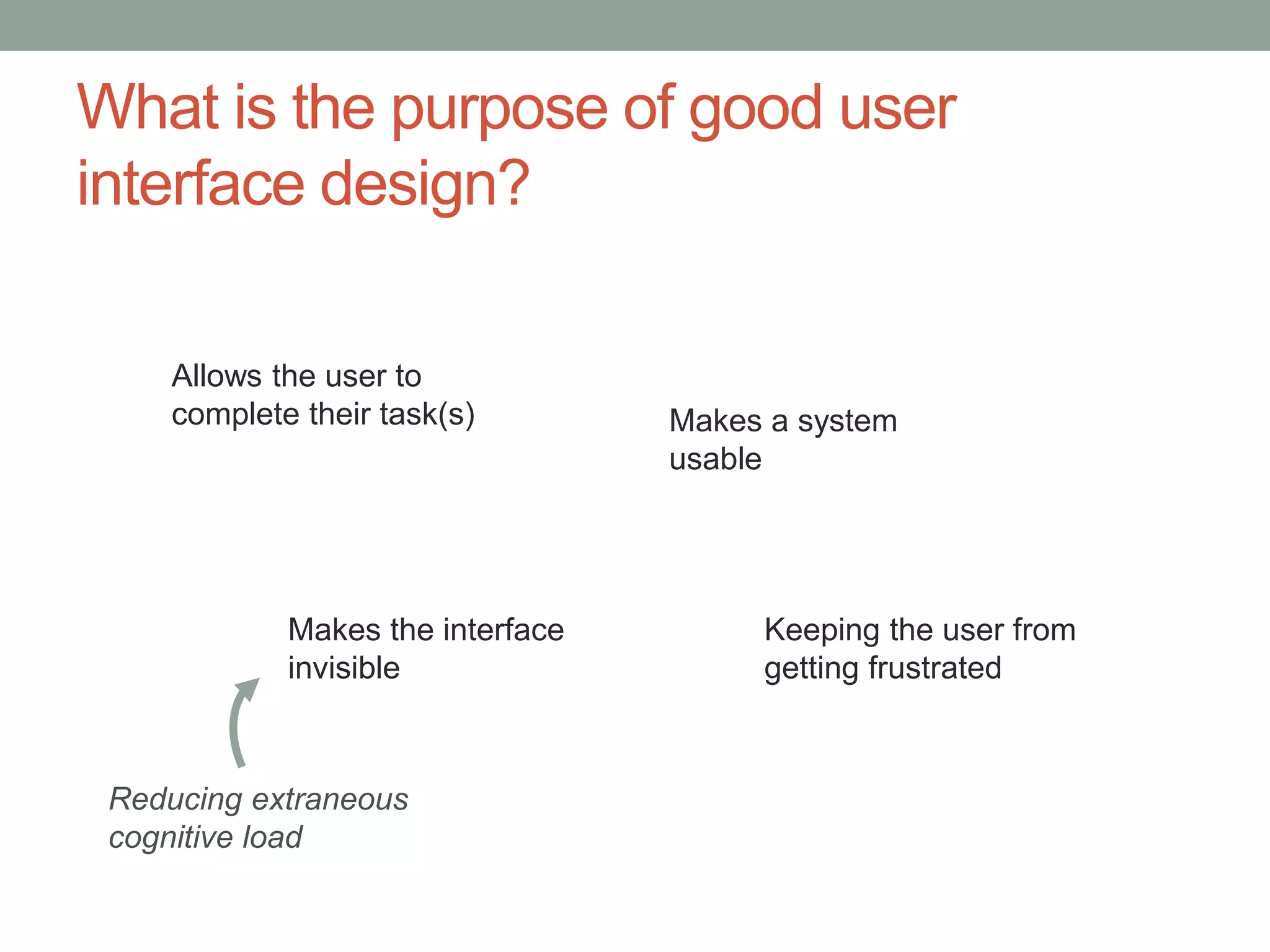
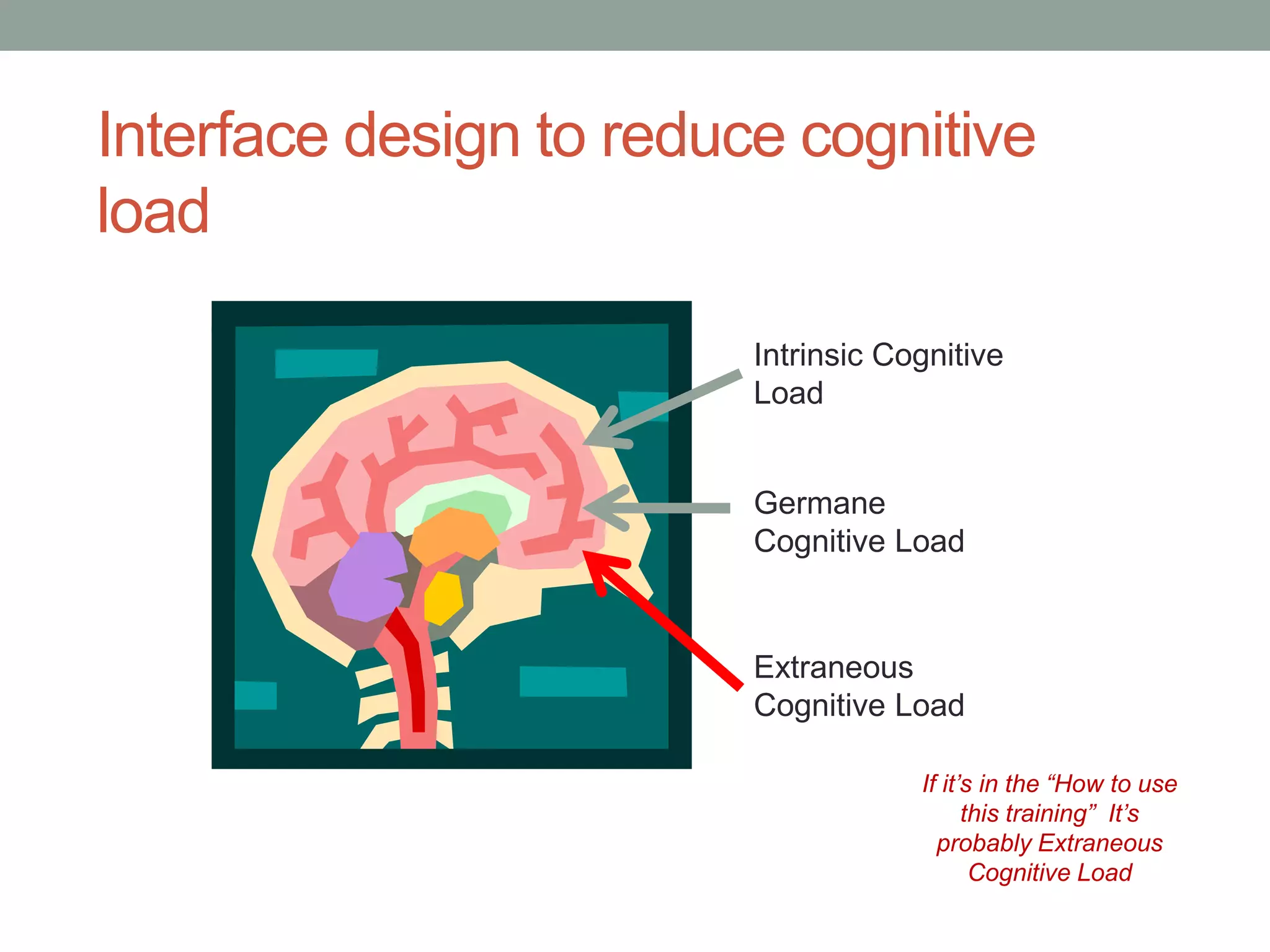
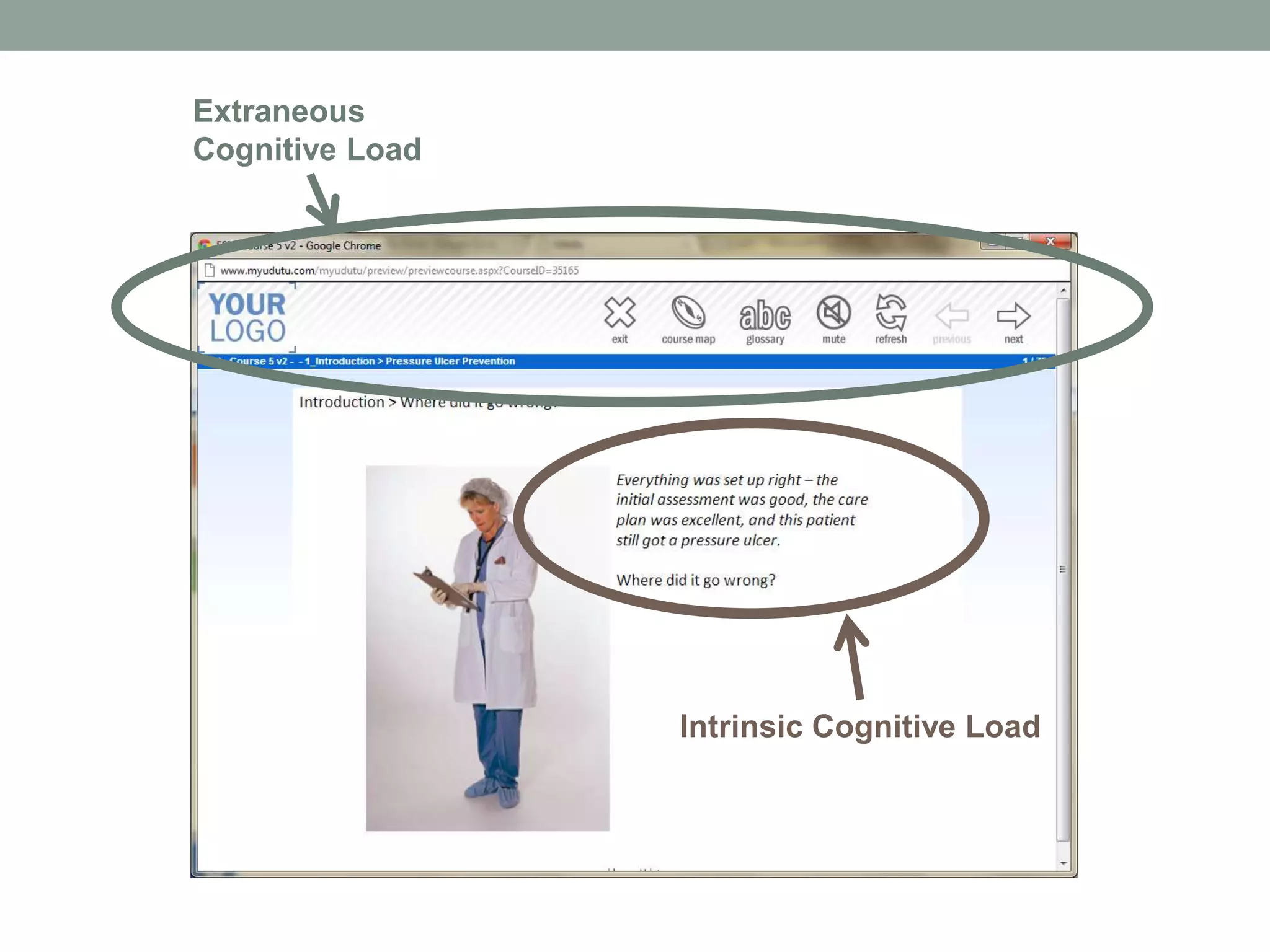
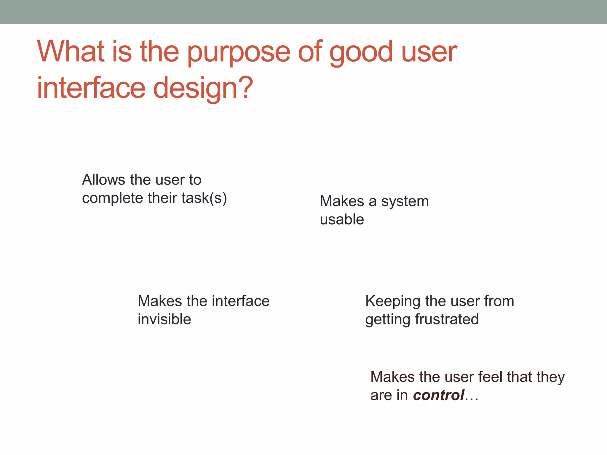
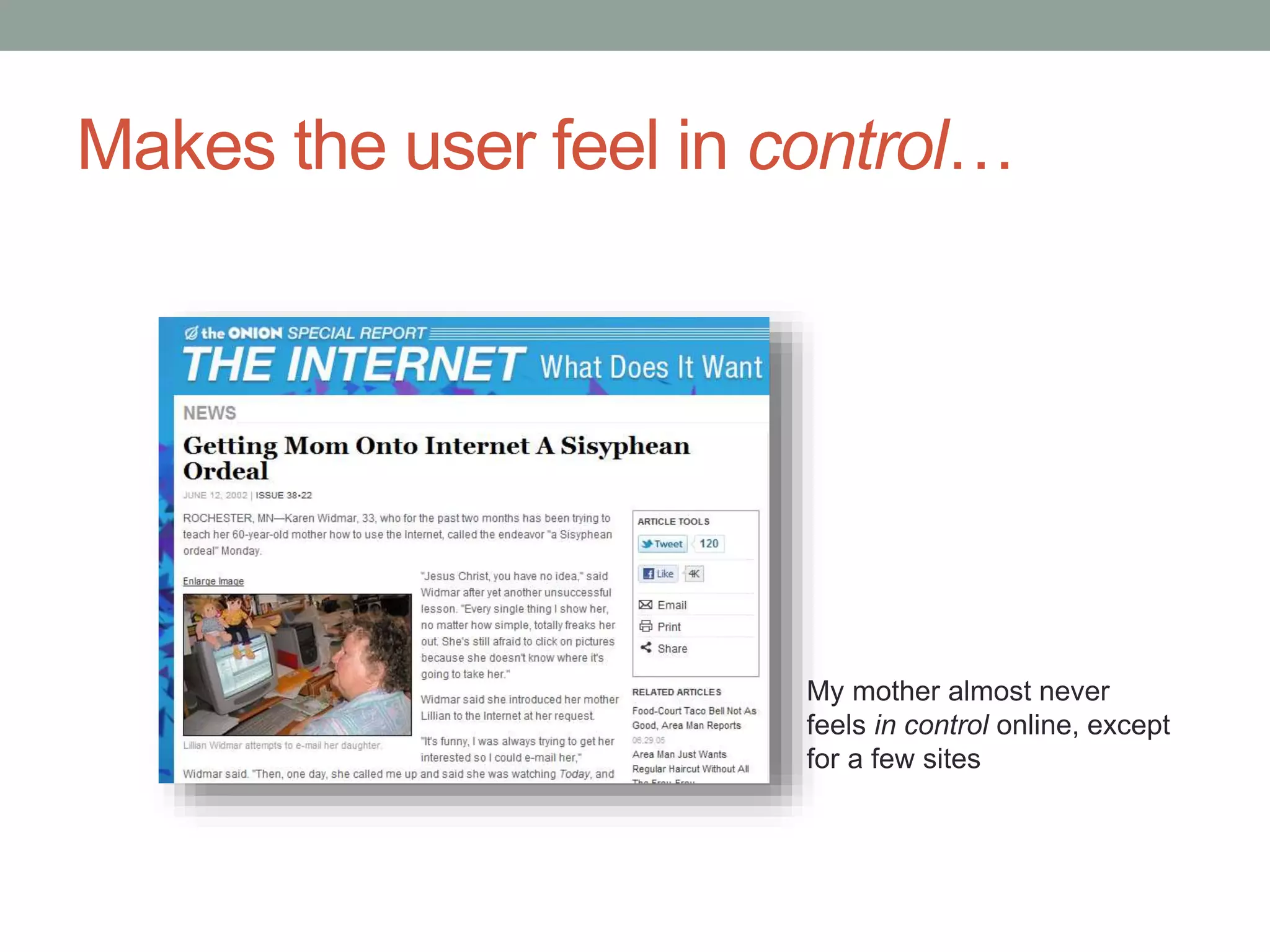
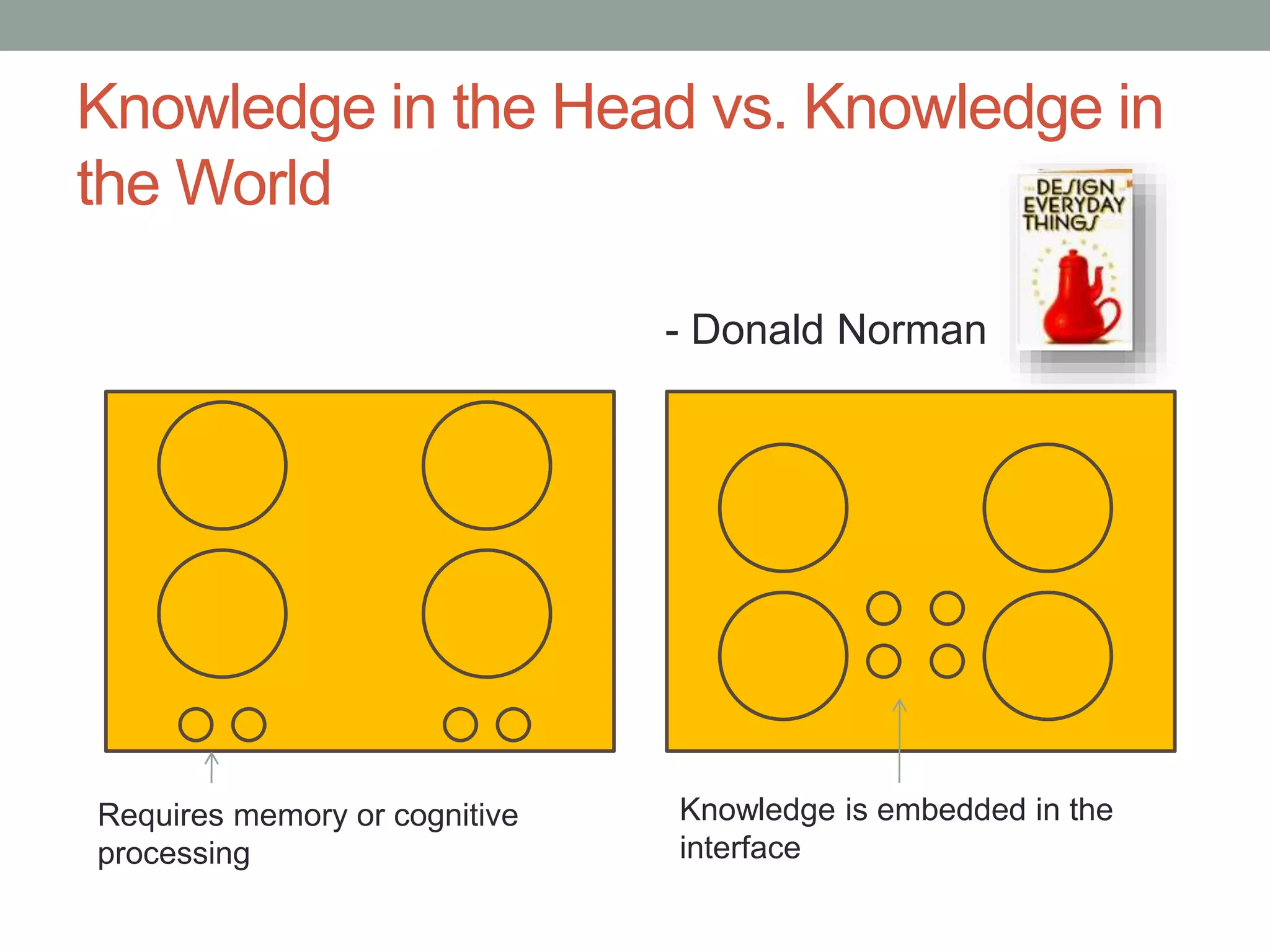
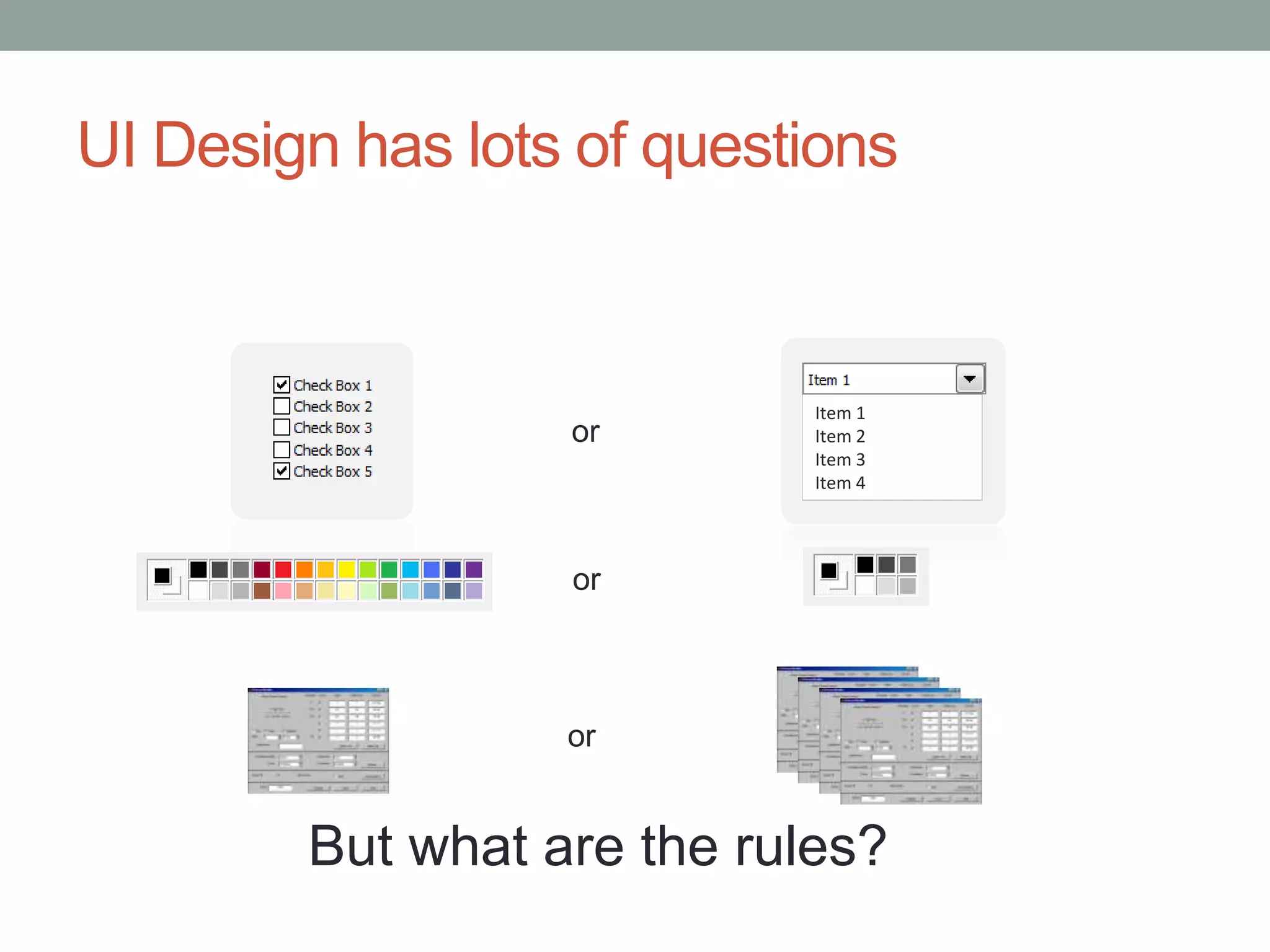
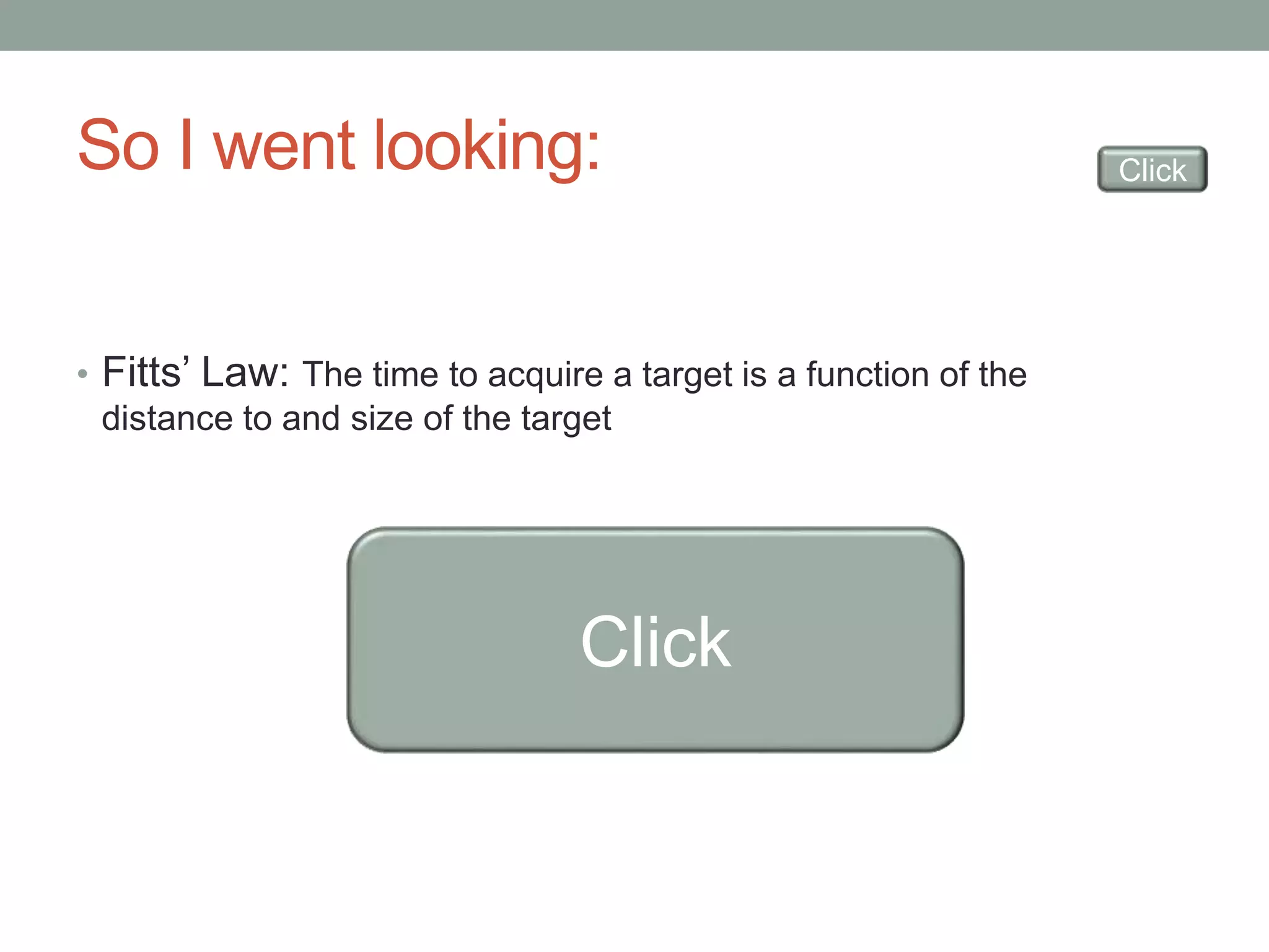
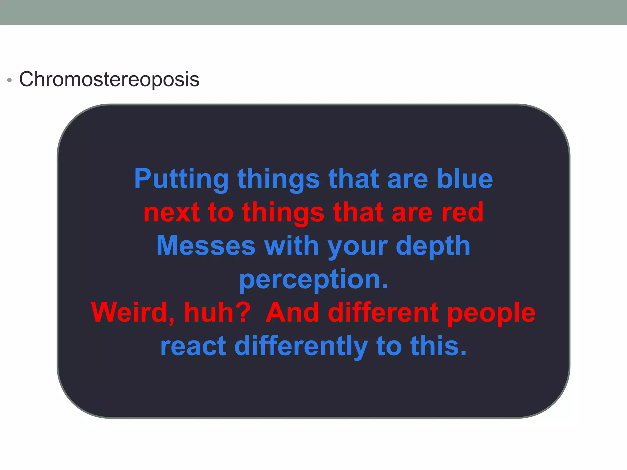
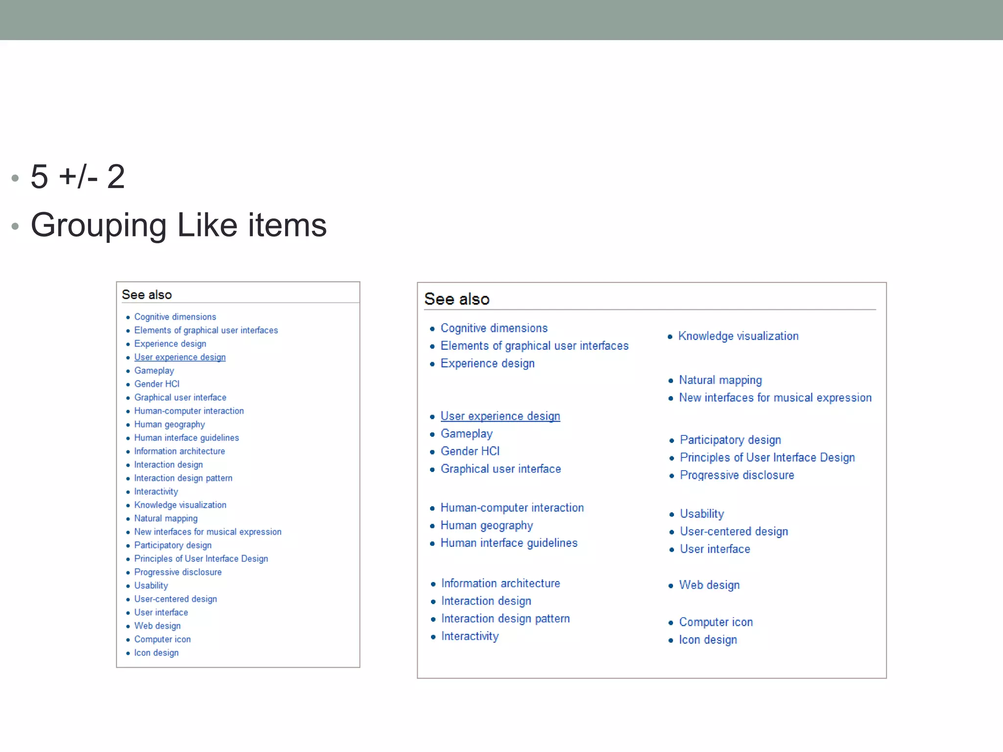
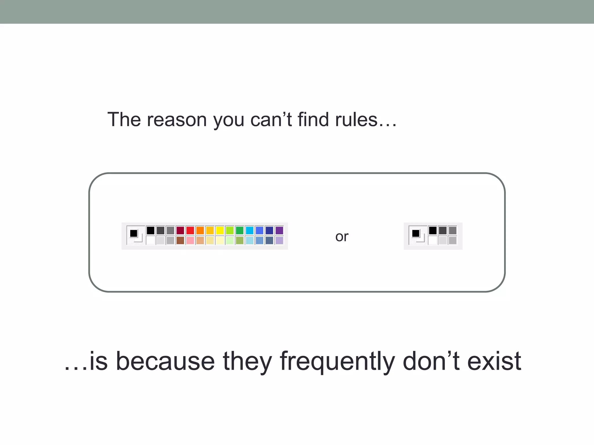
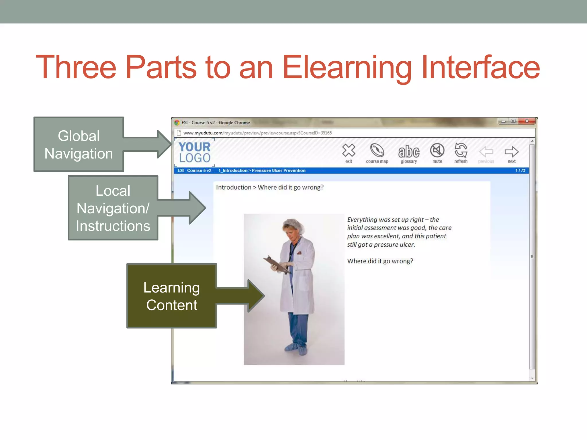
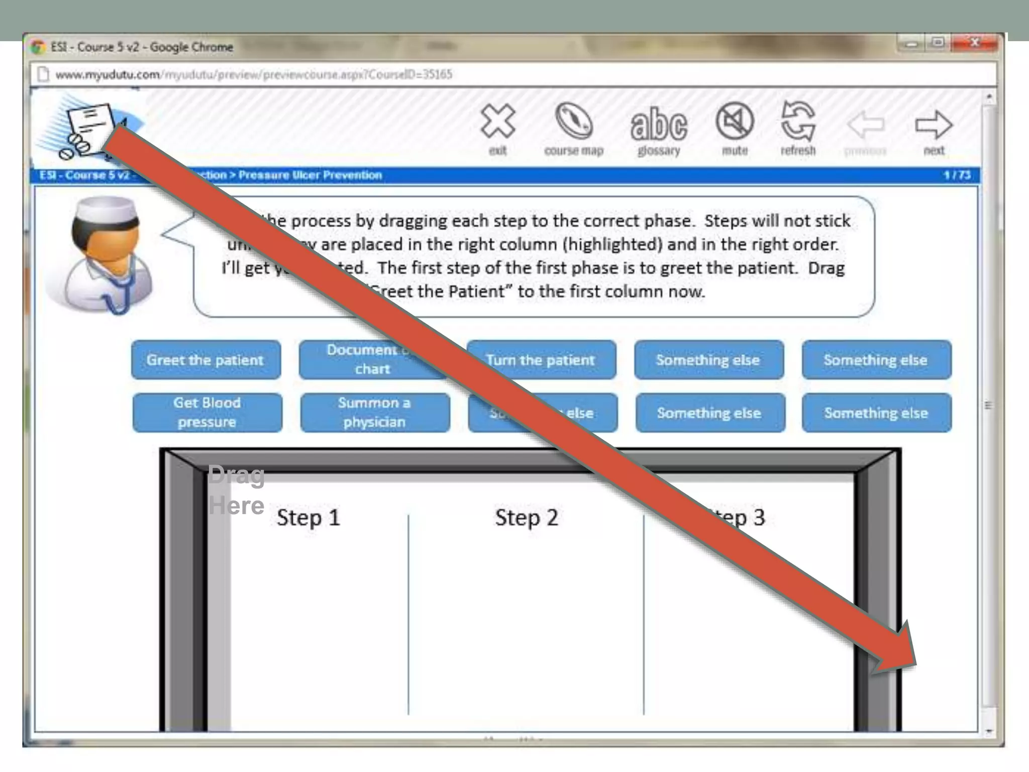
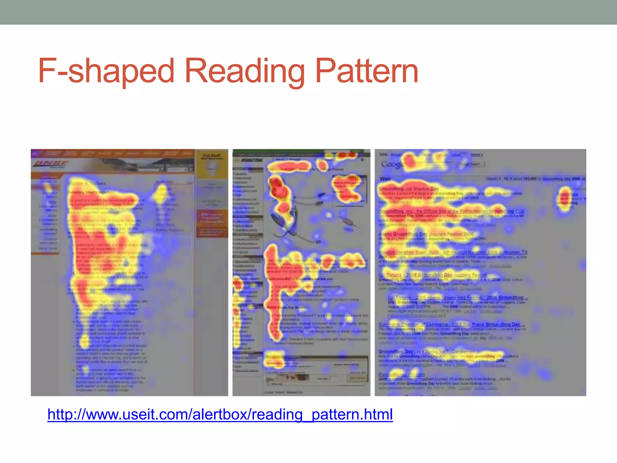
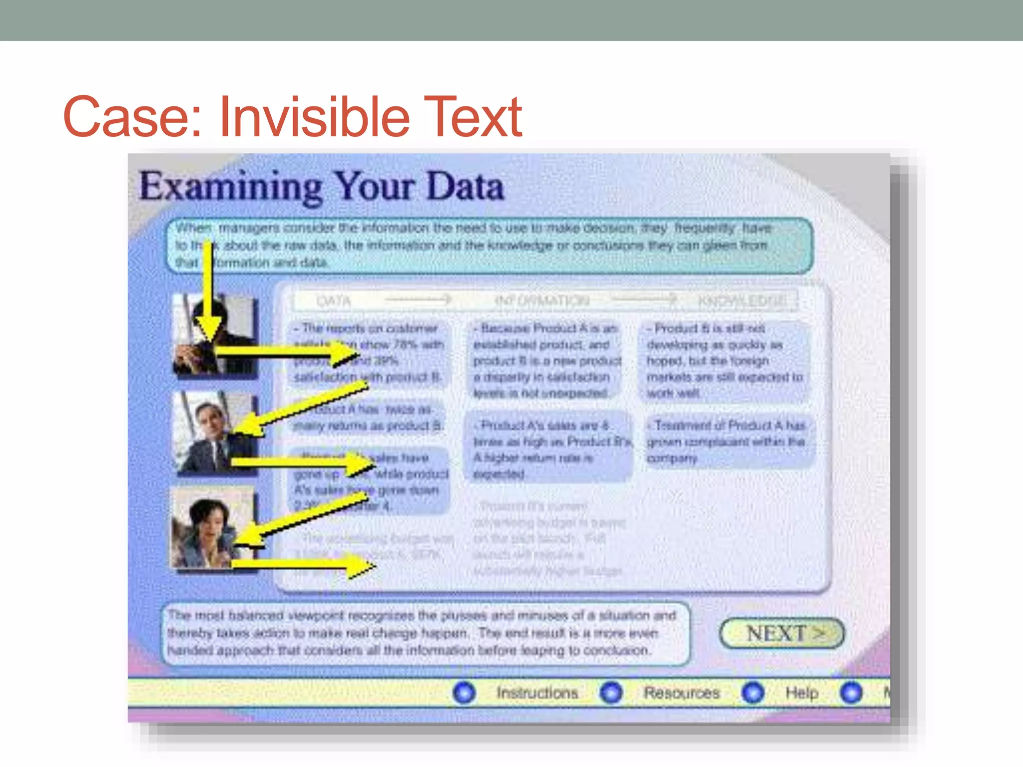
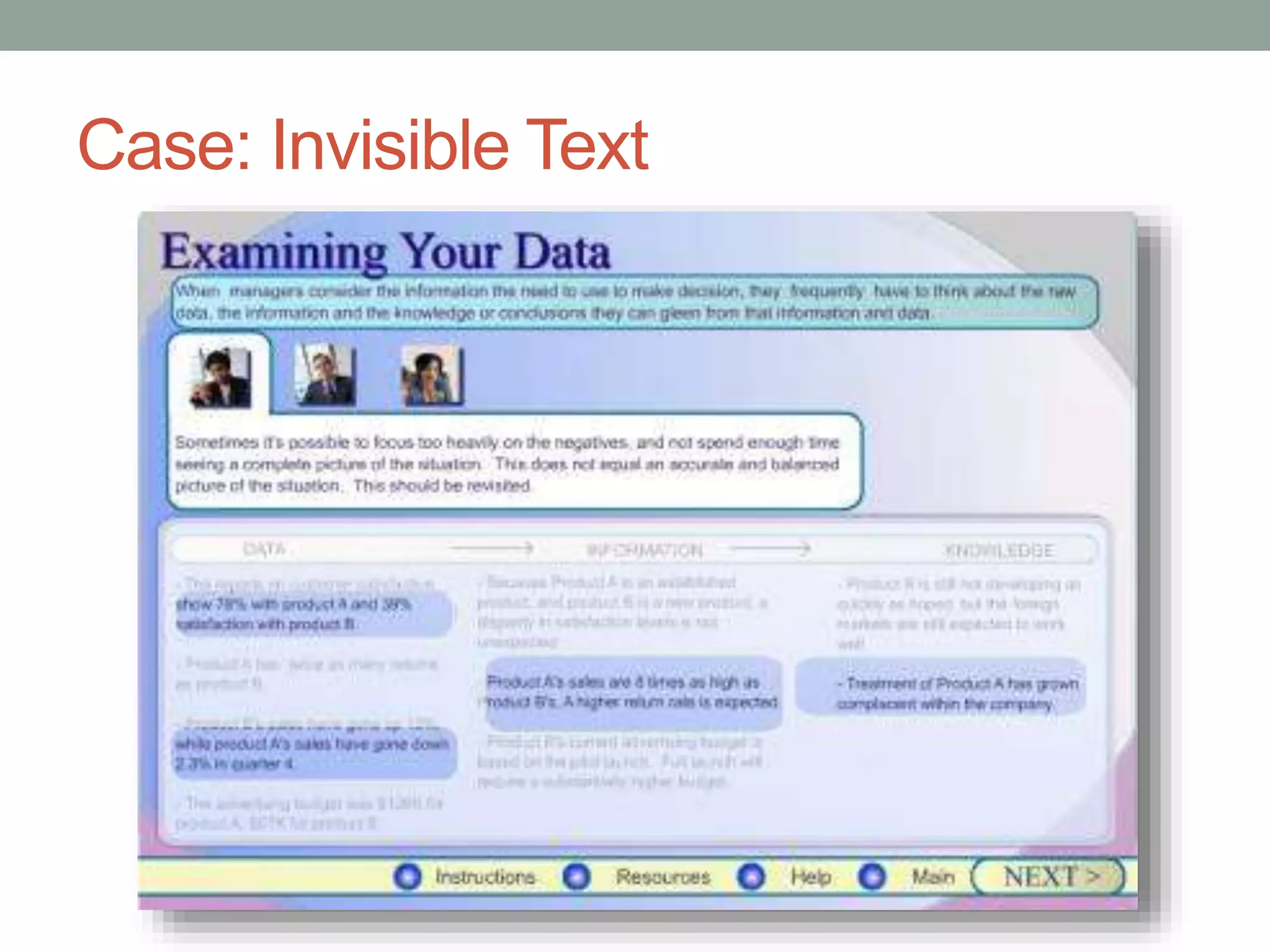
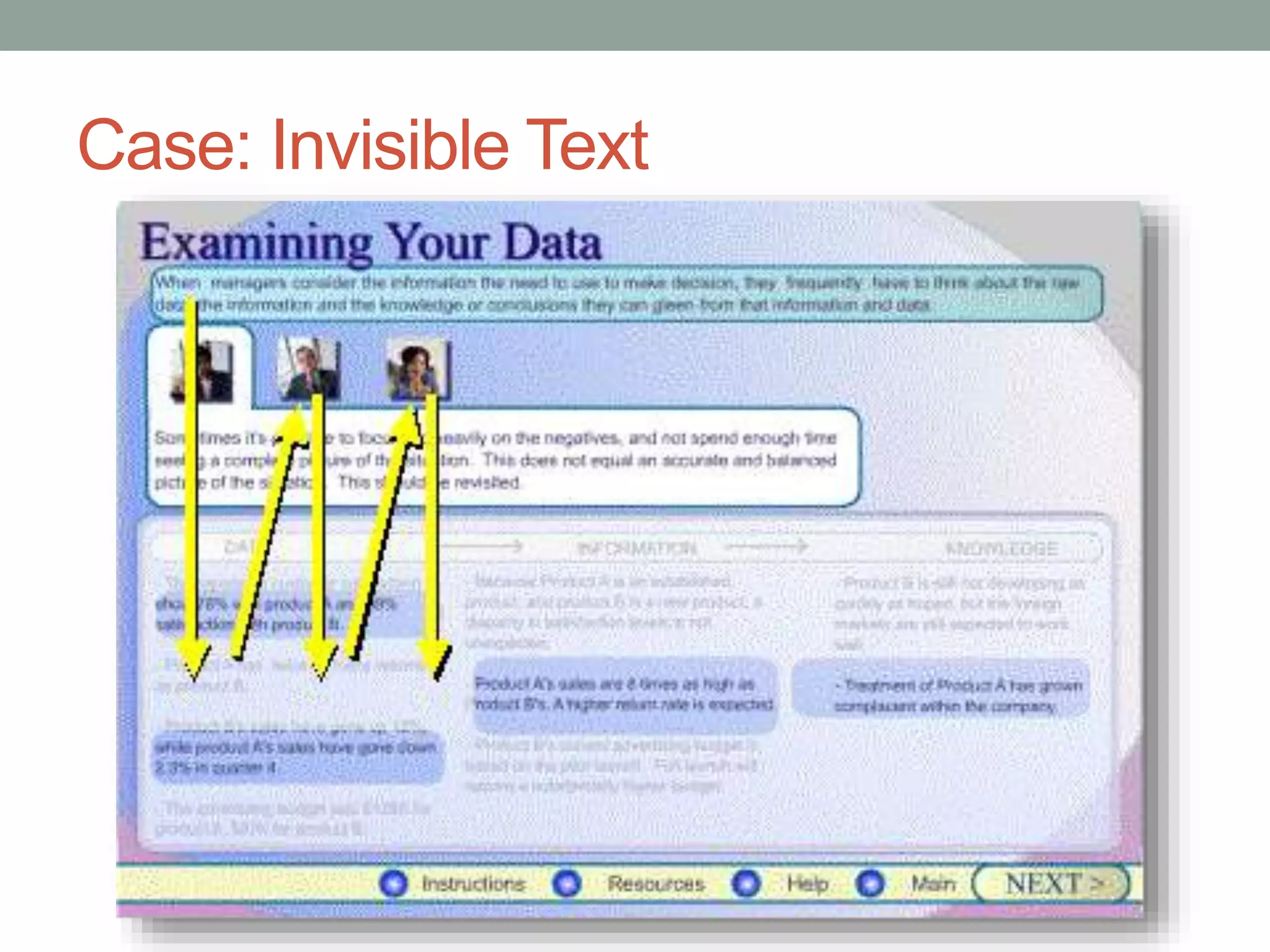
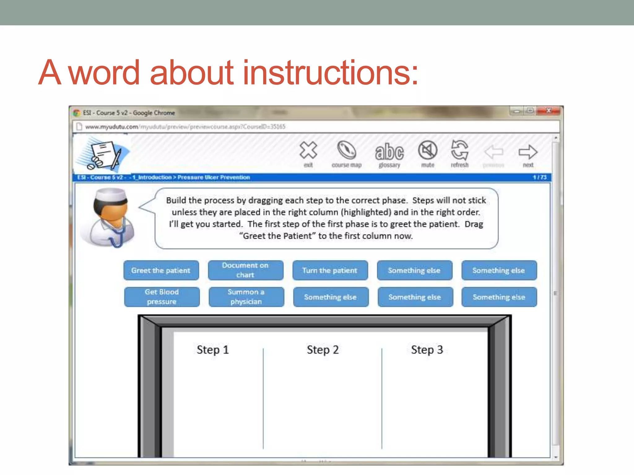
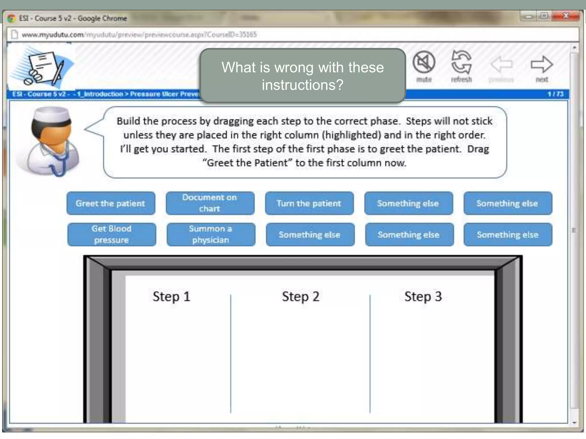
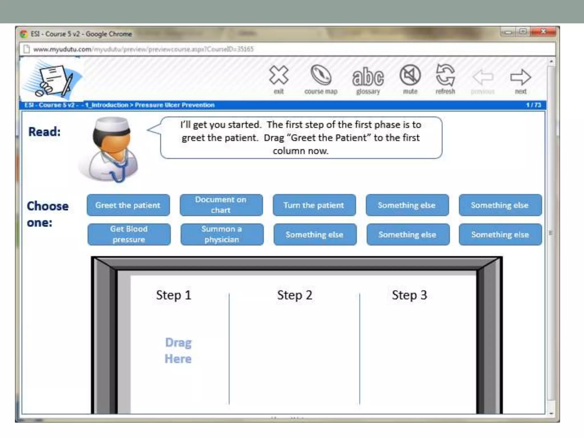
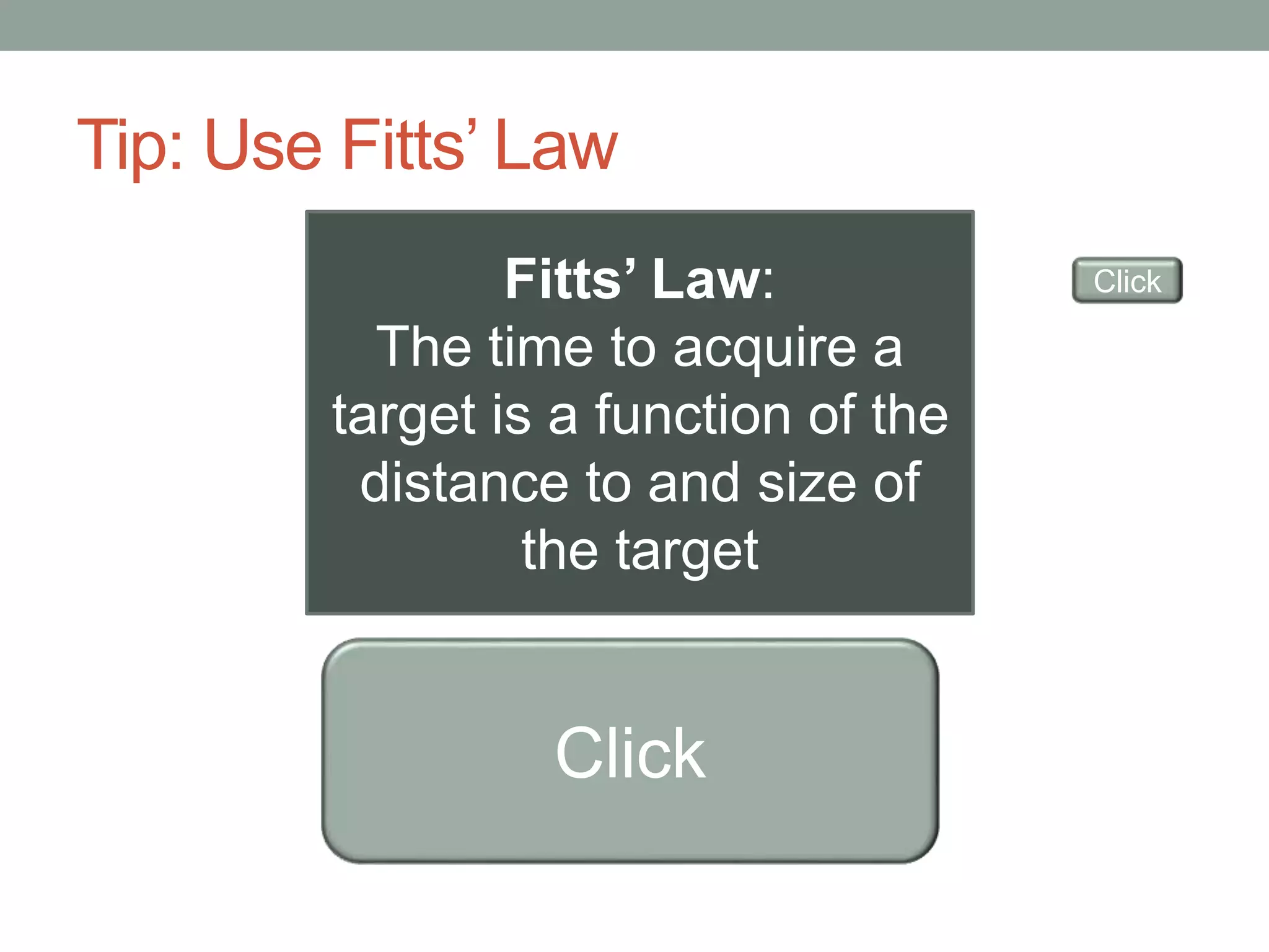
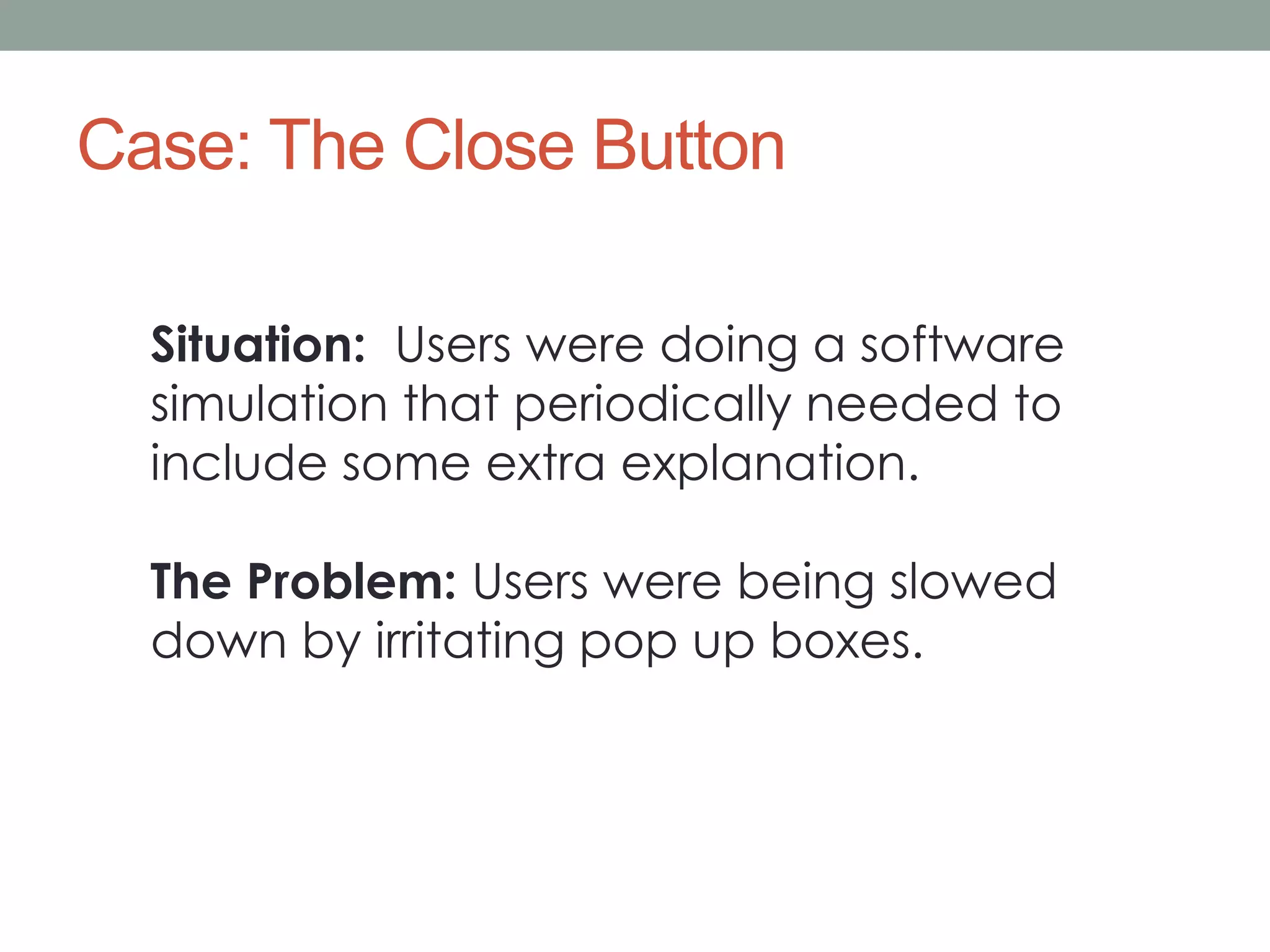
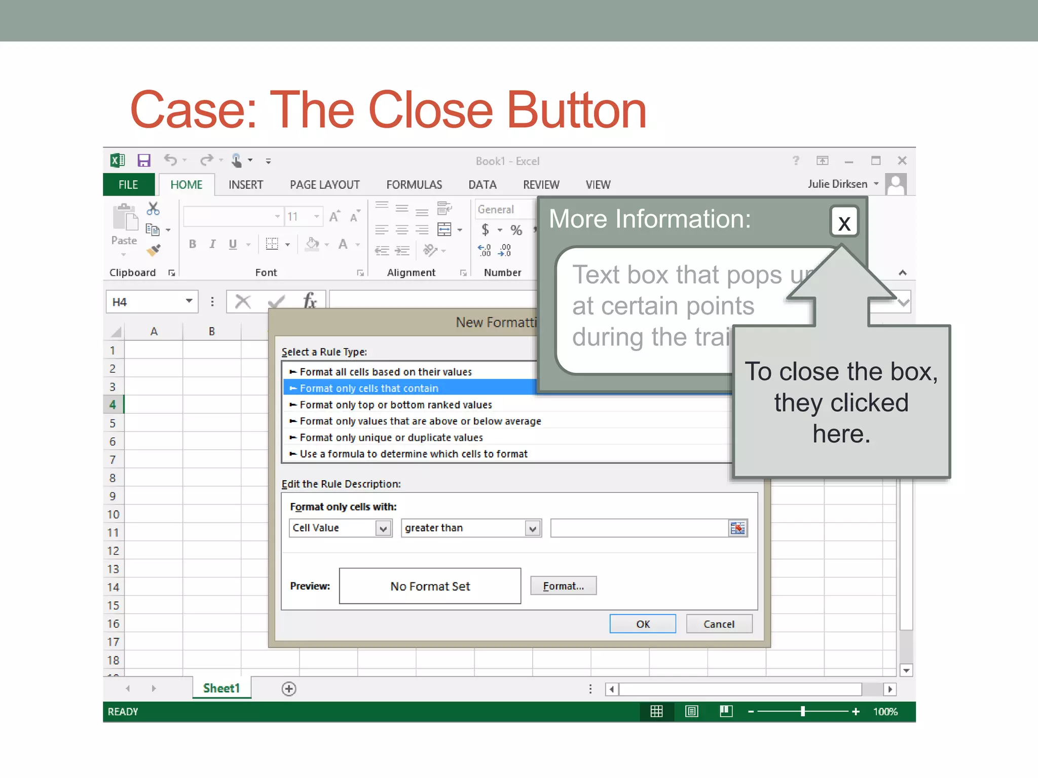
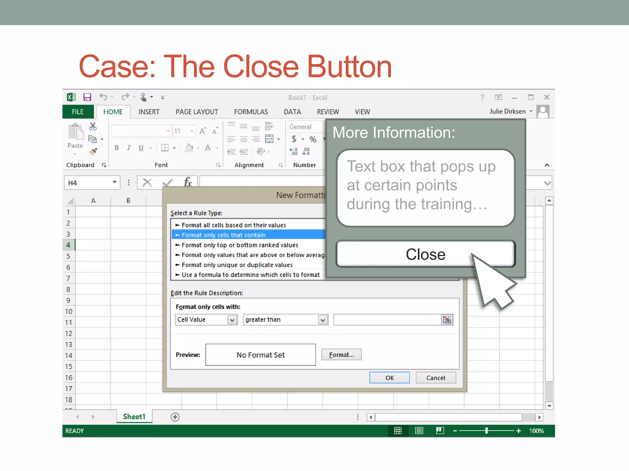
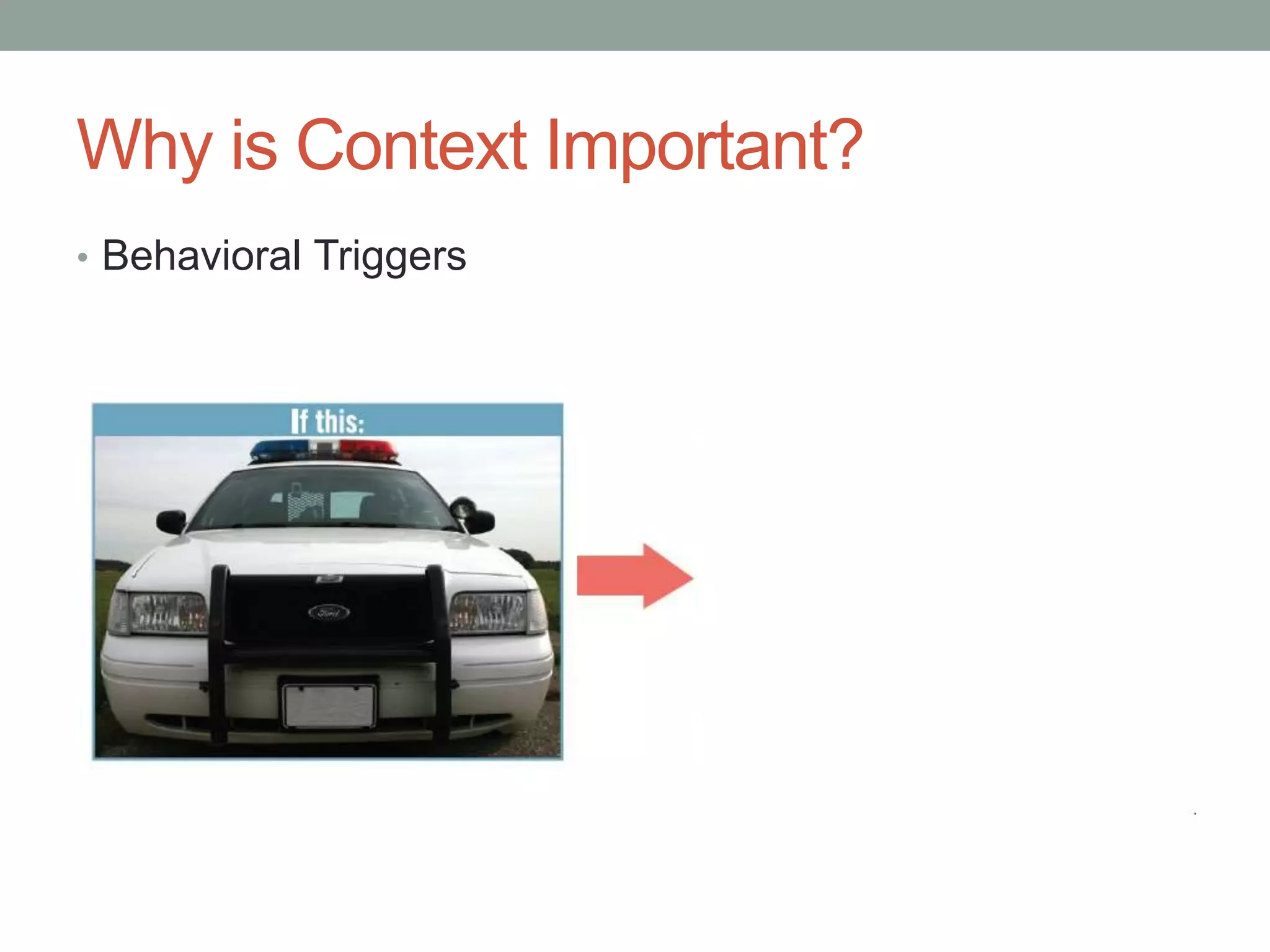
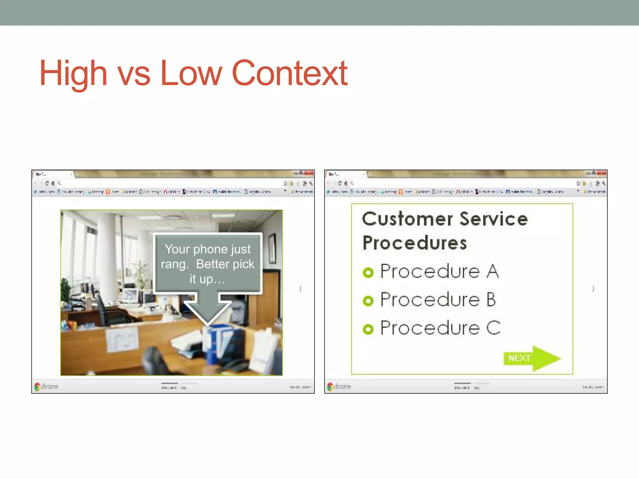
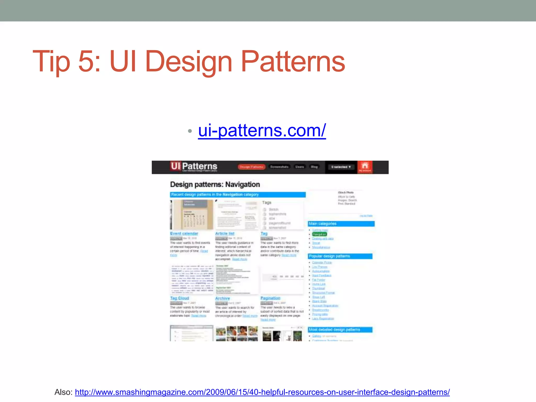
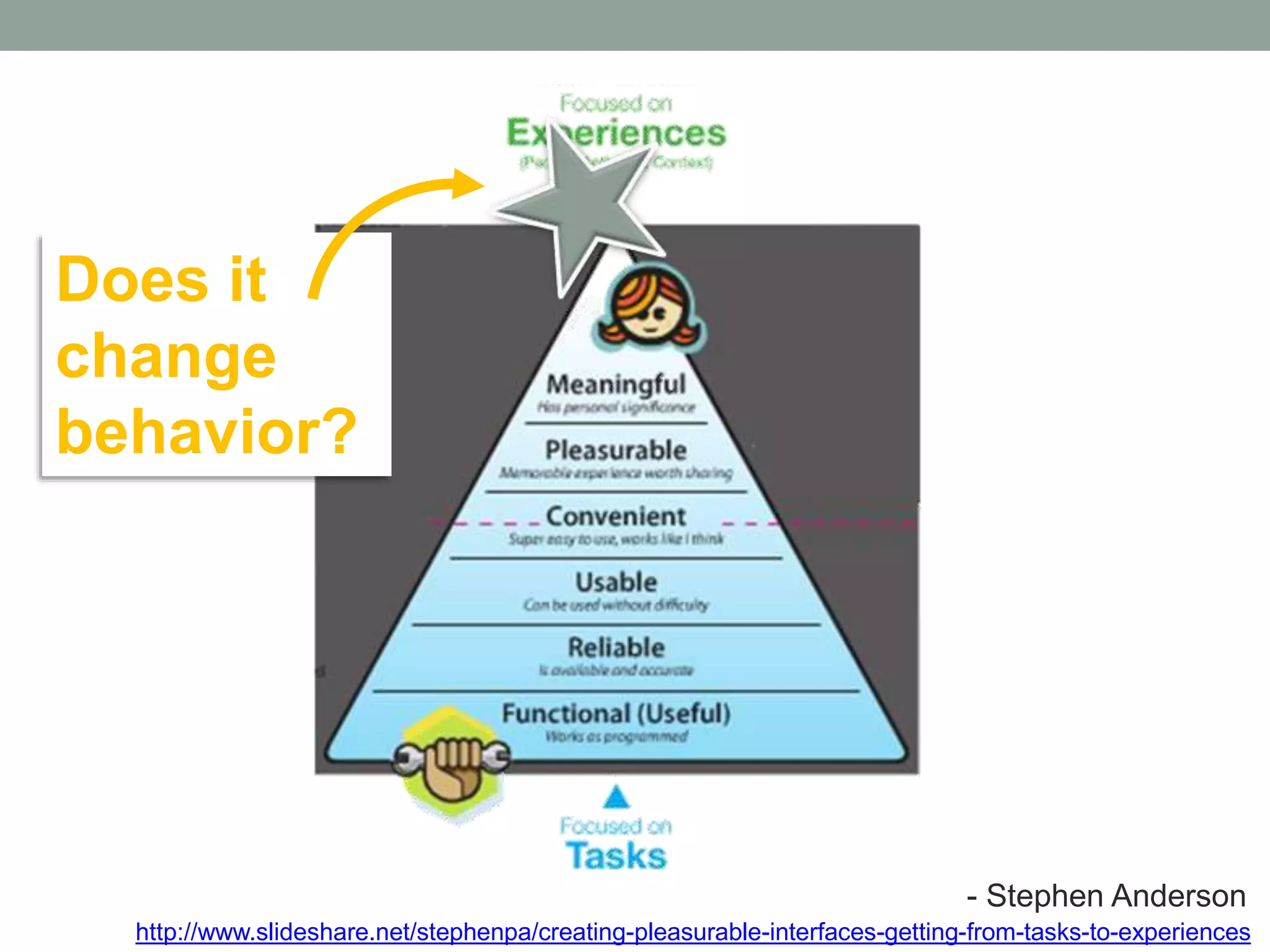
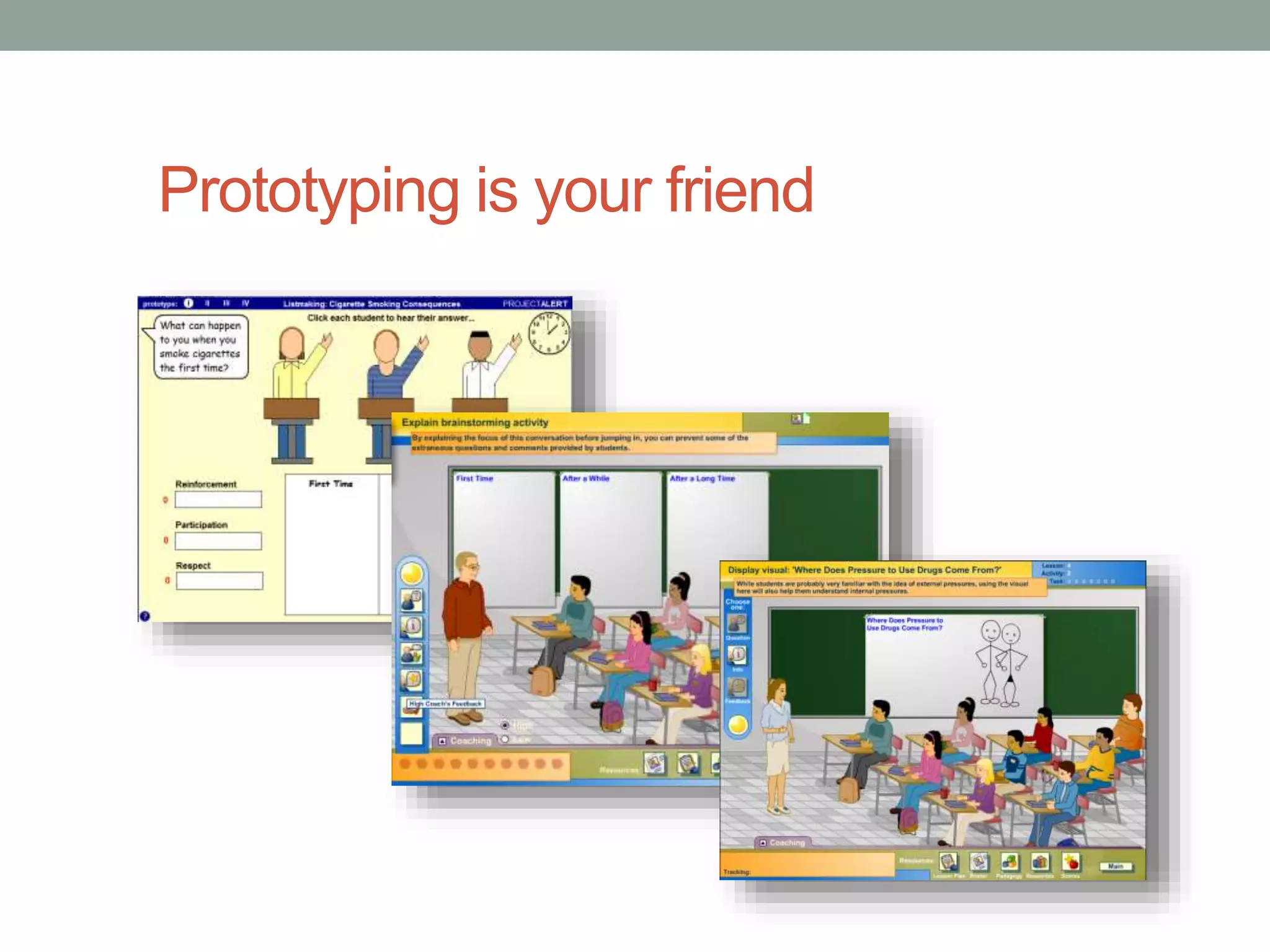
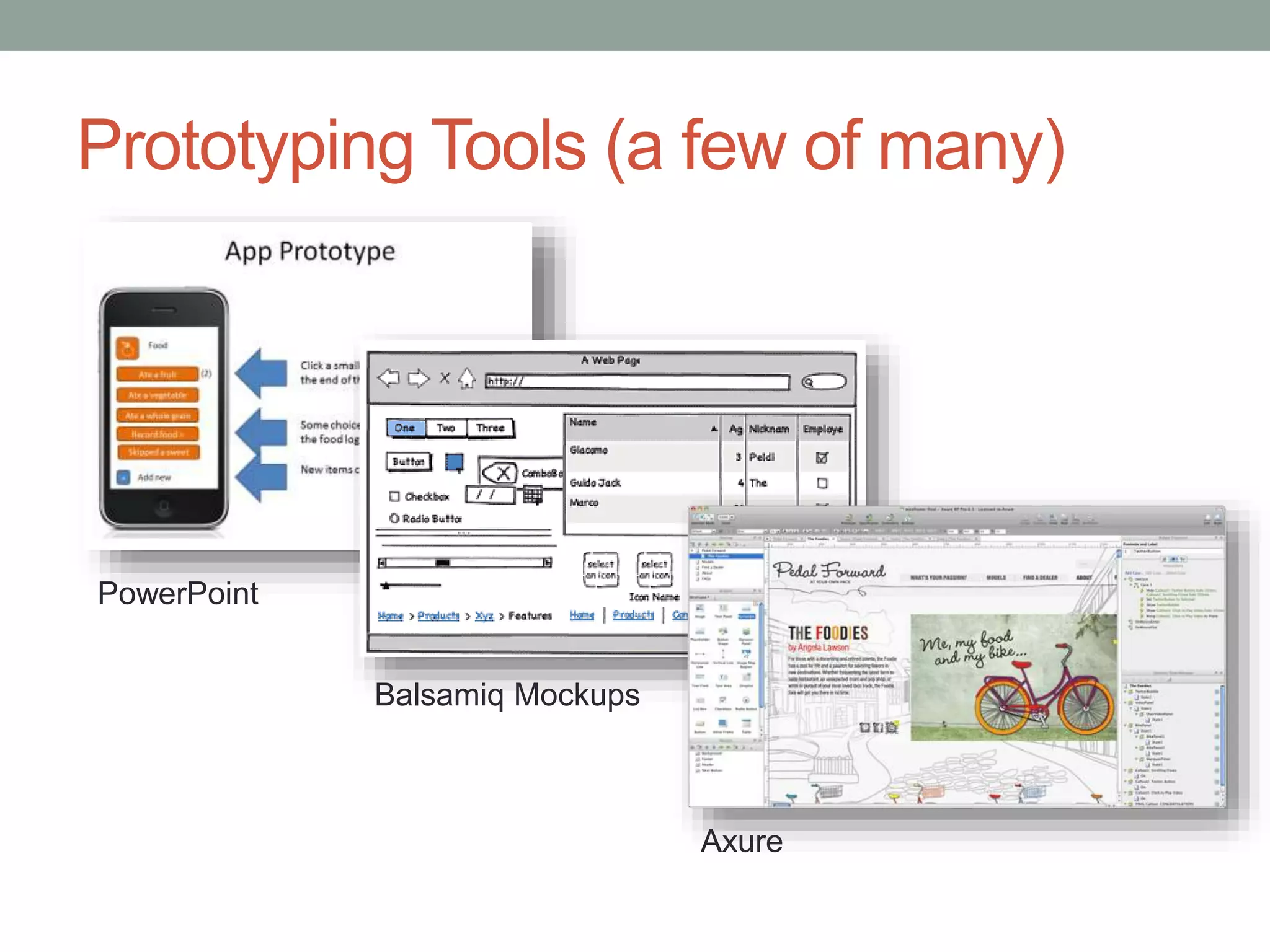
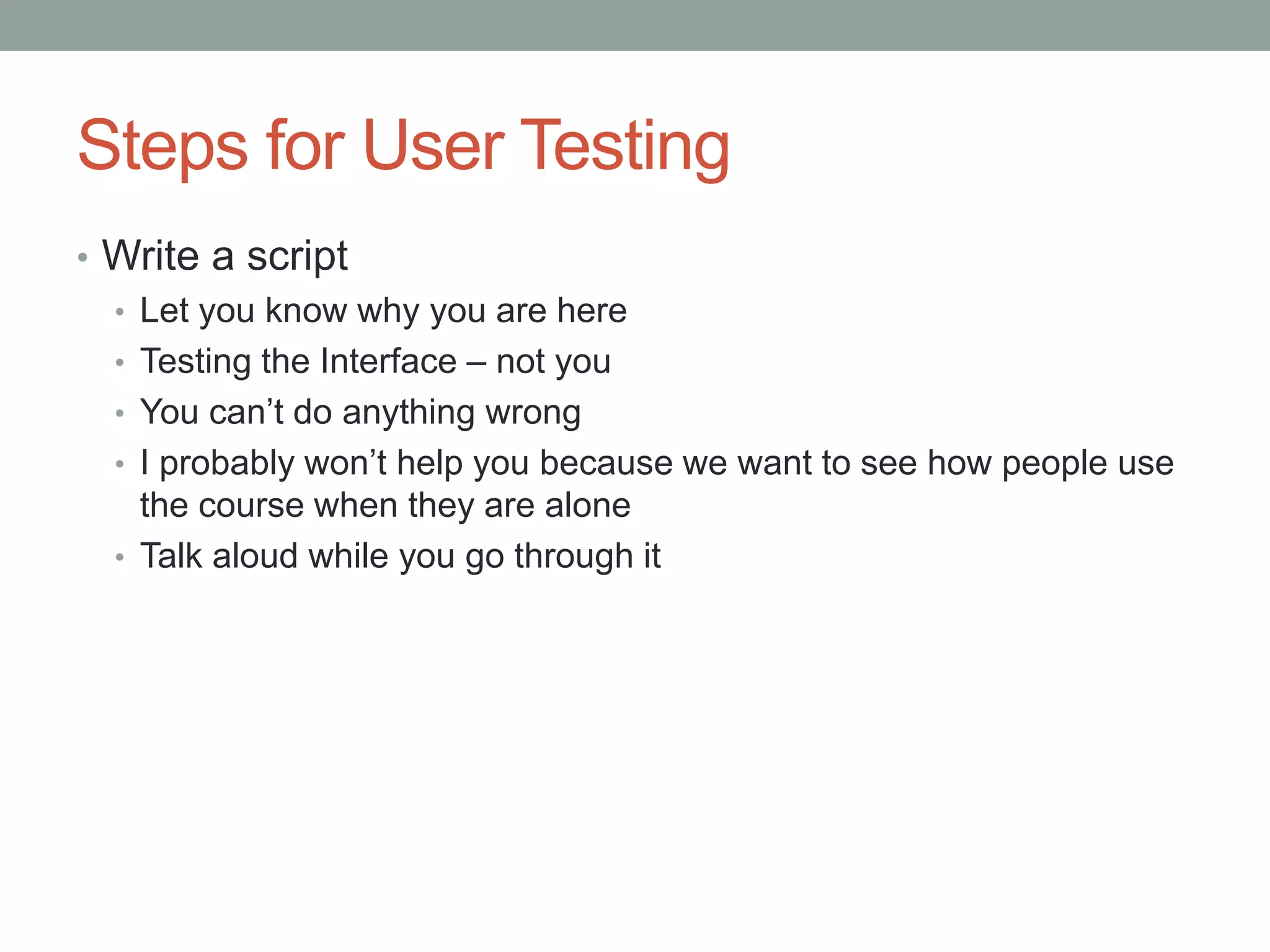
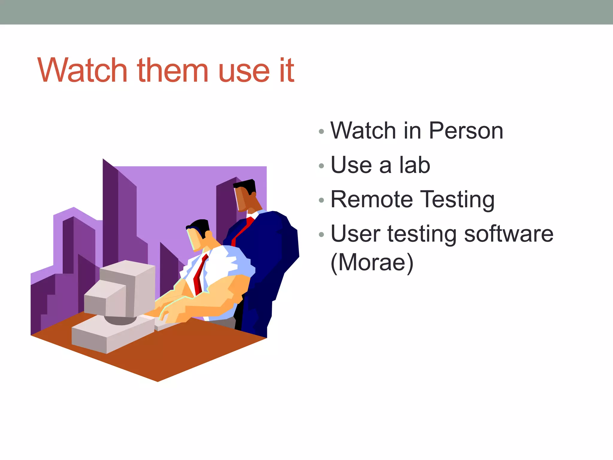
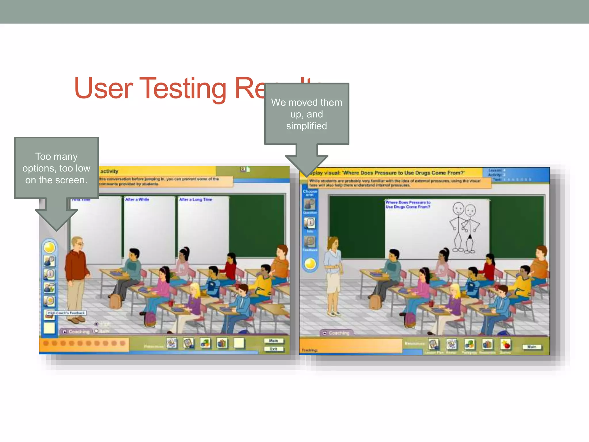
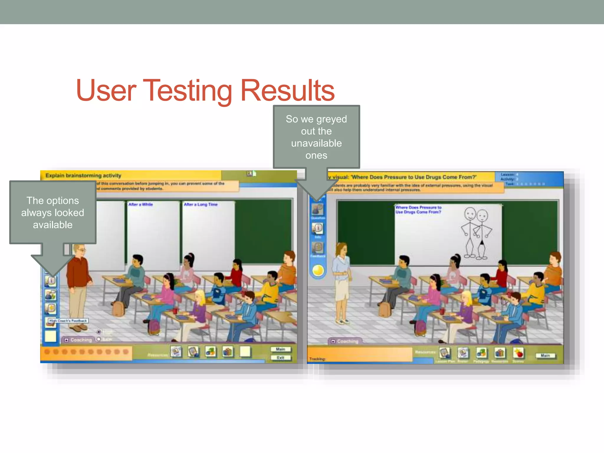
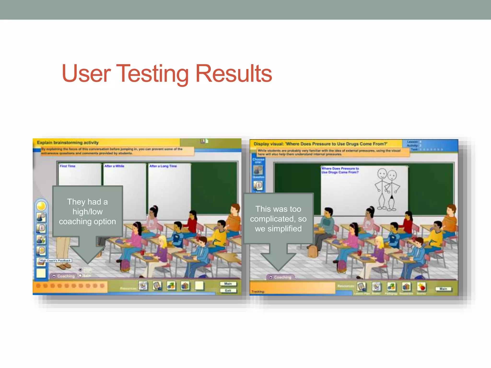
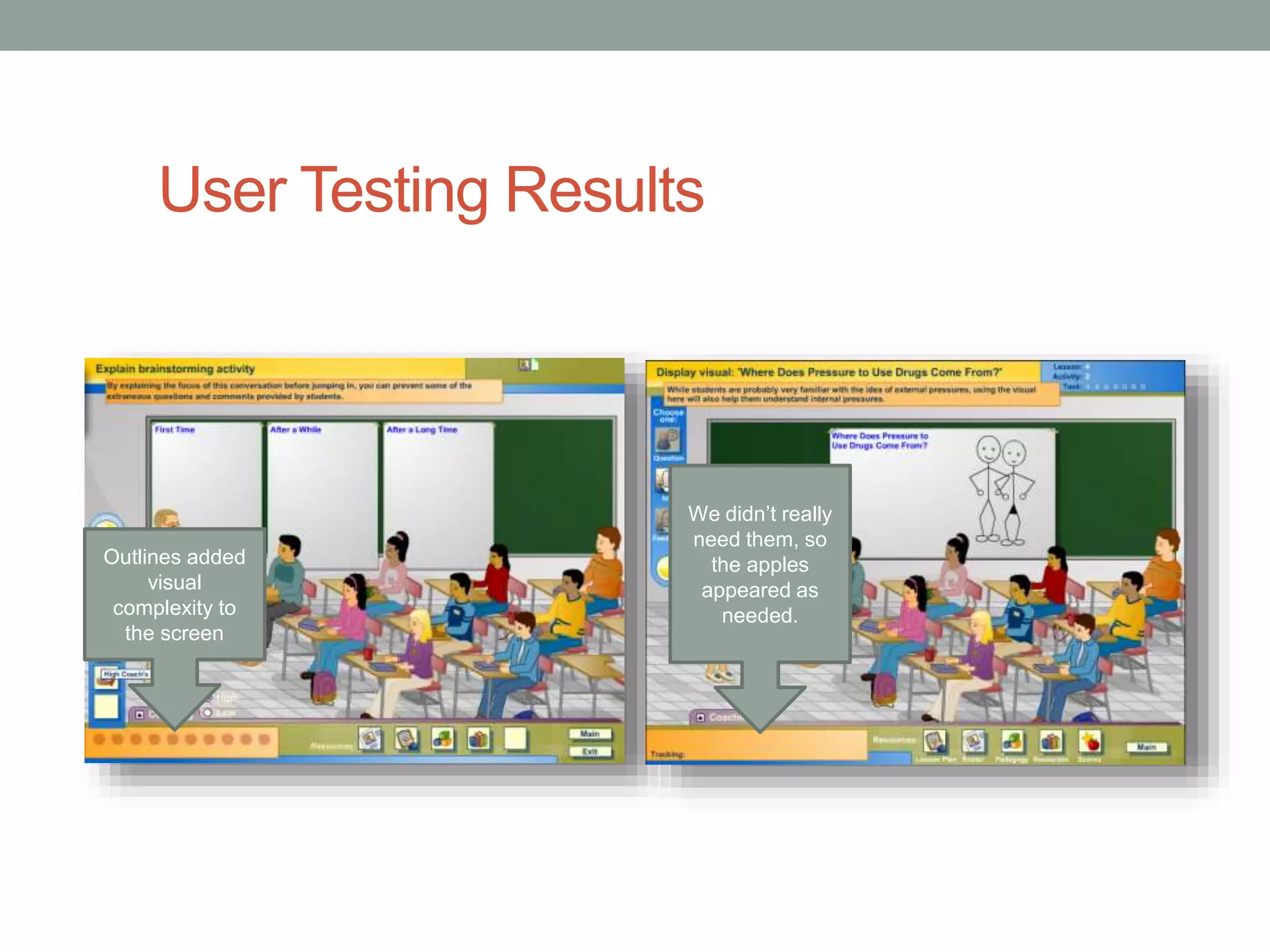
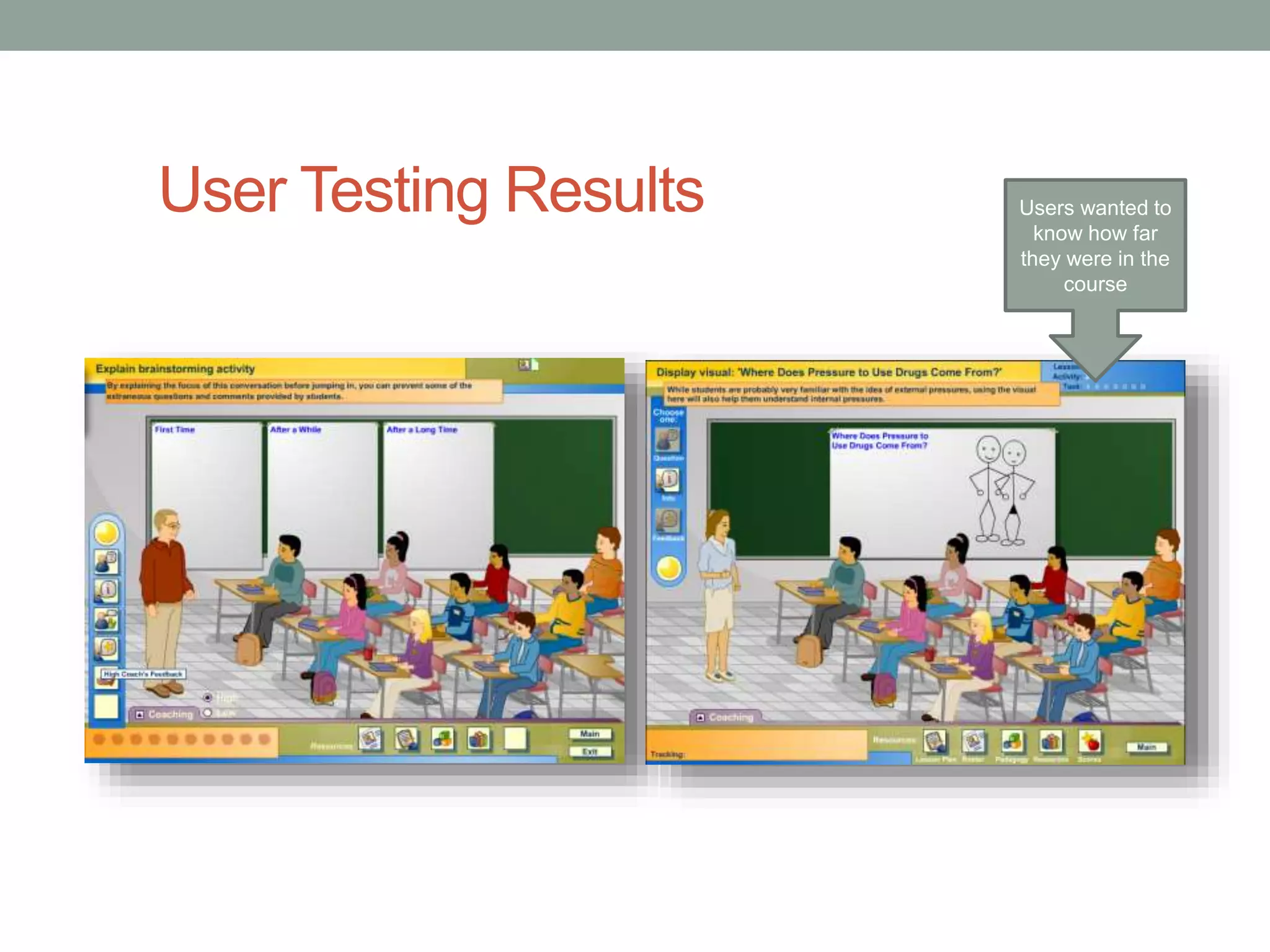
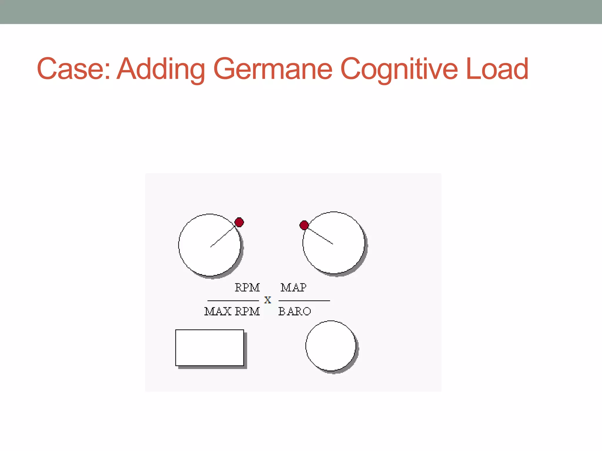
INTERFACE DESIGN 
Tips and Tricks for designing for Learning 
Environments 
Julie Dirksen 
Usable Learning
So, what are your challenges?
Interface Design For ELearning 
โ€ข Principles of UI Design 
โ€ข Tips for UI Elearning Design 
โ€ข Process of Design
The Elements of User Experience 
- Jesse James 
Garrett 
http://www.jjg.net/ 
elements/ 
Jesse James Garret โ€“ Elements of User Experience
- Stephen Anderson 
http://www.slideshare.net/stephenpa/creating-pleasSurtaebpleh-einnte rAfancedse-grsetotinng w-frwomw-.tapsokes-ttpo-aeixnpteerrie.cncoems
What is the purpose of good user 
interface design? 
Makes a system 
usable 
Allows the user to 
complete their task(s) 
Keeping the user from 
getting frustrated 
Makes the interface 
invisible 
Reducing extraneous 
cognitive load
Interface design to reduce cognitive 
load 
Intrinsic Cognitive 
Load 
Germane 
Cognitive Load 
Extraneous 
Cognitive Load 
If itโ€™s in the โ€œHow to use 
this trainingโ€ Itโ€™s 
probably Extraneous 
Cognitive Load
Intrinsic Cognitive Load 
Extraneous 
Cognitive Load
What is the purpose of good user 
interface design? 
Makes a system 
usable 
Makes the user feel that they 
are in controlโ€ฆ 
Allows the user to 
complete their task(s) 
Keeping the user from 
getting frustrated 
Makes the interface 
invisible
Makes the user feel in controlโ€ฆ 
My mother almost never 
feels in control online, except 
for a few sites
The Purpose? 
โ€ข Reduced cognitive load 
โ€ข More positive user experience 
โ€ข Better learning outcomes
Knowledge in the Head vs. Knowledge in 
the World 
- Donald Norman 
Requires memory or cognitive 
processing 
Knowledge is embedded in the 
interface
UI Design has lots of questions 
or 
Item 1 
Item 2 
Item 3 
Item 4 
or 
or 
But what are the rules?
So I went looking: 
โ€ข Fittsโ€™ Law: The time to acquire a target is a function of the 
distance to and size of the target 
Click 
Click
โ€ข Chromostereoposis 
Putting things that are blue 
next to things that are red 
Messes with your depth 
perception. 
Weird, huh? And different people 
react differently to this.
โ€ข 5 +/- 2 
โ€ข Grouping Like items
And that was kind of itโ€ฆ 
โ€ฆUmm?
Then I bumped into thisโ€ฆ
The reason you canโ€™t find rulesโ€ฆ 
or 
โ€ฆis because they frequently donโ€™t exist
We design in a tunnel
And we fill in 
gaps
But there are some tips:
Three Parts to an Elearning Interface 
Global 
Navigation 
Local 
Navigation/ 
Instructions 
Learning 
Content
Tip: Work with reading patterns 
โ€ข Ensure that your formats follow the way people read.
Drag 
Here
F-shaped Reading Pattern 
http://www.useit.com/alertbox/reading_pattern.html
Case: Invisible Text
Tip 3: Make better instructions 
โ€ข Match the format of the instructions to the context of use.
A word about instructions:
What is wrong with these 
instructions?
What are the purposes for screen 
instructions? 
โ€ข Set up the situation / scenario / 
learning context 
โ€ข Tell the learner what they are 
going to do on the screen 
โ€ข Help them figure out what to do 
next
What is subitizing?
Tip: Use Fittsโ€™ Law 
Fittsโ€™ Law: 
The time to acquire a 
target is a function of the 
distance to and size of 
the target 
Click 
Click
Case: The Close Button 
Situation: Users were doing a software 
simulation that periodically needed to 
include some extra explanation. 
The Problem: Users were being slowed 
down by irritating pop up boxes.
Case: The Close Button 
More Information: x 
Text box that pops up 
at certain points 
during the trainingโ€ฆ 
To close the box, 
they clicked 
here.
Case: The Close Button 
More Information: x 
Text box that pops up 
at certain points 
during the trainingโ€ฆ 
Close
Tip 4: Create high context interfaces 
โ€ข Embed the triggers for behavior in the interface itself.
Quick Poll 
If you have to study for a test, where would you rather 
study: 
1. In a quiet Library? 
2. In your favorite coffee shop? 
3. In the grey, window-less classroom with the noisy 
HVAC system?
Why is Context Important? 
โ€ข Behavioral Triggers
High vs Low Context 
Your phone just 
rang. Better pick 
it upโ€ฆ
Tip 5: UI Design Patterns 
โ€ข ui-patterns.com/ 
Also: http://www.smashingmagazine.com/2009/06/15/40-helpful-resources-on-user-interface-design-patterns/
- Stephen Anderson 
Stephen Anderson www.poetpainter.com 
Does it 
change 
behavior? 
http://www.slideshare.net/stephenpa/creating-pleasurable-interfaces-getting-from-tasks-to-experiences
Tip 6: The Biggest Rule of All 
โ€ข Test your designs 
Image by Gluemoon cc license 
http://www.flickr.com/photos/gluemoon/90804324/sizes/l/in/photostream/
Prototyping is your friend
Prototyping Tools (a few of many) 
PowerPoint 
Balsamiq Mockups 
Axure
Who does Usability Testing?
Steps for User Testing 
โ€ข Create a test plan
Steps for User Testing 
โ€ข Recruit users (5-6 testers / 1-1.5 hours each)
Steps for User Testing 
โ€ข Write a script 
โ€ข Let you know why you are here 
โ€ข Testing the Interface โ€“ not you 
โ€ข You canโ€™t do anything wrong 
โ€ข I probably wonโ€™t help you because we want to see how people use 
the course when they are alone 
โ€ข Talk aloud while you go through it
Watch them use it 
โ€ขWatch in Person 
โ€ข Use a lab 
โ€ข Remote Testing 
โ€ข User testing software 
(Morae)
Document the Results 
โ€ข User Testing Summary Report 
โ€ข Design Recommendations 
โ€ข Rinse and Repeat
User Testing Results 
Too many 
options, too low 
on the screen. 
We moved them 
up, and 
simplified
User Testing Results 
The options 
always looked 
available 
So we greyed 
out the 
unavailable 
ones
User Testing Results 
They had a 
high/low 
coaching option 
This was too 
complicated, so 
we simplified
User Testing Results 
Outlines added 
visual 
complexity to 
the screen 
We didnโ€™t really 
need them, so 
the apples 
appeared as 
needed.
User Testing Results Users wanted to 
know how far 
they were in the 
course
Case: Adding Germane Cognitive Load
Questions? 
โ€ข Thanks for coming 
โ€ข Contact: 
โ€ข Julie Dirksen 
โ€ข julie@usablelearning.com 
โ€ข http://usablelearning.com 
โ€ข Twitter: usablelearning 
โ€ข Slides will be available on Slideshare: 
http://www.slideshare.net/usablelearning

Interface Design for Elearning - Tips and Tricks

  • 1.
    INTERFACE DESIGN Tipsand Tricks for designing for Learning Environments Julie Dirksen Usable Learning
  • 2.
    So, what areyour challenges?
  • 3.
    Interface Design ForELearning โ€ข Principles of UI Design โ€ข Tips for UI Elearning Design โ€ข Process of Design
  • 4.
    The Elements ofUser Experience - Jesse James Garrett http://www.jjg.net/ elements/ Jesse James Garret โ€“ Elements of User Experience
  • 5.
    - Stephen Anderson http://www.slideshare.net/stephenpa/creating-pleasSurtaebpleh-einnte rAfancedse-grsetotinng w-frwomw-.tapsokes-ttpo-aeixnpteerrie.cncoems
  • 6.
    What is thepurpose of good user interface design? Makes a system usable Allows the user to complete their task(s) Keeping the user from getting frustrated Makes the interface invisible Reducing extraneous cognitive load
  • 7.
    Interface design toreduce cognitive load Intrinsic Cognitive Load Germane Cognitive Load Extraneous Cognitive Load If itโ€™s in the โ€œHow to use this trainingโ€ Itโ€™s probably Extraneous Cognitive Load
  • 8.
    Intrinsic Cognitive Load Extraneous Cognitive Load
  • 9.
    What is thepurpose of good user interface design? Makes a system usable Makes the user feel that they are in controlโ€ฆ Allows the user to complete their task(s) Keeping the user from getting frustrated Makes the interface invisible
  • 10.
    Makes the userfeel in controlโ€ฆ My mother almost never feels in control online, except for a few sites
  • 11.
    The Purpose? โ€ขReduced cognitive load โ€ข More positive user experience โ€ข Better learning outcomes
  • 12.
    Knowledge in theHead vs. Knowledge in the World - Donald Norman Requires memory or cognitive processing Knowledge is embedded in the interface
  • 13.
    UI Design haslots of questions or Item 1 Item 2 Item 3 Item 4 or or But what are the rules?
  • 14.
    So I wentlooking: โ€ข Fittsโ€™ Law: The time to acquire a target is a function of the distance to and size of the target Click Click
  • 15.
    โ€ข Chromostereoposis Puttingthings that are blue next to things that are red Messes with your depth perception. Weird, huh? And different people react differently to this.
  • 16.
    โ€ข 5 +/-2 โ€ข Grouping Like items
  • 17.
    And that waskind of itโ€ฆ โ€ฆUmm?
  • 18.
    Then I bumpedinto thisโ€ฆ
  • 19.
    The reason youcanโ€™t find rulesโ€ฆ or โ€ฆis because they frequently donโ€™t exist
  • 20.
    We design ina tunnel
  • 21.
    And we fillin gaps
  • 22.
    But there aresome tips:
  • 23.
    Three Parts toan Elearning Interface Global Navigation Local Navigation/ Instructions Learning Content
  • 24.
    Tip: Work withreading patterns โ€ข Ensure that your formats follow the way people read.
  • 25.
  • 26.
    F-shaped Reading Pattern http://www.useit.com/alertbox/reading_pattern.html
  • 27.
  • 28.
  • 29.
  • 30.
  • 31.
  • 32.
  • 33.
    Tip 3: Makebetter instructions โ€ข Match the format of the instructions to the context of use.
  • 34.
    A word aboutinstructions:
  • 35.
    What is wrongwith these instructions?
  • 36.
    What are thepurposes for screen instructions? โ€ข Set up the situation / scenario / learning context โ€ข Tell the learner what they are going to do on the screen โ€ข Help them figure out what to do next
  • 37.
  • 39.
    Tip: Use Fittsโ€™Law Fittsโ€™ Law: The time to acquire a target is a function of the distance to and size of the target Click Click
  • 40.
    Case: The CloseButton Situation: Users were doing a software simulation that periodically needed to include some extra explanation. The Problem: Users were being slowed down by irritating pop up boxes.
  • 41.
    Case: The CloseButton More Information: x Text box that pops up at certain points during the trainingโ€ฆ To close the box, they clicked here.
  • 42.
    Case: The CloseButton More Information: x Text box that pops up at certain points during the trainingโ€ฆ Close
  • 43.
    Tip 4: Createhigh context interfaces โ€ข Embed the triggers for behavior in the interface itself.
  • 44.
    Quick Poll Ifyou have to study for a test, where would you rather study: 1. In a quiet Library? 2. In your favorite coffee shop? 3. In the grey, window-less classroom with the noisy HVAC system?
  • 45.
    Why is ContextImportant? โ€ข Behavioral Triggers
  • 46.
    High vs LowContext Your phone just rang. Better pick it upโ€ฆ
  • 47.
    Tip 5: UIDesign Patterns โ€ข ui-patterns.com/ Also: http://www.smashingmagazine.com/2009/06/15/40-helpful-resources-on-user-interface-design-patterns/
  • 48.
    - Stephen Anderson Stephen Anderson www.poetpainter.com Does it change behavior? http://www.slideshare.net/stephenpa/creating-pleasurable-interfaces-getting-from-tasks-to-experiences
  • 49.
    Tip 6: TheBiggest Rule of All โ€ข Test your designs Image by Gluemoon cc license http://www.flickr.com/photos/gluemoon/90804324/sizes/l/in/photostream/
  • 50.
  • 51.
    Prototyping Tools (afew of many) PowerPoint Balsamiq Mockups Axure
  • 52.
  • 53.
    Steps for UserTesting โ€ข Create a test plan
  • 54.
    Steps for UserTesting โ€ข Recruit users (5-6 testers / 1-1.5 hours each)
  • 55.
    Steps for UserTesting โ€ข Write a script โ€ข Let you know why you are here โ€ข Testing the Interface โ€“ not you โ€ข You canโ€™t do anything wrong โ€ข I probably wonโ€™t help you because we want to see how people use the course when they are alone โ€ข Talk aloud while you go through it
  • 56.
    Watch them useit โ€ขWatch in Person โ€ข Use a lab โ€ข Remote Testing โ€ข User testing software (Morae)
  • 57.
    Document the Results โ€ข User Testing Summary Report โ€ข Design Recommendations โ€ข Rinse and Repeat
  • 58.
    User Testing Results Too many options, too low on the screen. We moved them up, and simplified
  • 59.
    User Testing Results The options always looked available So we greyed out the unavailable ones
  • 60.
    User Testing Results They had a high/low coaching option This was too complicated, so we simplified
  • 61.
    User Testing Results Outlines added visual complexity to the screen We didnโ€™t really need them, so the apples appeared as needed.
  • 62.
    User Testing ResultsUsers wanted to know how far they were in the course
  • 63.
    Case: Adding GermaneCognitive Load
  • 64.
    Case: Adding GermaneCognitive Load
  • 65.
    Case: Adding GermaneCognitive Load
  • 66.
    Case: Adding GermaneCognitive Load
  • 67.
    Questions? โ€ข Thanksfor coming โ€ข Contact: โ€ข Julie Dirksen โ€ข julie@usablelearning.com โ€ข http://usablelearning.com โ€ข Twitter: usablelearning โ€ข Slides will be available on Slideshare: http://www.slideshare.net/usablelearning

Editor's Notes

  • #12ย Need user experience definition
  • #46ย Need images
  • #47ย Need illustration of a messy desk vs a blank elearning image.