Download to read offline
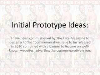


The document outlines initial prototype ideas for a 40-year commemorative issue of The Face magazine, including logo design and composition ideas using photography. The author explores various logo design prototypes and positions, inspired by Egon Schiele's artistic style. Different photographic techniques and designs are discussed, emphasizing the visual contrast and attention-grabbing elements for a successful magazine cover.


