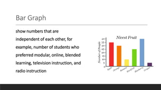
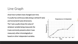
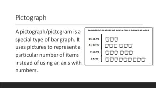
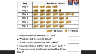
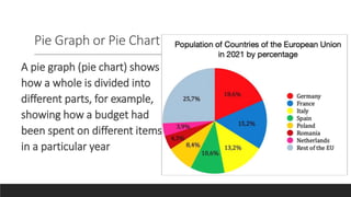
2. VISUAL-VERBAL REPRESENTATION
Expository texts are designed to explain, inform, and
present facts of
specific topics. These texts can be accompanied by
visual cues to provide or
further highlight information.
3. Examples of these visual elements include graphs,
tables, maps, illustrations, and the like. Their
primary function is to improve comprehension of a
reading material. However, understanding graphic
elements like those cited above is an important
aspect of comprehending texts that some tend to
skip.
4. Graphs
These are diagrams showing the relation
between variable quantities, typically of two
variables, each measured along a pair of axes at
right angles.
6. Bar Graph
show numbers that are
independent of each other, for
example, number of students who
preferred modular, online, blended
learning, television instruction, and
radio instruction
7. Line Graph
show how numbers have changed over time.
It usually has continuous data along a vertical (Y-axis)
and horizontal (X-axis) dimensions.
The Y-axis usually shows the value of
whatever variable being measured; the
X-axis commonly presents when it was
measured, either chronologically or
based on other independent variables.
8. ACTIVITY
Apple Sales
Jules sold 8 apples last Monday, on Tuesday he sold 15
apples, on Wednesday he got the lowest sales of only
3 apples, on Thursday he sold 25 apples and ending in
Friday with only 8 apples.
9. Jake and Janna recorded the time they spent
together chatting for 6 days. Draw the Graph
Using the Dta bellow.
DAY TIME (Minutes)
Day 1 40
Day 2 60
Day 3 75
Day 4 25
Day 5 50
Day 6 30
10. 1. Which day did they spent the most time
chatting?
2.From day 4 to day 5, did the amount of
time increase or decrease?
3. How many more minutes did they spend
on day 1 and 2 than day 5 and 6?
11. 4. How many hours did they chat all in all?
Your answer should be in complete time
definition.
5. What is the verbal interpretation of the
chat that you have drawn?
12. Pictograph
A pictograph/pictogram is a
special type of bar graph. It
uses pictures to represent a
particular number of items
instead of using an axis with
numbers.
13.
14. Pie Graph or Pie Chart
A pie graph (pie chart) shows
how a whole is divided into
different parts, for example,
showing how a budget had
been spent on different items
in a particular year