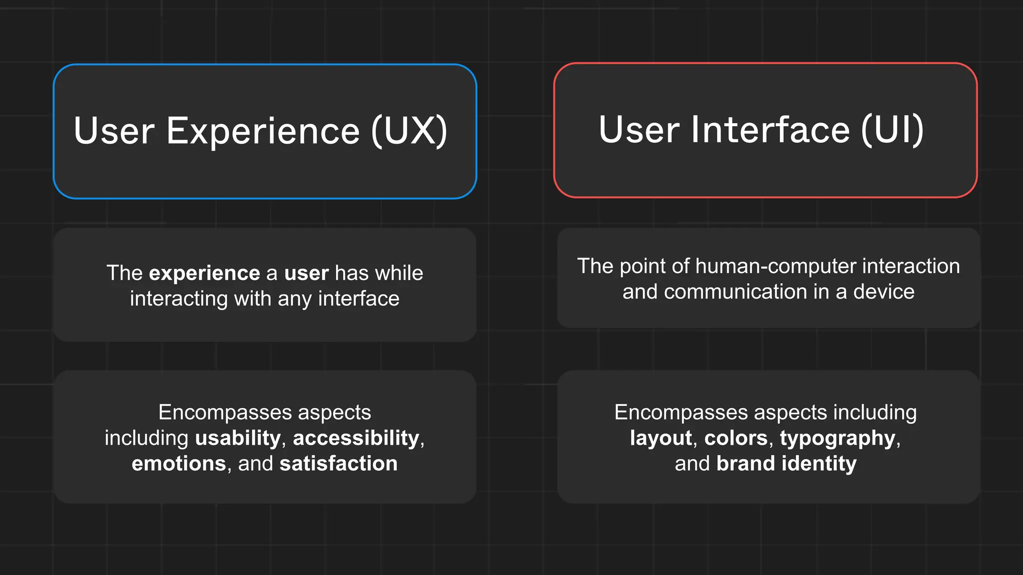
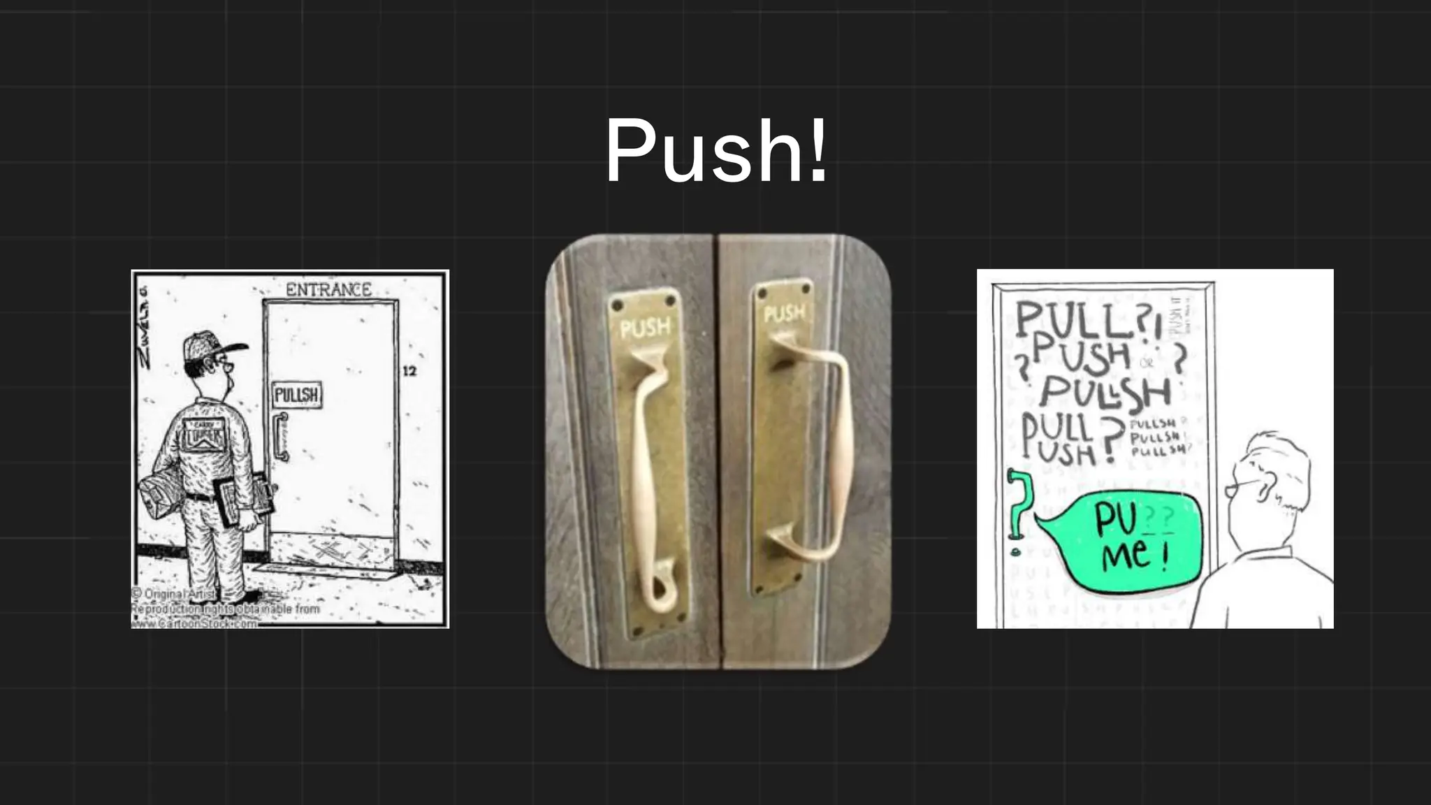
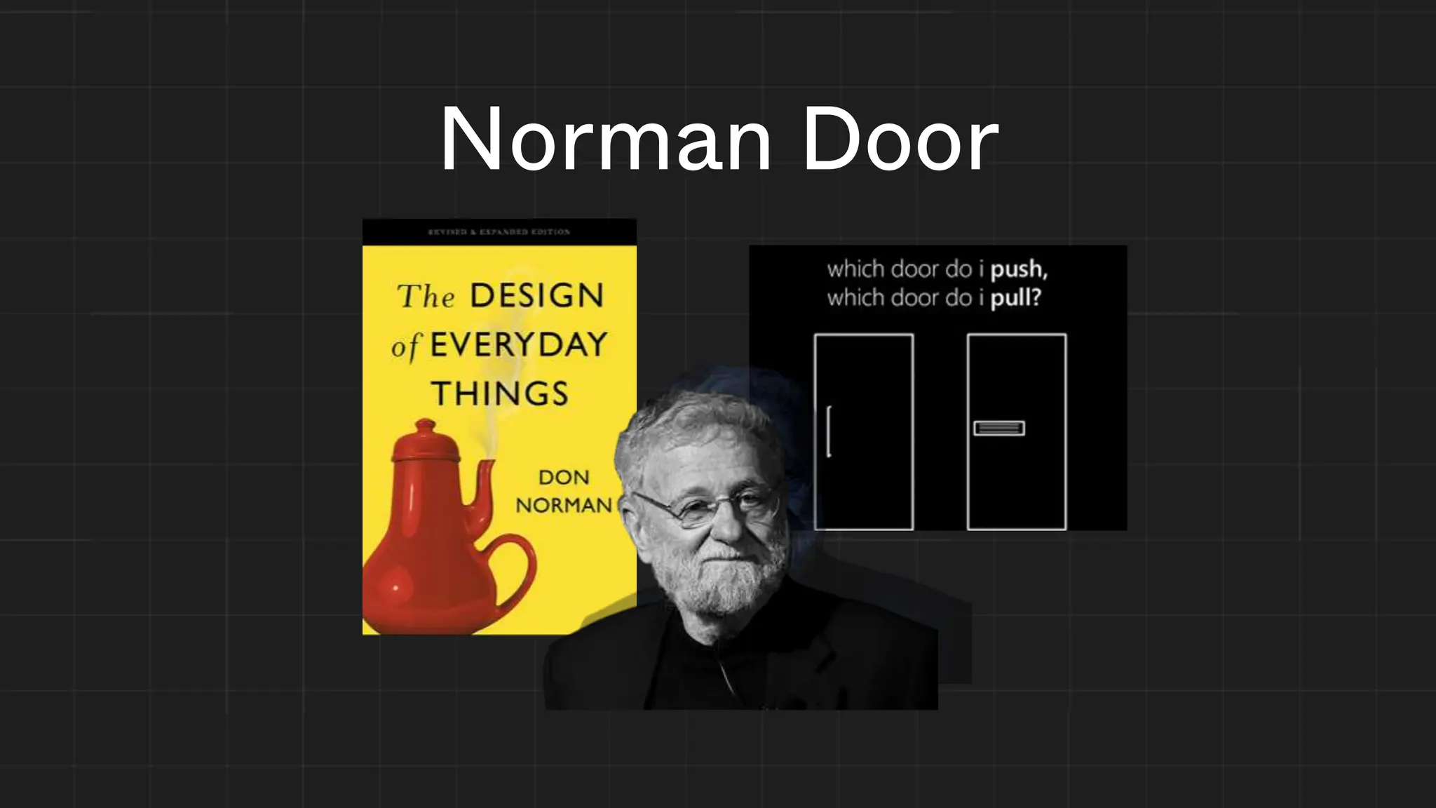
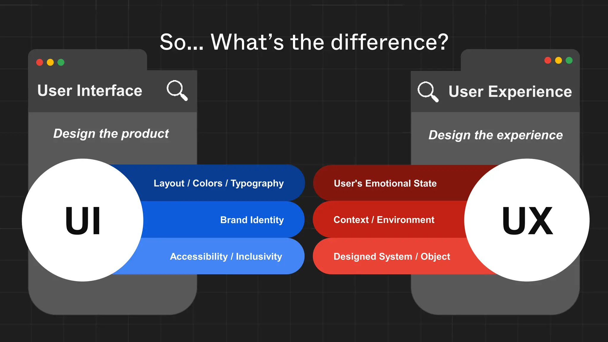
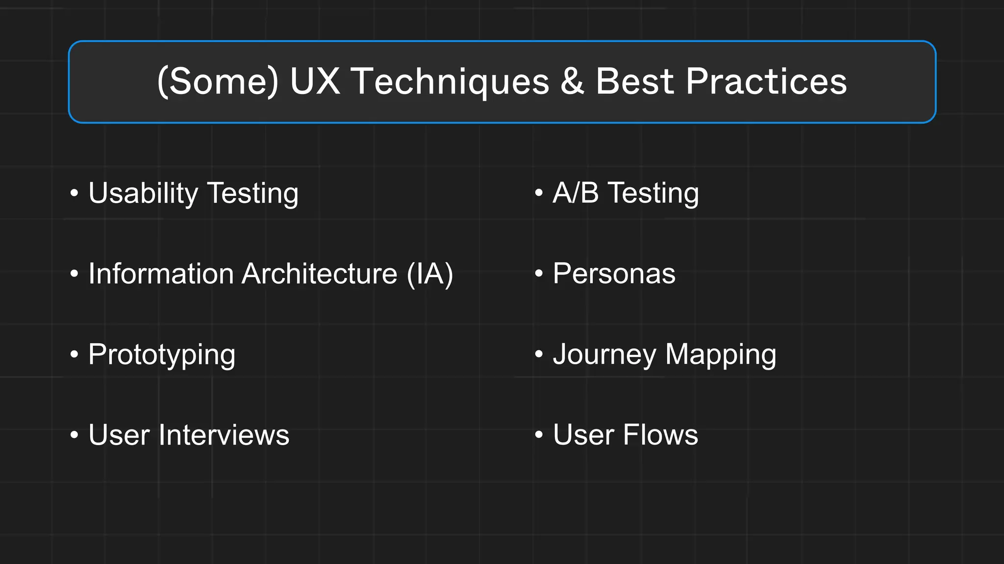
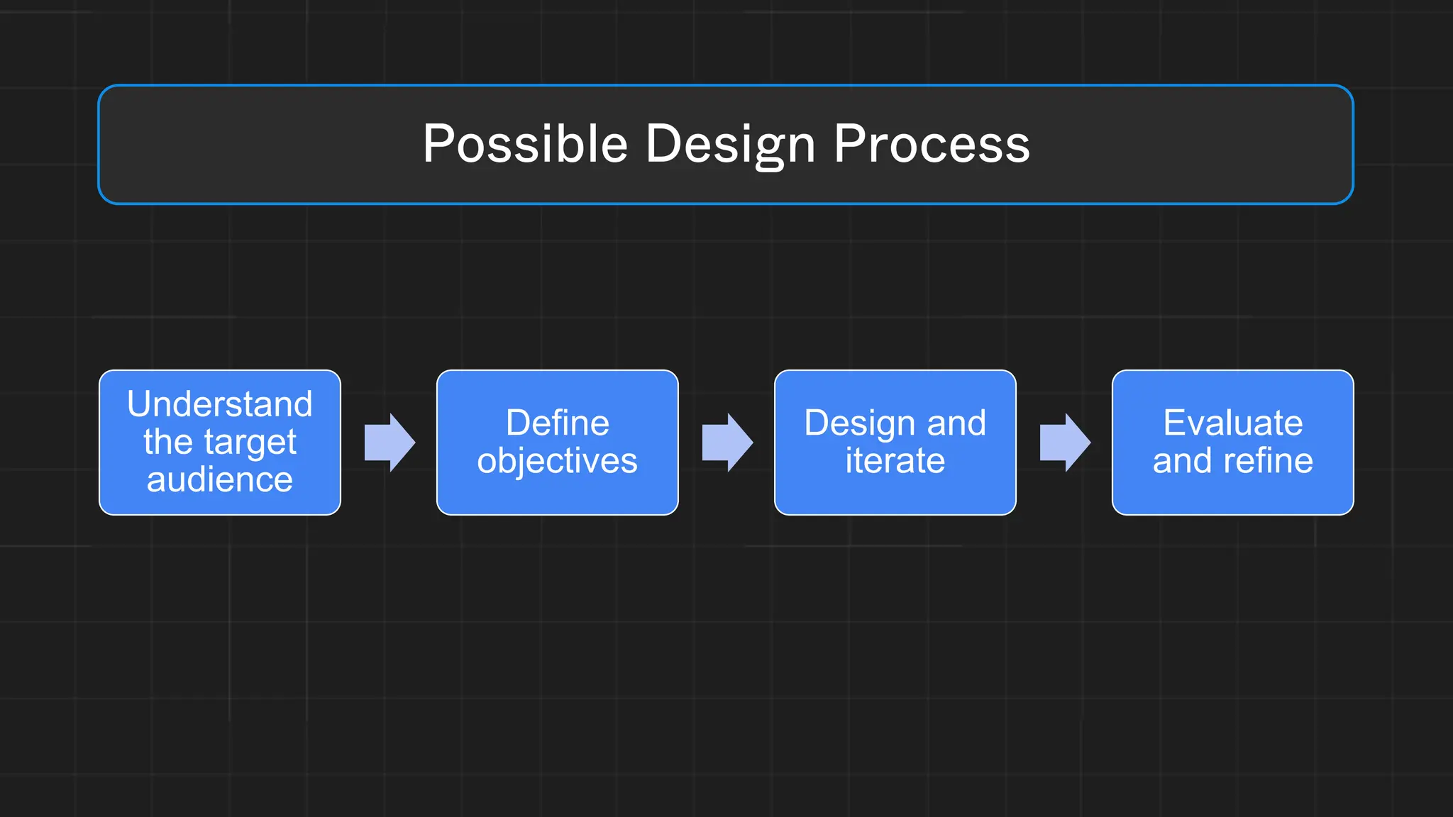
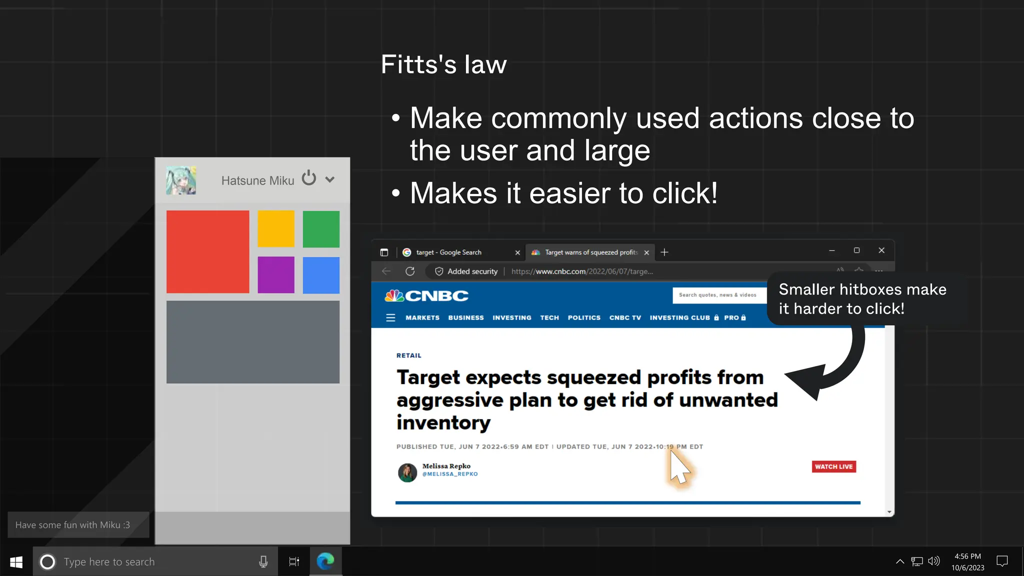
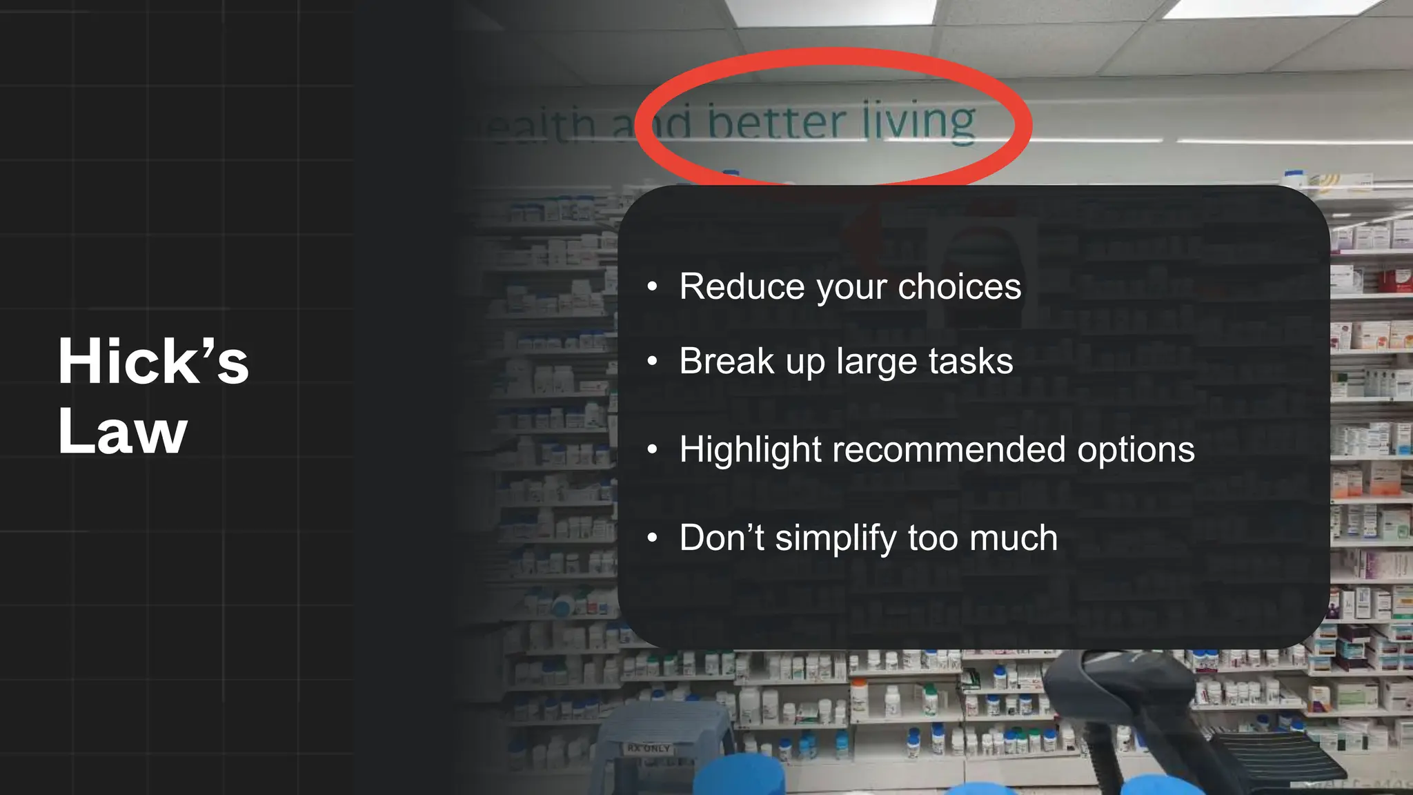
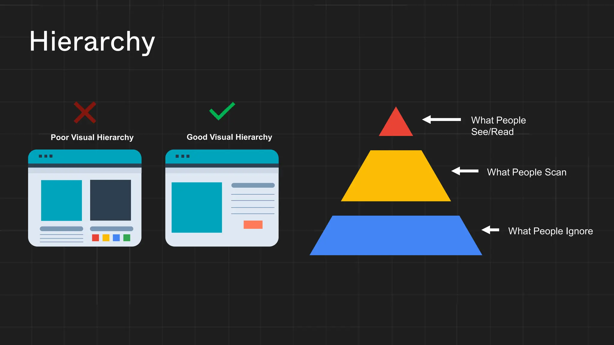
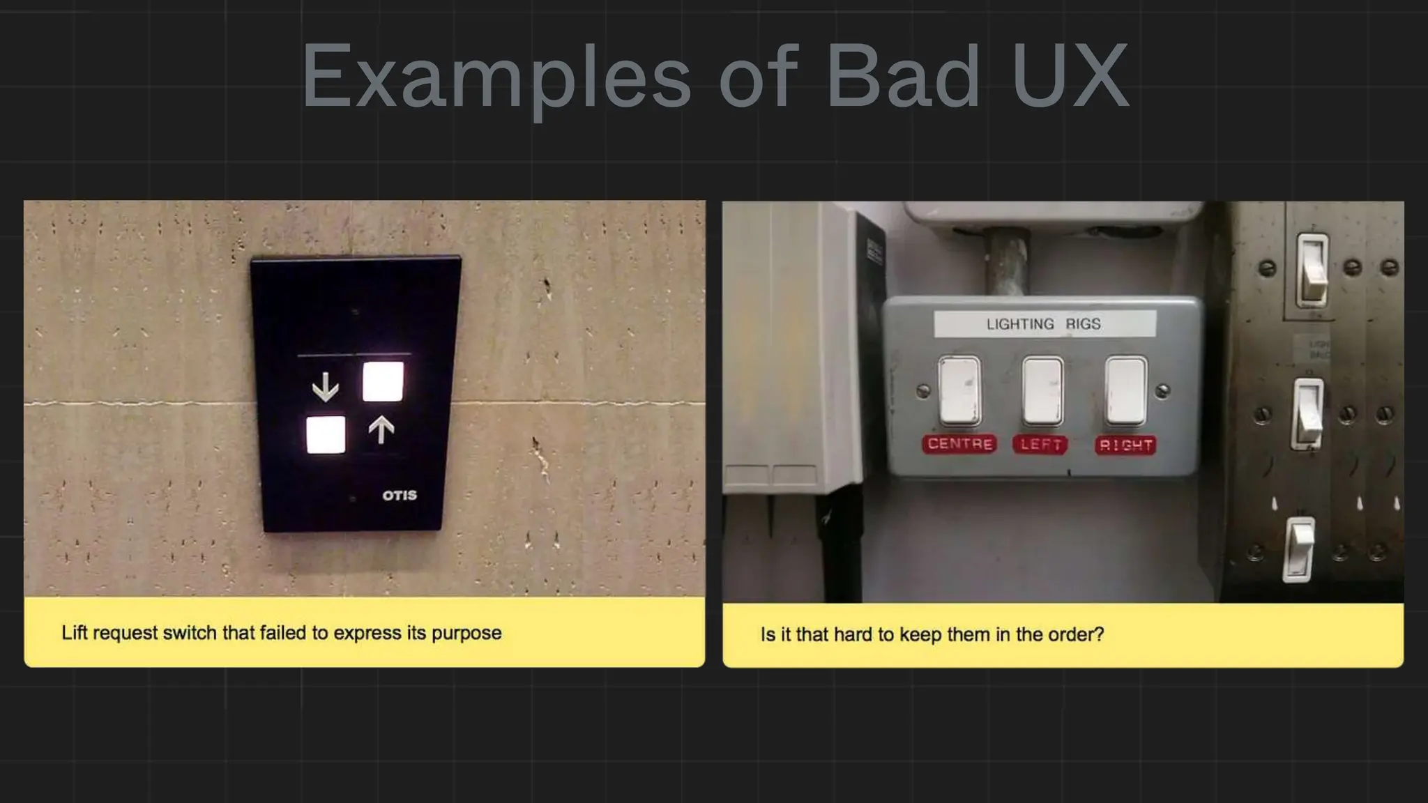
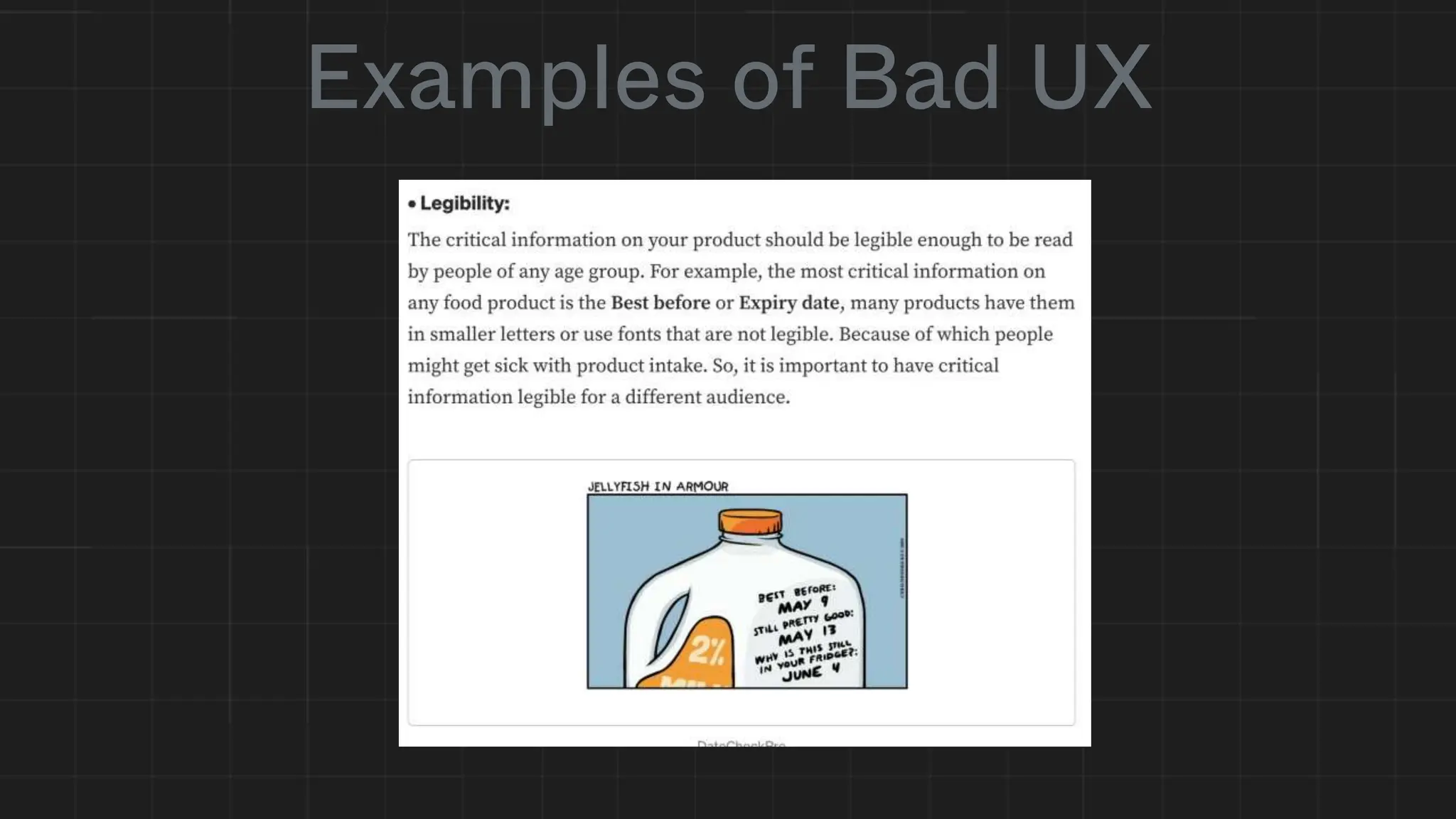
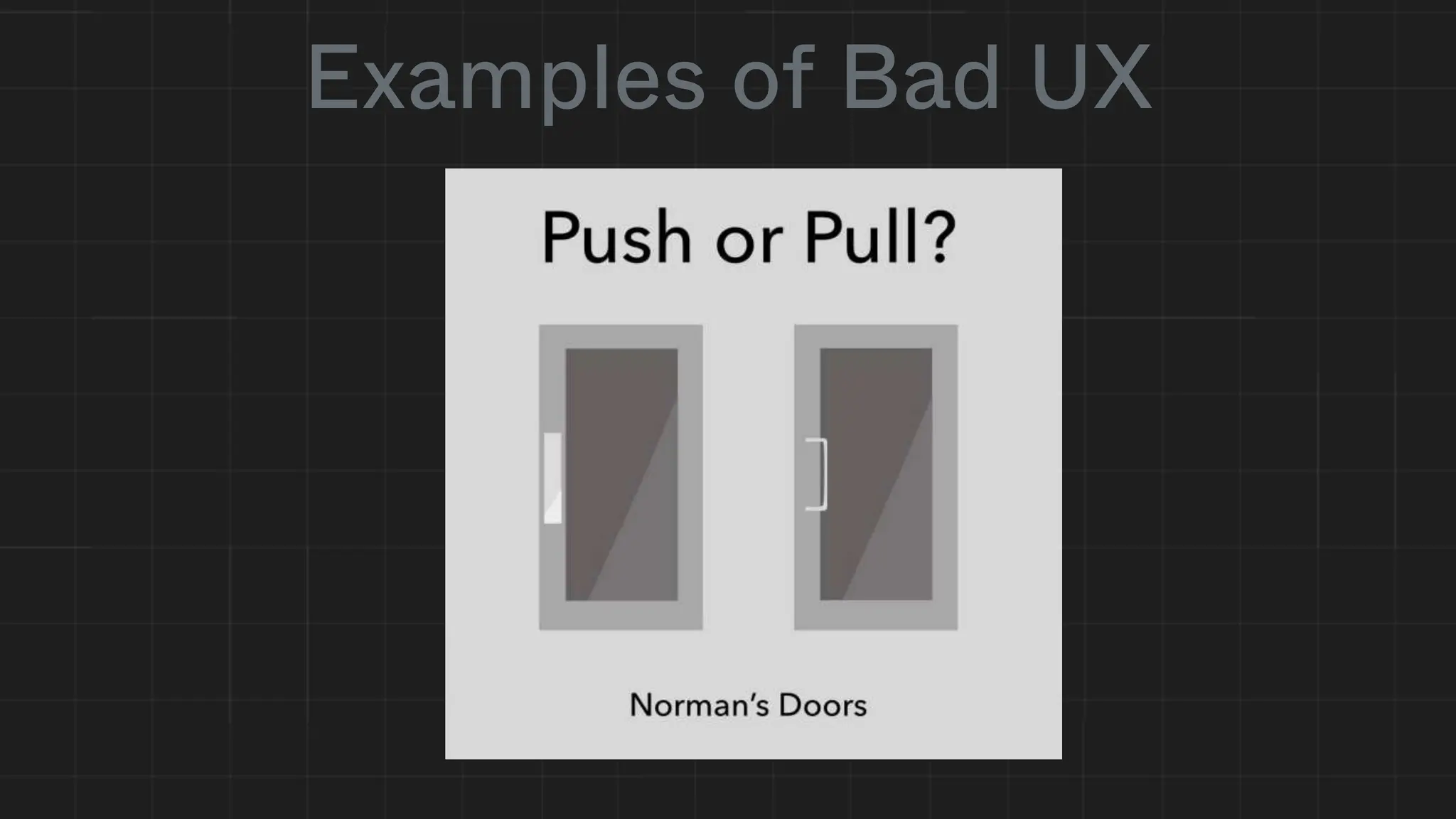
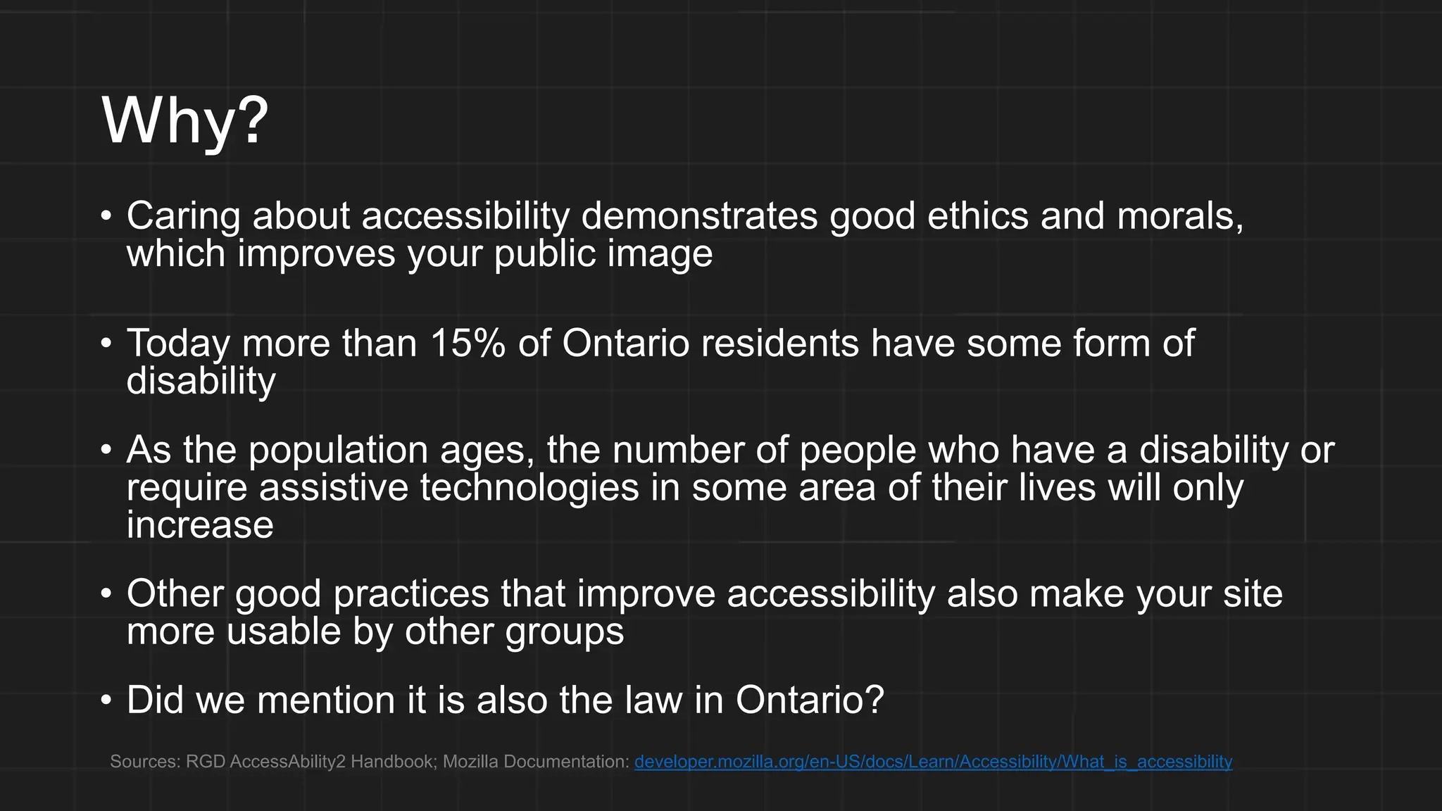
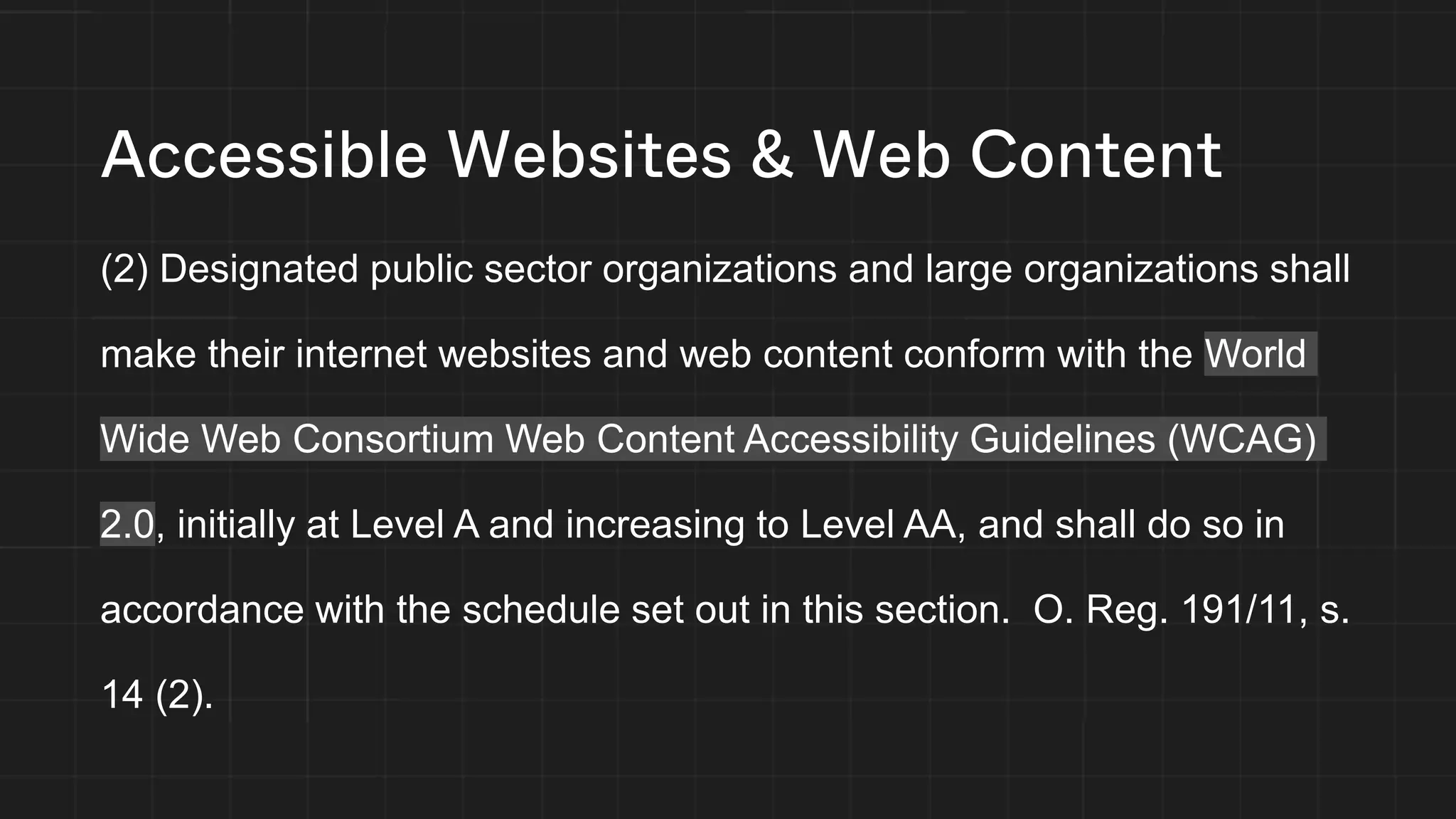
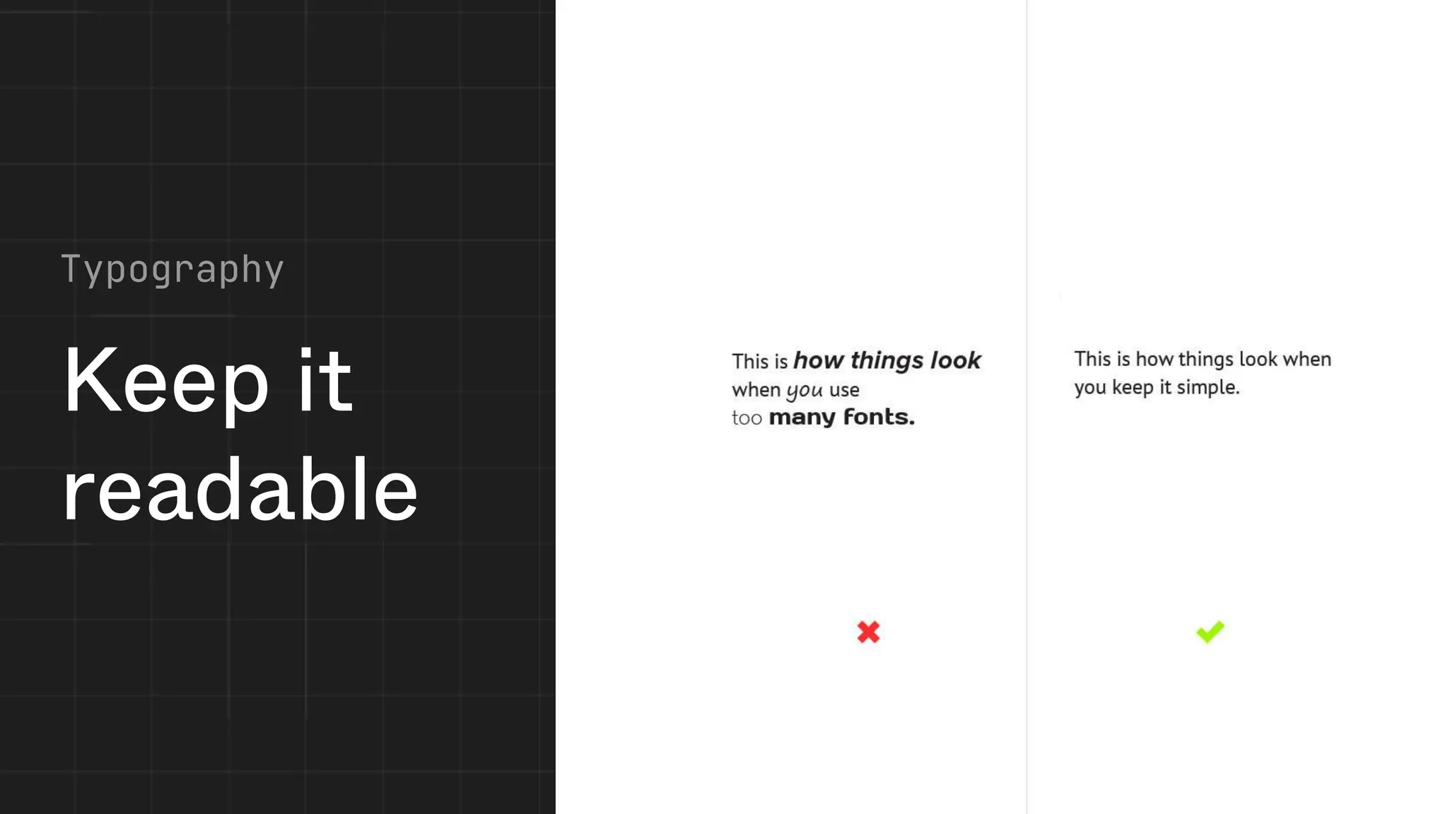
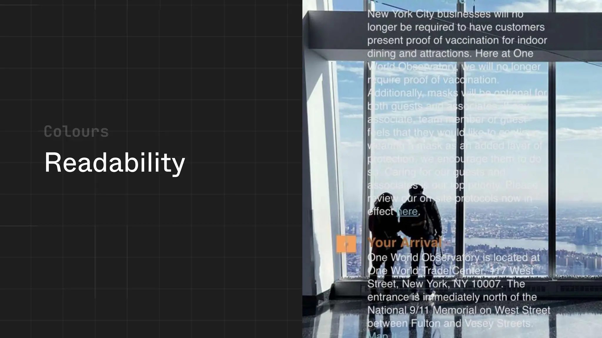
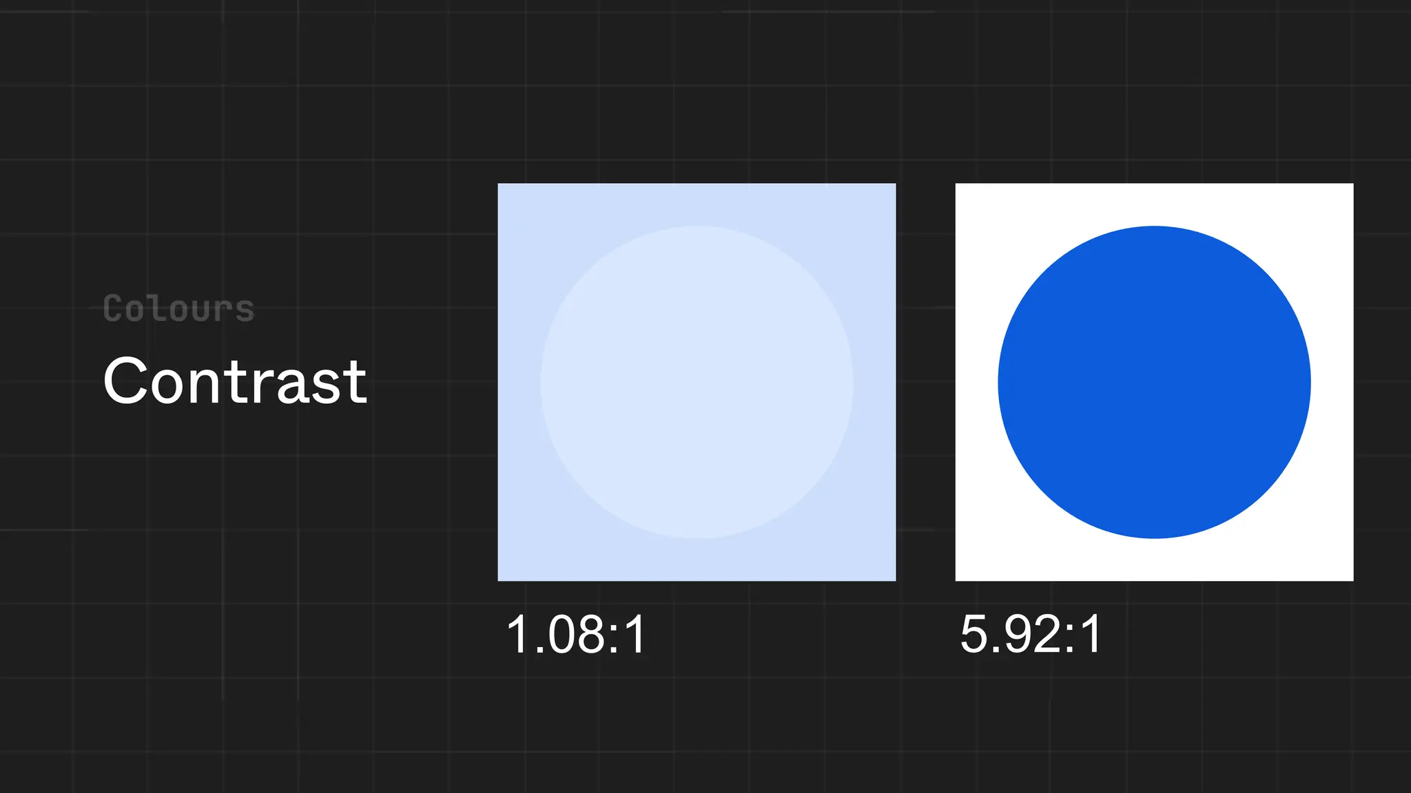
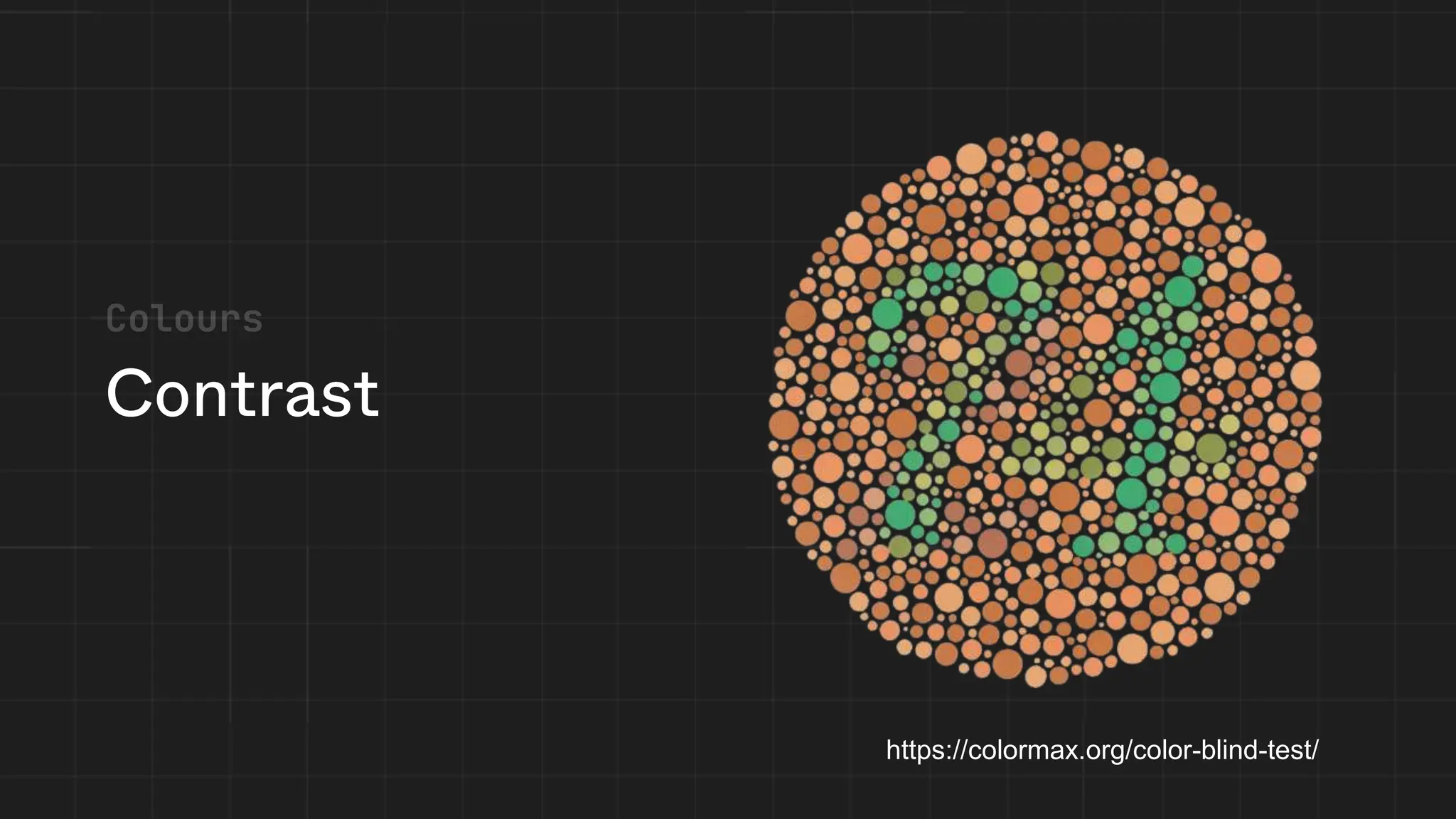
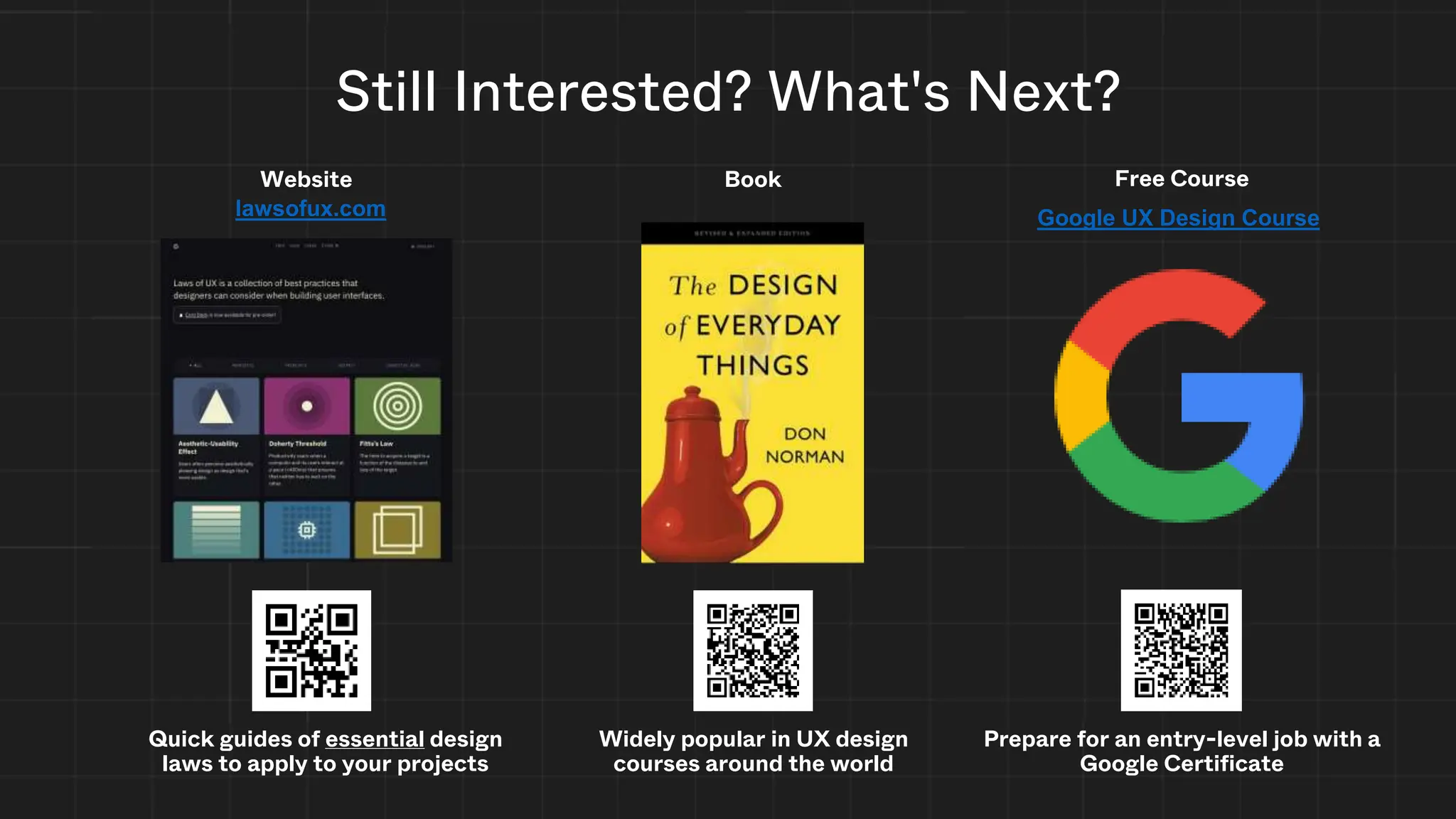
UX/UI & Figma
ICCIT Council & GDSC
Creative Workshop
853 x 352
User Experience (UX)
The experience a user has while
interacting with any interface
Encompasses aspects
including usability, accessibility,
emotions, and satisfaction
User Interface (UI)
The point of human-computer interaction
and communication in a device
Encompasses aspects including
layout, colors, typography,
and brand identity
Have you done
the same?
Push!
Norman Door
Norman Door
Norman Door
Good Affordance!
Design the product Design the experience
Accessibility / Inclusivity Designed System / Object
Layout / Colors / Typography
Brand Identity
User's Emotional State
Context / Environment
UX
UI
User Interface User Experience
So... What’s the difference?
Techniques & Best Practices
Just some of them... cause we need time for the tutorial :)
• Usability Testing
• Information Architecture (IA)
• Prototyping
• User Interviews
(Some) UX Techniques & Best Practices
• A/B Testing
• Personas
• Journey Mapping
• User Flows
Understand
the target
audience
Define
objectives
Design and
iterate
Evaluate
and refine
Possible Design Process
Don’t make me think
Fitts's law
• Make commonly used actions close to
the user and large
• Makes it easier to click!
Hatsune Miku
Smaller hitboxes make
it harder to click!
10/6/2023
4:56 PM
Hick’s
Law
• Reduce your choices
• Break up large tasks
• Highlight recommended options
• Don’t simplify too much
You are not the user!
User Interviews I think you
should scan
this QR code
:)
User Interviews
A
B
Research: A/B Testing
User Stories & Personas
Needs
Easy to scan content
Navigation ease of use
Content accuracy and references
Breadth of content and high reading level
Nicole Ballinger
Biography
Nicole is an author and freelance writer currently
working on a personal project. She receives income
from her freelancing and can afford her own condo.
She describes herself as someone with a passion for
detailed and history. She is very interested in history
and wants to learn more about the history of human
subject to add realism to her next novel. Nicole will
conduct research through websites found on search
engines for inspiration. Her research on the topic
consists of researching human subject research in
relation to its history in major world events, such as
World War 2.
Age
32 (Millennial)
Ancestry
German, Spanish
Education
Bachelor of Arts
in English
Ethnicity
Caucasian
Family
Mother, younger
sister
Hobbies
Learning about
history and
science, reading
Income
$45,000/year
Interests
World history,
scientific journals
Occupation
Author, freelance
writer
Remoteness
Suburban,
Greater Boston
Nobody else has the unique
experience you can tell others”
“
Technological literacy
Literate, can navigate most websites
Internet usage habits: socializing, reading online,
research
Social networks in use:
Behaviours
Knowledge of human subject research
Thirst for human subject research information
Consumption of scientific media elsewhere
Goals
• To find inspiration for creative writing
about inhumane human subject
research
• To satisfy her own curiosity about the
history of human subject research
Pain Points
• Words are written at a high reading
level which makes it hard to imagine
while reading
• Struggles with finding what content she
wants
Usability Testing
Consider
spacing
Negative Space
Negative Space
Hierarchy
What People
See/Read
What People Scan
What People Ignore
Good Visual Hierarchy
Poor Visual Hierarchy
Hierarchy
https://gdscutm.com
About Resources Past Projects Events Sign in
Upcoming events
January 23, 2024
Giang’s birthday
You better wish her
November 24, 2023
Council × GDSC
Bee movie watching :)
November 24, 2023
Wireframing
This is a wireframe!
November 24, 2023
PowerPoint
And why it’s better
Register Register
X
X X
Low Fidelity Wireframe
Wireframing
Register Register
Lorem ipsum dolor sit amet, consectetur adipiscing elit, sed do eiusmod tempor incididunt ut labore et dolore magna aliqua. Sollicitudin aliquam
ultrices sagittis orci a scelerisque. Turpis nunc eget lorem dolor sed viverra ipsum nunc. Mattis molestie a iaculis at erat pellentesque adipiscing.
Egestas congue quisque egestas diam in arcu cursus euismod quis. Facilisis sed odio morbi quis commodo odio aenean sed adipiscing. Nisl vel
pretium lectus quam id leo in vitae. Dolor sit amet consectetur adipiscing elit pellentesque. Cursus risus at ultrices mi tempus. Lacus suspendisse
faucibus interdum posuere. Ipsum consequat nisl vel pretium lectus quam id leo. Et magnis dis parturient montes nascetur. Suspendisse sed nisi lacus
sed. Pretium vulputate sapien nec sagittis aliquam malesuada bibendum arcu. Augue mauris augue neque gravida. Turpis cursus in hac habitasse
platea. Sit amet justo donec enim.
Cursus risus at ultrices mi tempus imperdiet nulla malesuada.
Potenti nullam ac tortor vitae purus faucibus ornare suspendisse sed. Rutrum tellus pellentesque eu tincidunt tortor aliquam nulla facilisi. Maecenas
sed enim ut sem viverra aliquet. Fermentum posuere urna nec tincidunt praesent semper feugiat. Tempus imperdiet nulla malesuada pellentesque elit
eget gravida cum. Enim sit amet venenatis urna cursus eget nunc. Pellentesque habitant morbi tristique senectus et netus et malesuada fames. Ligula
ullamcorper malesuada proin libero nunc. Nisl pretium fusce id velit ut.
Who are we?
F-Pattern
1
2
3
1
2
3
1
2
3
Examples of Bad UX
Examples of Bad UX
Examples of Bad UX
Examples of Bad UX
Examples of Bad UX
Examples of Bad UX
Examples of Bad UX
Accessibility
What does it mean to you?
Why?
• Caring about accessibility demonstrates good ethics and morals,
which improves your public image
• Today more than 15% of Ontario residents have some form of
disability
• As the population ages, the number of people who have a disability or
require assistive technologies in some area of their lives will only
increase
• Other good practices that improve accessibility also make your site
more usable by other groups
• Did we mention it is also the law in Ontario?
Sources: RGD AccessAbility2 Handbook; Mozilla Documentation: developer.mozilla.org/en-US/docs/Learn/Accessibility/What_is_accessibility
Accessible Websites & Web Content
(2) Designated public sector organizations and large organizations shall
make their internet websites and web content conform with the World
Wide Web Consortium Web Content Accessibility Guidelines (WCAG)
2.0, initially at Level A and increasing to Level AA, and shall do so in
accordance with the schedule set out in this section. O. Reg. 191/11, s.
14 (2).
Keep it
readable
Readability
Contrast
1.08:1 5.92:1
Contrast
https://colormax.org/color-blind-test/
What's Next?
Figma
(Free to Use)
Best Design Software
Adobe Illustrator
Photoshop
Practice Wireframing
Let's Practice Your Design Skills!
Get Started: Figma.com
Still Interested? What's Next?
Quick guides of essential design
laws to apply to your projects
Website
Widely popular in UX design
courses around the world
Book
lawsofux.com Google UX Design Course
Prepare for an entry-level job with a
Google Certificate
Free Course
Credits
Slides
• Jackson Lee
• Joshua Tan
• Jasmine Battu
• Paris Phan
• Ido Ben Haim
Peer Review
• Disha Prabhu
• Winny Peng
• Megan McHaughton
• Giang Bui
• Yasmine Said
• Leila Uy
Content from:
• Don Norman
• Christine McGlade
• Ramtin Loftabadi
• Mozilla Foundation
• lawsofux.com
• Wikipedia
• City of Mississauga
• RGD AccessAbility2
Handbook

ICCIT Council × GDSC: UX / UI and Figma

  • 1.
    UX/UI & Figma ICCITCouncil & GDSC Creative Workshop 853 x 352
  • 2.
    User Experience (UX) Theexperience a user has while interacting with any interface Encompasses aspects including usability, accessibility, emotions, and satisfaction User Interface (UI) The point of human-computer interaction and communication in a device Encompasses aspects including layout, colors, typography, and brand identity
  • 3.
  • 4.
  • 5.
  • 6.
  • 7.
  • 8.
    Design the productDesign the experience Accessibility / Inclusivity Designed System / Object Layout / Colors / Typography Brand Identity User's Emotional State Context / Environment UX UI User Interface User Experience So... What’s the difference?
  • 9.
    Techniques & BestPractices Just some of them... cause we need time for the tutorial :)
  • 10.
    • Usability Testing •Information Architecture (IA) • Prototyping • User Interviews (Some) UX Techniques & Best Practices • A/B Testing • Personas • Journey Mapping • User Flows
  • 11.
  • 12.
  • 13.
    Fitts's law • Makecommonly used actions close to the user and large • Makes it easier to click! Hatsune Miku Smaller hitboxes make it harder to click! 10/6/2023 4:56 PM
  • 14.
    Hick’s Law • Reduce yourchoices • Break up large tasks • Highlight recommended options • Don’t simplify too much
  • 15.
    You are notthe user!
  • 16.
    User Interviews Ithink you should scan this QR code :) User Interviews
  • 17.
  • 18.
    User Stories &Personas Needs Easy to scan content Navigation ease of use Content accuracy and references Breadth of content and high reading level Nicole Ballinger Biography Nicole is an author and freelance writer currently working on a personal project. She receives income from her freelancing and can afford her own condo. She describes herself as someone with a passion for detailed and history. She is very interested in history and wants to learn more about the history of human subject to add realism to her next novel. Nicole will conduct research through websites found on search engines for inspiration. Her research on the topic consists of researching human subject research in relation to its history in major world events, such as World War 2. Age 32 (Millennial) Ancestry German, Spanish Education Bachelor of Arts in English Ethnicity Caucasian Family Mother, younger sister Hobbies Learning about history and science, reading Income $45,000/year Interests World history, scientific journals Occupation Author, freelance writer Remoteness Suburban, Greater Boston Nobody else has the unique experience you can tell others” “ Technological literacy Literate, can navigate most websites Internet usage habits: socializing, reading online, research Social networks in use: Behaviours Knowledge of human subject research Thirst for human subject research information Consumption of scientific media elsewhere Goals • To find inspiration for creative writing about inhumane human subject research • To satisfy her own curiosity about the history of human subject research Pain Points • Words are written at a high reading level which makes it hard to imagine while reading • Struggles with finding what content she wants
  • 19.
  • 20.
  • 21.
  • 22.
  • 23.
    Hierarchy What People See/Read What PeopleScan What People Ignore Good Visual Hierarchy Poor Visual Hierarchy
  • 24.
  • 25.
    https://gdscutm.com About Resources PastProjects Events Sign in Upcoming events January 23, 2024 Giang’s birthday You better wish her November 24, 2023 Council × GDSC Bee movie watching :) November 24, 2023 Wireframing This is a wireframe! November 24, 2023 PowerPoint And why it’s better Register Register X X X Low Fidelity Wireframe
  • 26.
    Wireframing Register Register Lorem ipsumdolor sit amet, consectetur adipiscing elit, sed do eiusmod tempor incididunt ut labore et dolore magna aliqua. Sollicitudin aliquam ultrices sagittis orci a scelerisque. Turpis nunc eget lorem dolor sed viverra ipsum nunc. Mattis molestie a iaculis at erat pellentesque adipiscing. Egestas congue quisque egestas diam in arcu cursus euismod quis. Facilisis sed odio morbi quis commodo odio aenean sed adipiscing. Nisl vel pretium lectus quam id leo in vitae. Dolor sit amet consectetur adipiscing elit pellentesque. Cursus risus at ultrices mi tempus. Lacus suspendisse faucibus interdum posuere. Ipsum consequat nisl vel pretium lectus quam id leo. Et magnis dis parturient montes nascetur. Suspendisse sed nisi lacus sed. Pretium vulputate sapien nec sagittis aliquam malesuada bibendum arcu. Augue mauris augue neque gravida. Turpis cursus in hac habitasse platea. Sit amet justo donec enim. Cursus risus at ultrices mi tempus imperdiet nulla malesuada. Potenti nullam ac tortor vitae purus faucibus ornare suspendisse sed. Rutrum tellus pellentesque eu tincidunt tortor aliquam nulla facilisi. Maecenas sed enim ut sem viverra aliquet. Fermentum posuere urna nec tincidunt praesent semper feugiat. Tempus imperdiet nulla malesuada pellentesque elit eget gravida cum. Enim sit amet venenatis urna cursus eget nunc. Pellentesque habitant morbi tristique senectus et netus et malesuada fames. Ligula ullamcorper malesuada proin libero nunc. Nisl pretium fusce id velit ut. Who are we?
  • 27.
  • 28.
  • 29.
  • 30.
  • 31.
  • 32.
  • 33.
  • 34.
  • 35.
  • 36.
    Why? • Caring aboutaccessibility demonstrates good ethics and morals, which improves your public image • Today more than 15% of Ontario residents have some form of disability • As the population ages, the number of people who have a disability or require assistive technologies in some area of their lives will only increase • Other good practices that improve accessibility also make your site more usable by other groups • Did we mention it is also the law in Ontario? Sources: RGD AccessAbility2 Handbook; Mozilla Documentation: developer.mozilla.org/en-US/docs/Learn/Accessibility/What_is_accessibility
  • 37.
    Accessible Websites &Web Content (2) Designated public sector organizations and large organizations shall make their internet websites and web content conform with the World Wide Web Consortium Web Content Accessibility Guidelines (WCAG) 2.0, initially at Level A and increasing to Level AA, and shall do so in accordance with the schedule set out in this section. O. Reg. 191/11, s. 14 (2).
  • 38.
  • 39.
  • 40.
  • 41.
  • 42.
    What's Next? Figma (Free toUse) Best Design Software Adobe Illustrator Photoshop
  • 43.
    Practice Wireframing Let's PracticeYour Design Skills! Get Started: Figma.com
  • 44.
    Still Interested? What'sNext? Quick guides of essential design laws to apply to your projects Website Widely popular in UX design courses around the world Book lawsofux.com Google UX Design Course Prepare for an entry-level job with a Google Certificate Free Course
  • 45.
    Credits Slides • Jackson Lee •Joshua Tan • Jasmine Battu • Paris Phan • Ido Ben Haim Peer Review • Disha Prabhu • Winny Peng • Megan McHaughton • Giang Bui • Yasmine Said • Leila Uy Content from: • Don Norman • Christine McGlade • Ramtin Loftabadi • Mozilla Foundation • lawsofux.com • Wikipedia • City of Mississauga • RGD AccessAbility2 Handbook

Editor's Notes

  • #4 Q: Raise your hand if you have ever pushed on a pull door?
  • #5 Well, I hate those doors. Raise your hand if you hate those confusing doors. *Pause*   But here’s the thing as soon as you start looking for those confusing doors…THEY ARE EVERYWHERE!   But why is that?
  • #6 Don Norman, author of The Design of Everyday Things says that those doors that we all hate are called Norman Doors. What is a Norman Door? A Norman Door is one where the design tells you to do the opposite of what you’re supposed to do. But why does such a simple thing (like opening a door) in need of an instruction manual? Why do we need a sign that says Push or Pull? Why not make it obvious?   Norman says "It will be obvious if it is designed right."
  • #7 Q: What makes these handles such good designs?
  • #8 Well, we can say that these handles have good affordances. Affordance is the relationship between a person and physical (or digital) object.   In this case, our user interface affordances are perceivable, we have decided push or pull based on our expectations and previous experiences.   So, the next time you don’t whether to push or pull, blame design.
  • #9 Now that we’ve taken a look at some real-life examples and have dipped our toes into the difference between UX/UI. UI (User interface) is the space where humans interact with computers. -       For example, on your mobile phone, the user interface is what is displayed on the screen of the device. -       User interface (UI) design is a design discipline focused on the visual elements of the interface, for example: o   layout, colors, typography, brand identity, responsiveness and usability, accessibility, and inclusivity o   All of which we will discuss later in this workshop!   UX (User experience) is how a person feels interacting with a system, an object (physical or digital). -       It describes the entire experience around a product or service, considering o   the user’s emotional state o   the context or environment o   the designed system or object
  • #12 Understand the target audience: Conduct research to gather insights about players' preferences, needs, and behaviors. Define objectives: Set clear goals for the desired user experience. (Understand what are the needs etc…, personas) Design and iterate: Create prototypes, test them with players, and gather feedback for continuous improvement. (Prototyping in figma) Evaluate and refine: Continuously assess the game's UX through user testing and feedback loops. (Surveys etc…)
  • #13 Tying into meeting expectations and preventing mistakes, The second truth of UX is that you don’t want your users to think, or in other words, we want to reduce their cognitive load.
  • #14 fitts law predicts the time for a person to point to something, and is described by the ratio between the distance to the target and its width. you can see here that the target in this first example is miniscule, so it takes a while to point to it. meanwhile, you can slam the start button and access it quickly. thus, in a user interface, you should make your hitboxes large enough to be quickly selectable. there should also be lots of spacing between the targets, and they should be placed in a place that is quickly accessible by the user. More reading Fitts's law – Wikipedia Fitts’s Law | Laws of UX
  • #15 hicks law in summary is that the time it takes to make a decision increases with the number and complexity of choices. [grocery store example] thus, you should Minimize choices when response times are critical to increase decision time. Break complex tasks into smaller steps in order to decrease cognitive load. Avoid overwhelming users by highlighting recommended options. Be careful not to simplify to the point of abstraction. side note: not for game design!!! haha More reading Hick’s Law | Laws of UX Hick's law - Wikipedia
  • #16 the designer is not the main user of the product! everyone does stuff differently and we need to account for that. do not assume that your users are you!
  • #17 User interviews involve engaging with users in one-on-one conversations to understand their needs, motivations, and pain points.
  • #18 Usability testing involves observing users as they interact with a product or prototype to identify usability issues and gather feedback.
  • #19 User personas are a reminder that you aren’t the user. They are essentially fictional characters with lore: a name, picture, goals, and a personality. The goal should be related to the interface you’re building. Using these personas, you can form user stories Real UX researchers use personas – here’s a screenshot from the city of Mississauga User stories Features added to the backlog phrased as "user stories" As a <user type> I want to <do something> so that <desired result>  A good story is Independent, negotiable, valuable, estimable, small, and testable Related stories may be clustered into "epics" on the PBI More reading Take CSC207 :yummers: User Stories | Examples and Template | Atlassian User-Centered Design: User Personas vs. User Stories | Function1 From Personas to User Stories | Roman Pichler SMRTCTY Master Plan – City of Mississauga
  • #20 Usability testing involves observing users as they interact with a product or prototype to identify usability issues and gather feedback.
  • #21 Also consider the spacing between the letters and words. Adjusting the spacing between characters is a process known as kerning. Poor kerning ruins your design!
  • #22 Negative space (or whitespace) is empty space between elements on your site/app Negative space is very powerful when used correctly Improves readability and lets the user focus on the main subject
  • #25 Google’s site lets you know exactly what you should look at You are going to ignore the buttons below the search bar You see the search bar and logo loud and clear
  • #26 Prototyping involves creating interactive and clickable representations of a product or interface. Wireframing is a crucial part of the UI/UX process of frontend design. It could be thought of as a prototyping stage, creating a mockup that is either: Low-fidelity: used to create the layout of the design. Medium fidelity: builds off the low-fidelity mockup, adds style elements. High-fidelity: a prototype as close to the final product as possible A wireframe should always be made before writing any frontend code!
  • #27 Ipsum text can be used if you don’t have content yet
  • #28 some of the time, users will scan your content very fast we will only cover one pattern, specifically the f pattern Users first read in a horizontal movement, usually across the upper part of the content area Next, users move down the page a bit and then read across in a second horizontal movement that typically covers a shorter area than the previous movement Finally, users scan the content’s left side in a vertical movement. Sometimes this is a slow and systematic, Other times, users move faster implication: users may skip lots of important content, since they’re skimming! place important content (call to action?) “above the fold,” or the screen you can see before scrolling culture: this “F” is flipped or rotated depending on the language, for right-to-left languages the pattern is flipped place important content where the eye will first focus Further reading: F-Shaped Pattern of Reading on the Web: Misunderstood, But Still Relevant (Even on Mobile) (nngroup.com) F-Shaped Pattern For Reading Web Content (original eyetracking research) (nngroup.com) Text Scanning Patterns: Eyetracking Evidence (nngroup.com) The Layer-Cake Pattern of Scanning Content on the Web (nngroup.com)
  • #39 The key ingredient for good typography is legibility, if your users can’t read the text its fanciness wont impress them much. This includes how you write! A user interface with complex vocabulary is impressive but harder to use Keep it simple, don’t use too many fonts It's hard to focus on the text when you have too much going on Size matters, make sure all text is visible and legible across all devices (desktop, mobile, etc...) Also consider the spacing between the letters and words. Adjusting the spacing between characters is a process known as kerning. Poor kerning ruins your design!
  • #43 Figma is a powerful collaborative interface design tool that is relatively beginner friendly. Figma enables teams to quickly design, prototype, and iterate on product experiences.
  • #44 Both wireframes and prototypes serve distinct and unique roles in the product design process. While the main difference between the two often boils down to fidelity (how closely a mockup resembles the final product), there are other differences in design and functionality.   Wireframes Three Exact Purposes It presents the information that will be displayed on the page It gives an outline of structure and layout of the page It conveys the overall direction and description of the user interface   Prototypes They allow the user to test a digital product’s interface and interactions, and this level of functionality can be useful during the usability testing of an application. Because they often resemble a more finished product, the time and effort invested in creating a prototype can translate to savings during the development phase.