Download to read offline


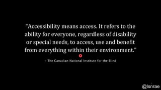


![“Imagine not
being able to
access
information.
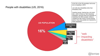
For [35 million people in
the US], this is the reality.
Today, only 5 percent of
printed materials are
available in alternate
formats, while less than 1
percent of websites are
accessible.” - CNIB
WHY?
26](https://image.slidesharecdn.com/developing-accessible-experience-waq-2019-slideshare-190411112440/85/Developing-Accessible-Experiences-26-320.jpg)

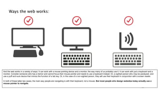


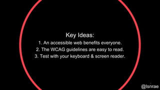
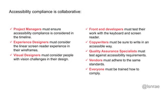
The document outlines key principles and practical advice for developing accessible web experiences, emphasizing that accessibility benefits everyone, not just those with disabilities. It introduces the Web Content Accessibility Guidelines (WCAG) and highlights the importance of testing web designs with assistive technologies like keyboards and screen readers. The author shares common accessibility issues encountered in front-end development, encouraging a proactive approach to creating inclusive digital environments.


