Download to read offline

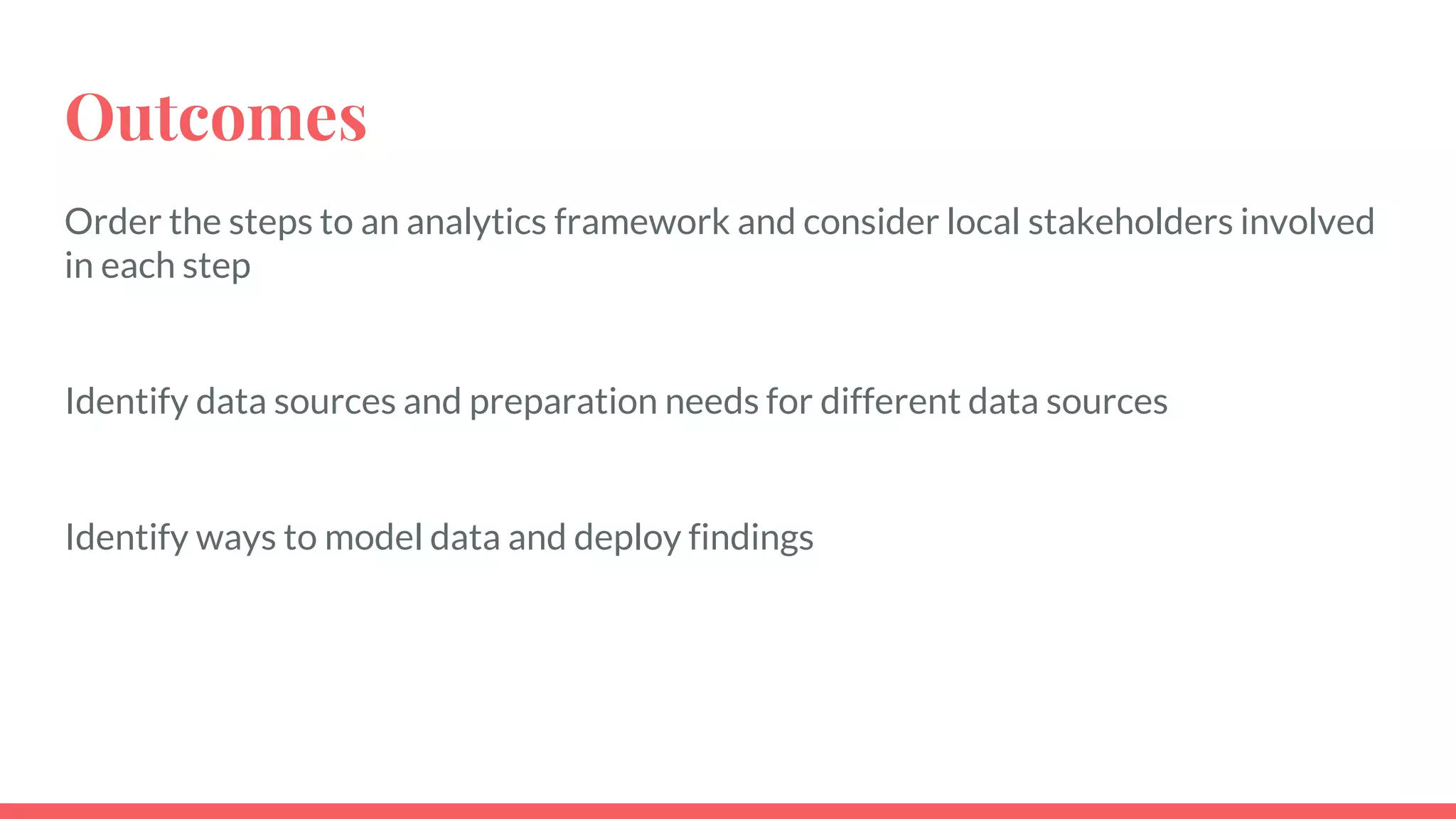
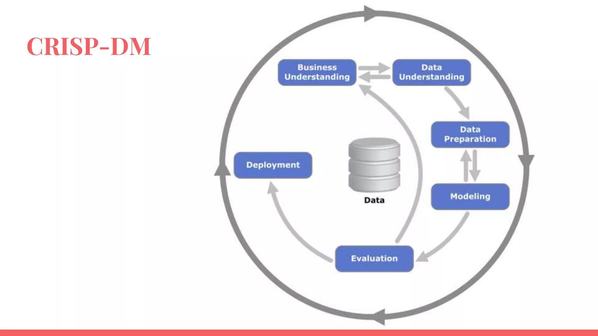

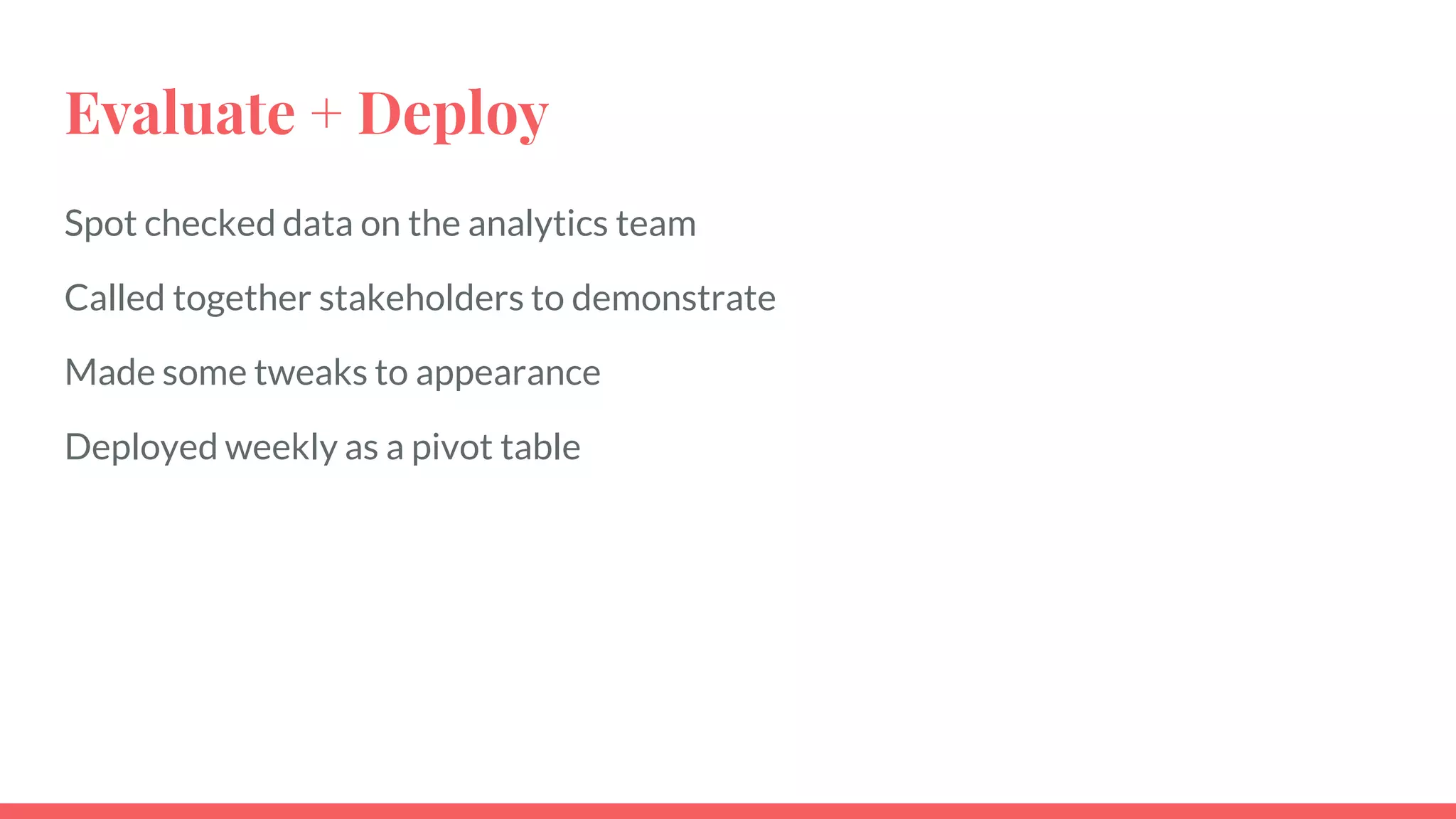
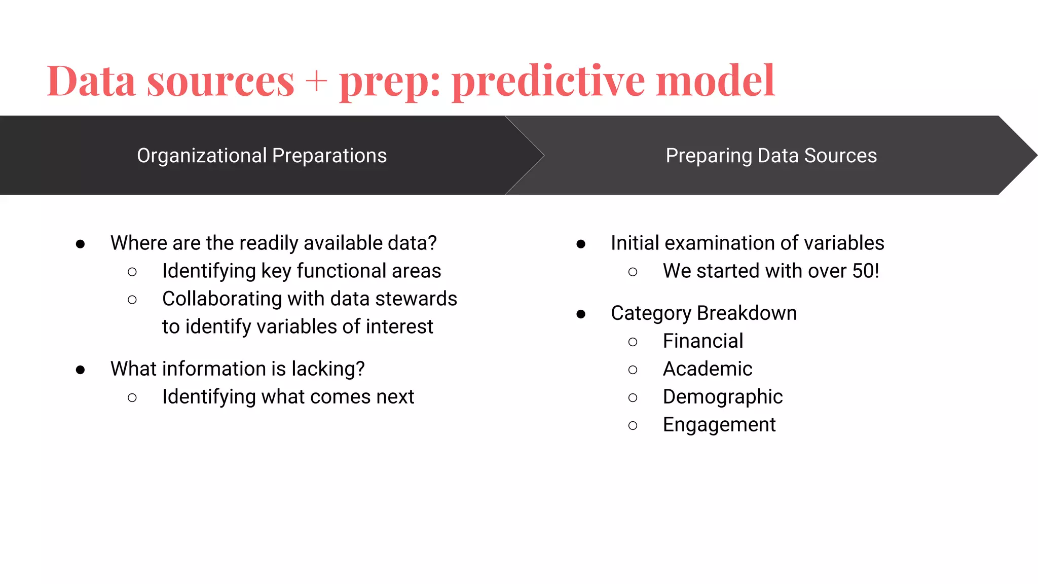
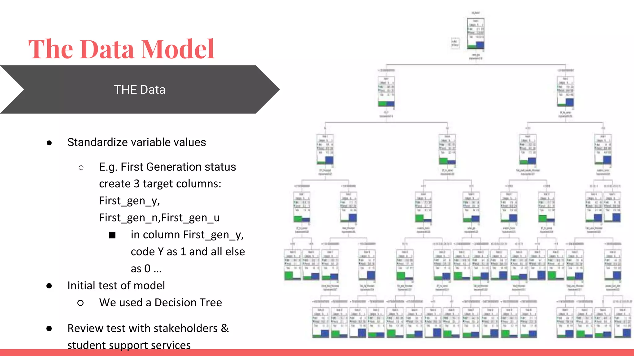
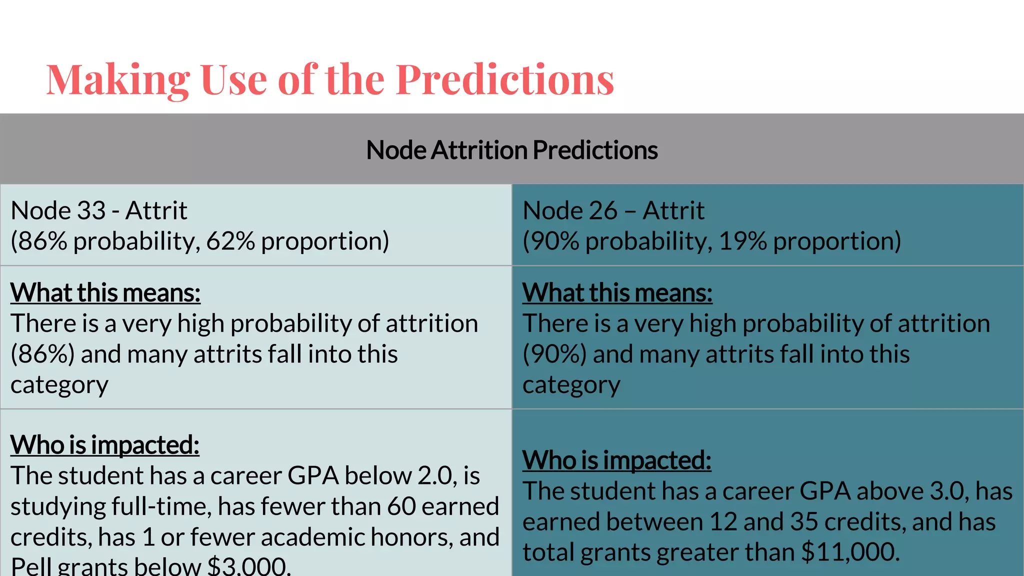


The document outlines a framework for institutions to implement retention analytics, focusing on data sources, preparation, modeling, and deployment. It includes examples of data analysis for predicting student attrition using various variables such as academic performance and financial status. Key steps involve collaboration with stakeholders, standardizing variables, and evaluating predictive models to enhance student retention strategies.