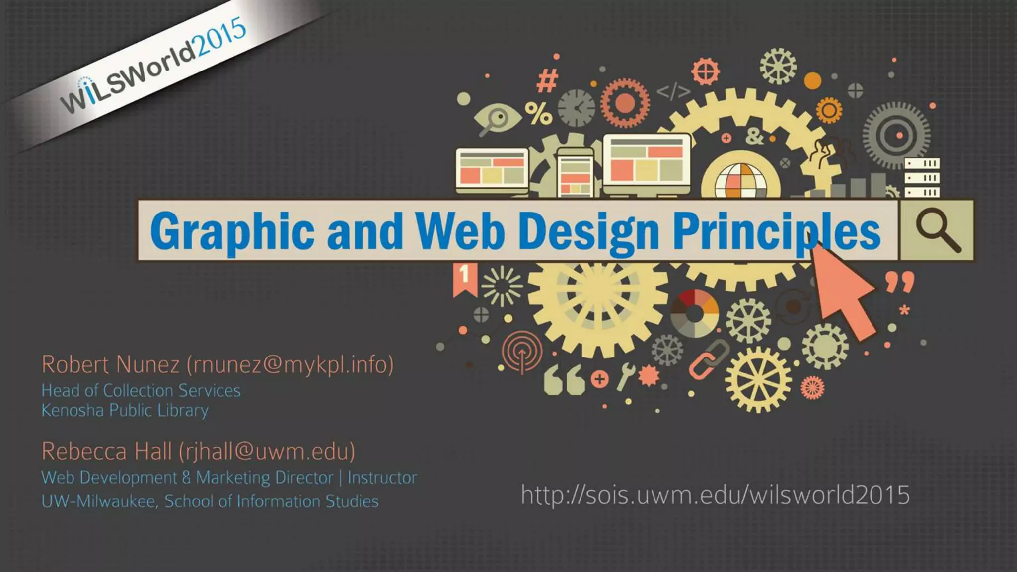
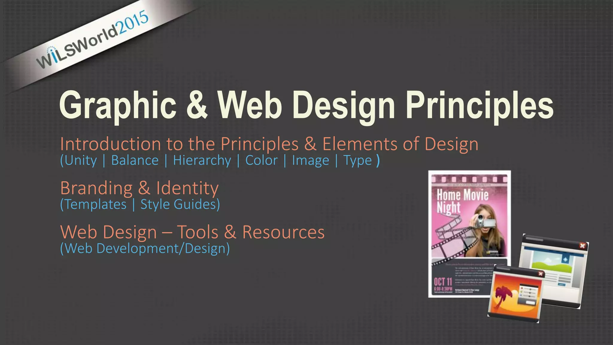
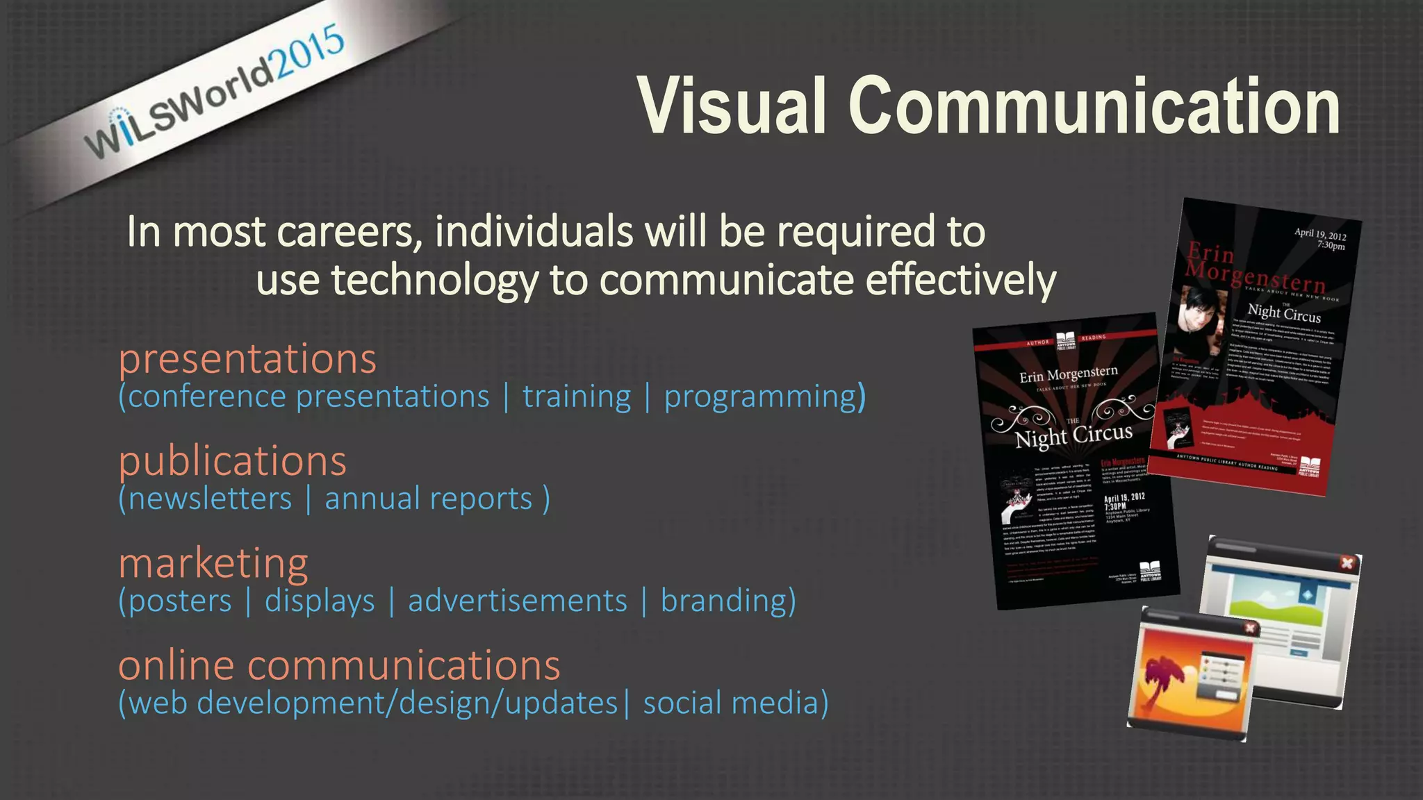
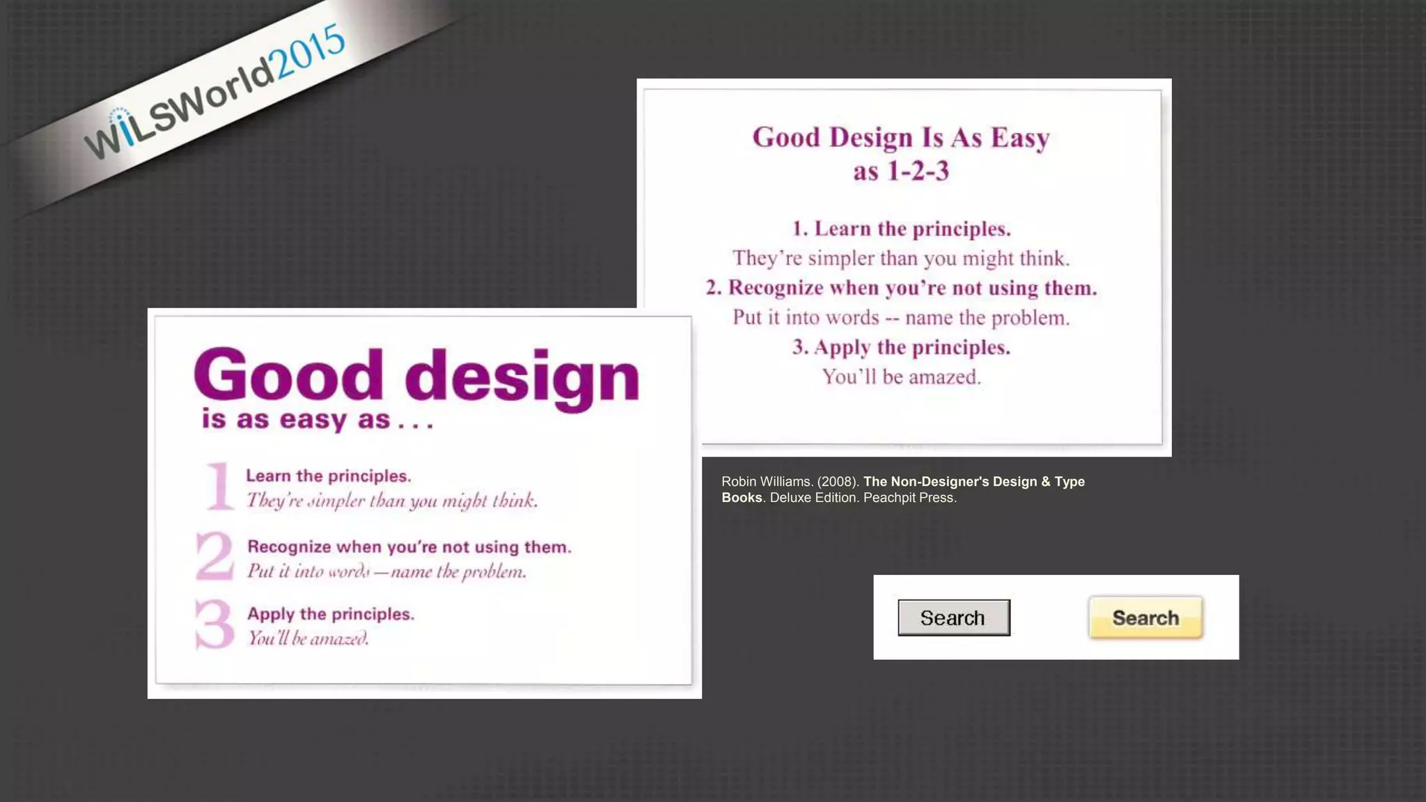
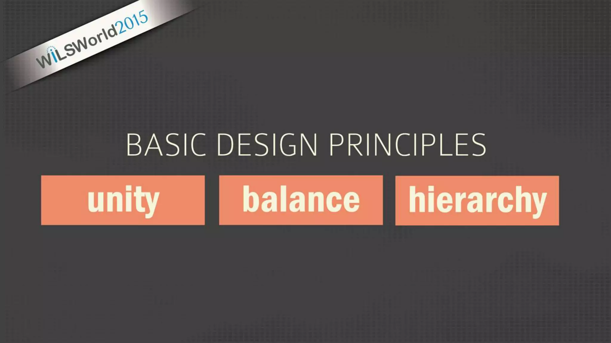
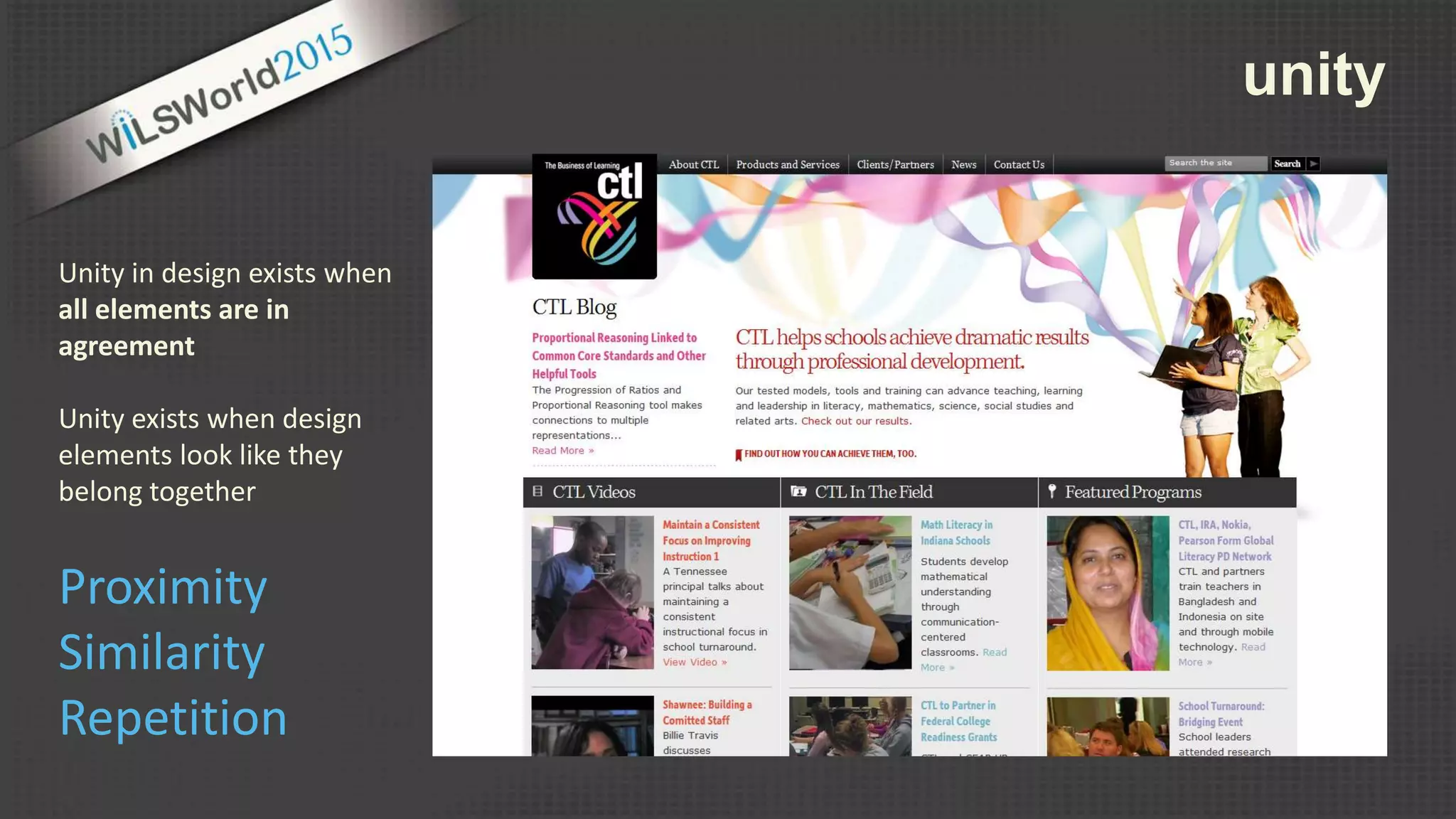
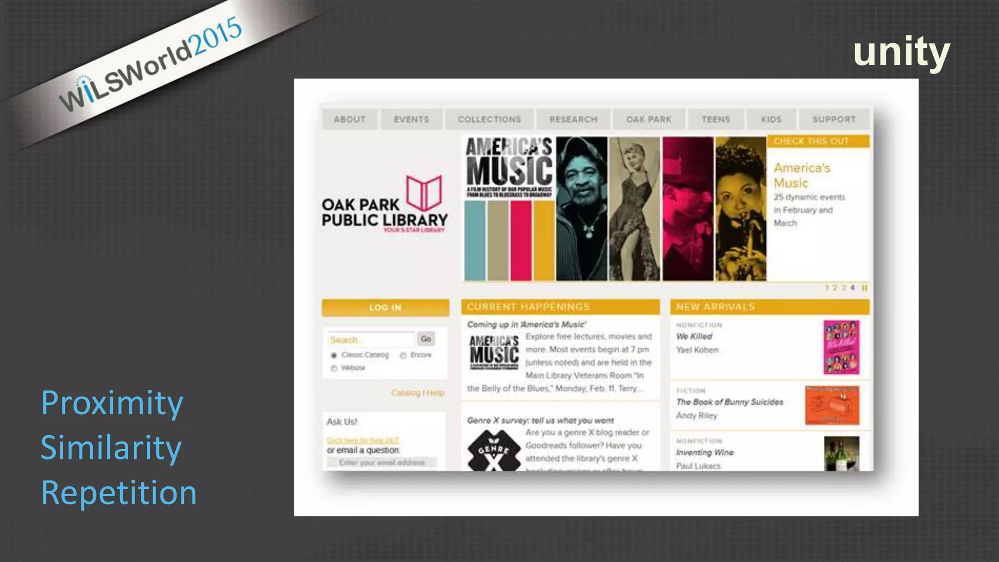
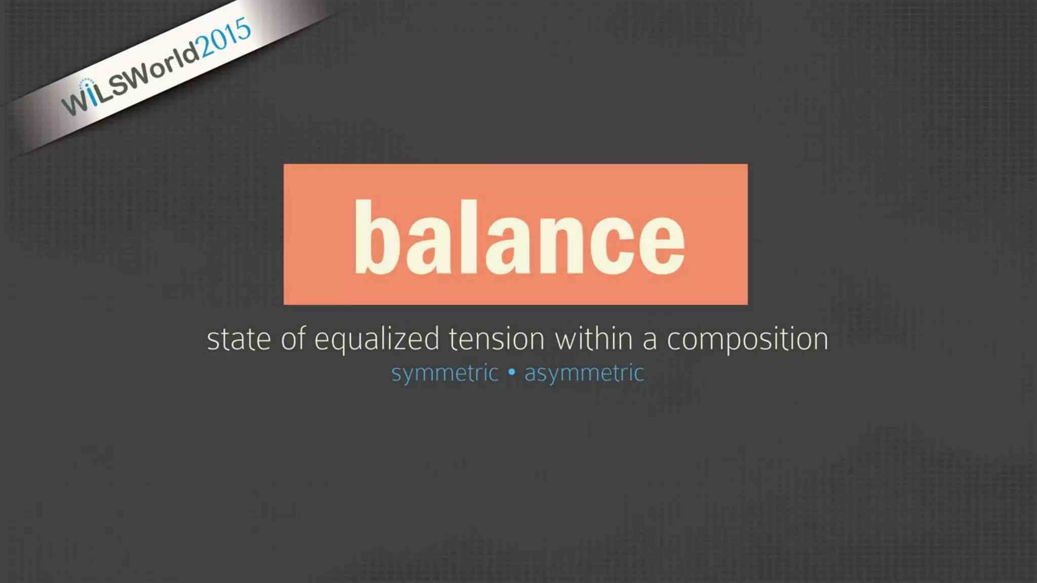
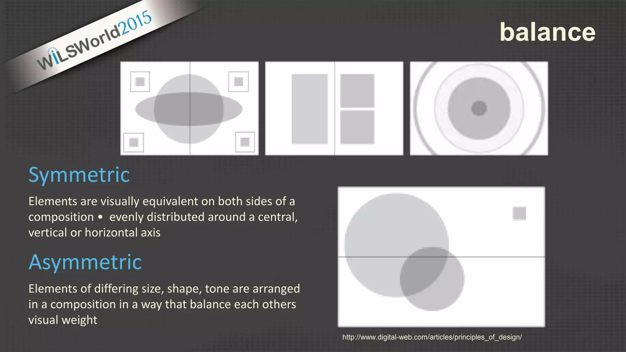
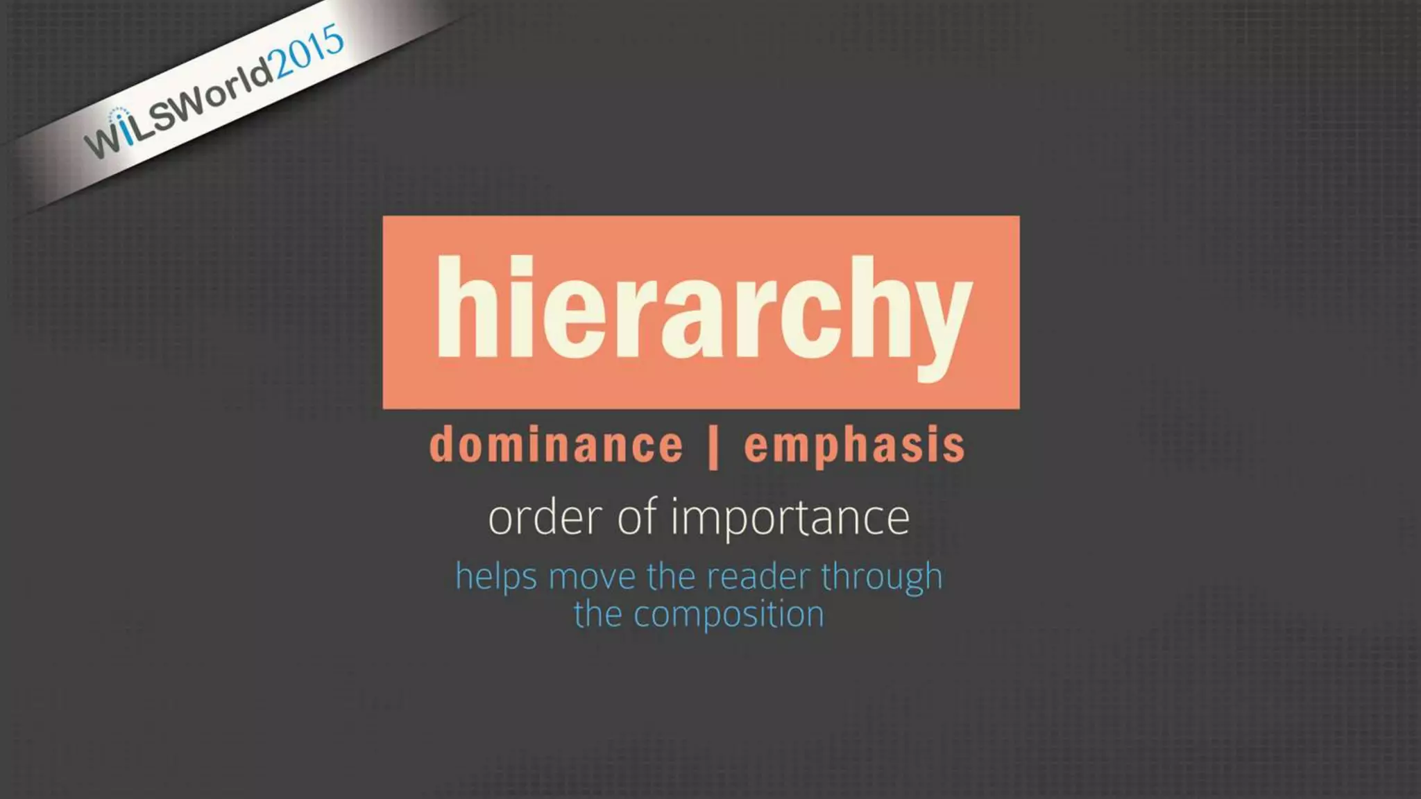
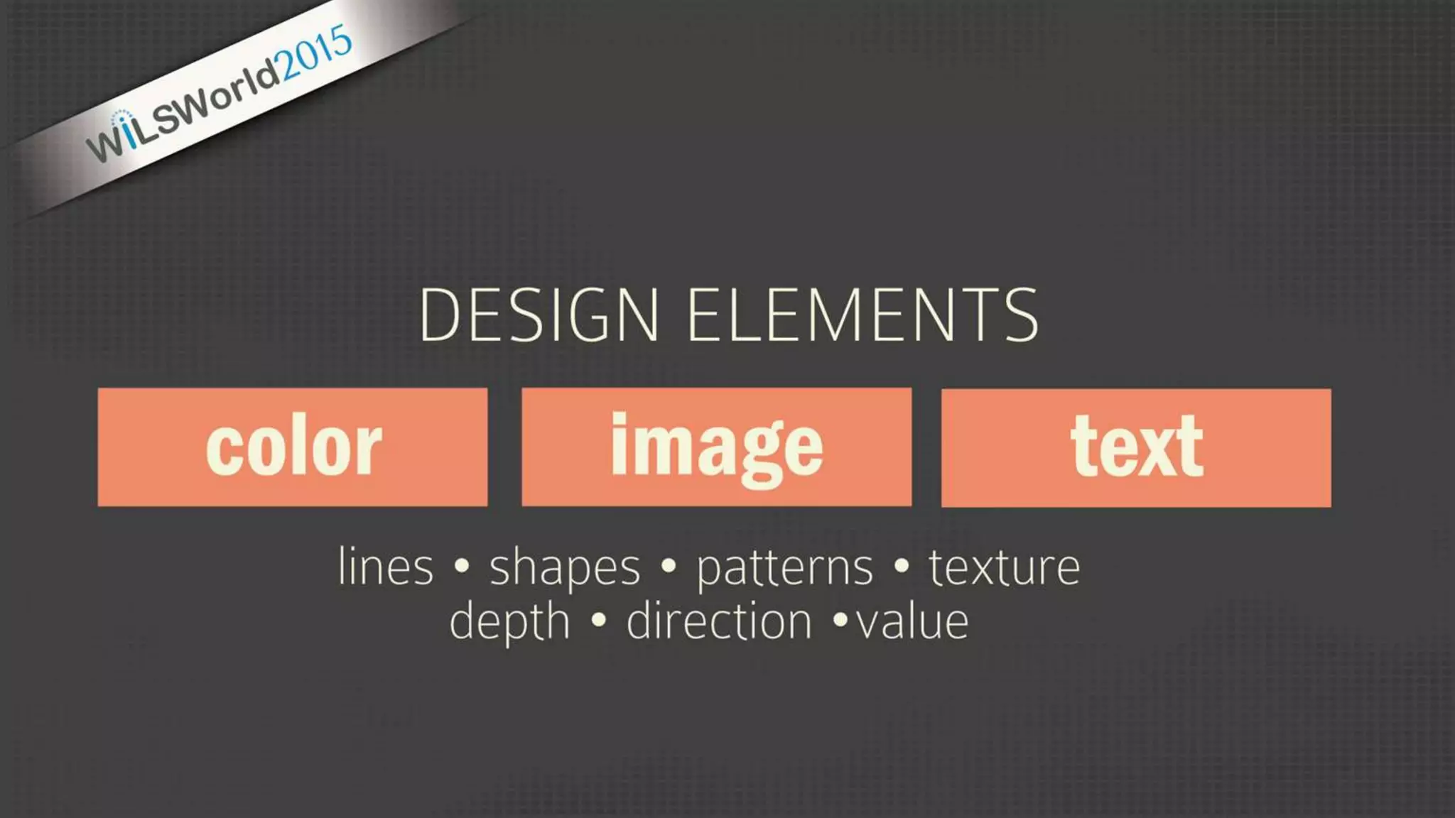
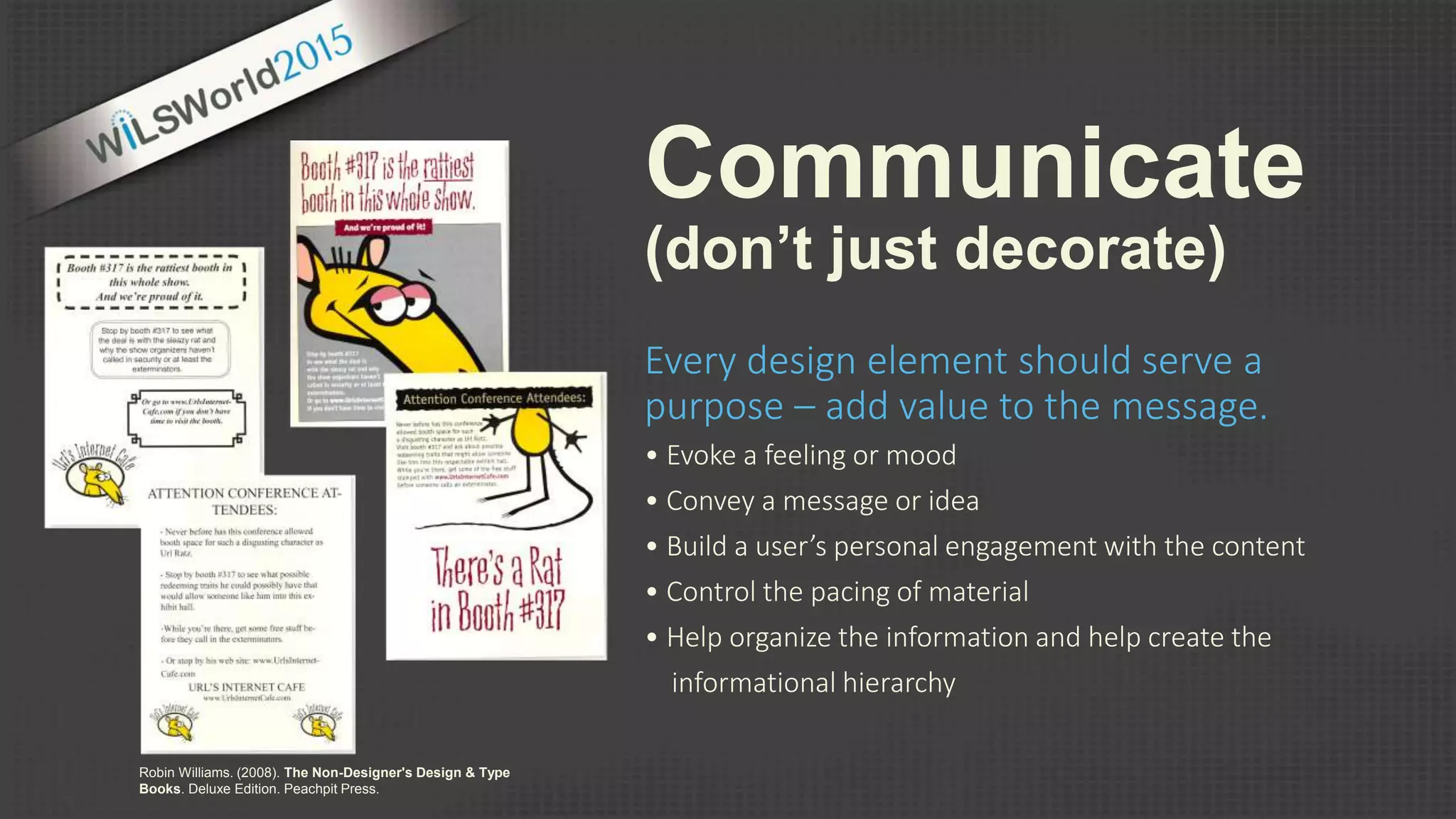
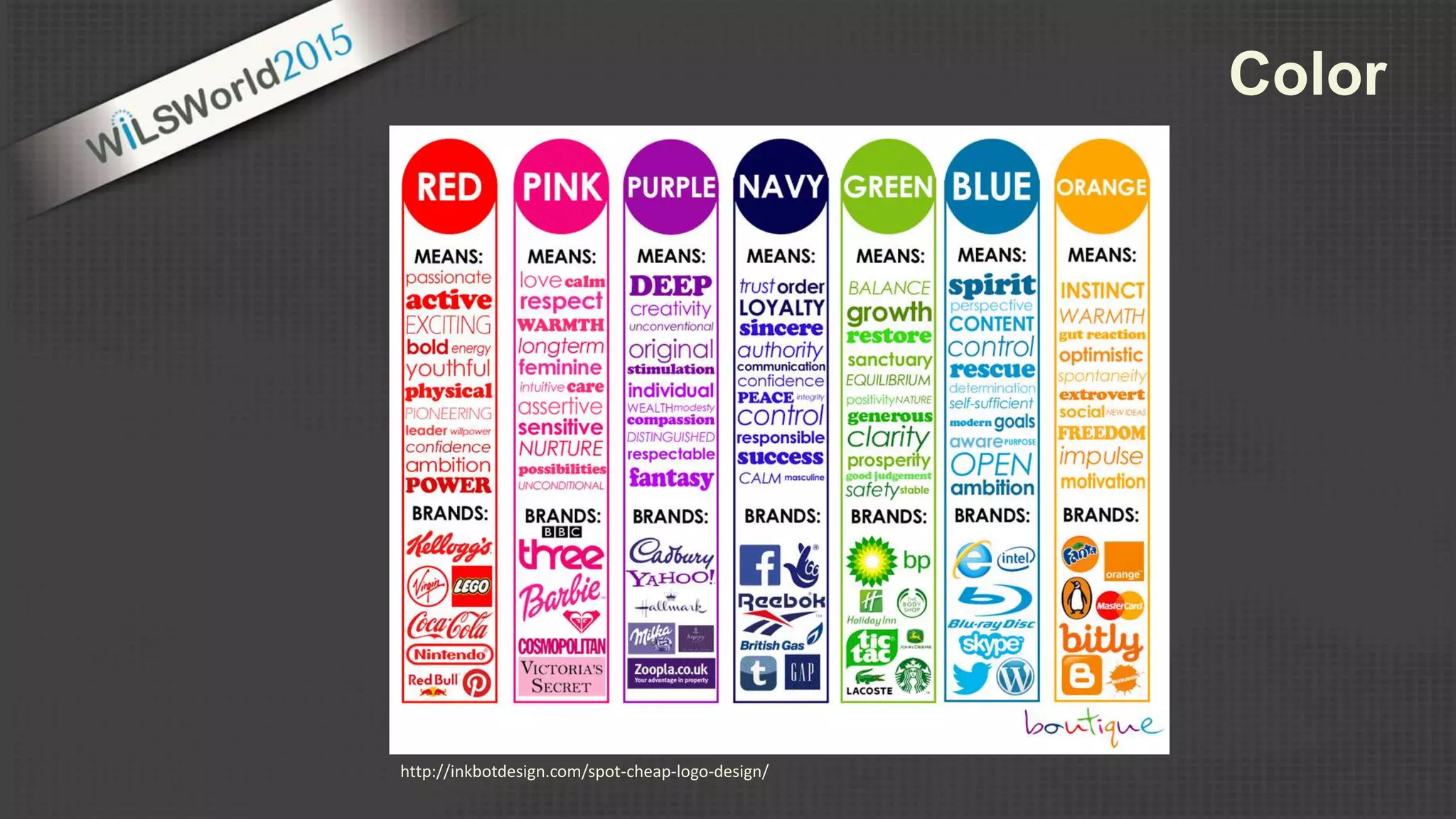
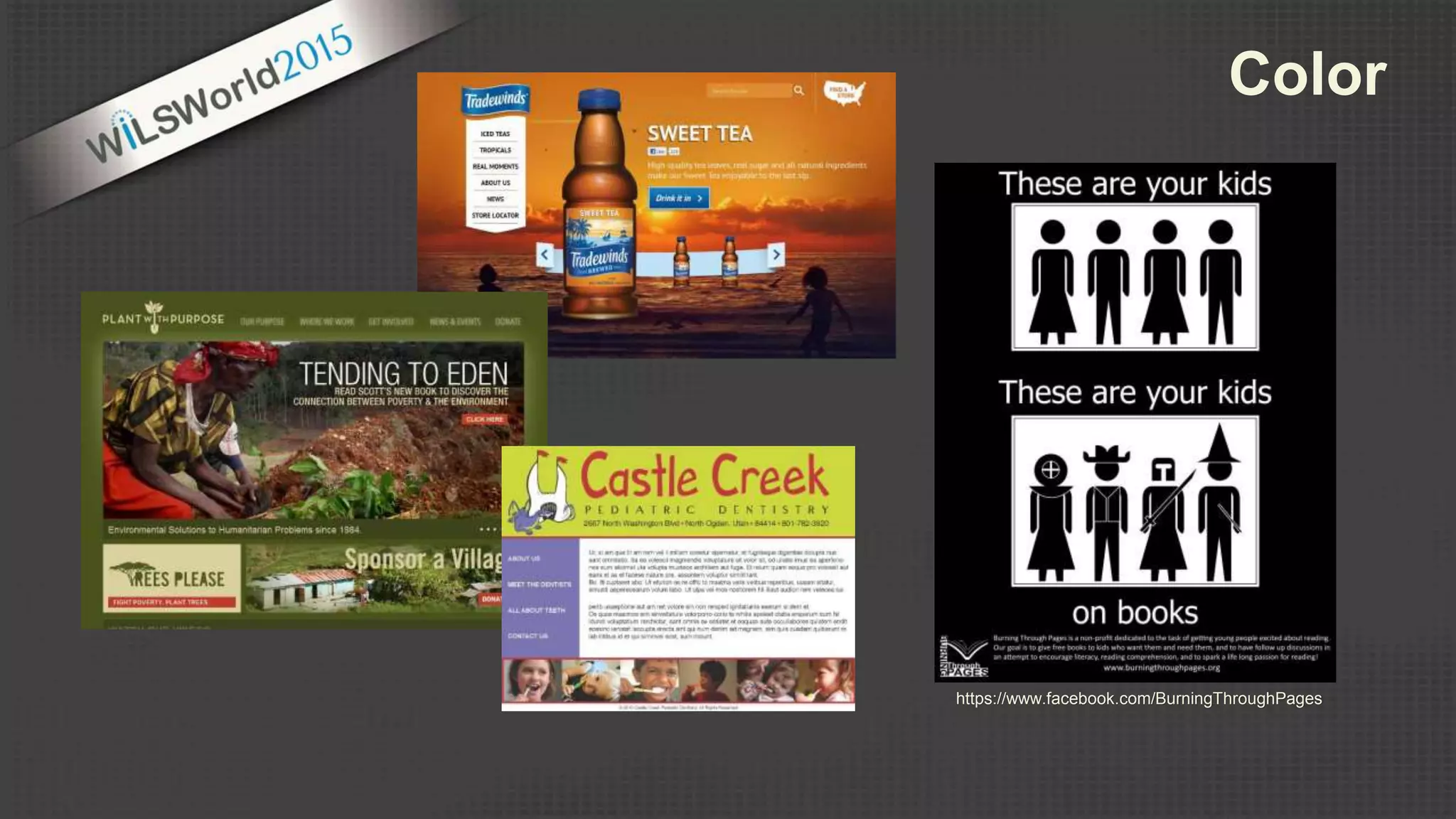
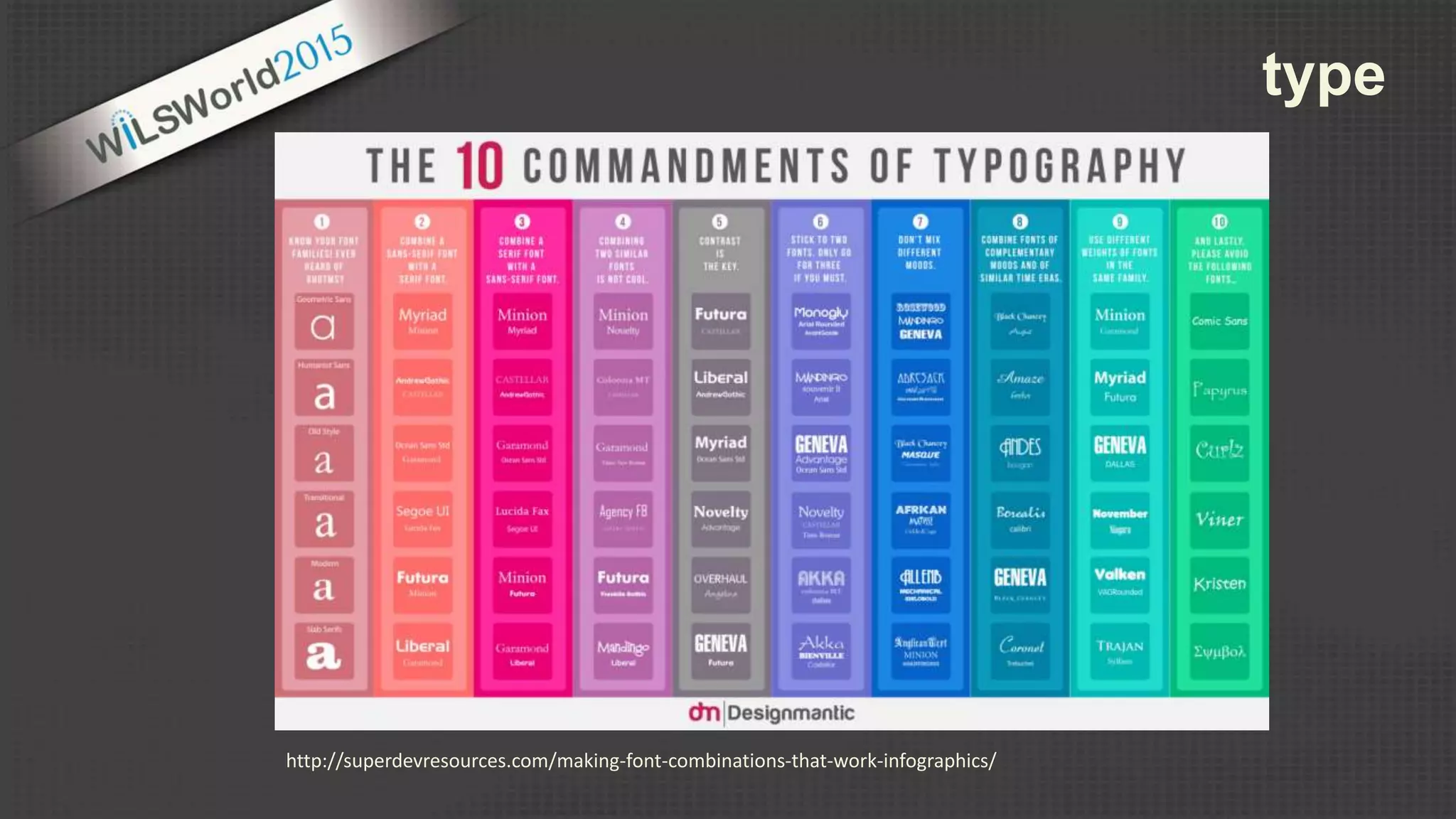
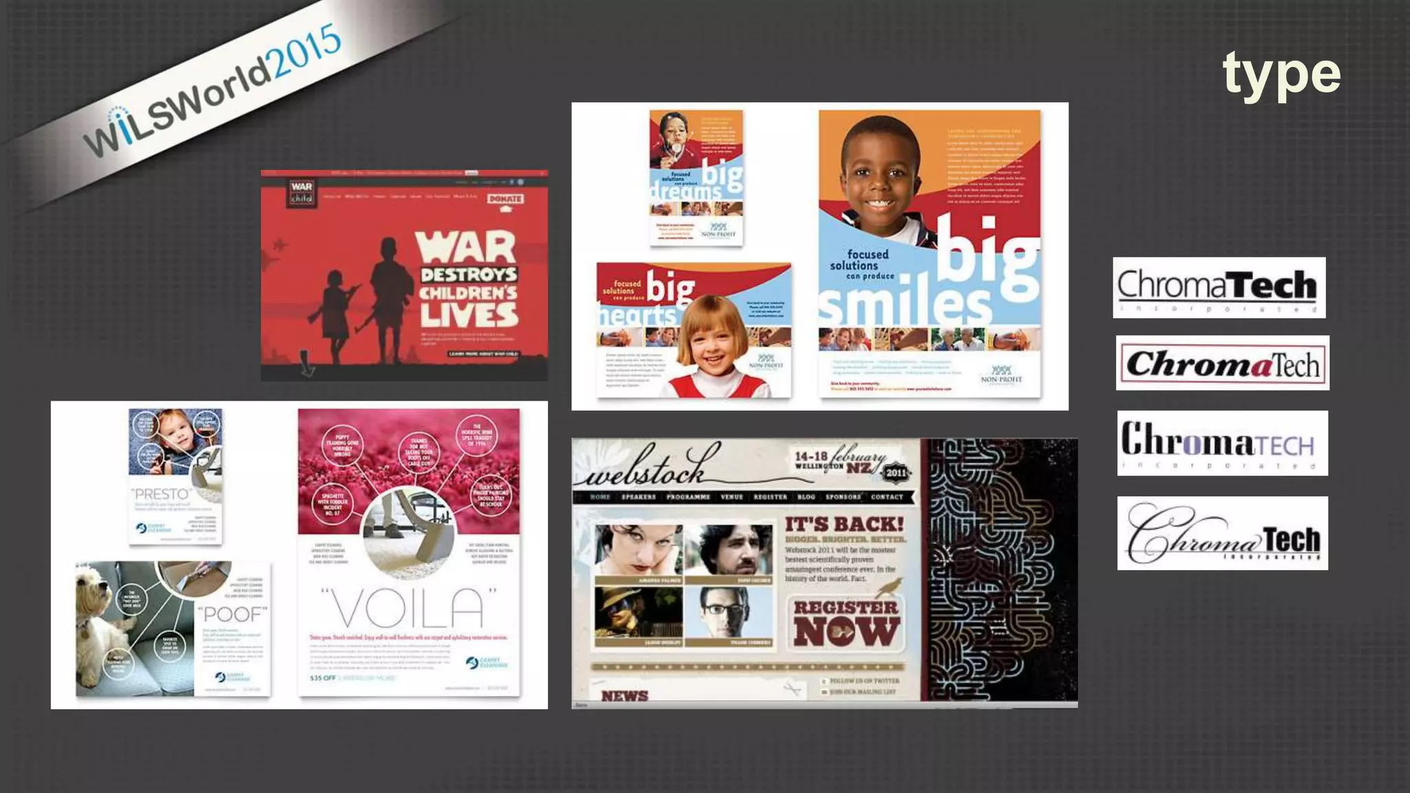
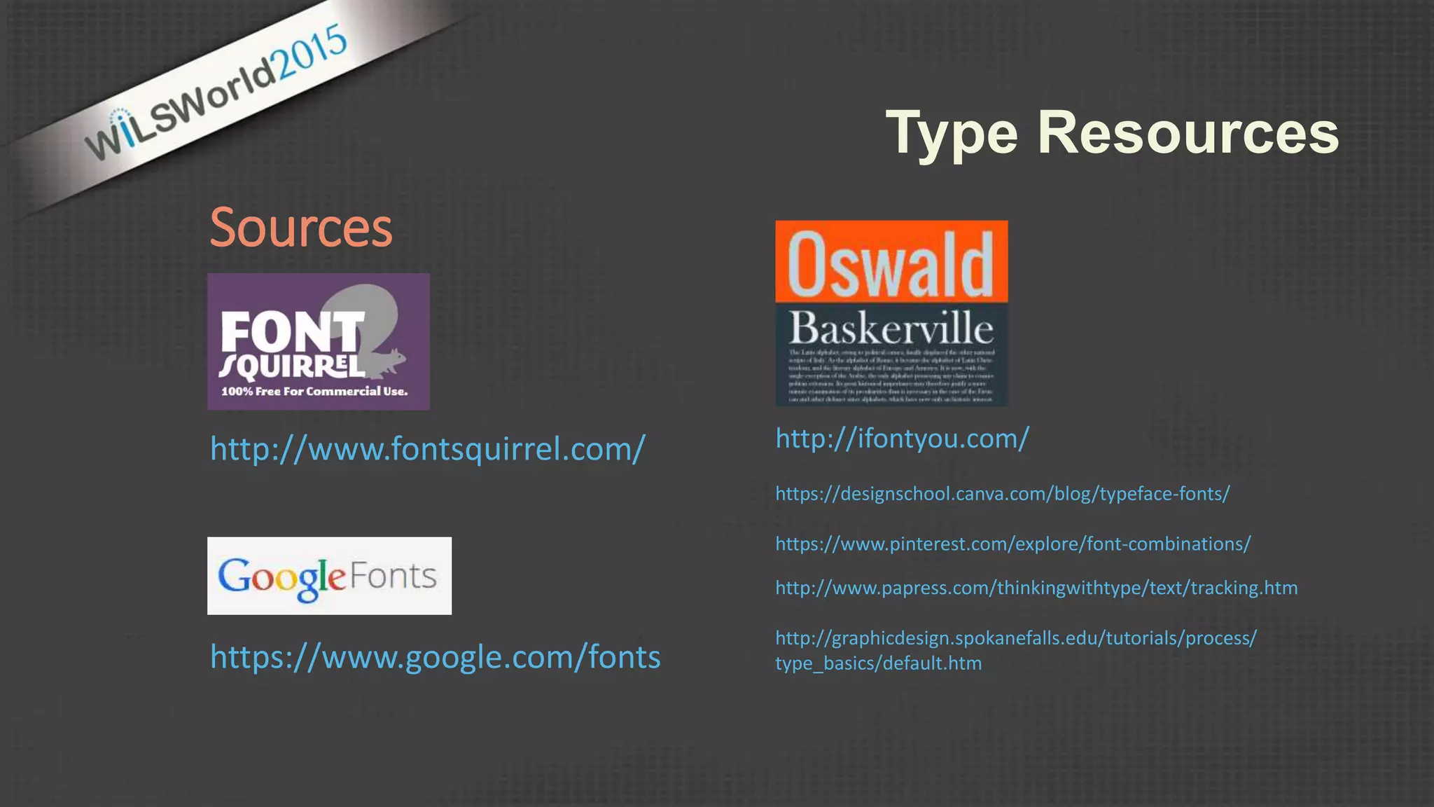
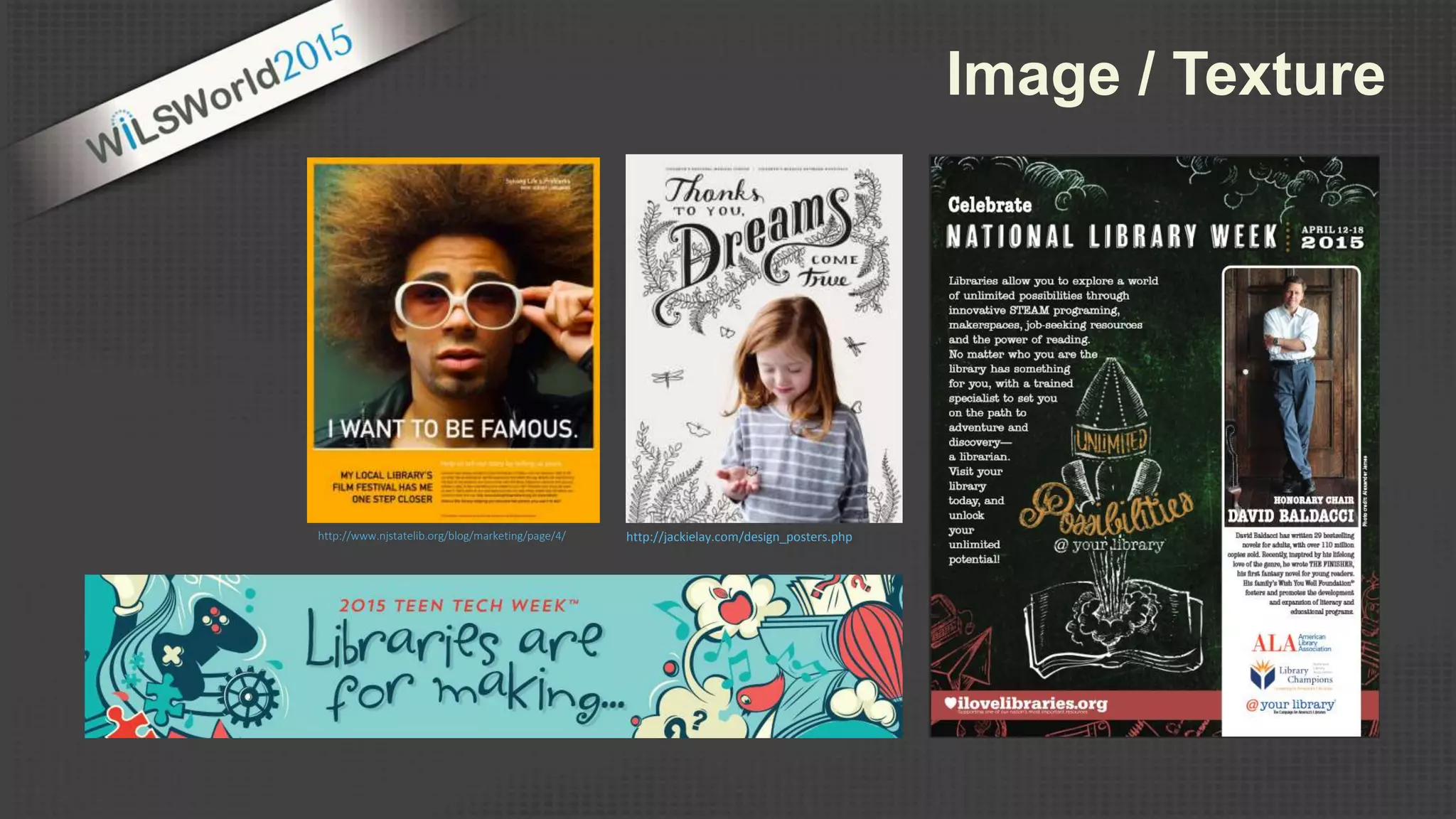
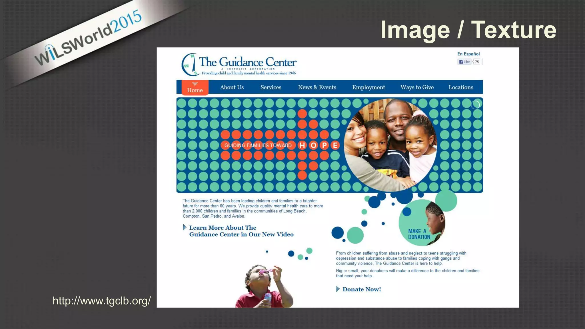
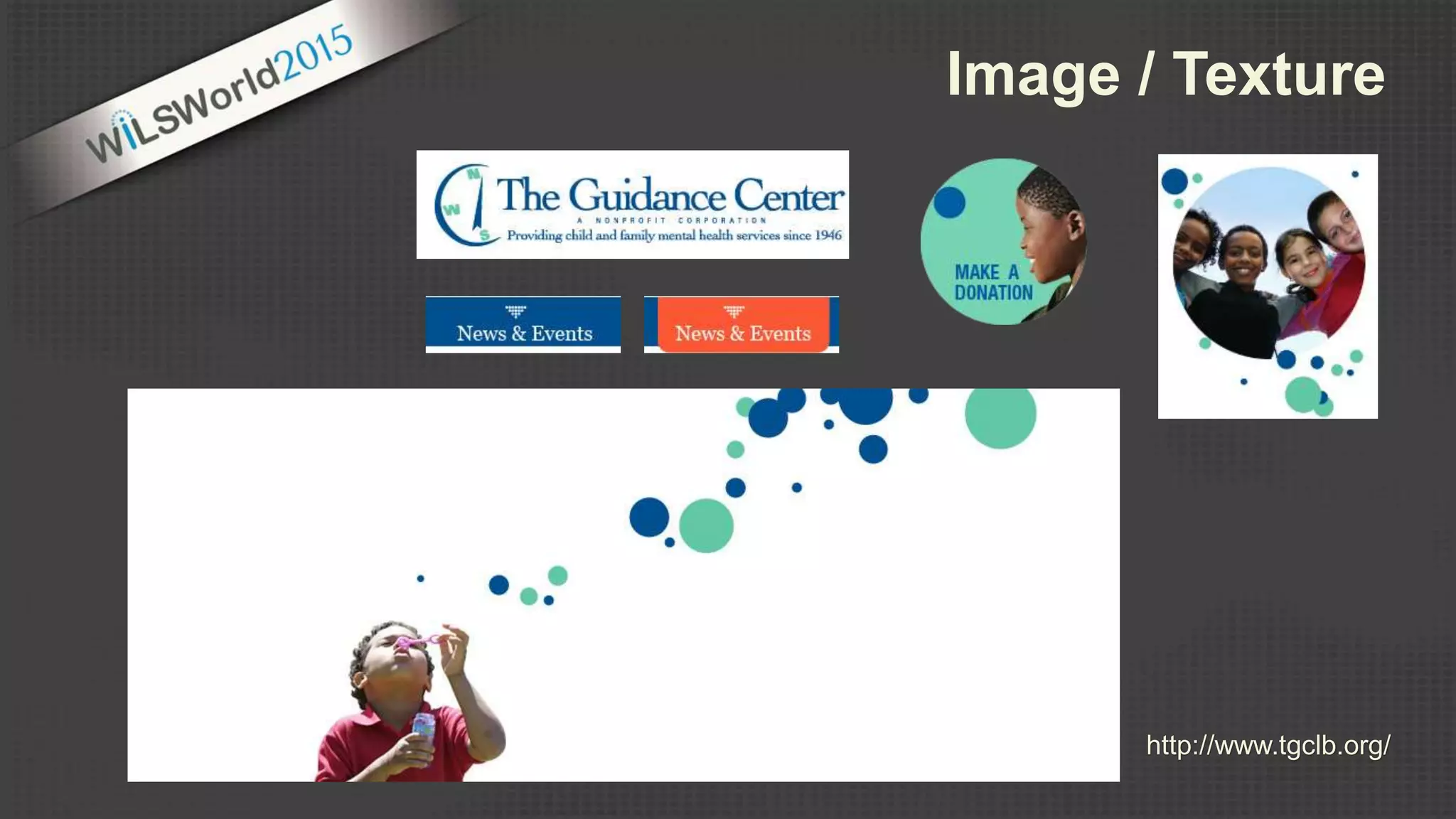
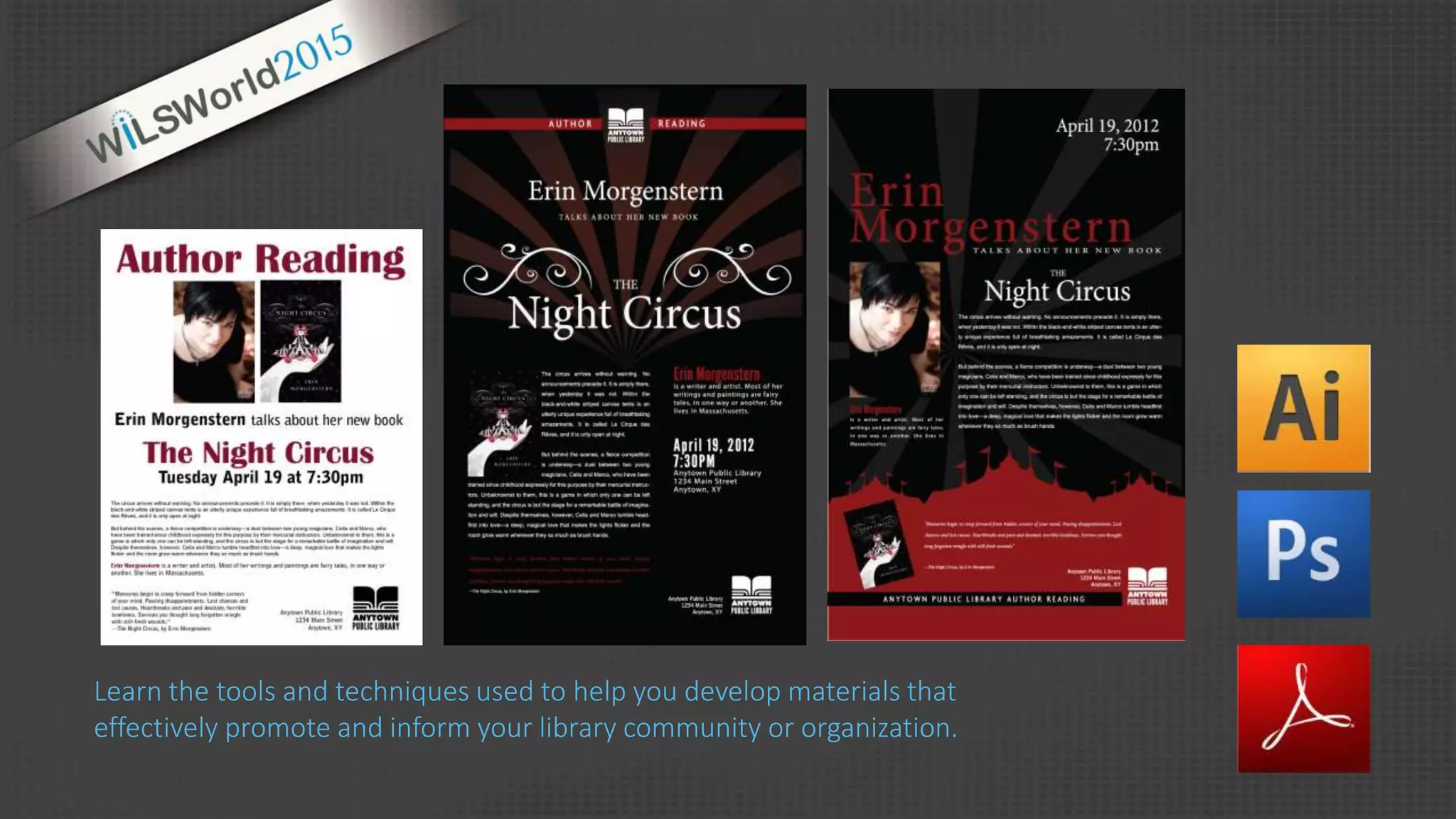
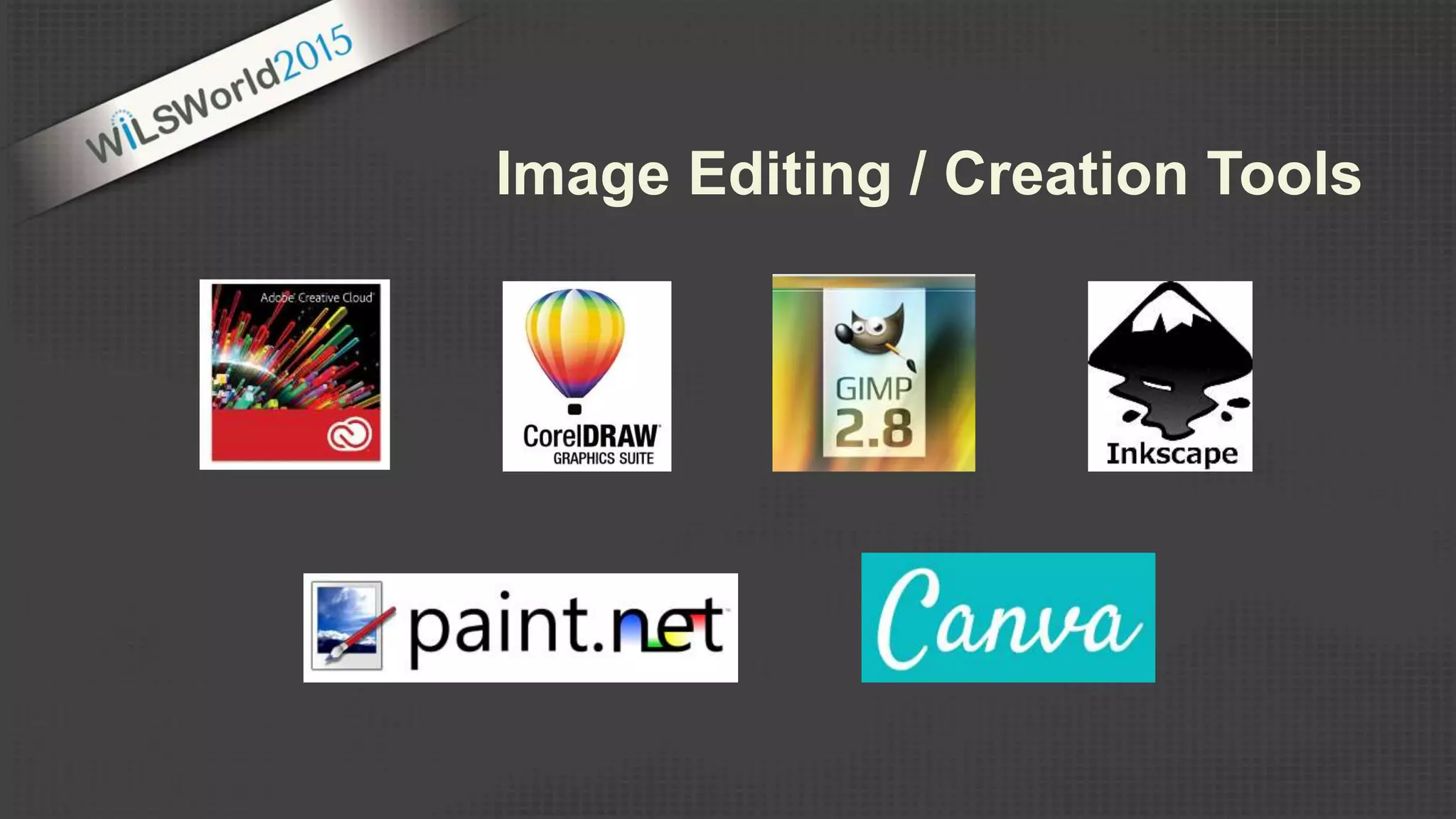
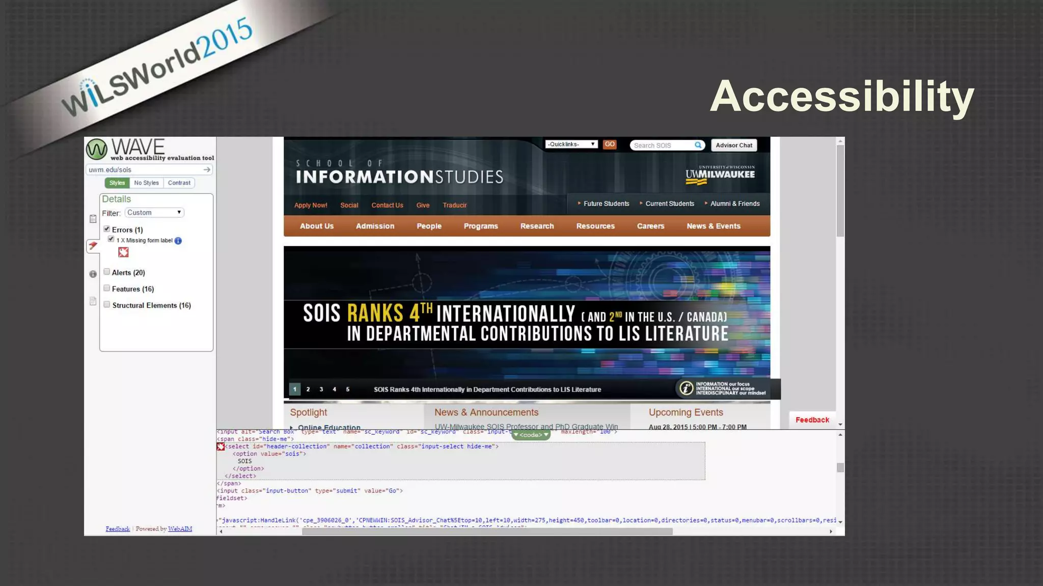
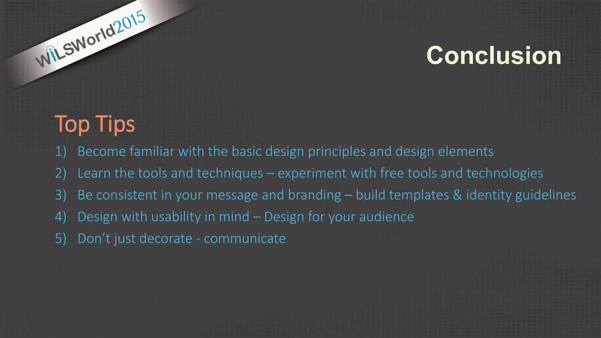
Graphic & Web Design Principles
Introduction to the Principles & Elements of Design
(Unity | Balance | Hierarchy | Color | Image | Type )
Branding & Identity
(Templates | Style Guides)
Web Design – Tools & Resources
(Web Development/Design)
Visual Communication
In most careers, individuals will be required to
presentations
(conference presentations | training | programming)
publications
(newsletters | annual reports )
marketing
(posters | displays | advertisements | branding)
online communications
(web development/design/updates| social media)
use technology to communicate effectively
Robin Williams. (2008). The Non-Designer's Design & Type
Books. Deluxe Edition. Peachpit Press.
FORM SPACE
design is the deliberate arrangement of …
Form = lines, shapes, textures, colors, words, pictures, etc. (ORDER) Form = lines, textures, shapes, textures, colors, words, pictures, etc. (ACTION)
Evokes a feeling | conveys a message
Arrangement of Form & Space
unity
Unity in design exists when
all elements are in
agreement
Unity exists when design
elements look like they
belong together
Proximity
Similarity
Repetition
unity
Proximity
Similarity
Repetition
balance
Elements are visually equivalent on both sides of a
composition • evenly distributed around a central,
vertical or horizontal axis
Symmetric
Elements of differing size, shape, tone are arranged
in a composition in a way that balance each others
visual weight
Asymmetric
http://www.digital-web.com/articles/principles_of_design/
balance
https://www.canva.com/
emphasis | hierarchy
The varying degrees of emphasis
in a composition
Dominant
(focal point)
Sub-dominant
(middle ground - secondary)
Subordinate
(background – least visual weight)
hierarchy
emphasis | hierarchy
Contrast
Placement
Proportion
dominance or emphasis in a
design can be created by the
use of:
http://www.stocklayouts.com/
emphasis | hierarchy
Dominance & Hierarchy
Communicate
(don’t just decorate)
Every design element should serve a
purpose – add value to the message.
• Evoke a feeling or mood
• Convey a message or idea
• Build a user’s personal engagement with the content
• Control the pacing of material
• Help organize the information and help create the
informational hierarchy
Robin Williams. (2008). The Non-Designer's Design & Type
Books. Deluxe Edition. Peachpit Press.
Color
http://inkbotdesign.com/spot-cheap-logo-design/
Color
https://www.facebook.com/BurningThroughPages
color
color
https://color.adobe.com
Color Resources
Adobe Color CC
https://color.adobe.com
COLOURlovers
http://www.colourlovers.com/
web/trends/websites
Design Melt Down
http://www.designmeltdown.com/default.aspx
Colrd
http://colrd.com/
Color Hunter
http://colorhunter.com/
Pinterest
https://www.pinterest.com/search/
pins/?q=color%20schemes
Design Seeds
http://design-seeds.com/http://www.britishlogodesign.co.uk/business-startup-
help/logo-design/colour-in-logo-design-infographic/
In visual communication we can treat
type as a design element
http://trentwalton.com/2009/11/08/things-ive-learned-from-car-guys/
type
http://superdevresources.com/making-font-combinations-that-work-infographics/
type
Sources
http://www.fontsquirrel.com/
https://www.google.com/fonts
Type Resources
http://ifontyou.com/
https://designschool.canva.com/blog/typeface-fonts/
https://www.pinterest.com/explore/font-combinations/
http://www.papress.com/thinkingwithtype/text/tracking.htm
http://graphicdesign.spokanefalls.edu/tutorials/process/
type_basics/default.htm
Image / Texture
http://www.njstatelib.org/blog/marketing/page/4/ http://jackielay.com/design_posters.php
http://www.tgclb.org/
Image / Texture
http://www.tgclb.org/
Image / Texture
Learn the tools and techniques used to help you develop materials that
effectively promote and inform your library community or organization.
Image Editing / Creation Tools
Canva.com
Designers
99Designs.com
Crowdspring.com
Freelancer.com
Crowdstudio.in
Guru.com
Stock Images
iStockPhoto.com
Flickr Creative Commons
Compfight.com
500px.com
Outsource Solutions
http://tfuresz.com/portfolio/vpl/
VISUAL IDENTITY:
Consistency in visual
design strengthens the
visual identity and
makes the brand more
recognizable
BRANDING
Consistency in visual design strengthens the visual identity and makes the
brand more recognizable • creates a connection
https://bonkperformanceseries.wordpress.com/
http://www.uwosh.edu/imc/brand-guidelines/brand-templates
Create Templates
https://brand.frontify.com/d/qAiubNByt
HKf/style-guide#/style-guide/logo
frontify.com
Examples
Foursquare Brand Standards
http://issuu.com/bondo/docs/foursquare
Barnes & Noble Brand Standards
http://issuu.com/carol_pistone/docs/barnes___noble_issuu/1
UWM Brand Standards Manual
http://uwm.edu/wp-content/uploads/sites/115/2014/06/
UWMBrandGuidelines8-13.pdf
Tools
https://frontify.com/styleguide
http://styletil.es/
Brand & Design Style Guides
Resources
https://designschool.canva.com/blog/your-brand-needs-a-visual-style-guide/
https://designschool.canva.com/blog/20-easy-tips-build-visual-brand-identity/
https://designschool.canva.com/branding-identity-design/
Web Editing Tools
Wordpress
• woothemes.com
• Themify.me
• appthemes.com
Drupal
• themeforest.net
• Omega
drupal.org/project/omega
Outsource Solutions
A/B/N Testing
Accessibility
Card Sort
Tree Navigation
Site Speed
Top Tips
1) Become familiar with the basic design principles and design elements
2) Learn the tools and techniques – experiment with free tools and technologies
3) Be consistent in your message and branding – build templates & identity guidelines
4) Design with usability in mind – Design for your audience
5) Don’t just decorate - communicate
Conclusion
http://sois.uwm.edu/wilsworld2015
Robert Nunez (rnunez@mykpl.info)
Head of Collection Services
Kenosha Public Library
Rebecca Hall (rjhall@uwm.edu)
Web Development & Marketing Director
UW-Milwaukee, School of Information Studies
Questions?

Graphic and Web Design Principles

Editor's Notes

  • #3 The goal of this program is to provide a overview of the elements, principles and tools used in design to create effective visual communications. Note: More information on promotional campaigns tomorrow at the WiLSWorld Workshops – Wednesday On Target: Marketing and Promoting Your Library Services
  • #4  Q: How many of you have created presentation, publications, marketing material, or online communications? Q: How many of you have formal design training? In most careers – in particular the library profession – individuals will be required to use technology to communicate effectively. (what do you most frequently create or design for your organization) There are many benefits to good design – Good design can lead to successful programming and events. It can help us convey complex information more clearly. It can make a significant impact on a users overall experience. So… what is good design?
  • #5 So what is good design? What makes a design good… ~Many disciplines of design: industrial design, architectural design, graphic design, user interface design, the list goes on…. ~But to me, what all of these thing have in common is that design adds value and usability to things. To design is to create something that is both functional and aesthetically pleasing. To create order out of chaos and randomness. Visual design is the process of taking ideas and giving them visual form so that others can understand them. A designer uses imagery, symbols, type, form and color to represent an idea that must be conveyed. -------------------------------------------------------- I’d like to think that most of us can recognize good design when we see it… but we may not stop to think about what is making a design good, effective or functional. Or a bad design for that matter… you may at some point have encountered a website that you’ve had a lot of trouble navigating or a form or publication that was difficult to read or understand. We don’t always stop to think about what is happening within a design that is making it effective or not usable. Examples ^ Here we have a few examples… and I’m willing to bet that everyone has an opinion about which one they think is more effective. To be honest, we may not all agree… design is often subjective and very much related to context and audience. But, there are some basic principles that can guide the arrangement of elements within designs that will help us create more effective and usable compositions.
  • #6 In it’s simplest definition, graphic design is the deliberate arrangement of form and space
  • #7 Form is all sorts of stuff… Design Elements: images, text, lines, points, shapes, patterns, textures, depth, color, values, words, etc. Space, in terms of design is often a 2-dimensional space. A poster, a billboard, a computer screen. The medium (printed page | Electronic) brochure, flyer, poster, advertisement, webpage, banner ad, etc. The arrangement of form within space can help convey meaning and create a message Examples ^ Web Interfaces: the types of forms used – the images, the textures, the surface activity, the colors, and the arrangements of these forms within the space creates a mood or feeling within the design. Ultimately… The goal is to have the feeling that is created contribute to or enhance the overall purpose or message of the site – appropriate for the target audience. Ultimate goal in design is to add value or enhance the composition in some way.
  • #8 Design principles are the fundamental concepts that guide the arrangement of elements within a composition. If we can recognize and identify these design principles… we can then use them to help us create effective designs.
  • #9 Unity: is the relationship between the individual design elements and the composition as a whole Unity in design exists when all elements are in agreement with one another Unity exists when all the design elements look like they belong together
  • #10 Unity in design can be achieved in a variety of ways…. Some of the way we can create unity in design is through the manipulation of: Proximity, Similarity, Repetition Example ^ PROXIMITY: Take a look at the Video headings, paragraphs and image. These elements are grouped or clustered together and they become one visual unity – their proximity implies that they are related in some way. SIMILARITY: Not only do elements in close proximity become one visual unit, but elements similar in size, shape, color, position or alignment are seen as related. A similar font style and color is used in headings for each area to help categorize the information – this helps us understand the information visually within the composition. It helps us absorb the information more efficiently. REPETITION: Repetition of size, color, shape, position, texture or special relationships create unity. In this design we see colors repeated…. Shapes (logo and background) repeated. ALIGNMENT: Alignment helps create a sense of order and intent to a design…. Thus creating unity. --------------------------------------- PROXIMITY (Grouping or clustering elements together) Elements in close proximity become one visual unit Physical closeness implies a relationship ALIGNMENT Elements that line up with one another appear related (similar) Every element in a design should have a visual connection with the other elements in the design SIMILARITY Elements similar in size, color, shape, position or texture are seen as related REPETITION Repetition of size, color, shape, position, texture or spatial relationships create unity in a design. ! Don’t forget contrast simple repetition without variation can become boring
  • #11 What is creating unity in this design? Repetition of color and repetition of a theme (colored rectangles) Similar treatment of headings and navigational elements.
  • #12 When applied to design… balance is the state of equalized tension within a composition.
  • #13 Horizontal symmetry Implied symmetry Radial symmetry Asymmetric – more interesting type of balance in design… but a little more difficult to achieve or get right. Example ^ Larger gray circles being balanced by the large area of white space and the small grey box - a little trickier to apply… but it can add a lot of interest to a design.
  • #14 Examples ^ Symmetric design Asymmetric balance – elements not visually equivalent on each side of the composition, but the various shapes and tones are arranged in a way that balance each others visual weight.
  • #15 The last principle that we will explore is dominance or emphasis is design. Dominance or emphasis plays an important role in helping to create a hierarchy – or the order of importance of the design elements. Its this hierarchy of elements that helps guide the reader through the content – guides the viewers eye, it visually explains to the viewer what is most important and helps emphasize the purpose and message of the content.
  • #16  Most designs have varying degrees of emphasis – to help guide the viewer through the design. Dominate elements are often the focal point and are set in the foreground of the composition. Sub-dominant elements are often of secondary importance and often fall in the middle ground Subordinate elements - elements with the least visual weight. Often having the less importance. (small text… fax, phone, hours)
  • #17 We can create emphasis in a design in a variety of ways. Through the use of Contrast, Placement, Proportion Contrast: juxtaposition of dissimilar graphic elements Contrast in type – font styles or sizes (Look at address and phone #) Contrast of color, line thickness, shapes Proportion: differences in scale or proportion can draw attention to the object (headlines in large bold text would make them stand out) ^ Large image ^ The emphasis we give to various elements can really influence the flow and understanding of the content. The placement of elements can help create emphasis. ^ “hours” - set apart Placement: isolation (set apart from the rest… creates emphasis – sets it apart as different… more important ^
  • #18 The emphasis we give to various elements can really influence the flow and understanding of the content. The placement of elements can help create emphasis. ^ “simplifying IT” Placement: isolation (set apart from the rest… creates emphasis – sets it apart as different… more important ^
  • #19 The lack of dominance or emphasis among elements forces competition among them ( no hierarchy created) If everything in the design is the same size or weight or color or texture – our eyes don’t know what to look at first. This may cause us to gloss over or miss the overall message.
  • #20 Once we are familiar with the design principles… we can then use them to help guide the arrangement of the design elements within a composition. Design elements can be many things… but we will focus on the big three: color, image and text
  • #22 Color is very powerful and it plays a very important role in visual communications. Not only do people respond to colors emotionally, but colors can also influence the meaning and message we are sending. Lots of really cool charts and infographics online that describe the various color associations and meanings… Color association – related to cultural and personal experiences – ultimately our goal is to choose colors that add value to the design. Selecting colors should never be an arbitrary decision. An understanding of basic color concepts can help us choose colors that will enhance our designs, create visual impact and reinforce our message.
  • #23 Here we have some examples of some designs that take advantage of the various color association and use color concepts effectively as a design element. Complementary colors – orange and blue…. Creates visual impact | unity | orange sunset… sets the tone and adds to the mood of the message (tradewinds) Plant with Purpose… again we see complimentary colors (red and green)… but also the green and tan are earthy and relevant to the message. Castle Creek… bold bright colors… communicating to the target audience. Black and white design… the absence of color can create an impact as well.
  • #24  When creating a design… It can be helpful to create a color scheme based on information from an existing logo or image. Again… chose colors that add value to the design… contribute in some way. It’s not always easy to put a good color scheme together. There are tools and site for inspiration to help!
  • #25 Adobe Color CC
  • #27 In visual communication … type not only communicates our message (literally) but it can also be treated as a design element.
  • #28 Again… there are lots of resources and sites for inspiration that will help us choose typefaces that add value to our design. As a general rule, we want to use typefaces sparingly. One – two difference typefaces is a design is generally enough to communicate the message – add interest – or help us organize our content. Think back to unity in design…. If we have to many different elements - too many different typeface… there may not be a sense of unity in the overall design.
  • #29 When choosing typefaces… think about what the style of type communicates. ^ ChromaTech - this example shows the combination of different typefaces all giving a slightly different feel to the design. ( elegant, modern, bold, friendly) Think about the type as a design element… how it looks visually within the composition. ^ webstock text is fluid and light…. “register now” is bold and dark ^ “Voila” “Poof” “Presto”…. Very thin and light… but works within the white space.
  • #31 Images can transmit information very quickly, they can help engage the audience and can help clarify complex information. Images can help create a mood and reinforce a message. All images use in design should have a purpose or add value to the message. (remember… communicate… don’t just decorate) When choosing images, think about the type of image that will best fit the communication. The style of an image carries meaning in terms of feeling. Photographic images are very different than clip art or illustration. What type of image will best suit your message.
  • #32 This design uses a variety of different images and design elements to communicate the message. Not only are designers responsible for finding appropriate images for a design…. But they are also responsible for editing them and preparing them to work within the design.
  • #34 MS word vs. Adobe products
  • #35 Canva Adobe -- Qualify for Traditional (outright own) and Cumulative (Points [8k min]) License Programs (adobe) - provartech.com, 70/year Training at tv.adobe.com/ CorelDRAW, cheaper alt to adobe (Journyed.com $94.99 [$500]) provides tutorials online free tools: Gimp (Photoshop), Inkscape (Illustrator), Paint.net (photoshop elements/lite) gimp: gimp.com/tutorials Inkscape:
  • #37 http://compfight.com/
  • #39 VISUAL IDENTITY: Consistency in visual design strengthens the visual identity and makes the brand more recognizable Repetition of color: blue and black Repetition of theme: “book pages” Prepetition of shape: rectangle with curves Consistent use of logo We may not all have the means to hire a professional design firm to create a brand identity and all its corresponding elements for us. But there are a few things we can do to create consistency in our communications.
  • #40 ^ BONK – Racine Public Library – Free Poetry and music series. Consistent design and is recognizable… this consistently creates a connection to the event - the series. (if you have a monthly event…. Create a really good design once and reuse with slight modifications) ^ Library of congress – Anytown Public LIbrary Consistent positioning and use of the logo… will help strengthen the overall visual design. If you don’t have a logo or identity graphic… try to use the same type treatment consistently throughout all designs. – build an identity
  • #45 Brackets - Brackets.io is a free, opensource tool originally provided by adobe Flux (Mac, $109) - is a WYSIWYG editor, Adobe Dreamweaver and Muse is the defacto for PC Wordpress has a greater focus on ease of use and on graphical usage via plugins Drupal has a learning curve, but is extremely powerful when used properly
  • #46 Important things to consider when selecting a theme: Will it allow for customization? Does it support Responsive Web Design?
  • #47 A/B Testing == Google Analytics’ Experiments Accessibility == Web Accessibility Evaluation Tool (WAVE)
  • #48 Accessibility == Web Accessibility Evaluation Tool (WAVE) http://webaim.org/resources/contrastchecker/ (Web Accessibility In Mind) CheckMyColors.com == Color Testing
  • #49 Card Sort == Help place items in the navigation There are online programs, but they will cost. OptimalSort starts at $109/Month
  • #50 The second part to navigation testing, it will help you see if the language you are using will help or hinder users from getting to information
  • #51 Site Speed and Responsive Design are important for the end user and for placement in Google and Bing Search results. The easiest tool to use is google’s PageSpeed Insights (shown) which will show you what’s lacking and give you recommendations on what you can do to improve the speeds. NOTE: If you are using a CMS, usually you can usually find a solution to the problem by browsing the official forums.