Downloaded 48 times
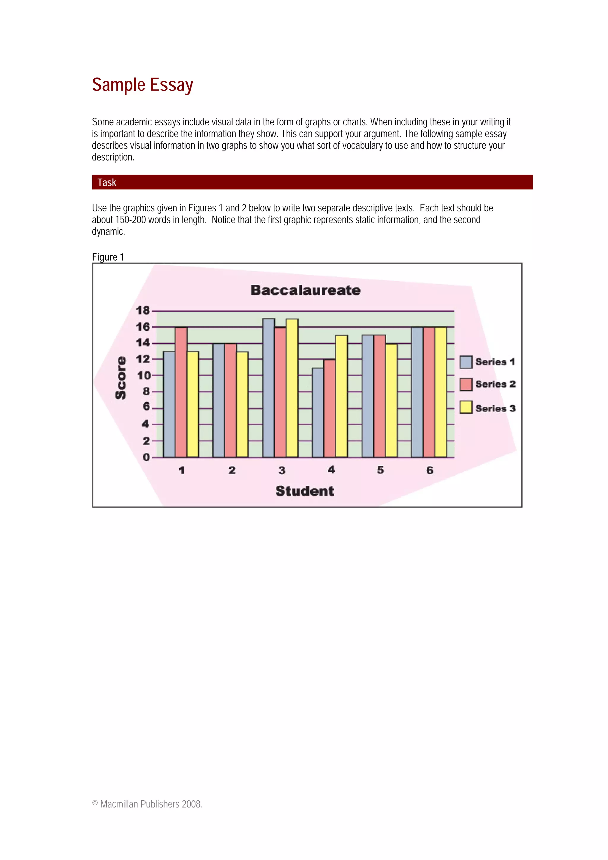
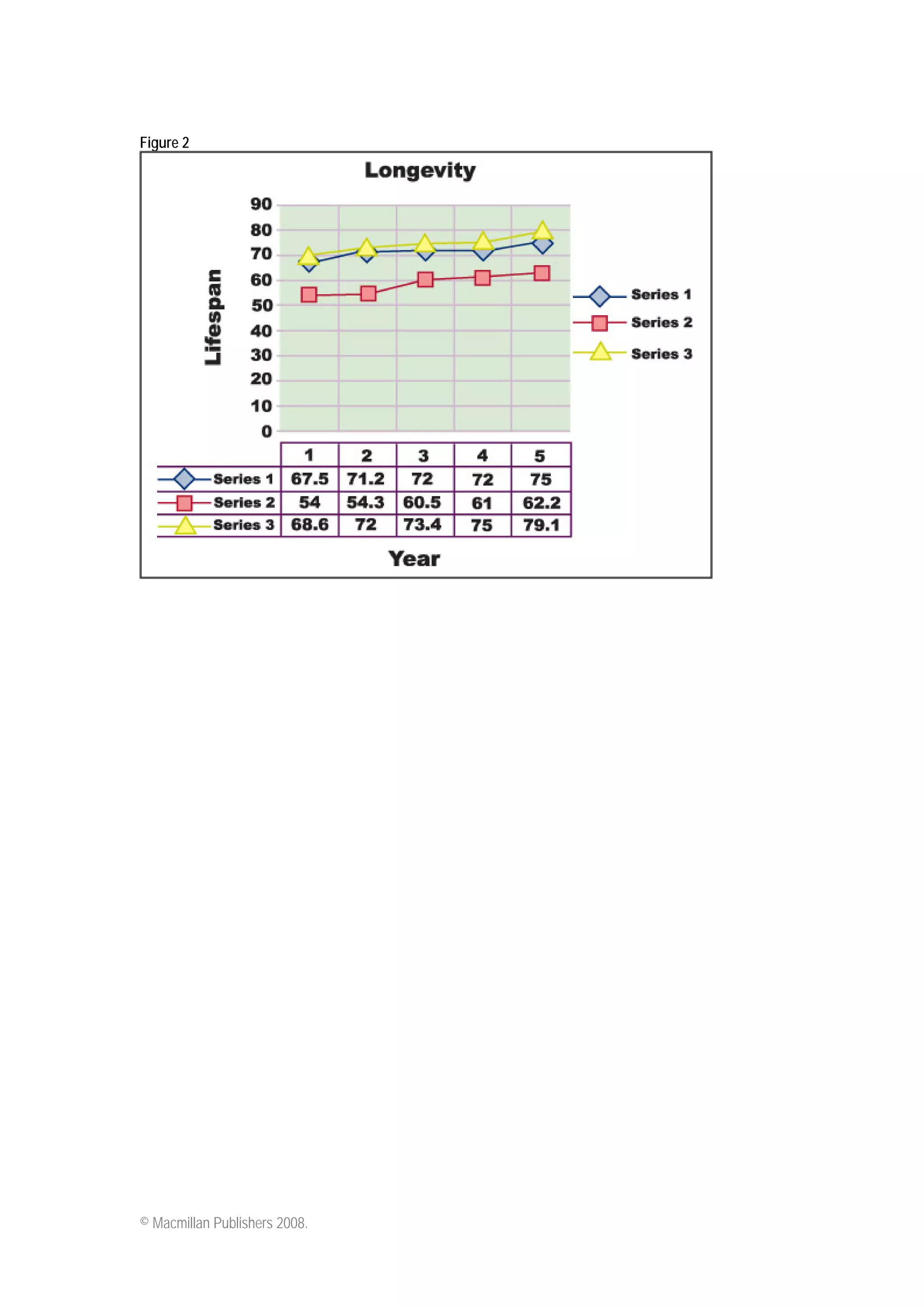

The document provides guidance on summarizing visual data from graphs or charts in academic essays. It includes a sample essay that describes two graphs in 3 sentences or less each to illustrate how to concisely summarize key details from visuals in a structured manner. The first graph summarizes test scores for international students, identifying the highest and lowest performing students. The second graph summarizes longevity trends in 3 countries over 50 years, noting the gradual increases in two countries and most significant gains in the third country.


