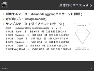
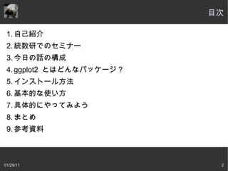
ggplot2 とはどんなパッケージ?
ggplot2 とは?
ggplot2 is a plotting system for R, based on the
grammar of graphics, which tries to take the good parts
of base and lattice graphics and none of the bad parts.
It takes care of many of the fiddly details that make
plotting a hassle (like drawing legends) as well as
providing a powerful model of graphics that makes it
easy to produce complex multi-layered graphics
超意訳:グラフ文法をベースにした R の描画機能。簡
単にきれいでパワフルなグラフがかけまっせ!
出典: http://had.co.nz/ggplot2/
01/29/11 10


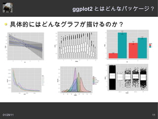


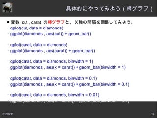
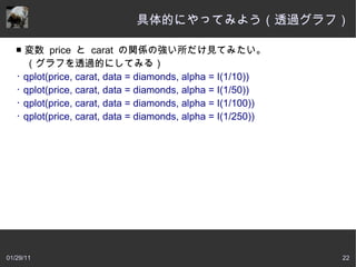
![基本的な使い方
ggplot2 には 2 つの構文があります。
ggplot([data] , aes(x = X 軸
, y = Y 軸 )) : データ定義
+ geom_ () : 出力するグラフ
+ geom_ () : 出力するグラフ 2
+ xlim( 最小値 , 最大値 ) + ylim( 最小値 , 最大値 )
+ xlab(X 軸ラベル )+ ylab(Y 軸ラベル ) などなど…
例)
ggplot(movies, aes(x=mpaa, y=rating))
+geom_jitter(aes(colour=rating))+xlab(“ 対象年令” ) +
ylab(“ レーティング” )
01/29/11 15](https://image.slidesharecdn.com/ggplot2110129-110128200955-phpapp02/85/ggplot2-110129-15-320.jpg)
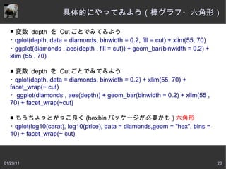
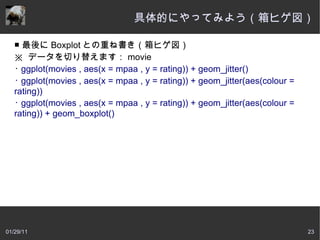
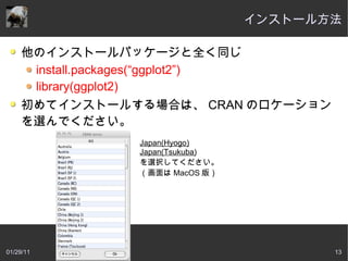
![基本的な使い方
ggplot2 には 2 つの構文があります。
qplot(x , y , data = [data] , geom = グラフ )
例)
qplot(mpaa, rating,
data=movies,geom=c("boxplot","jitter"))
ggplot~,qplot も構文が違うだけで同じグラフを作ってくれま
す。
01/29/11 16](https://image.slidesharecdn.com/ggplot2110129-110128200955-phpapp02/85/ggplot2-110129-16-320.jpg)