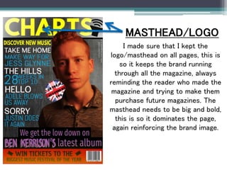
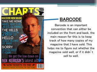
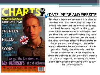
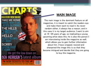
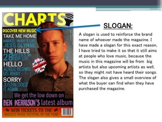
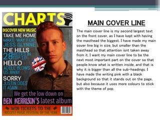
In what ways does your media
product use, develop or challenge
forms and conventions of real media
products?
I made sure that I kept the
logo/masthead on all pages, this is
so it keeps the brand running
through all the magazine, always
reminding the reader who made the
magazine and trying to make them
purchase future magazines. The
masthead needs to be big and bold,
this is so it dominates the page,
again reinforcing the brand image.
MASTHEAD/LOGO
BARCODE
Barcode is an important
convention that can either be
included on the front and back, the
main reason for this is to keep
track of how many copies of my
magazine that I have sold. This
helps me to figure out whether the
magazine sold well, or if it didn’t
sell to well.
DATE, PRICE AND WEBSITE
The date is important because if it is close to
the date when they are buying the magazine
then it tells them that the information is new
and fresh because they will be able to tell
when it has been released, it also helps them
put them into context/order when they have
collected a number of issues over the weeks
that they have been released. Price relates to
the people who I am aiming at, I wanted to
make it affordable for my audience of 14 – 24
year olds. Finally, the website is there for
further information about the magazine, it
allows the audience to visit the official website
of CHARTS magazine, increasing the brand
name again, possibly persuading them to buy
the upcoming issues.
MAIN IMAGE
The main image is the dominant feature on all
magazines, it is meant to catch the readers eye
and make them want to read it. Its never
random either, it always has a reason, and in
this case it is my target audience, I want to aim
at 14 -24 years of age, so implicating a young
upcoming artist does this, he is also the person I
am interviewing inside the magazine as well,
which allows you to gain further information
about him. I have cropped, resized and
sharpened the image this is so that they
become intrigued and decide that they are going
to buy the magazine.
SLOGAN:
A slogan is used to reinforce the brand
name of whoever made the magazine. I
have made a slogan for this exact reason,
I have tried to make it so that it still aims
at people who love music, because the
music in this magazine will be from big
artists but also upcoming artists as well,
so they might not have heard their songs.
The slogan also gives a small overview of
what the buyer can find when they have
purchased the magazine.
MAIN COVER LINE
The main cover line is my second largest text
on the front cover, as I have kept with having
the masthead the biggest. I have made my main
cover line big in size, but smaller than the
masthead so that attention isnt taken away
from it. I want my main cover line to be the
next most important part on the cover so that
people know what is written inside, and that is
why it is bigger than all the sub-headings. I
have made the writing pink with a black
background so that it stands out on the page,
but also because it uses more colours to stick
with the theme of pop.

Generic conventions

  • 1.
    In what waysdoes your media product use, develop or challenge forms and conventions of real media products?
  • 2.
    I made surethat I kept the logo/masthead on all pages, this is so it keeps the brand running through all the magazine, always reminding the reader who made the magazine and trying to make them purchase future magazines. The masthead needs to be big and bold, this is so it dominates the page, again reinforcing the brand image. MASTHEAD/LOGO
  • 3.
    BARCODE Barcode is animportant convention that can either be included on the front and back, the main reason for this is to keep track of how many copies of my magazine that I have sold. This helps me to figure out whether the magazine sold well, or if it didn’t sell to well.
  • 4.
    DATE, PRICE ANDWEBSITE The date is important because if it is close to the date when they are buying the magazine then it tells them that the information is new and fresh because they will be able to tell when it has been released, it also helps them put them into context/order when they have collected a number of issues over the weeks that they have been released. Price relates to the people who I am aiming at, I wanted to make it affordable for my audience of 14 – 24 year olds. Finally, the website is there for further information about the magazine, it allows the audience to visit the official website of CHARTS magazine, increasing the brand name again, possibly persuading them to buy the upcoming issues.
  • 5.
    MAIN IMAGE The mainimage is the dominant feature on all magazines, it is meant to catch the readers eye and make them want to read it. Its never random either, it always has a reason, and in this case it is my target audience, I want to aim at 14 -24 years of age, so implicating a young upcoming artist does this, he is also the person I am interviewing inside the magazine as well, which allows you to gain further information about him. I have cropped, resized and sharpened the image this is so that they become intrigued and decide that they are going to buy the magazine.
  • 6.
    SLOGAN: A slogan isused to reinforce the brand name of whoever made the magazine. I have made a slogan for this exact reason, I have tried to make it so that it still aims at people who love music, because the music in this magazine will be from big artists but also upcoming artists as well, so they might not have heard their songs. The slogan also gives a small overview of what the buyer can find when they have purchased the magazine.
  • 7.
    MAIN COVER LINE Themain cover line is my second largest text on the front cover, as I have kept with having the masthead the biggest. I have made my main cover line big in size, but smaller than the masthead so that attention isnt taken away from it. I want my main cover line to be the next most important part on the cover so that people know what is written inside, and that is why it is bigger than all the sub-headings. I have made the writing pink with a black background so that it stands out on the page, but also because it uses more colours to stick with the theme of pop.