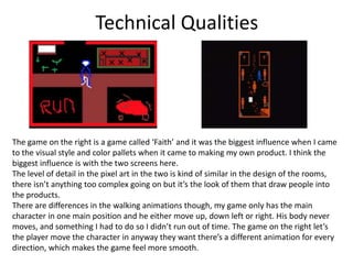
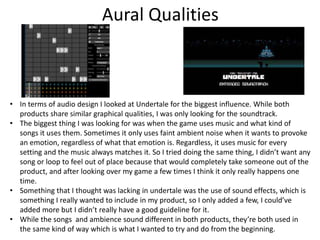
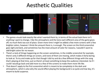
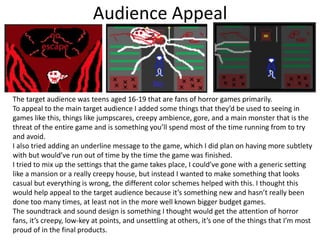
Evaluation
James
Research
• While doing research I looked at specific smaller things that I could try and
incorporate in my own, things like what the walking animations look like,
what kind of songs are used and at what times, the appropriate times to
use sound effects, different colour pallets and mood they fit in with, and
what the look of the characters should try and be.
• For that I looked at a few different examples, some recent and some older
ones. I looked at the most common uses of what I was looking for and
came up with a plan for how I wanted to incorporate them into my own
game.
• Something that I found difficult was trying to come up with a way to
shorten the ideas that I got from looking at the existing products, because
I knew that I wouldn’t have as much time to make the game, and it would
have to be much shorter anyway. So I either had to cut out plans already
at this stage or find a good way to shorten them down but to the point
where they still make sense.
• The product never really suffered because of this it just means there were
some things that I really wanted to add that I couldn’t anymore.
Planning
• While planning I took what I gathered during research, things like ideas
that I got from looking at existing products, potential colour pallets for the
background and focus of the levels, and a few design ideas for what the
main character, plus a few extras might look like. Once I gathered and
finalised everything I definitely wanted to include, I tried expanding the
ideas by putting them a slide and visualising what they would probably
look like when put into practise. I ended up using most of what I came up
with.
• To improve the planning I probably could’ve come up with a few more
ideas since I didn’t really have much of a backup plan to fall back on if this
idea didn’t work out. I had to cut a few ideas later on since they would’ve
taken to long to make and I would’ve fallen behind. So coming up with a
few smaller ideas just in case things don’t work out would be a better idea
to keep in mind for next time.
• Also the game did end up lacking in the amount of characters, and that’s
mainly because I overlooked that part of it when I was planning, in the end
it didn’t effect the game too badly because I wanted to create a lonely
atmosphere anyway. It’s just something to keep in mind going forward.
Time Management
• I made sure to not fall behind on anything with this project. If something
was looking like it would take too long to make or if it was overly
complicated then I immediately just left it because going forward with it
was just going to take too long and I would’ve fallen behind.
• Managing time while making the product was easier then I was
anticipating it to be as well, since I already knew exactly what I wanted to
make, how I wanted it start and end, and basically everything in between.
All I had to do was go forward with it.
• With more time I would’ve been able to make a more complete product.
I’m happy with how it turned out, however I did plan on having more
screens that would’ve made the game more interesting and explained
more with having less actual dialogue. But I didn’t have enough time to
add everything so I had to cut them out. In their place I had to add way
more dialogue with the few character that I did have. So technically
everything is in the game that I planned, just not in the way I really wanted
due to how much time I had.
Technical Qualities
The game on the right is a game called ‘Faith’ and it was the biggest influence when I came
to the visual style and color pallets when it came to making my own product. I think the
biggest influence is with the two screens here.
The level of detail in the pixel art in the two is kind of similar in the design of the rooms,
there isn’t anything too complex going on but it’s the look of them that draw people into
the products.
There are differences in the walking animations though, my game only has the main
character in one main position and he either move up, down left or right. His body never
moves, and something I had to do so I didn’t run out of time. The game on the right let’s
the player move the character in anyway they want there’s a different animation for every
direction, which makes the game feel more smooth.
Aural Qualities
• In terms of audio design I looked at Undertale for the biggest influence. While both
products share similar graphical qualities, I was only looking for the soundtrack.
• The biggest thing I was looking for was when the game uses music and what kind of
songs it uses them. Sometimes it only uses faint ambient noise when it wants to provoke
an emotion, regardless of what that emotion is. Regardless, it uses music for every
setting and the music always matches it. So I tried doing the same thing, I didn’t want any
song or loop to feel out of place because that would completely take someone out of the
product, and after looking over my game a few times I think it only really happens one
time.
• Something that I thought was lacking in undertale was the use of sound effects, which is
something I really wanted to include in my product, so I only added a few, I could’ve
added more but I didn’t really have a good guideline for it.
• While the songs and ambience sound different in both products, they’re both used in
the same kind of way which is what I wanted to try and do from the beginning.
Aesthetic Qualities
• The games visuals look exactly like what I wanted them to, in terms of the actual look there isn’t
anything I want to change, I like the atmosphere and the tone each different area of the game gives
off, no much feels too out of place. Given more time I might’ve added a few more screens with a few
brighter colors, however I think the amount there is, is enough. The screen on the third screenshot
goes light and dark, and sometimes has the most amount of color for reasons, I wouldn’t want to
add bright colors for no reason.
• There’s a lack of things happening on the screen sometimes, in the middle screenshot for example,
there’s only 3 different things on screen, and none of them are moving, which makes it fairly boring
to look at. To try and make up for that though I did try and do a few different things with the song
that’s playing at that time, just so there’s at least something to keep the audience interested. So if I
could I would go back and add more to a few of the screens to make them more life like.
• That doesn’t apply to the first screenshot which is meant to be completely in the dark and
atmospheric, which is also why the sound effect playing the background is so quite and low-key, it’s
meant to build suspense.
Audience Appeal
The target audience was teens aged 16-19 that are fans of horror games primarily.
To appeal to the main target audience I added some things that they’d be used to seeing in
games like this, things like jumpscares, creepy ambience, gore, and a main monster that is the
threat of the entire game and is something you’ll spend most of the time running from to try
and avoid.
I also tried adding an underline message to the game, which I did plan on having more subtlety
with but would’ve run out of time by the time the game was finished.
I tried to mix up the settings that the game takes place, I could’ve gone with a generic setting
like a mansion or a really creepy house, but instead I wanted to make something that looks
casual but everything is wrong, the different color schemes helped with this. I thought this
would help appeal to the target audience because it’s something new and hasn’t really been
done too many times, at least not in the more well known bigger budget games.
The soundtrack and sound design is something I thought would get the attention of horror
fans, it’s creepy, low-key at points, and unsettling at others, it’s one of the things that I’m most
proud of in the final products.

game evaluation

  • 1.
  • 2.
    Research • While doingresearch I looked at specific smaller things that I could try and incorporate in my own, things like what the walking animations look like, what kind of songs are used and at what times, the appropriate times to use sound effects, different colour pallets and mood they fit in with, and what the look of the characters should try and be. • For that I looked at a few different examples, some recent and some older ones. I looked at the most common uses of what I was looking for and came up with a plan for how I wanted to incorporate them into my own game. • Something that I found difficult was trying to come up with a way to shorten the ideas that I got from looking at the existing products, because I knew that I wouldn’t have as much time to make the game, and it would have to be much shorter anyway. So I either had to cut out plans already at this stage or find a good way to shorten them down but to the point where they still make sense. • The product never really suffered because of this it just means there were some things that I really wanted to add that I couldn’t anymore.
  • 3.
    Planning • While planningI took what I gathered during research, things like ideas that I got from looking at existing products, potential colour pallets for the background and focus of the levels, and a few design ideas for what the main character, plus a few extras might look like. Once I gathered and finalised everything I definitely wanted to include, I tried expanding the ideas by putting them a slide and visualising what they would probably look like when put into practise. I ended up using most of what I came up with. • To improve the planning I probably could’ve come up with a few more ideas since I didn’t really have much of a backup plan to fall back on if this idea didn’t work out. I had to cut a few ideas later on since they would’ve taken to long to make and I would’ve fallen behind. So coming up with a few smaller ideas just in case things don’t work out would be a better idea to keep in mind for next time. • Also the game did end up lacking in the amount of characters, and that’s mainly because I overlooked that part of it when I was planning, in the end it didn’t effect the game too badly because I wanted to create a lonely atmosphere anyway. It’s just something to keep in mind going forward.
  • 4.
    Time Management • Imade sure to not fall behind on anything with this project. If something was looking like it would take too long to make or if it was overly complicated then I immediately just left it because going forward with it was just going to take too long and I would’ve fallen behind. • Managing time while making the product was easier then I was anticipating it to be as well, since I already knew exactly what I wanted to make, how I wanted it start and end, and basically everything in between. All I had to do was go forward with it. • With more time I would’ve been able to make a more complete product. I’m happy with how it turned out, however I did plan on having more screens that would’ve made the game more interesting and explained more with having less actual dialogue. But I didn’t have enough time to add everything so I had to cut them out. In their place I had to add way more dialogue with the few character that I did have. So technically everything is in the game that I planned, just not in the way I really wanted due to how much time I had.
  • 5.
    Technical Qualities The gameon the right is a game called ‘Faith’ and it was the biggest influence when I came to the visual style and color pallets when it came to making my own product. I think the biggest influence is with the two screens here. The level of detail in the pixel art in the two is kind of similar in the design of the rooms, there isn’t anything too complex going on but it’s the look of them that draw people into the products. There are differences in the walking animations though, my game only has the main character in one main position and he either move up, down left or right. His body never moves, and something I had to do so I didn’t run out of time. The game on the right let’s the player move the character in anyway they want there’s a different animation for every direction, which makes the game feel more smooth.
  • 6.
    Aural Qualities • Interms of audio design I looked at Undertale for the biggest influence. While both products share similar graphical qualities, I was only looking for the soundtrack. • The biggest thing I was looking for was when the game uses music and what kind of songs it uses them. Sometimes it only uses faint ambient noise when it wants to provoke an emotion, regardless of what that emotion is. Regardless, it uses music for every setting and the music always matches it. So I tried doing the same thing, I didn’t want any song or loop to feel out of place because that would completely take someone out of the product, and after looking over my game a few times I think it only really happens one time. • Something that I thought was lacking in undertale was the use of sound effects, which is something I really wanted to include in my product, so I only added a few, I could’ve added more but I didn’t really have a good guideline for it. • While the songs and ambience sound different in both products, they’re both used in the same kind of way which is what I wanted to try and do from the beginning.
  • 7.
    Aesthetic Qualities • Thegames visuals look exactly like what I wanted them to, in terms of the actual look there isn’t anything I want to change, I like the atmosphere and the tone each different area of the game gives off, no much feels too out of place. Given more time I might’ve added a few more screens with a few brighter colors, however I think the amount there is, is enough. The screen on the third screenshot goes light and dark, and sometimes has the most amount of color for reasons, I wouldn’t want to add bright colors for no reason. • There’s a lack of things happening on the screen sometimes, in the middle screenshot for example, there’s only 3 different things on screen, and none of them are moving, which makes it fairly boring to look at. To try and make up for that though I did try and do a few different things with the song that’s playing at that time, just so there’s at least something to keep the audience interested. So if I could I would go back and add more to a few of the screens to make them more life like. • That doesn’t apply to the first screenshot which is meant to be completely in the dark and atmospheric, which is also why the sound effect playing the background is so quite and low-key, it’s meant to build suspense.
  • 8.
    Audience Appeal The targetaudience was teens aged 16-19 that are fans of horror games primarily. To appeal to the main target audience I added some things that they’d be used to seeing in games like this, things like jumpscares, creepy ambience, gore, and a main monster that is the threat of the entire game and is something you’ll spend most of the time running from to try and avoid. I also tried adding an underline message to the game, which I did plan on having more subtlety with but would’ve run out of time by the time the game was finished. I tried to mix up the settings that the game takes place, I could’ve gone with a generic setting like a mansion or a really creepy house, but instead I wanted to make something that looks casual but everything is wrong, the different color schemes helped with this. I thought this would help appeal to the target audience because it’s something new and hasn’t really been done too many times, at least not in the more well known bigger budget games. The soundtrack and sound design is something I thought would get the attention of horror fans, it’s creepy, low-key at points, and unsettling at others, it’s one of the things that I’m most proud of in the final products.

Editor's Notes

  • #3 What were the strengths of your research? How did your research help your product? Discuss product research and experiments. What were the weaknesses of your research? What could you have done better/improve? What effect would this have had on your product?
  • #4 What were the strengths of your planning? How did your planning help your product? What were the weaknesses of your planning? What could you have done better/improve? What effect would this have had on your product?
  • #5 Did you manage your time well? Did you complete your project on time or would your products have improved with additional time? What would you have done if you had more time to produce your work?
  • #6 Discuss the strengths and weaknesses of the technical aspects of your work; level of detail in the pixel art, smoothness of the animation, complexity of animated elements. Compare your work to similar existing products (pixel art games/similar genre games) and discuss the similarities and differences Consider putting your final piece(s) in the centre of a page alongside an existing product- Use text boxes and arrows
  • #7 Discuss the strengths and weaknesses of the audio elements of your work; amount of different music, music complexity, amount of sound effects, quality of sound effects, use of dialogue. Compare your work to similar existing products (pixel art games/similar genre games) and discuss the similarities and differences in the use of audio What other audio elements could you have added? What would have made it better?
  • #8 Does your work look good? Was it creative? What aspects of your game’s visuals do you like? What would you improve? How would you improve it? Consider use of colour, if you can tell what your art is meant to represent, backgrounds, characters, pick-ups, enemies etc Discuss the strengths and weaknesses Put your final piece(s) in the centre of a page and analyse them Use text boxes and arrows
  • #9 How have you appealed to your target audience? What specific bits of content would appeal to your target audience. Put your final piece(s) in the centre of a page and analyse them Use text boxes and arrows Consider using you https://yougov.co.uk/profileslite#/ to develop your audience description