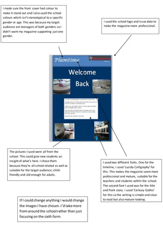
The document discusses the design choices made for a school magazine, including using the school colors on the front cover to appeal to teenagers of all genders, employing two fonts ("Lucida Calligraphy" and "Century Gothic") to seem professional yet clear, using pictures from around the school to provide insight for new students, and including the school logo and issue date to seem professional. The only change mentioned would be including more images from around the school rather than just focusing on the sixth form.